


Still downloading templates?
There’s an easier way. Try a free AI Agent in ClickUp that actually does the work for you—set up in minutes, save hours every week.
Sorry, there were no results found for “”
Sorry, there were no results found for “”
Sorry, there were no results found for “”

Have you ever encountered overlapping circles in data analysis—a staple in presentations and reports?
Well, that’s a Venn diagram in action.
Understanding how to create a Venn diagram can significantly enhance your ability to analyze information and present complex ideas effectively.
In this article, we’ll walk you through the process of creating a Venn diagram in Excel and explore a bonus tool that can help visualize data relationships easily. Let’s get started.
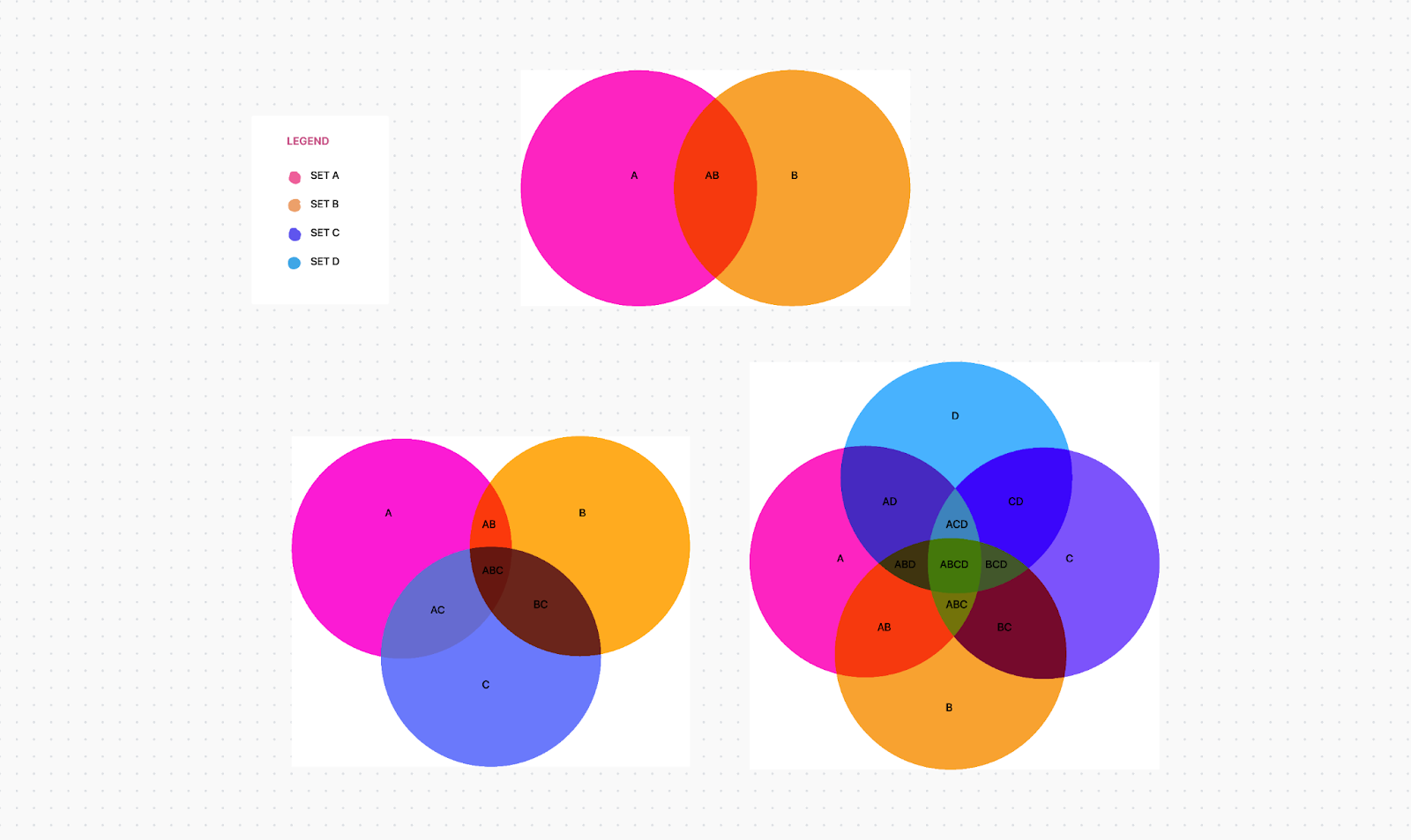
Popularized by John Venn in the 1880s, a Venn diagram is a diagram type that uses circles or ellipses to illustrate a logical relation between things or groups of things (data sets), making it easier to understand overlaps or differences in characteristics or values.

A Venn diagram helps compare two or more sets of information. In business, you can use a Venn diagram to compare product features and market segments, aiding competitive analysis and strategic decision-making. In education, a Venn diagram can help teach elementary set theory and demonstrate simple set relationships in probability, statistics, and computer science.
Broadly, a Venn diagram facilitates better comparisons, clearer communication, and more effective problem-solving.
When it comes to complexity, a basic Venn diagram structure may involve two or three sets of elements. At advanced levels, it can have 3D presentations, progressing to six or seven sets and beyond. A Venn diagram is also known as a set diagram or logic diagram.

If you don’t have a Venn diagram Excel template, you can create a Venn diagram from scratch in Microsoft Excel. This requires manual work but can be accomplished by creating a Venn diagram layout and adding appropriate labels for overlapping relationships.
Confused about mapping connections? Make it easy with ClickUp’s Venn Diagram Template. Try it now!
1. Launch Microsoft Excel on your computer. Open a new or an existing workbook.
2. On the green ribbon, go to ‘Insert’ tab. Click on ‘Shapes’ and select ‘Oval.’

3. Click and drag on the workbook to draw the first circle. Hold the ‘Shift’ key while drawing to ensure the circle is perfectly round. You don’t want an oval shape.

4. Add a new circle or copy and paste the existing circle to create the second and third circles. You can add more circles to create a different Venn diagram layout. For this example, we’ll create a basic Venn with three circles.

5. Move the three circles to overlap appropriately, representing the sets you want to illustrate. They must show the intersections clearly.
6. Click on each circle and use the ‘Shape Format’ tab to fill in the color and outline it. Use different colors for each circle to distinguish between sets. In this step, you can also adjust the size of the circles.

7. Now, to make the overlapping areas visible, right-click on a circle to open a new pop-up bar. Select ‘Format Shape’ to open a new panel on the right comprising advanced formatting options.

8. In the ‘Format Shape’ pane, go to ‘Shape Options’ and adjust the transparency slider under ‘Fill.’

9. A good transparency level is around 50%, but adjust as needed for clarity. Repeat the steps to format all the circles similarly till the overlapping area is clearly visible.

10. To add text, navigate back to the ‘Insert’ tab in the top menu and select ‘Text Box.’ Click and drag within the circles to draw text boxes, then type your desired text. You can also change the font type and size here.

11. In a separate column of the Excel workbook, define labels to explain what each circle represents. Be concise and clear, as shown below:

Please note: Unlike other Venn diagram alternatives, which allow you to link data directly to the chart, Venn diagrams in Excel require manual adjustments and annotations to represent data.
12. Select all the shapes (circles and text boxes), right-click, and choose ‘Group’ to group them and create a single graph. This ensures they stay together when you move or resize the Venn diagram.

Remember to save your Excel file to retain your Venn diagram. You can also copy it into other apps, like Word or PowerPoint, to create graphic elements for your presentations.
📌Also Read: How to Create a Venn Diagram in Google Docs
Excel also offers a SmartArt graphic feature that can be used to create Venn diagrams. Although the customization options might be more limited than using shapes, it still provides a good starting point.
Let’s take a look:
1. Click on the ‘Insert’ tab and go to ‘SmartArt.’

2. Hover over ‘Relationship’ to open a box of related templates and select a ‘Basic Venn’ diagram. You can also choose a different Venn diagram layout—linear Venn, stacked Venn, or radial Venn.

3. To label each circle, click ‘[Text]’ and type there. You can also insert text boxes in the text pane to establish overlapping relationships.

4. To change the color scheme of your diagram, go to the ‘SmartArt Tools Design’ tab. Click on ‘Change Colors’ to choose a different color scheme.

Excel’s Venn diagram functionality may work for basic requirements, but lacks advanced features such as dynamic filtering and interactive elements. Plus, if your data changes, you must manually update the diagram, which can be time-consuming and prone to errors.
So what do you do in such a situation? You seek out specialized diagram software options. 🧐
One such tool is ClickUp.
ClickUp is an all-in-one project management solution with customizable functions and features to monitor project progress, manage operations across departments, and collaborate with team members.
Let’s find out how it helps in creating a Venn diagram.
ClickUp has a convenient and user-friendly ClickUp Venn Diagram Template, a feature-rich option whether you’re tracking project progress or analyzing customer data.
This scalable whiteboard template goes beyond mere sketching.
It provides a platform for real-time collaboration, enabling you and your team to capture and organize information into logical and meaningful categories, visualize the connections between different data sets, and compare and contrast components at a glance—just as you’d see in comparison chart templates.
You can create a ClickUp Doc to define the Venn diagram’s purpose. This will help ensure everyone is on the same page.
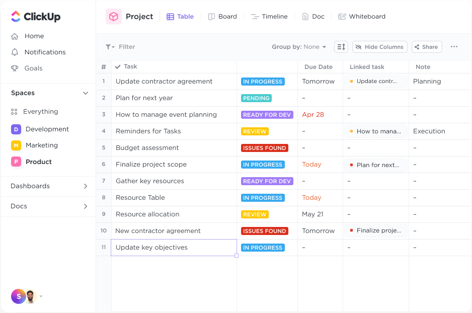
First, you need to get your data in order. With ClickUp Tasks, you can collect all the data you need for diagram creation by assigning individual data tasks to team members. Categorize and add attributes to each task to better understand the connections between different items in the diagram.

Once you’ve gathered information, draw two circles that intersect in the middle. Label each circle with one of the data sets you collected.
Then, navigate to the Board View to map them out. Adjust the size of the circles, ensuring that the relative importance of the category they represent is instantly recognized. Use the ClickUp Table View to add points to the diagram for review and analysis.
That’s it—your Venn diagram is now ready!
But wait, ClickUp’s range of benefits doesn’t stop with this template.
You can use advanced visualization techniques in ClickUp Whiteboards to create a flexible canvas for brainstorming. The drag-and-drop interface allows you to add various elements, such as sticky notes, shapes, connectors, and text boxes, which can be customized and arranged to represent your ideas or processes visually.

You can also link tasks directly from ClickUp to your whiteboard, connecting your visual plan and project management tasks. You and your team members can edit the canvas in real time, add inputs, embed links and media, and make changes simultaneously.
On the other hand, if you want to visualize hierarchical information and explore ideas in a non-linear fashion, ClickUp also functions as a mind-mapping software.
Use the ClickUp Mind Maps feature to create task-based visual workflows. Add nodes and subnodes easily, representing different ideas or tasks that can be linked to specific assignees and due dates.
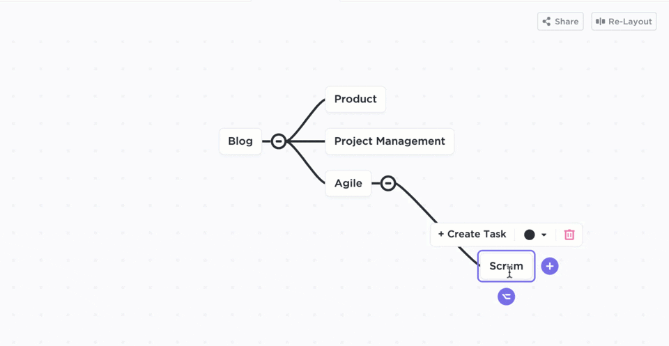
To provide more context and detail, you can customize each node with colors, text, and attachments. Moreover, a Re-Layout option automatically realigns items to organize your mind map into a structure, preserving its hierarchy and identifying priorities.
ClickUp, when used as a flowchart software, simplifies creating and organizing complex workflows within an organization. It helps create a process roadmap that is easy to follow and track tasks through each stage.
📮ClickUp Insight: When a goal falls short, only 34% of our survey respondents revise their strategy and 33% just give up. 🫢
But failure isn’t the end; it’s feedback.
You can easily unpack what went wrong with ClickUp Mind Maps and Whiteboards, explore new ideas, and chart a smarter course forward. Think of it as your built-in bounce-back plan.
💫 Real Results: ClickUp users say they can take on ~10% more work—because setting realistic goals means more wins and fewer meltdowns
💡Pro Tip: Another great way to simplify data visualization and decision-making is to use comparison templates.
Creating a Venn diagram in Excel is a valuable skill. It helps you lay your data sets together using simple shapes to get an overview of their differences and similarities. Studying Venn diagrams can also be an intellectually stimulating activity.
While Excel is a useful tool, ClickUp makes data visualization flexible and collaborative with advanced functionalities.
For instance, the Venn Diagram Template in ClickUp is simple and highly customizable, fulfilling both personal and professional requirements. And ClickUp’s Whiteboard and Mind Map turn messy workflows into structured and easy-to-digest visual resources, making insights more accessible and impactful.
So what are you waiting for? Create visually appealing and functional Venn diagrams and uncomplicate your relationship with data!

© 2026 ClickUp

There’s an easier way. Try a free AI Agent in ClickUp that actually does the work for you—set up in minutes, save hours every week.