

Sorry, there were no results found for “”
Sorry, there were no results found for “”
Sorry, there were no results found for “”
Imagine leading a high-stakes project when a stakeholder suddenly asks, “What’s the biggest risk here?”
You freeze—because there’s obviously more than one. Budget overruns, delays, supply chain issues…this beats the length of your Netflix queue.
However, a tornado diagram makes risk assessment performance much easier. Instead of debating potential risks and impacts in endless meetings, this visual tool will prevent unforeseen risks from wreaking business havoc.
Let’s break down how tornado chart analysis works and how to use it to manage project risks like a pro.
A tornado diagram is a bar graph used in quantitative risk identification to visualize the impact of different variables on a particular outcome. It gets its name because the bars are arranged in a shape resembling a tornado—widest at the top and narrowest at the bottom.
These diagrams are extensively used in project management, construction, engineering, and business.
They are essentially like your weather forecast—helping you prepare for the worst by visually analyzing risk factors. At the same time, they also help you make better-informed decisions.
🧠 Fun Fact: Tornado diagrams are surprisingly versatile! While often used by project managers, they can also be applied in fields like finance, environmental science, and even personal decision-making, such as evaluating the pros and cons of different career paths.
In risk analysis, a tornado diagram acts as your project’s radar. It highlights factors that could drive up project risk cost by affecting timelines or expenses.
The diagram helps pinpoint the uncertainties that can make or break a project. It’s primarily used for sensitivity analysis and measures how changes in different inputs affect the outcome.
The longer the bar, the more sensitive the project outcome is to that variable. For example, if a slight change in labor shortages significantly affects the project timelines, that factor will have a long bar, signaling that it needs attention.
On the other hand, factors with shorter bars have a lower impact and might not require immediate focus.
Tornado diagrams are especially beneficial for risk analysts and project managers as they avoid the hassle of going through a spreadsheet full of numbers. You can perform a tornado analysis and compare multiple risk factors side-by-side.
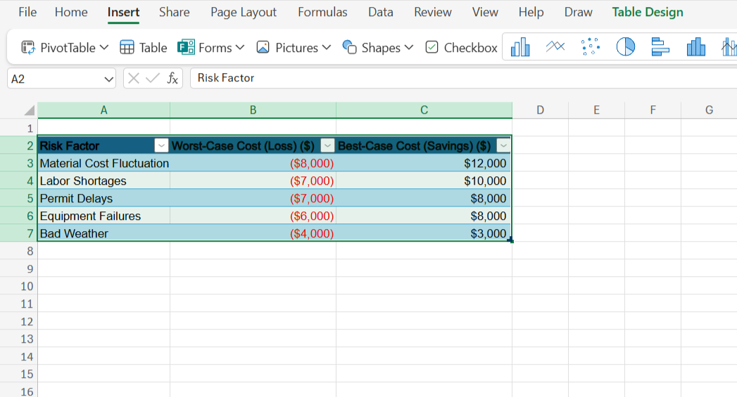
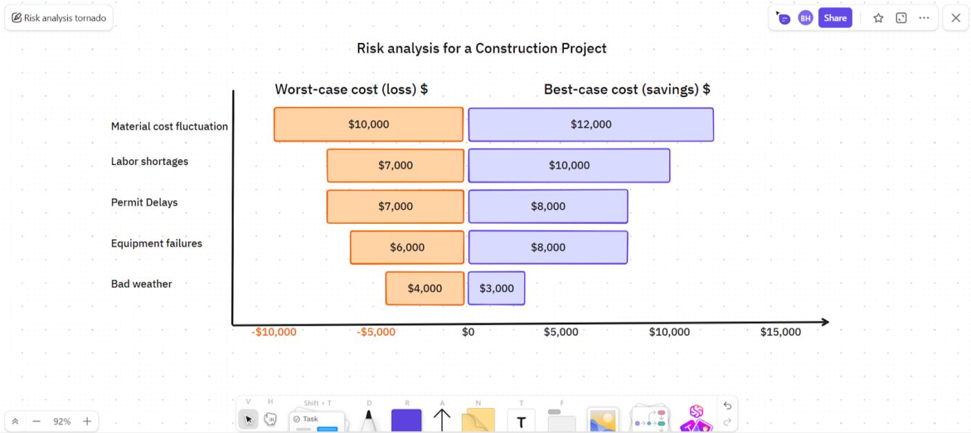
📌 Example: Say you’re managing a construction project. In this case, various factors such as material price changes, labor shortages, permit delays, bad weather, and equipment failures can impact costs. This could be your data:
| Risk Factor | Negative Impact ($) | Positive Impact ($) |
| Material cost fluctuation | -$8,000 | $12,000 |
| Permit delays | -$7,000 | $10,000 |
| Labor shortages | -$7,000 | $8,000 |
| Bad weather | -$6,000 | $8,000 |
| Equipment failures | -$4,000 | $3,000 |
Here’s how a tornado diagram will represent these risks:
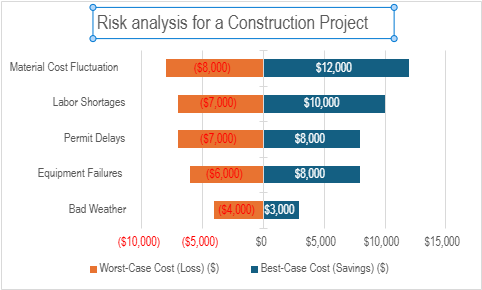
This tornado diagram shows which risks have the biggest impact (negative and positive). The longest bar is material cost fluctuation, which implies that it could cause major financial headaches. Knowing this, you can take preventive actions, like ensuring regular maintenance or having backup equipment ready.
👀 Did You Know? Only 46% of companies actually mitigate risks after assessing them—when they should be taking action.
Let’s break tornado graphs down into their core components.
Reading a tornado graph is like scanning a weather report—looking for the biggest storms ahead. Here’s how to read it effectively.
The longest bars at the chart’s top indicate the most significant potential impact. As mentioned, these are the ‘critical factors’ that require the most attention and mitigation strategies. Prioritizing the most important risks helps you focus on what’s urgent and avoids burdening your team.
Now that you know what to prioritize first, look for how big of an impact it’s creating. Each bar shows the potential negative and positive variations of a particular factor. If one uncertainty can push costs up or down by $10,000, you know it has a huge impact and can work on risk management accordingly.
While the diagram shows the potential impact, you should consider how likely it is to happen. Also think about how much you can control it, and how it will really affect your overall goals.
Once you know which risks matter most, allocate resources to control the highest-impact risks, plan for worst-case scenarios by preparing solutions, and take advantage of potential positive impacts when possible.
💡Pro Tip: A longer bar might not always mean a high likelihood of occurrence. So, discuss the tornado diagram with your team and choose the risks that are more likely to happen even if they represent a smaller bar in the diagram.
Tornado diagrams are not as straightforward to create as they are to read. Here’s a step-by-step guide to help you!
First, consider what could most affect your project.
This could be costs, schedules, resources, or risks like delays and price changes. Brainstorm with your team to ensure you cover everything that matters.
How do you figure out the impact of risks? Good question. Look at past project data, industry reports, real-world numbers, and consult experts. Try to estimate best-case, worst-case, and most likely scenarios for every risk.
You are now all set to create your tornado diagram!
List the input variables on the x-axis from highest to lowest impact. Show their possible value ranges. Then, calculate their effect on the outcome and display them as bars on the y-axis. But what does that mean?
Using the same construction project example, let’s understand by creating a tornado diagram with Microsoft Excel.
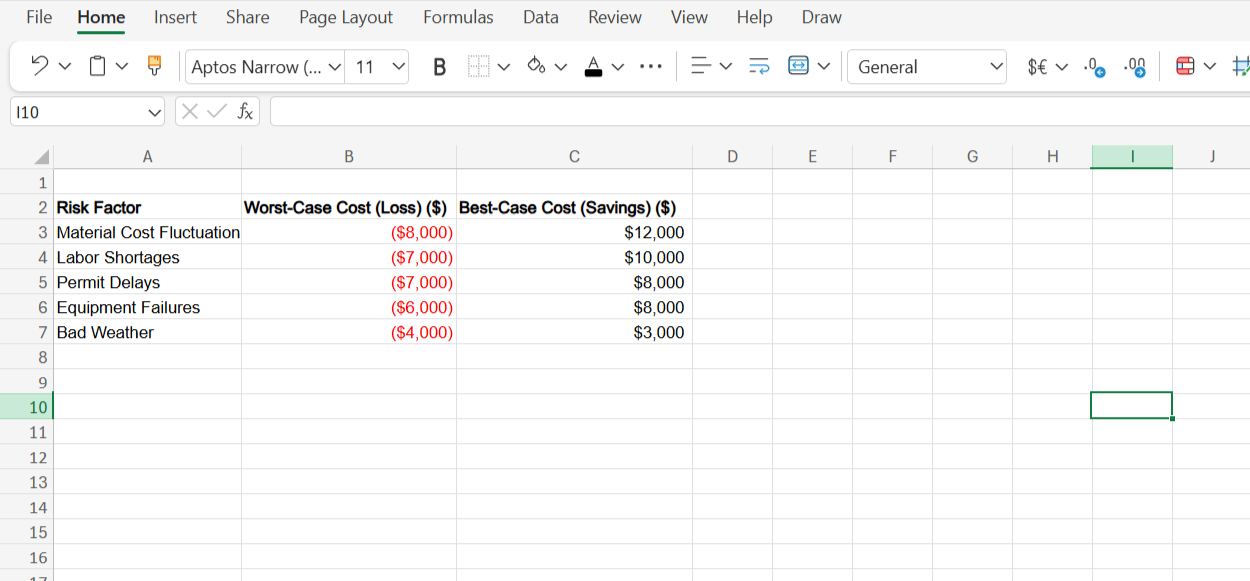
1. Open a new Excel sheet and enter your data
Sort the data in descending order of potential impact. This will help you create a more visually intuitive tornado diagram, where the most impactful factors are prominently displayed.
2. Select the entire data section. Go to Insert, and click Table
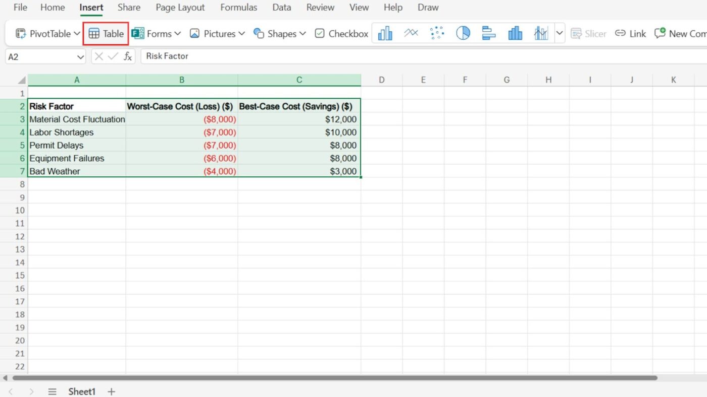
3. Click OK. Here’s what you’ll see
Now, your data is ready to be turned into a tornado diagram.
4. Select the entire table and click Insert. In the charts section, select Stacked Bar
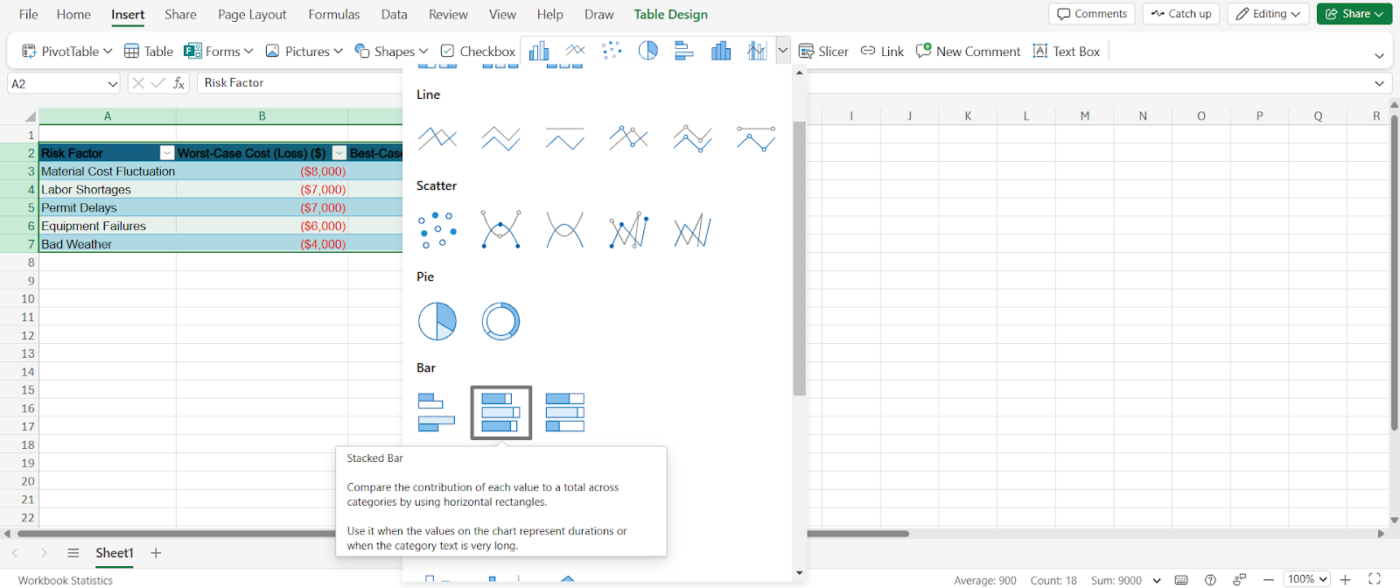
This will give you a basic tornado chart you can customize according to your preferences.
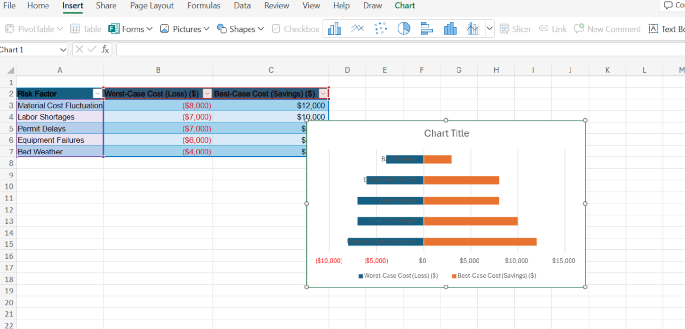
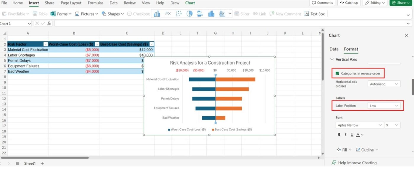
5. Add in a suitable Chart Title for your tornado diagram

6. If your diagram comes out inverted, as in this example, simply go to the Vertical Axis section and check the Categories in the reverse order box
7. Assign the labels high or low based on your preferences
Try out different customization options and see what works best for your diagram. Once you are satisfied, you can copy and paste this diagram onto documents and effectively work on risk management.
📮 ClickUp Insight: 92% of workers use inconsistent methods to track action items, which results in missed decisions and delayed execution. Whether you’re sending follow-up notes or using spreadsheets, the process is often scattered and inefficient.
ClickUp’s Task Management Solution ensures seamless conversion of conversations into tasks—so your team can act fast and stay aligned.
You already know this one! Longest bars = most significant risks. Check whether the impact is primarily negative or varies both ways.
Prioritize managing the most significant risks through contingency plans, budget adjustments, backup suppliers, or flexible timelines. Finally, discuss your findings with stakeholders, explore solutions, and make informed decisions to keep your project on track.
💡 Pro Tip: If a risk looks major, conduct further analysis to understand its full effect!
One of the tornado diagram challenges is manual creation. This can be time-consuming and prone to errors. Fortunately, several software tools can help.
Excel and Google Sheets are the most widely used software tools that offer basic charting capabilities. You can also opt for diagram software like Draw.io or Miro. If diagram creation is your sole purpose, these tools might be the best for you.
However, a dedicated risk management software like @RISK can be a great fit if you are looking for specialized platforms. @RISK is a powerful tool specifically designed for risk and uncertainty analysis, and it has advanced features for tornado chart sensitivity analysis.
But what if you could brainstorm risks, turn them into tornado diagrams, and create tasks out of the results, all in one place?
It’s possible with ClickUp, the everything app for work!
ClickUp may seem like just a project management tool. However, its advanced collaboration and visualization capabilities make it ideal for your risk assessment and management process.
Start by brainstorming all the risks that might impact your project. Thinking of using Microsoft Word to note down all your findings? You don’t have to!
ClickUp Docs lets you create a centralized document with version history tracking to share with your entire team. This could be your customizable risk register template for future use!
Plus, you can also collaborate with your team members or get feedback from different shareholders in real time. No more complaints about endless document versions!
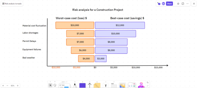
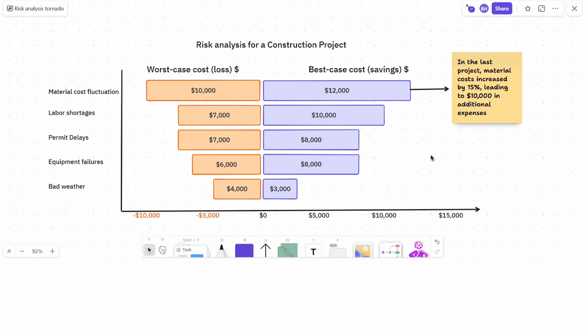
Next, ClickUp Whiteboards is a fantastic tool for visualizing your project risks with a tornado diagram. Here’s the construction project example (ClickUp’s version).
But wait, there’s more to it!
What makes ClickUp so great is its flexibility. Once you have your tornado diagram ready, you can add notes about past project results or anything your team needs to know about the data presented to them.
The best part? You can turn these notes into tasks and assign them to your team members right here on the board!
Once you’ve created the tasks, go to the team workspace where they exist and add any description or links that might help your team work better.
You can also use ClickUp Task Checklists to create a risk assessment checklist for your team.
You might ask, “Would I have to go back to the docs or the Whiteboard whenever I want to look at the variables?” Absolutely not!
ClickUp Custom Fields lets you add them directly to your tasks. Plus, you can add a custom field specially designed to track monetary values so that ‘$1,000’ doesn’t become ‘@1000’ and you have a uniform database.
The last puzzle piece is easily visualizing and managing risk data in a single view. ClickUp Dashboards is your holy grail for doing this effectively! It helps you visualize key risk metrics, such as the total potential impact of all risks.
Plus, you can also utilize widgets to display critical information, such as the number of open risks or the progress of risk mitigation activities.
Risk analysis and management are best performed when they’re simplified. ClickUp is your ultimate predictive analysis software, eliminating the need for hopping between team chats to discuss an already complex process.
ClickUp brings everyone—from your data analysts to your sales team and HR team—under one roof so everyone works collaboratively and you stay stress-free!
As Project Manager Tiffany Vedamuthu of Mayo Clinic attests:
ClickUp has helped me to stay-on-the-ball as a Project Manager allowing me to accurately track and flip back and forth between project, various tasks, and accurately keep a record of things like decisions, risks, and timelines all in one place.
So, you could say that you don’t really need tornado diagrams for risk management (and question your life choices later). But let us give you some concrete reasons why you do need them.
They can help you:
In summary, tornado diagrams allow you to anticipate, understand, and proactively address project risks, so you enter the field all informed!
You now know everything there is to know about tornado diagrams. But when should you actually use them? Here are some practical applications.
Planning a marketing campaign? A tornado diagram helps you identify budget-busting risks like rising ad costs or unexpected expenses.
This gives you time to allocate funds strategically and potentially explore cost-effective alternatives like organic social media campaigns.
Working on new projects comes with uncertainties. Identify potential delays like approvals, supplier issues, or extensive testing with a tornado diagram.
You can then adjust your timeline and add buffers for regulatory approvals, supplier bottlenecks, and unforeseen circumstances.
Launching a new product or service? A tornado diagram helps you visualize risks like intense competition, changing consumer preferences, and high marketing costs.
This allows you to develop a better marketing strategy, allocate resources effectively, and thrive in a competitive market.
Whether a new business or a stock purchase, a tornado diagram helps you assess the impact of market competition, economic conditions, and other factors. So, you can make more informed investment decisions and minimize your exposure to potential losses.
We hope you’re not blown away by our tornado puns just yet—because here comes another.
If your project is a ship braving stormy seas, tornado diagrams are your weather radar, helping you forecast the most significant risks before they whirl into disaster.
While you could wrestle with Excel formulas or juggle between multiple tools, why not make life easier with ClickUp?
It brings everything you need, from brainstorming to creating tornado charts and tracking them, in one flexible place.
Sign up for a free ClickUp account today!

© 2026 ClickUp


