Sorry, there were no results found for “”
Sorry, there were no results found for “”
Sorry, there were no results found for “”
Every abandoned task dashboard dies the same way. Not from a bad layout or the wrong tool, but from the moment one number contradicts what the team saw happen that week, and people stop believing the screen.
That’s why this guide is upside down compared to most dashboard tutorials. Four of its six steps happen before you touch a layout, because a dashboard is a mirror: it can only show what your task records already say. Get the records right, and a plain four-card dashboard runs your Monday. Get them wrong, and the prettiest screen in the world becomes a weekly argument.
Below: the setup, the build, where to build it, and what keeps it trusted past week one.
TL;DR: Assign one owner, a clear status, and a due date to every task. Build a dashboard with four cards: tasks by status, overdue tasks, tasks per person, and blocked work. Pick one regular moment to update statuses, like the first five minutes of your Monday meeting, and test the dashboard against a week you already remember before trusting it with one you don’t.
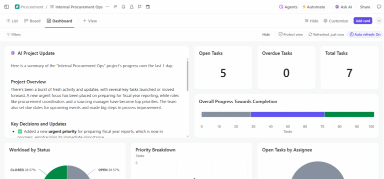
A task dashboard is a single view that shows the live status of a set of tasks, usually filtered to one team, project, or person. It combines a count of open and completed work, an overdue list, a breakdown of tasks per owner, and a view of what’s blocked.
A dashboard has no data of its own. It reads your task records when you open it and displays whatever they say. Updated records produce an accurate dashboard. Stale records produce a confident-looking wrong one.
These three answer different questions for different readers. A task dashboard tracks execution at the task level. A project dashboard tracks delivery at the initiative level. A status report is a written summary for people who open neither.
| Dimension | Task dashboard | Project dashboard | Status report |
|---|---|---|---|
| Unit of measure | Individual tasks | Projects, phases, milestones | Narrative plus headline numbers |
| Primary reader | The team doing the work and its lead | Program manager, PMO, department head | Executives, clients, stakeholders |
| Update rhythm | Continuous, refreshed on open | Continuous, reviewed weekly | Assembled weekly or monthly |
| Question answered | What is late and who has it? | Will this project land on time? | Should we be worried, and about what? |
| Fails when | Statuses go stale | Milestones aren’t linked to real tasks | The author softens bad news |
The core rule: Match the tool to the reader. The team uses the task dashboard, PMO needs the project dashboard, and executives usually work with the report.
Most task dashboards get abandoned because the task records behind them go stale, and once one number looks wrong, the team stops trusting the rest of the screen. A study in the Journal of Medical Quality documented two dashboards in the same hospital with the same data and purpose. One was adopted, and the other wasn’t.
The difference had nothing to do with design. Instead, the study found three essential social mechanisms that influence if a dashboard will be adopted and used:
Trust often becomes a common reason for a dashboard being abandoned. Someone notices a number that doesn’t match, and then every meeting about the dashboard becomes a debate about data accuracy.
Half of organizations don’t even have access to real-time project KPIs, according to Wellingtone’s State of Project Management report. 72% of project professionals spend half a day or more each month manually assembling project status reports.
So before you build anything, get three things right:
A quick way to test your current records: sort any task list by last updated. Anything untouched for two weeks either needs a status change or was never real work to begin with.
A task dashboard comes together in six steps, and only the last two involve the layout. The first four set up the task records the dashboard reads from: the decision it supports, the status set, ownership and due dates, and the update ritual. Skip those, and you’ll build a dashboard on incomplete data.
Write down the specific decision someone will make from this screen, before you add a single card. ‘See how the team is doing’ is an observation. ‘Decide every Monday which two tasks to pull forward and who to reassign’ is a decision, and it tells you exactly which cards to build.
Before you add a card, check it against that decision:
Pro Tip: Ask the three people who’ll use the dashboard most what they checked manually last week. The questions they repeat are your first cards.
Every card on the dashboard is calculated from your status list, so define it as a team and keep it to five or six stages. Write a one-line definition for each stage and store it where the team plans work.
Two stages cause the most confusion when they’re not clearly defined:
Before you lock in the statuses, have the team categorize 20 real tasks using them. Wherever two people disagree on where a task belongs, the status definition isn’t clear enough yet.
Assign every task to exactly one person. A task assigned to three people displays correctly on the dashboard and gets picked up by no one, because each assignee assumes someone else has it.
Repeat the same for due dates. When the backlog fills with dates everyone knows are aspirational, the team learns to ignore the overdue card. Set dates the owner commits to, and move the ones that slip instead of leaving them red. If the backlog is already full of dates nobody believes, start by prioritizing the competing work.
One settings change removes the entire category of unowned, undated work: make the assignee and due date fields required when creating a task.
Decide when statuses get updated and who does it. Two patterns tend to stick:
Pick one and tie it to something the team already does. For example, if your team runs a Monday standup, use the first five minutes to walk the board and update statuses together. That way, the update happens inside a meeting people already attend.
Good to do: Set up an automation that flags any task with no update in the last 10 days. It won’t replace the ritual, but it catches tasks that slip through, so you don’t have to manually check every task.
Start with four cards. Each one answers a specific question your team asks repeatedly:
Use these four for two weeks before adding anything else. If you keep leaving the dashboard to look up the same thing (say, what’s due this week), that’s your fifth card.
When you arrange the cards, put overdue and blocked work in the top left. That’s where people look first, and those cards need the fastest response. Put trend charts (like completion rates over time) lower on the page since those inform weekly planning.
Pick a recent week where you remember what happened: which tasks were late, who was overloaded, what got blocked.
Open the dashboard for that week and compare what it shows to what you know actually happened. If your team had a rough week with missed deadlines but the dashboard shows everything on track, something in the setup is wrong. Better to catch that now than after someone makes a decision based on it.
Two things to look for specifically:
Do this review with one teammate who was there that week. You’ll remember different things, and between the two of you, you’ll catch gaps the dashboard missed that neither of you would have caught alone.
This walkthrough covers the same sequence, including the habits that keep dashboards accurate:
Steps 1 through 6 get a dashboard built. These habits keep the data underneath it worth reading a month from now.
Three approaches cover almost every team: a spreadsheet, a dedicated BI tool, or the work management platform where the tasks already exist. Here’s how to pick between them.
| Approach | Strength | Weak spot | Best for |
|---|---|---|---|
| Spreadsheet (Excel, Google Sheets) | Free, familiar, restructure it in an afternoon | Holds a copy of the work that someone must keep in sync | Teams under 10 people tracking fewer than 100 tasks |
| BI tool (Power BI, Tableau, Looker) | Joins task data with finance, CRM, and product data at any scale | Needs a data pipeline and a technical owner, plus refresh lag | Organizations reporting across several systems |
| Work management platform | Reads live tasks directly, so the dashboard can’t drift from the source | Reporting is scoped to that platform’s data | Teams whose work already lives in one system |
A spreadsheet dashboard is a pivot table plus two or three charts over a task list. Enter your tasks as rows, tag each one with a status, owner, and due date, then use formulas to count and sort them by those fields.
Excel and Google Sheets task tracker templates come with prebuilt formulas and charts. Paste your tasks in, and you have a working dashboard within the hour.
What works well:
Limitations:
Skip it if: More than three people update the source data, or the project runs longer than a quarter.
Best for: Small teams, short projects, and anyone who needs a working dashboard today without buying software.
Business intelligence tools like Power BI, Tableau, and Looker pull data from multiple systems and combine it into one report. They connect to your task tool, finance system, CRM, and product analytics, then let you build dashboards that draw from all of those at once.
For example, you could show task completion by team alongside the revenue each team’s projects generated. Or compare engineering cycle time against customer support ticket volume. BI tools are ideal for those cross-system views.
What works well:
Limitations:
Skip it if: You only need to track what’s late and who owns it. A BI tool is overkill for that.
Best for: Teams that need task data and financial, customer, or product data on the same dashboard.
Most work management platforms (Asana, Jira, monday.com, Smartsheet, and others) have built-in dashboards that read directly from the tasks your team works in every day. For most teams doing day-to-day visual project management, this is where they end up.
What works well:
Limitations:
Skip it if: Your reporting has to combine task data with financial or product analytics. A BI tool handles that better, and many teams run both: a work management dashboard for weekly team reviews and a BI dashboard for monthly leadership reports.
Best for: Teams whose tasks already live in one system and who need progress, workload, and risk on a single screen.
Task dashboards work differently depending on who’s reading them. We have three examples here: the team lead managing the week, the individual contributor managing their own queue, and the program manager coordinating across teams.
A marketing lead manages six campaigns across five people. Every Monday before standup, they open one screen to answer two questions: who needs help getting unblocked, and does any work need to move to someone else?
Their marketing dashboard works with four cards:
Worth adding after the first month: A staleness card that lists any task with no update in the last 10 days. Stale tasks are easy to miss because they don’t show up as overdue or blocked. They sit there. This card helps you catch work, like a design handoff that nobody picked up because the receiving designer didn’t know it was theirs.
Keep it focused. This dashboard has four cards, and each one leads to a specific action: reassign, unblock, or flag. Trend charts and completion percentages are useful for sprint reviews, but they don’t help with those three actions. Add them to a separate weekly review dashboard if you need them.
A senior engineer in the middle of sprint planning needs to know three things when they start their day: what should I work on, what’s stuck, and did anything new land on my plate since yesterday? Their dashboard is scoped entirely to their own tasks.
It requires four cards:
Why this dashboard matters for the whole team: When an engineer or designer has a personal dashboard that helps them plan their own day, they update their tasks as part of their workflow. That means every other dashboard gets more accurate data without anyone having to chase updates. If you build only one dashboard from this guide, build this one first.
An operations manager is coordinating a product launch that involves marketing, support, and engineering. No single team’s board shows the full picture of the launch, because each team tracks only their own work. This custom dashboard watches the spaces between teams, specifically the handoffs where work moves from one group to the next.
To keep track, implement five cards:
The part nobody plans for: ownership. Each team has someone who runs their board. This dashboard sits between teams, so no single team owns it. Assign one person to review it weekly and flag when a handoff gap or cross-team blocker hasn’t moved. Without that, the dashboard exists, but nobody acts on what it shows, because everyone assumes the other team is watching it.
ClickUp is a work management platform where tasks, docs, goals, and chat live in one workspace. ClickUp Dashboards pull directly from that task data, so you don’t need to export or sync anything. Every card on the dashboard reads from the same records your team updates every day.
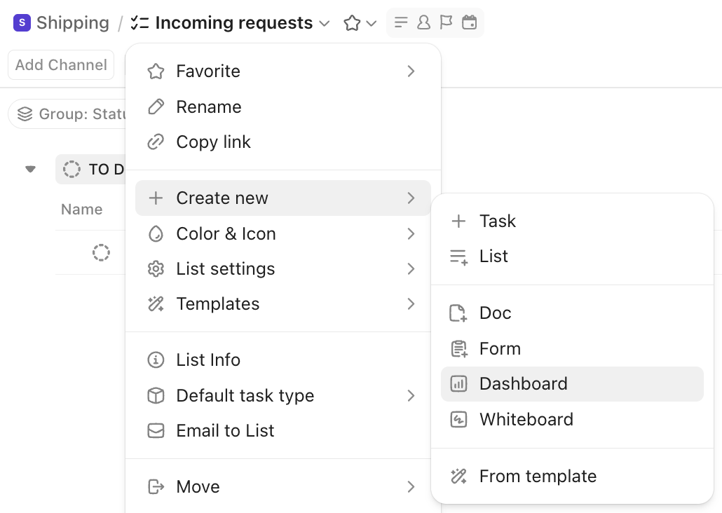
Open the Dashboards section from the left sidebar. Click + New Dashboard, name it to match the decision it supports (from Step 1), and choose whether to start from a blank dashboard or a template.
ClickUp includes prebuilt templates for common setups like sprint tracking and project overviews. Templates give you a starting layout you can customize; blank dashboards let you build from scratch.
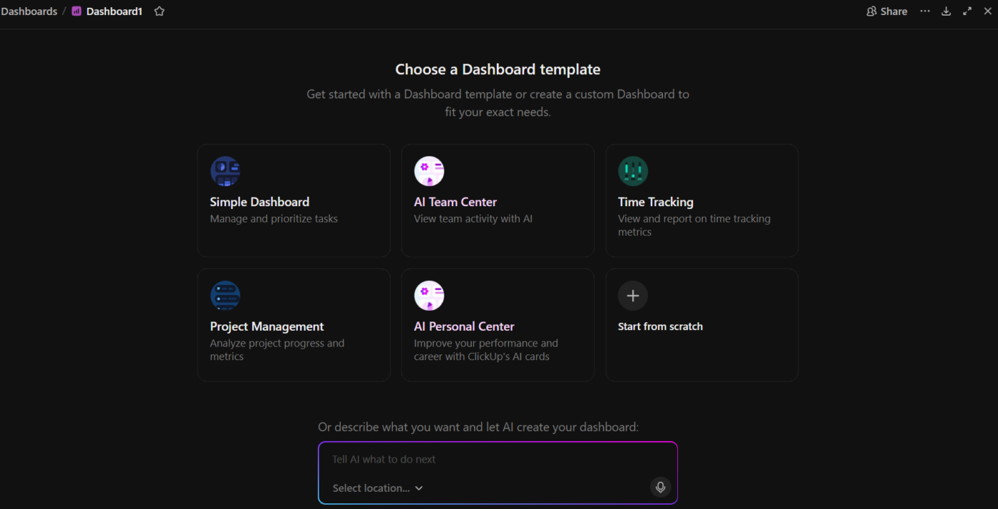
To add a card, click + Add card, choose the card type, and point it at the Space, Folder, or List your team works in.
By default, each card on a ClickUp dashboard pulls data from whatever Space, Folder, or List you pointed it at when you set it up. But you can also apply a single filter at the dashboard level, and every chart-based card on the page adjusts to match.
For example, say your dashboard shows data from your entire Marketing Space. You’re heading into a sprint review and only want to see tasks from the current sprint. Instead of editing each card’s filters one by one, apply a date range filter at the dashboard level. Every chart on the page now shows only that sprint’s data. Remove the filter to return to the full picture.
Individual cards can still have their own filters on top of the dashboard-level one. So you could have a dashboard filtered to one team’s Space, with a single card that further filters to blocked tasks only. This means one dashboard can serve as both the weekly overview and a focused drill-down, without building and maintaining two separate dashboards.
Limitations:
Skip it if: You’re a solo user tracking fewer than 20 tasks. A filtered List view or Board view gives you the same information without the setup.
Best for: Teams where more than one person needs to see task progress, workload balance, and risk on a single screen.
The dashboards that work look simple and have four or five cards. They work because the team agreed on what question the screen answers, and someone made sure it gets checked regularly.
The ones that get abandoned usually started bigger. They end up carrying too many cards, charts, and metrics. Within a month, half the numbers look off because task updates fell behind. In two months, the team stops opening it and goes back to status meetings.
If your team already works in ClickUp, the dashboard pulls from the same tasks people update every day, with no separate data source to maintain. Get started with ClickUp for free.
A Kanban board is a working surface: you move task cards through columns to update their status. A task dashboard is a read-only summary built on top of that work. You act inside a board, and you read a dashboard. A board shows every card in one project; a dashboard aggregates across projects to surface exceptions such as overdue and blocked work. Most teams use both: the board for daily flow and the dashboard for the weekly review.
A task tracker is the system you use to record and update tasks. A task dashboard is a summarized view built on top of those records. You work inside a tracker and read a dashboard. The tracker holds every field and comment for each task, while the dashboard surfaces only the aggregates and exceptions a reader needs, like overdue counts and workload imbalance.
Yes. Free templates exist for ClickUp, Excel, and Google Sheets, and most work management platforms include starter dashboards on their free plans. A template saves layout time but still renders whatever your team records, so the one-owner, one-status, one-due-date discipline matters more than which template you pick.
AI can assemble a dashboard layout and summarize the data, but it cannot fix the records underneath. ClickUp Brain answers questions against live workspace data in plain language. That covers the one-off queries that would otherwise become permanent extra cards. The limit is the same as any dashboard: if statuses and owners are stale, an AI-generated view is confidently wrong.
A management dashboard rolls several task dashboards into one summarized view for a leader who never opens the underlying task lists. It shows indicators such as delivery rate, budget consumption, and headline KPIs across a team or business unit, usually pulled from several systems rather than one task tool. A task dashboard shows the work items; a management dashboard shows whether the function is on track.
Within five seconds of opening a dashboard, a viewer should grasp at least one key insight without scrolling or asking questions. Nielsen Norman Group defines dashboards as at-a-glance displays users can act on with minimal cognitive processing. For a task dashboard, that means overdue and blocked work in the top left, where eyes land first, and trend charts lower on the page.

Sudarshan Somanathan
Max 22min read

Praburam Srinivasan
Max 23min read
Praburam Srinivasan
Max 21min read
© 2026 ClickUp