


Still downloading templates?
There’s an easier way. Try a free AI Agent in ClickUp that actually does the work for you—set up in minutes, save hours every week.
Sorry, there were no results found for “”
Sorry, there were no results found for “”
Sorry, there were no results found for “”
American actor and writer Steven Wright once said, “If everything seems to be going well, you obviously don’t know what’s going on.”
It may sound cynical, but project managers know how easily timelines, budgets, and project status updates can fall apart without clear visibility in a project.
That’s where a Smartsheet dashboard template can make a world of difference. These templates serve as a single source of truth, consolidating project information, metrics, and real-time updates for both internal teams and external stakeholders.
Using built-in layouts for tracking key performance indicators, budgets, timelines, and resources, Smartsheet dashboards offer a streamlined approach to creating dashboards quickly, eliminating the need to build a project management dashboard template from scratch.
Below is a curated list of top-performing Smartsheet dashboard templates to help you get started.
Here’s a quick summary for you:
| Template Name | Download Template | Best Features | Ideal For | Visual Format |
| Smartsheet Project Dashboard Template | Download the template | Auto-updating charts, task/priority/timeline tracking, live sharing | PMs needing real-time project visibility | Smartsheet Dashboard |
| Smartsheet Executive Dashboard Template | Download the template | Finance/sales/ops KPIs, QTD vs target, dept snapshots | Execs, business owners needing high-level KPIs | Smartsheet Dashboard |
| Smartsheet KPI Performance Dashboard Template | Download the template | Monthly/YTD trends, line/bar/donut charts, variance highlights | Teams tracking performance trends over time | Smartsheet Dashboard, Google Sheets |
| Smartsheet KPI Dashboard Template | Download the template | Efficiency level, revenue/expense/YoY tracking, real-time updates | Managers measuring output vs targets | Smartsheet Dashboard, Google Sheets |
| Smartsheet Financial Dashboard Template | Download the template | Revenue/expense/YoY deltas, product/region filters, live charts | Finance teams, business leaders | Smartsheet Dashboard |
| Smartsheet Sales Management Dashboard Template | Download the template | Pipeline/win rates/bookings, segment trends, live sharing | Sales leads, account managers | Smartsheet Dashboard |
| Smartsheet Project Portfolio Management Summary Dashboard Template | Download the template | Aggregate status/budget/risk, priority/progress comparison | Execs, portfolio managers | Smartsheet Dashboard |
| ClickUp Project Management Dashboard Template | Get free template | Active/overdue/capacity, assignee/tag/sprint filters, charts | PMs needing real-time project progress/blocker visibility | ClickUp Dashboard |
| ClickUp Analytics Report Dashboard Template | Get free template | Charts/trends, period comparison, read-only sharing | Teams turning raw data into clear visuals | ClickUp Dashboard |
| ClickUp Digital Marketing Report Dashboard Template | Get free template | Channel KPIs, CTR/CPA/ROAS, client-ready exports | Marketing teams consolidating campaign data | ClickUp Dashboard |
| ClickUp IT Roadmap Dashboard Template | Get free template | Initiatives/dependencies/timelines, rollout readiness | IT teams managing complex dependencies | ClickUp Dashboard |
| ClickUp Marketing Report Dashboard Template | Get free template | Spend/reach/engagement, channel segmentation, auto-refresh | Marketers needing clear, visual campaign insights | ClickUp Dashboard |
| ClickUp Project Report Template | Get free template | Scope/milestones/risks, change logging, status tracking | Project leads surfacing risks and tracking delivery | ClickUp Dashboard |
| ClickUp KPI Template | Get free template | Centralized KPIs, targets/thresholds, review cadence | Managers/team leads tracking business-critical KPIs | ClickUp Dashboard |
| ClickUp Sales Report Template | Get free template | Bookings/pipeline/velocity, conversion by stage, quota tracking | Sales managers/reps needing real-time performance | ClickUp Dashboard |
When managing complex projects, information tends to scatter: updates in emails, deadlines in spreadsheets, and budgets in separate tools. This fragmentation in work management slows down decision-making and makes it challenging to see where things stand.
That’s why many teams turn to Smartsheet dashboards. They bring together real-time updates, task status, and performance data, serving as a single data visualization tool, so project managers and stakeholders can see the full picture at a glance.
A Smartsheet dashboard template is a pre-built, customizable layout designed to help you do exactly that, along with the following:
💡 Pro Tip: Struggling to make sense of messy spreadsheets? Learn how to turn raw data into clear visuals with the step-by-step guide in How to Create A Dashboard in Excel? And start making smarter, faster decisions.
Here’s a video tutorial to help you do it better:
A functional dashboard may show data, but a good Smartsheet dashboard template turns raw project information into insights that are easy to interpret, prioritize, and act on.
For project managers, analysts, and business teams, this difference can mean catching a delay before it derails timelines or identifying a budget risk before it escalates.
Here’s how to identify a strong dashboard template:
✅ Prioritizes key metrics by placing them at the top or center for immediate visibility
✅ Uses clear, consistent labels that help users understand data without confusion
✅ Applies visual hierarchy—grouping, color, and font size—to highlight key performance indicators
✅ Incorporates effective charts and graphs to present complex data in digestible formats
✅ Ensures the design is intuitive so that users can navigate and extract value quickly
Here are 7 free Smartsheet dashboard templates designed to help you handle marketing campaigns, oversee budgets, or manage cross-functional resources.
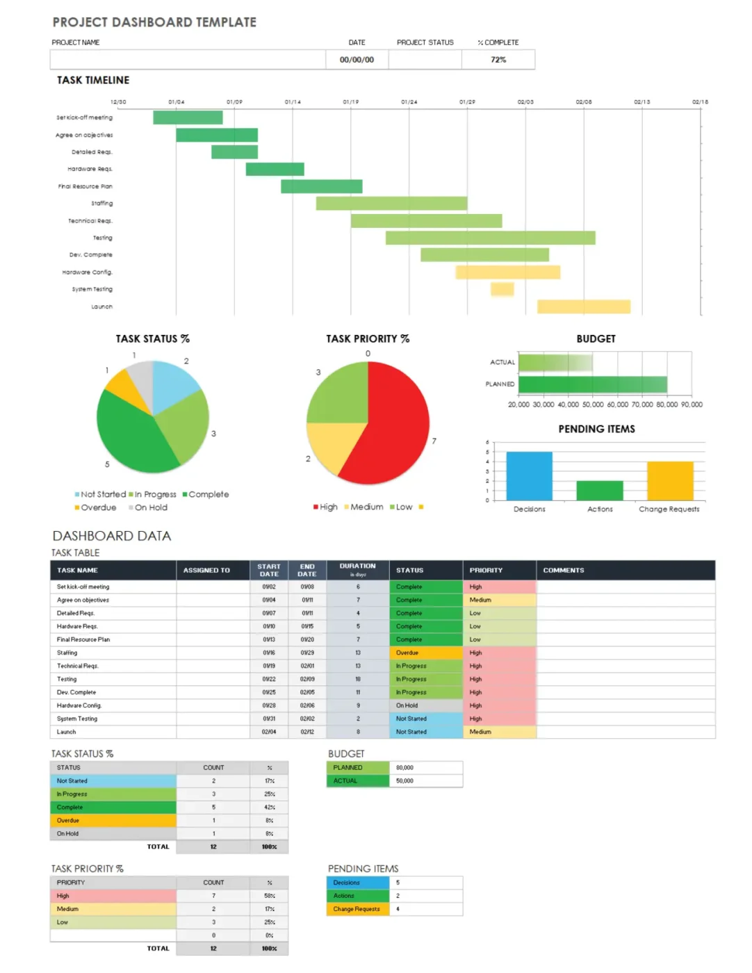
Tracking multiple tasks, priorities, and deadlines across a project is never simple, especially when updates are coming from different people and places.
This Smartsheet Project Dashboard Template gives you a real-time view of everything that matters. It uses color-coded visuals like pie charts and a Task Timeline to show task status, priority breakdowns, and key project timelines at a glance.
Whether you’re managing a client onboarding project, coordinating a cross-team rollout, or running a weekly marketing sprint, just input your data, and the charts update automatically.
✨ Ideal For: Project managers who need a real-time view of tasks, priorities, and timelines across fast-moving projects.
🧠 Did You Know: While 53% of businesses think their clients are satisfied with self-service, the actual success rate is just 14%. How to Create a Client Dashboard (+ Examples) shows you how to fix that with dashboards that actually solve client problems.
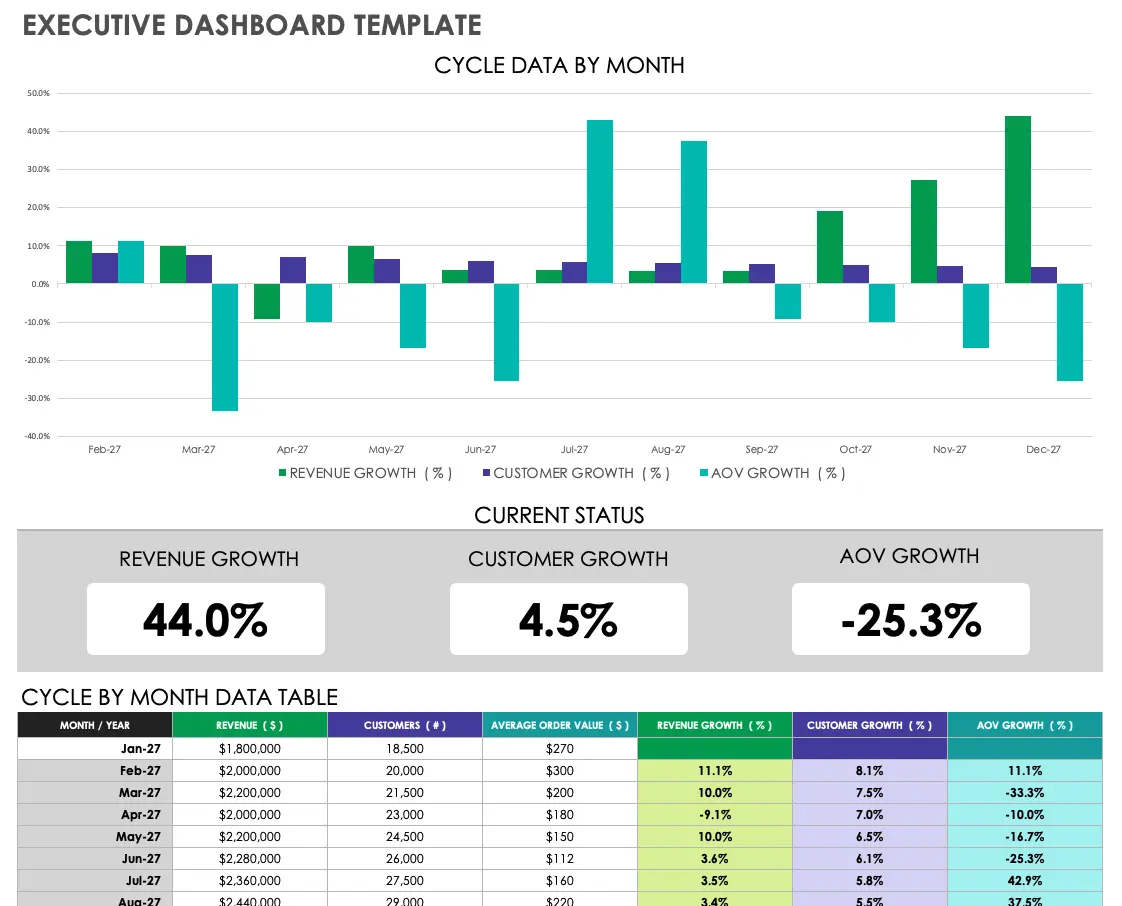
According to a NerdWallet report, the average small business owner in the U.S. works nearly 60 hours a week. With that kind of schedule, the last thing you want to do is dig through spreadsheets to find what matters.
This Smartsheet Executive Dashboard Template pulls together your most important key performance indicators into a single, easy-to-read view. Designed for high-level visibility, it helps leadership teams track financial data, sales, and departmental performance in real time.
Whether you’re preparing for a board meeting, reviewing quarterly goals, or monitoring company-wide projects, this executive dashboard keeps everyone focused on the metrics that drive decisions.
✨ Ideal For: Executives and business owners who want quick access to high-level KPIs without digging through spreadsheets.
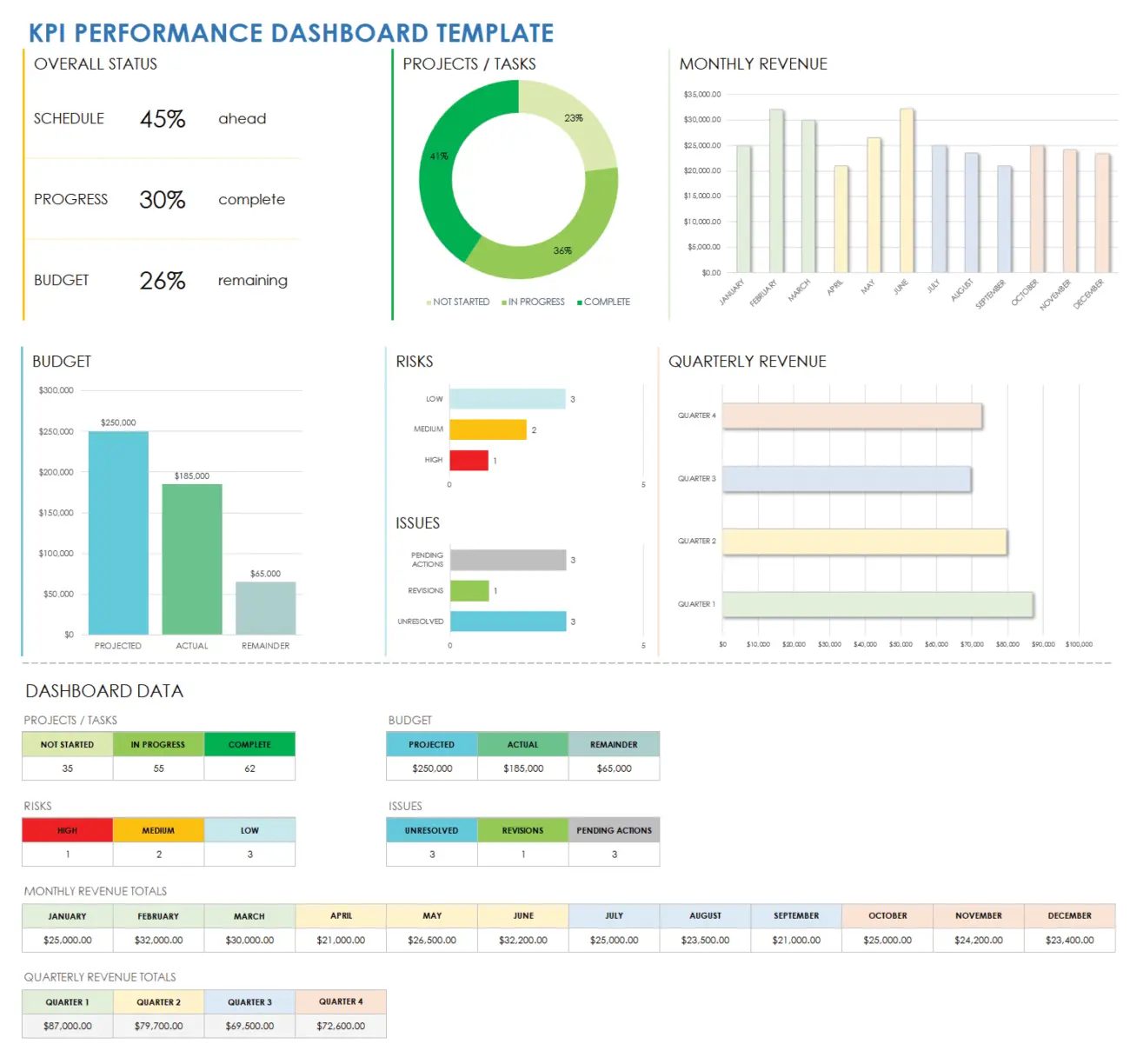
Without a clear view of performance over time, it’s hard to know if your team is improving or falling behind. However, comparing month-to-month or year-over-year progress manually can be time-consuming and error-prone.
This Smartsheet KPI Performance Dashboard Template features built-in bar charts, line graphs, and donut charts that make it easier to monitor trends and visualize your key performance indicators in real time.
You’ll get a clear view of monthly results, YTD progress, and historical comparisons. Plus, the template comes pre-filled with marketing and operations data, but it’s fully customizable for any department, team, or service.
✨ Ideal For: Teams that need to track performance trends over time and present progress with clear, customizable visuals.
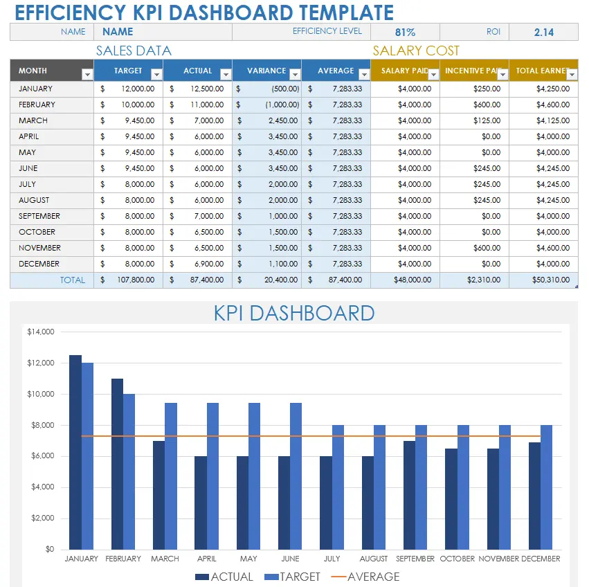
When you’re focused on output versus effort, you need a way to quickly measure whether your team is meeting expectations or wasting time and resources.
This Efficiency KPI Dashboard Template helps you track exactly that. It features a unique “Efficiency Level” field that calculates performance against set monthly targets, giving you a real-time percentage score based on actual results.
Pre-filled with sales data, this template is easy to adapt for any team or department, from product development to customer service.
Simply input your project or service metrics, and the work dashboard updates automatically to show where performance is strong and where there’s room to improve!
✨ Ideal For: Managers looking to measure team efficiency and compare actual output against monthly performance targets.
💡 Pro Tip: Tired of guessing whether your goals are on track? The blog How to Create an OKR Dashboard (With Templates) shows you how to turn vague objectives into clear, trackable outcomes—so your team always knows where it’s headed.
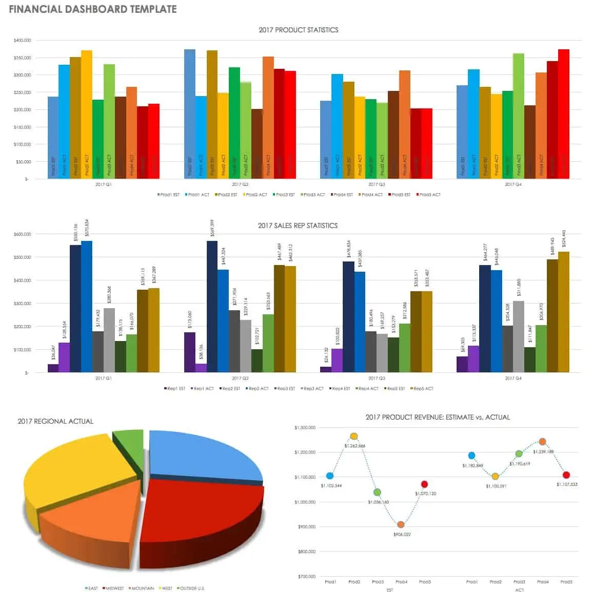
Understanding where your business stands financially shouldn’t require digging through endless spreadsheets or static reports.
The Smartsheet Financial Dashboard Template gives you a clear, visual summary of your most important financial data: from sales revenue and expense trends to year-over-year comparisons. It helps you track business growth and estimate future performance based on current results.
Simply plug in your numbers, and the dashboard updates automatically with charts that reflect real-time financial performance.
✨ Ideal For: Finance teams and business leaders who want a simple, visual summary of financial performance and growth.
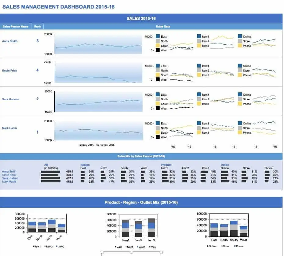
When results live in multiple platforms, keeping up with sales activity across products, regions, and customer segments can quickly get overwhelming.
The Smartsheet Sales Management Dashboard Template pulls everything into one visual workspace. Track sales performance by product, region, or customer type, and get instant visibility into which areas are hitting targets…and which need attention.
With built-in charts and structured fields, this template helps sales leads and account managers stay focused on performance, uncover trends, and hold teams accountable.
✨ Ideal For: Sales leads and account managers tracking performance across products, regions, and customer segments, as this solution offers.
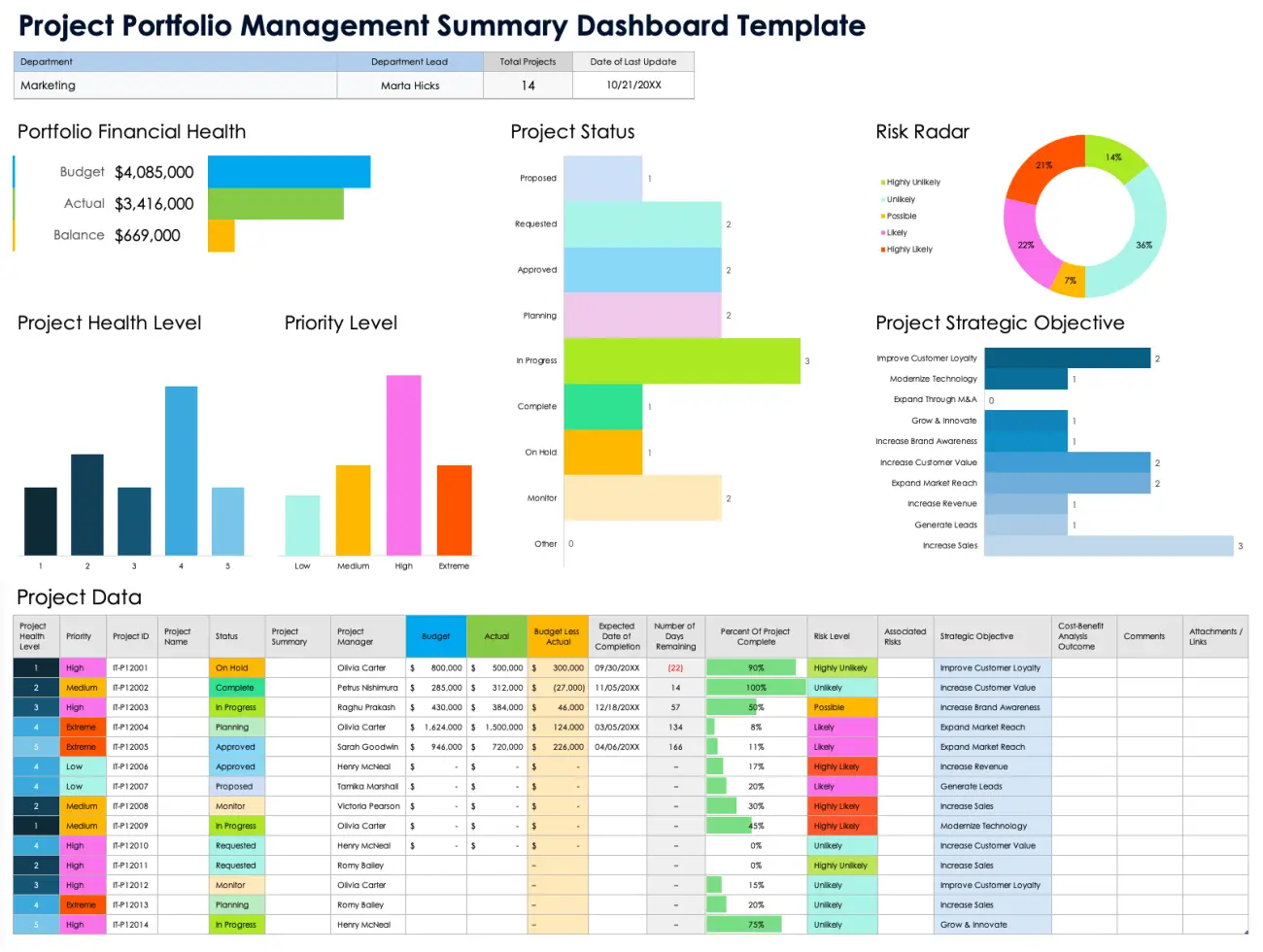
When you’re responsible for multiple projects, it’s more than just tracking individual progress—it’s about understanding how all of them work together to meet business goals.
The Smartsheet Project Portfolio Management Dashboard Template gives you that bigger picture. It pulls data from each project. Data such as status, budget, risk, and progress are turned into clear visual dashboards and summaries.
This app helps executives and portfolio managers identify areas where to allocate resources, pinpoint projects that are falling behind, and assess the overall performance of the portfolio. It’s especially useful during quarterly reviews and strategic planning.
Plus, with visual charts and summary views, this project portfolio dashboard shows key details like status, priority, budget vs. actuals, and overall progress so that you can make better decisions at the portfolio level.
✨ Ideal For: Executives and portfolio managers who need to monitor multiple projects and make strategic resource decisions, which require a timely response.
📖 Also Read: Best Data Visualization Tools for Projects
Users on the Smartsheet Community have pointed out several limitations that can impact scalability and flexibility, especially for larger teams or data-heavy projects.
These constraints mostly relate to widget caps, data display limits, and sheet capacity:
💡 Pro Tip: Still tracking HR metrics across multiple tools? How to Streamline Processes Using an HR Dashboard shows you how to manage teams smarter, with one real-time view for all your data.
While Smartsheet offers useful tools, users often run into limits like row caps, widget restrictions, and limited drilldowns.
ClickUp helps solve these challenges with customizable dashboards that support unlimited widgets, deeper data layers, and real-time updates across projects, teams, and departments, without hitting hard limits.
Here are eight ClickUp dashboard templates you can use to track projects and maintain visibility.
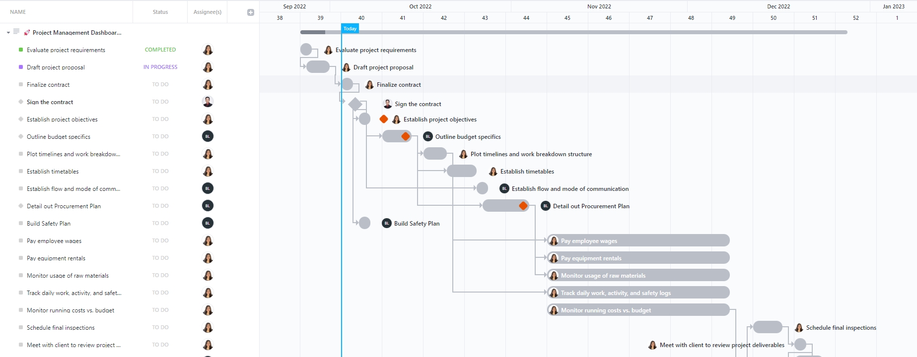
When timelines slip, it’s rarely due to one big issue. It’s the small blockers that add up unnoticed.
The ClickUp Project Management Dashboard Template helps you catch those delays early. It offers a real-time, visual view of your tasks, deadlines, and team capacity so you can resolve issues before they slow things down.
Designed for project managers leading cross-functional initiatives, this dashboard highlights active work, overdue items, and key deliverables, so you’re always a step ahead.
✨ Ideal For: Managers overseeing fast-moving projects who need visibility into potential blockers and real-time progress.
📖 Also Read: A Beginner’s Guide to Dashboards in ClickUp
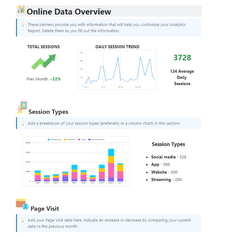
Let’s say you ran three campaigns last quarter, web traffic spiked, and churn dropped. However, explaining the reasons for these changes is difficult when all your data is stored in separate spreadsheets.
The ClickUp Analytics Report Dashboard Template brings everything together with customizable charts and visual summaries to help you understand what went wrong.
You have access to patterns, trends, and key performance indicators in context. Instead of hunting through rows of numbers, you can instantly identify what’s working and where to pivot.
✨ Ideal For: Teams that need to turn raw data into clear visuals and make decisions backed by trends, not guesses.
👀 Fun Fact: The term dashboard dates back to the 1840s when it literally meant “a board that dashes back mud.” Carriages didn’t have windshields, so this wooden board was your best protection from flying slush!
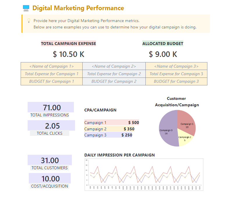
If you’re running campaigns across email, social, and paid channels, you already know the hardest part isn’t the launch; it’s pulling the results together in a way that actually makes sense.
The ClickUp Digital Marketing Report Dashboard Template helps you skip the scattered exports and manual tracking. It gives you one place to view key performance indicators, compare channel performance, and share real-time updates with your team or clients.
Instead of manually compiling metrics each week, marketing teams can quickly spot what’s working, optimize budget allocation, and present results to stakeholders with clarity.
Plus, the no-code database makes it easy to organize and filter data across multiple campaigns.
✨ Ideal For: Marketing teams who need to consolidate campaign data and turn it into clear, actionable reports.
🚧 Learn how to create a project report easily:
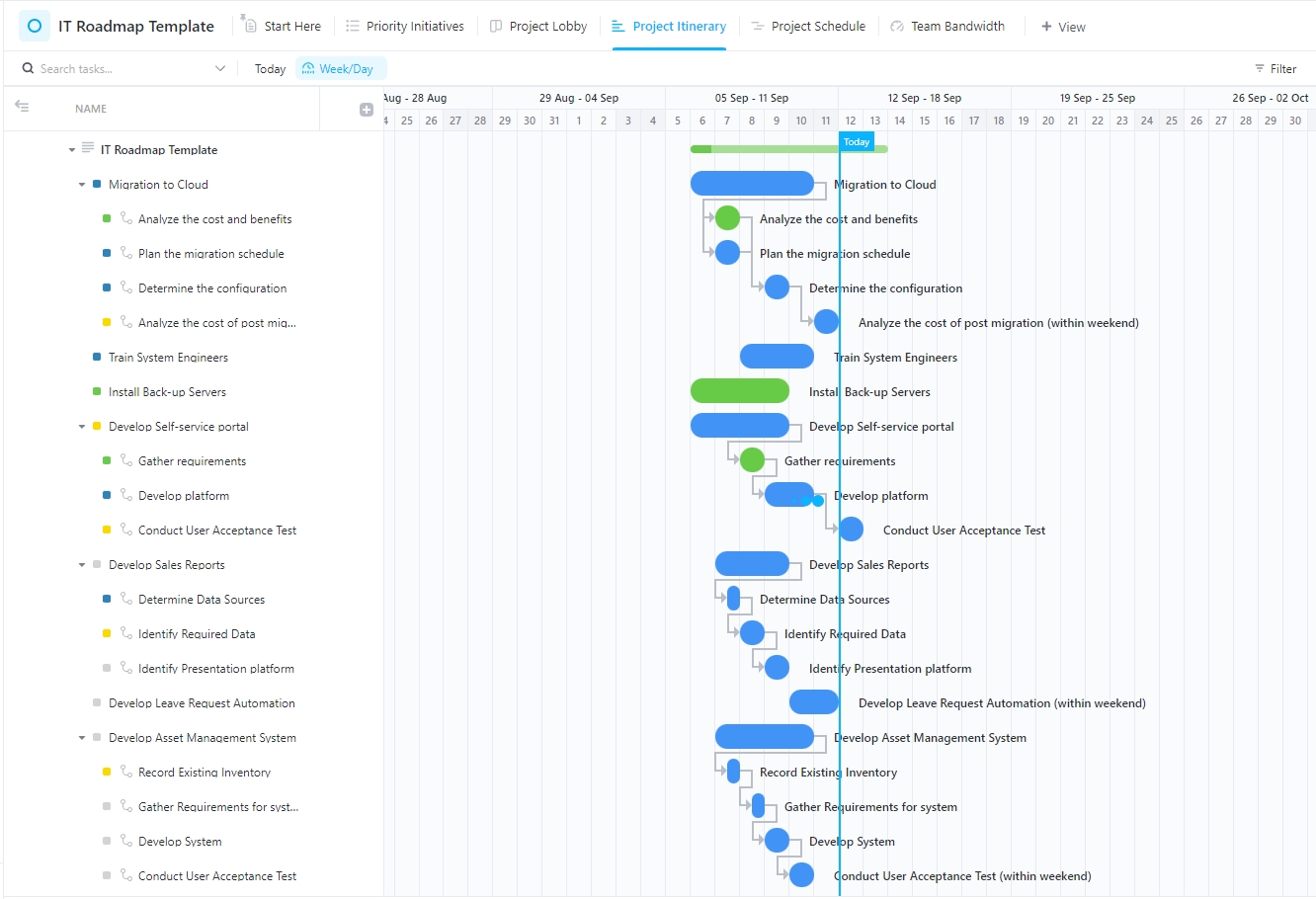
In IT, missing one dependency can throw off an entire launch. For instance, if you’ve planned a system rollout, but a single API integration isn’t ready, the whole launch gets pushed back two weeks.
This scenario happens more often than it should.
The ClickUp IT Roadmap Dashboard Template helps prevent these delays by laying out every project, dependency, and timeline in one visual view. Whether you’re migrating infrastructure, setting up new devices, or managing internal tools, you can prioritize work based on impact, assign deadlines, and track delivery progress across teams.
It’s especially useful for staying ahead of blockers, keeping leadership informed, and making sure your roadmap actually matches reality.
✨ Ideal For: IT teams that need to manage complex dependencies and ensure smooth, on-time project delivery.
📮 ClickUp Insight: 33% of people still believe multitasking equals efficiency.
In reality, multitasking only increases the cost of context switching. When your brain bounces between tabs, chats, and checklists, deep focus takes the biggest hit.
ClickUp helps you single-task with intention by pulling everything you need in one place! Working on a task, but need to check the internet? Just use your voice and ask ClickUp Brain MAX to do a web search from the same window. Want to chat with Claude and polish the draft you’re working on? You can do that too, without leaving your Workspaces!
Everything you need—think chat, docs, tasks, dashboards, multiple LLMs, web search, and more—lives in one converged AI workspace, ready to go!
You just wrapped a month-long campaign, but now comes the harder part: turning all that performance data into a report your team can actually use.
The ClickUp Marketing Report Dashboard Template helps you move from scattered metrics to structured, story-driven reporting. It brings together KPIs, campaign performance, and visual dashboards so you can explain what worked, what didn’t, and where to focus next.
Whether you’re tracking engagement, budget allocation, or channel performance, this template helps you build clear, high-quality reports that keep both your team and stakeholders aligned.
✨ Ideal For: Marketers who want to save time on reporting while delivering clear, visual insights that support smarter campaign decisions.
📖 Also Read: How to Create a KPI Dashboard in Excel
Halfway through a sprint, you realize a key deliverable is stuck—and it wasn’t flagged in the last update. Sound familiar?
Only one in 200 IT projects delivers its intended benefits on time and within budget, so this kind of slip happens more often than anyone would like.
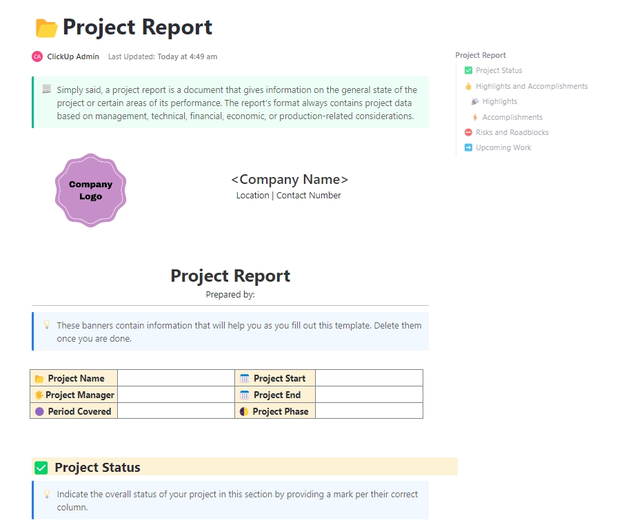
The ClickUp Project Report Template helps you catch those issues early by pulling all your project information—tasks, timelines, and updates—into one organized view. It makes it easier to spot blockers, measure progress, and share consistent updates with your team and stakeholders.
✨ Ideal For: Project leads who want to surface risks early and keep delivery on track with clear, reliable progress reports.
💡 Pro Tip: Missing deadlines because project info is all over the place? Project Management Dashboard Examples & Templates shows you how to keep everything in one view so you can spot risks early and stay on track.
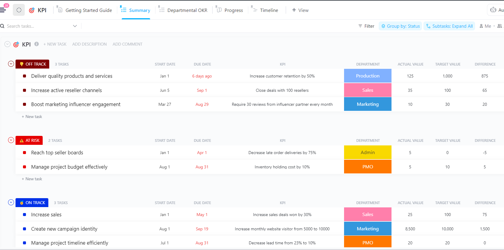
Most teams define their KPIs, but the challenge occurs in tracking them consistently. Without regular check-ins, goals lose relevance and progress stalls.
The ClickUp KPI Template fixes that by giving you one place to track, visualize, and review your most important key performance indicators.
From revenue and churn to task completion and engagement, you can monitor real-time performance and keep everyone aligned.
It’s designed for teams that want accountability without the reporting overhead: just clear metrics, simple visuals, and shared goals that stay top of mind.
✨ Ideal For: Managers and team leads who want to stay focused on business-critical KPIs and ensure follow-through.
👀 Fun Fact: The car dashboard still influences design. Even today, BI tools borrow design principles from car dashboards: color-coded alerts, speedometer-like widgets, and fuel-gauge-style progress rings are all UI nods to their automotive ancestor.
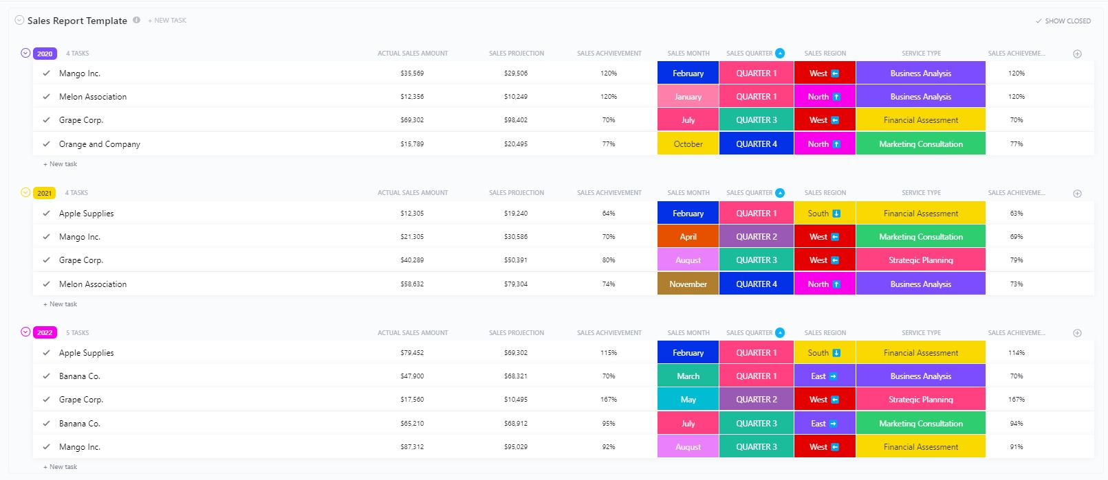
Many sales teams track performance, but here’s the thing: they often stop at surface-level numbers. Without deeper insight into trends and behavior, growth becomes a guessing game.
The ClickUp Sales Report Template helps sales teams go beyond basic metrics by visualizing the full sales cycle in one place. It connects performance data, customer trends, and team activity into a report that’s actually useful.
✨ Ideal For: Sales managers and reps who want real-time visibility into team performance and pipeline opportunities.
Dashboard templates are more than just visual aids; they’re truly decision-making tools.
For project managers, analysts, and department leads, having a single view of key metrics, project status, and real-time updates can make the difference between staying ahead and falling behind.
While Smartsheet dashboard templates offer a solid starting point, their limitations can hold teams back just when they need clarity the most.
On the other hand, with flexible dashboards, unlimited widgets, and more profound customization, ClickUp lets teams track progress, surface blockers, and align more effectively across departments.
And it’s not just theory—Hawke Media reported a 70% reduction in project delays within the first year of using ClickUp for executive reporting.
In short, if you want to build dashboards that actually drive action, sign up for ClickUp now!

© 2026 ClickUp

There’s an easier way. Try a free AI Agent in ClickUp that actually does the work for you—set up in minutes, save hours every week.