


Still downloading templates?
There’s an easier way. Try a free AI Agent in ClickUp that actually does the work for you—set up in minutes, save hours every week.
Sorry, there were no results found for “”
Sorry, there were no results found for “”
Sorry, there were no results found for “”
Here’s an uncomfortable truth: 70% of change programs fail. Not because the strategy was wrong or the team lacked skill, but because no one spotted the problems early enough to act.
A CEO approves a digital transformation in January. Six months later, she asks: “Where are we?” What arrives is chaos. Marketing sends completion percentages. Finance sends the budget variance. Ops sends timeline updates. None of it connects. None of it is current.
By the time leadership pieces it together, the decisions that mattered should’ve happened three months ago. It’s July. Too late.
This is work sprawl. When strategy lives in one place, execution lives in five others, and visibility is trapped in silos. Teams spend hours every week compiling status updates, dashboards, and spreadsheets to produce information that’s stale before anyone reads it.
The fix?
It’s not just collecting more data.
It’s building a reporting system that connects insight to action, in time to make a difference.
Most organizations treat reporting as a formality — something you do at the end of a cycle to show progress. But effective reporting isn’t about documenting what happened. It’s about shaping what happens next.
When done right, reporting becomes your decision engine. It helps leaders see patterns, detect risks, and act before problems compound. The best teams use it not to prove performance, but to improve it.
Strategic initiatives aren’t just big projects. They’re complex, cross-functional efforts that can span months, involve multiple teams, and cost millions. Without clear visibility, even the best ideas drift off course.
But here’s what most orgs get wrong: They treat reporting like documentation.
In reality, reporting is a decision infrastructure.
Think of it as the nervous system of your strategy. It connects every part of your organization so you can spot issues early, respond fast, and keep learning as you go.
💡 Pro Tip: Don’t report what happened; report what changed because it happened. It forces everyone to think in outcomes instead of activity.
Here’s what happens when reporting works the way it should:
Traditional reporting is rearview-mirror reporting. You see problems in next month’s review after they’ve already sunk a milestone. Too late.
Modern reporting works differently.
As teams complete tasks, update status, and log hours, metrics update instantly. AI looks for patterns. When three related tasks each slip by two days, the system flags a resource constraint that’ll snowball into a two-week delay if untouched. You catch it today, not in the monthly review three weeks later.
This matters because timing is everything. A problem caught early gives you options. You can shift resources. You can adjust the scope. You can negotiate timelines. A problem caught late gives you one option: miss the deadline.
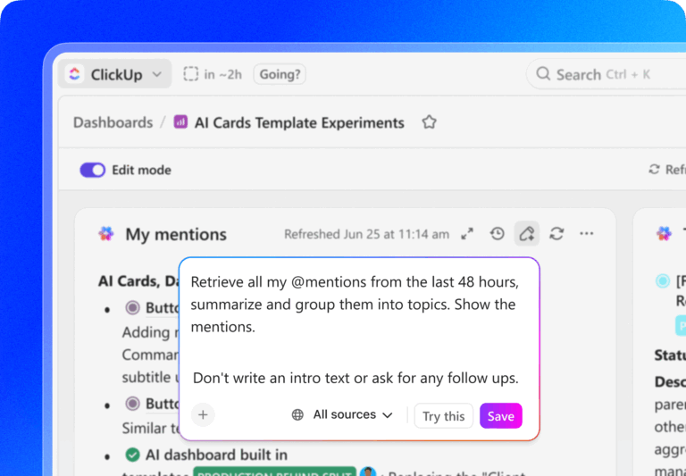
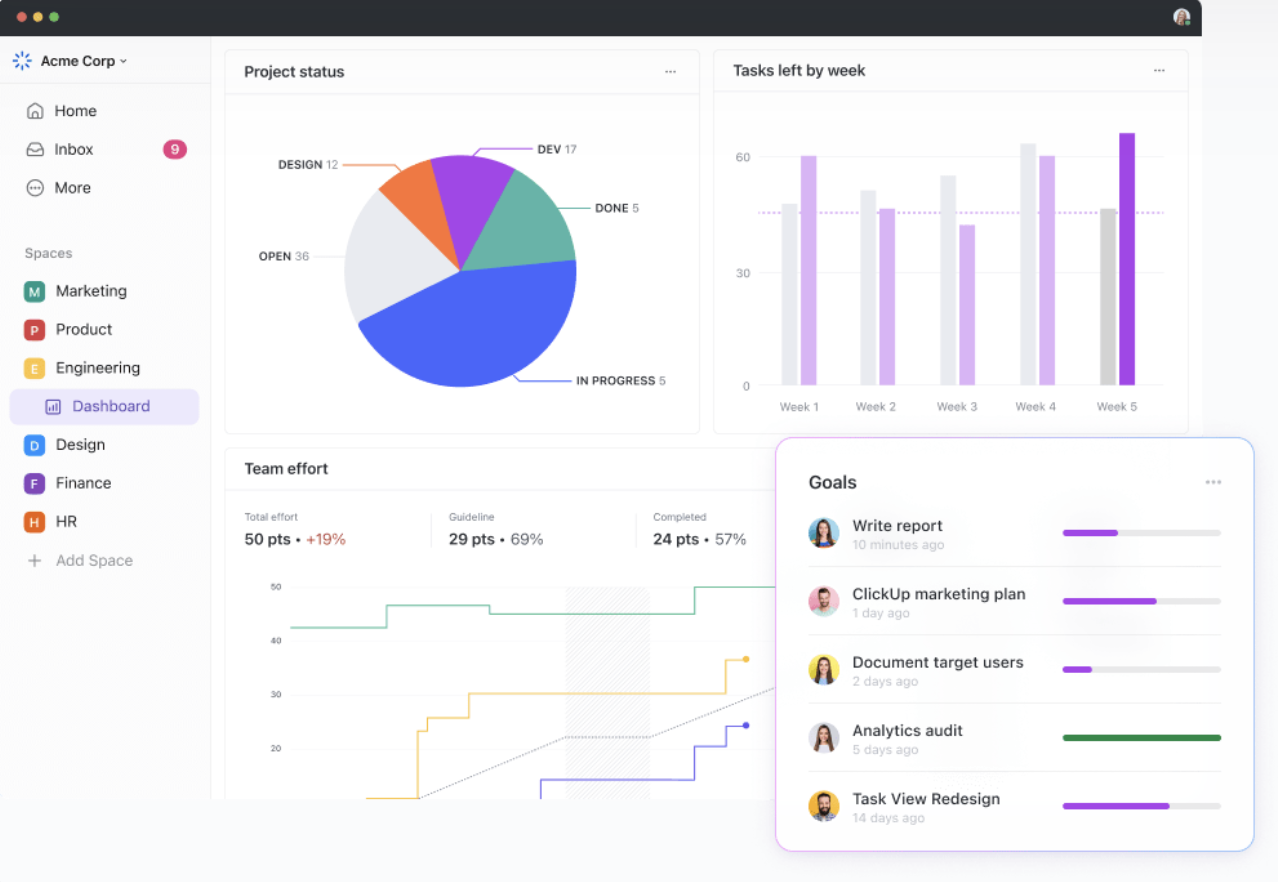
In ClickUp, this happens through the ClickUp Dashboard, which updates the moment work changes. Pair that with threshold-based alerts, and stakeholders get notified when a KPI drops or a milestone slips. You don’t have to refresh dashboards obsessively. The system tells you when something needs attention.
Here’s what a G2 reviewer said about how ClickUp enables strategy initiatives;
ClickUp really simplified the strategy creation process compared to how we used to work. In the past, there was a lot of back and forth with Excel files, version control demands, and waiting on each other to finish up. With ClickUp everything is centralised in one platform. It allowed us to collaborate seamlessly, capture all the key elements in real-time, and keep everything organised without the usual hassle. It made the strategy process faster and more efficient. We could just click through our process and so up on our strategy, time, and effort. You see we clicked up.
💡 Pro Tip: Make KPIs visible where work happens
If a KPI only lives in a slide deck, it’s already outdated. Embed KPIs inside the workspace so the team sees what success looks like every day, not just at reviews.
When marketing tracks campaign reach, Product tracks features shipped, and Finance tracks ROI—everyone’s working hard, but not necessarily toward the same goal.
Structured reporting creates a common language.
A strong dashboard doesn’t just say, “Marketing hit their target.”
It says, “Marketing, Product, and CX are collectively driving a 12% increase in customer lifetime value.”
That’s what real alignment looks like—and it’s impossible without shared visibility.
Stakeholders don’t want optimism. They want transparency. When you report progress clearly, acknowledge risks honestly, and quantify impact consistently, something shifts. They trust you’re in control—even when challenges emerge.
The corollary: surprises destroy trust faster than bad news does. A stakeholder can handle “We’re 10% behind schedule and here’s how we’ll recover.” They can’t handle “Surprise, we’re 10% behind schedule” dropped in a casual conversation three days before a board meeting.
And when trust builds, you get space. Stakeholders stop hovering. They start supporting. And you stop managing perceptions and start managing outcomes.
Late visibility limits your options. Early insight opens doors.
Organizations using predictive analytics in reporting see:
Because instead of reacting to failure, they’re anticipating risks—and fixing them before they derail everything.
💡 Pro Tip: Build ‘early warning’ dashboards, not only pretty dashboards
A good dashboard shouldn’t just impress you, it should interrupt you. Set thresholds that highlight slippage or anomalies automatically so you’re reacting today, not three weeks late.
When reporting becomes part of everyday work, rather than a periodic checkbox, something shifts. Instead of a tool to “monitor performance,” it becomes a tool teams actually use to unblock themselves, optimize workflows, and share wins.
This shift doesn’t just improve results. It improves culture.
Most reporting fails because it stops at surface-level stats: “tasks completed,” “meetings held,” “budget burned.” These are activity metrics. They make you feel productive, but they don’t tell you if anything meaningful actually happened.
If you can’t tie a metric to a business outcome, it’s noise.
| Looks productive (activity) | Actually proves progress (outcome) | What leaders learn |
|---|---|---|
| Tasks completed | Time-to-value reduced | Whether work changed user behavior |
| Meetings held | Decisions made and executed | Whether alignment improved |
| Budget spent | ROI or cost avoided | Whether money created value |
| Features shipped | Adoption and satisfaction | Whether the feature mattered |
| Training sessions delivered | Certification or proficiency achieved | Whether learning stuck |
| Milestones reached | Business metric moved | Whether strategy is working |
Here’s how to flip your reporting from shallow to strategic:
“Conducted 10 training sessions” is an activity. “90% of users completed training and achieved certification” is the outcome. One tells you work happened. The other tells you whether the work created value.
ClickUp closes this gap by letting you link every task and project to a measurable Goal. The moment something gets done, progress updates automatically. You’re not chasing status updates or pulling metrics from five places. You’re watching real outcomes in real time.
Let’s say you’re tracking a new onboarding flow. Your task board shows completion. Your Dashboard shows what actually changed: time-to-value dropped from 12 days to 6. That’s the signal leadership cares about—and that’s what your reporting needs to surface.
You can instantly see whether initiatives are delivering the expected impact, not just whether work is being done.
💡 Pro Tip: Automate KPI tracking in ClickUp by linking each metric to task completion or status changes. Every time a milestone closes, your dashboard updates itself.
A milestone isn’t just a date on the calendar. It should be a checkpoint that proves real value was delivered.
“Beta released” is motion.
“Beta used by 500 users with 93% satisfaction” is progress.
In ClickUp, you can tie Milestones to specific success criteria and track them with live data. Add owners, set dependencies, and monitor whether they’re delivering the right outcomes—not just marking tasks complete.
It’s not about showing that something happened. It’s about proving why it mattered.
How ClickUp BrainGPT strengthens your reporting rhythm
Live visibility reporting depends on real-time capture. ClickUp BrainGPT helps you document insights, decisions, and next steps the moment they surface, so nothing gets lost between meetings or departments.
This keeps your reporting cadence fast, accurate, and grounded in what is actually happening across initiatives.
“Integration might be delayed” is a source of anxiety. “Integration delays mentioned in 5 of 8 active initiatives, affecting 40% of the portfolio timeline.
Root cause: vendor API documentation is incomplete.
Mitigation: internal API wrapper, 2-week completion estimate” is intelligence.
Each risk should include: what could go wrong, probability (low/medium/high), impact (financial, timeline, quality), specific mitigation actions, owner, and current status. This structure replaces vague worry with actionable decisions.
ClickUp makes risk management visible and operational. You can tag tasks as high-risk, assign mitigation owners, and escalate blockers automatically. Risks stay on everyone’s radar until they’re addressed—not buried in a spreadsheet no one checks until next quarter’s review.
Teams can also surface cross-initiative risks early. If five different projects report vendor delays, ClickUp highlights the pattern before it spirals out of control. That’s the kind of intelligence spreadsheets can’t give you.
💡 Pro Tip: Clarify ownership for everything (even risks)
Unowned items die quietly. Add a visible “Owner” field for each KPI, risk, and milestone.
Accountability turns reporting into momentum.
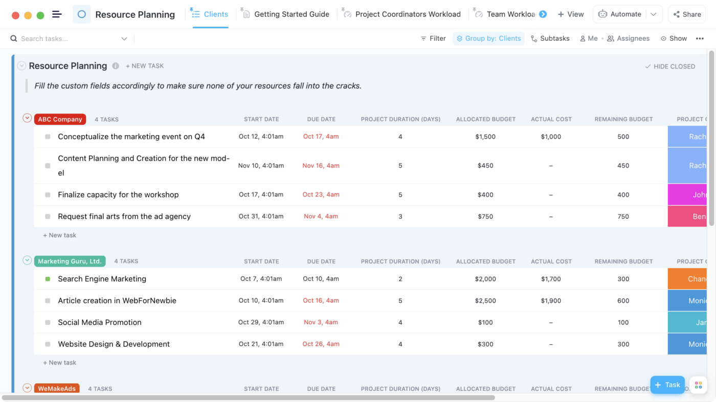
Three questions matter: Are we on budget? Is the workload balanced? Are we moving at the expected velocity?
A resource Dashboard might show that Q3 spending reached 92% of the target, marketing is 10% under budget, and product engineering is operating at 8% over capacity. That’s actionable.
You know where to rebalance. You know where you have flexibility. You know where burnout is brewing.
Track planned vs. actual spend by category, variance trends, velocity patterns, capacity utilization by team, skill gaps, and workload distribution. This trio provides a comprehensive view of whether initiatives are sustainable.
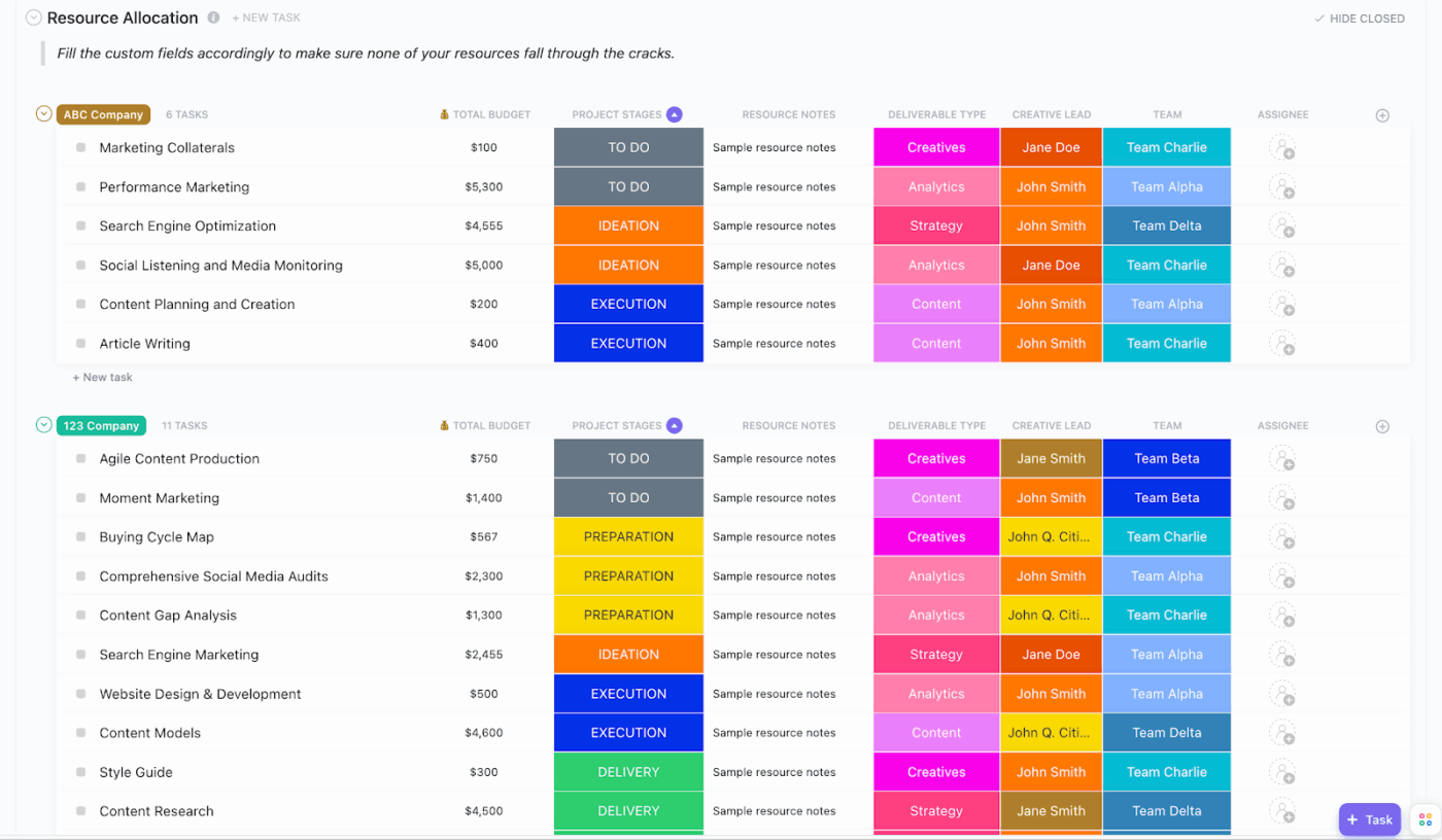
ClickUp highlights resource allocation across people, departments, and budgets.
If engineering is at 117% capacity but design is at 65%, you can shift resources and keep your timeline intact. No guesswork, no chasing updates, no playing catch-up.
Here’s what a G2 reviewer had to say:
ClickUp gives me full operational visibility without sacrificing flexibility. I can build custom dashboards to monitor strategic KPIs, use multiple views to manage complexity, and keep all teams aligned. It supports both high-level planning and daily execution seamlessly.
Velocity trends also reveal hidden bottlenecks. If one team’s output has dropped for three sprints in a row, that’s not a planning issue—it’s a signal something’s broken. With ClickUp, you can catch it before it becomes a delay.
Quantitative metrics show what’s happening. But qualitative signals often tell you why.
If your team starts leaving fewer updates, or task comments get shorter and colder, something’s off—even if the dashboards still look green.
ClickUp Forms let you collect structured feedback directly from your team—on workloads, blockers, clarity, or morale. It’s a fast way to hear what isn’t being said in meetings. Pair that with ClickUp Brain, which analyzes tone and sentiment across updates and comments, and you get both the explicit and implicit signals of how your team is really doing.
It’s not about surveillance. It’s about spotting burnout, confusion, or misalignment before they derail progress—so you can fix problems early, and keep your team moving at a sustainable, healthy pace.
Two SaaS companies can grow in completely different ways—one through a product that sells itself, the other through loyal customers who advocate for it.
This video explores how to track, measure, and optimize both Product-Led and Customer-Led Growth strategies inside ClickUp for long-term success.
There’s no shortage of strategy frameworks out there. And let’s be honest—most of them look great in a slide deck and fall apart in real life. Not because the models are wrong, but because no one sticks to them, no one connects them to actual work, and they’re rarely built into the tools teams use every day.
So the question isn’t which framework is best. It’s: which one helps you move from intent to execution without everything breaking in the middle?
The answer? Most high-performing teams don’t pick just one. They layer frameworks together, and more importantly, they operationalize them inside the systems they already use. That’s what makes the difference between theory and traction.
Here’s how the best orgs actually do it—and how ClickUp makes those frameworks real, not theoretical.
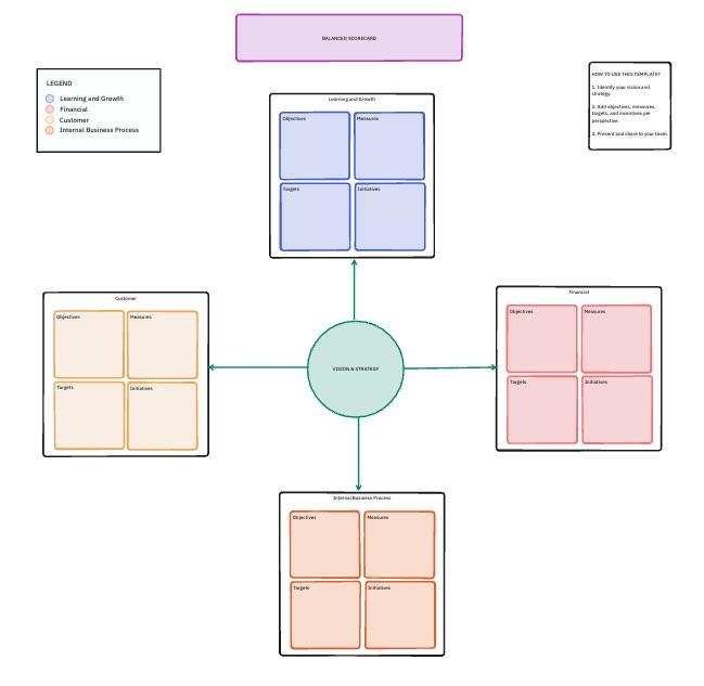
The Balanced Scorecard isn’t new. However, it remains one of the most reliable ways to maintain a balanced strategy across financial outcomes, internal operations, customer impact, and learning and growth.
Most teams only measure what’s easy: revenue, costs, timelines. But what about user experience? Long-term capacity? Innovation in health? These are just as critical—and just as likely to get overlooked.
ClickUp gives you a way to track all four dimensions in one place, so you don’t end up optimizing one and breaking another. You can connect each initiative to a Goal (e.g., “Reduce customer churn to below 5%”) and then tie in the KPIs that reflect it—support resolution time, onboarding speed, NPS—alongside more traditional business targets.
And because your work lives in the same system as your strategy, you’re not guessing where performance is coming from. You can see that a drop in churn correlates with improved onboarding experience, and why it improved: a new automation reduced time-to-value from seven days to three.
It’s not just a framework anymore. It’s living, learning, and visible at all times.
OKRs work when they’re visible, trackable, and directly tied to day-to-day work. But for many teams, they live in a Google Doc no one checks until the quarterly review. That’s not alignment—it’s wishful thinking.
With ClickUp, Objectives are real-time, not relics. Every task can roll up into a Key Result, and every Key Result feeds into a bigger objective. So whether someone’s writing content or closing deals, they can see exactly how their work contributes to the broader mission.
And when something’s off track, ClickUp Brain doesn’t just flag the lag—it gives you the “why.” It surfaces blockers, predicts missed targets, and even suggests where to refocus based on trends across your workspace.
Now you’re not just setting OKRs—you’re living them.
📮 ClickUp Insight: Only 10% of managers use a skills matrix to assign work, yet 44% say they try to match tasks to strengths and goals.
Without the right tools to support them, most managers are forced to make these decisions based on the immediate context, not data. This is exactly where you need a smart assistant!
ClickUp Brain can recommend task assignments by analyzing historical work, tagged skills, and even learning goals. With it, you can discover hidden strengths and surface the best person for the job, not just the available one.
💫 Real Results: Atrato saw a 30% faster product development pace and a 20% decrease in developer overwork thanks to ClickUp’s workload management.
Dashboards often become passive status walls: colorful, up-to-date, and completely ignored. That’s because most dashboards report what has happened—not what’s about to.
In ClickUp, Dashboards aren’t static. They’re predictive, customizable, and conversational. You can build different views for different leaders—finance sees spend vs. forecast, ops sees capacity by team, execs see milestone health across initiatives—and everyone’s pulling from the same real-time data.
The real magic? You can ask a Dashboard a question—“Which initiatives are falling behind and why?”—and ClickUp Brain answers with pattern recognition, trend analysis, and suggested next steps. This isn’t a dashboard. It’s a decision-making engine.
You stop wasting time asking, “Where are we?” and start asking, “What are we doing about it?”
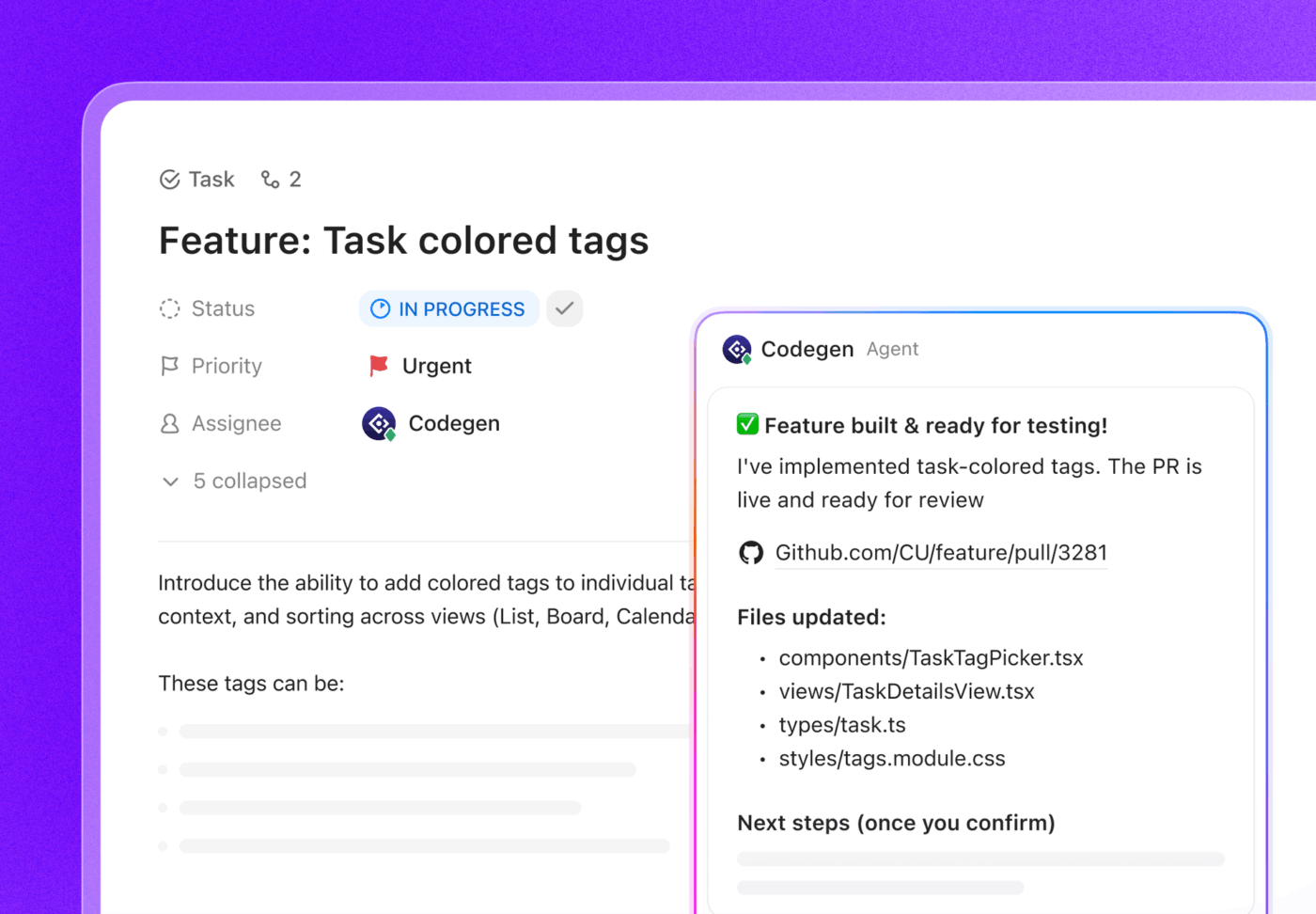
15% of workers worry automation could threaten parts of their job, but 45% say it would free them to focus on higher-value work. The narrative is shifting—automation isn’t replacing roles, it’s reshaping them for greater impact.
For instance, in a product launch, ClickUp’s AI Agents can automate task assignments and deadline reminders and provide real-time status updates so teams can stop chasing updates and focus on strategy. That’s how project managers become project leaders!
💫 Real Results: Lulu Press saves 1 hour per day, per employee using ClickUp Automations—leading to a 12% increase in work efficiency.
Our engineers and product managers were bogged down with manual status updates between Jira and other tools. With ClickUp, we’ve regained hours of wasted time on duplicative tasks. Even better, we’ve accelerated product releases by improving work handoff between QA, tech writing, and marketing.
Metrics show movement. But narratives show meaning. When you’re presenting to execs, stakeholders, or a board, they don’t just want graphs—they want context. What changed? Why? What’s next?
ClickUp lets you embed live, auto-updating charts directly into Docs and pair them with narrative summaries generated by ClickUp Brain. That means your leadership reports are always current, never static. The KPIs update themselves. You fill in the story.
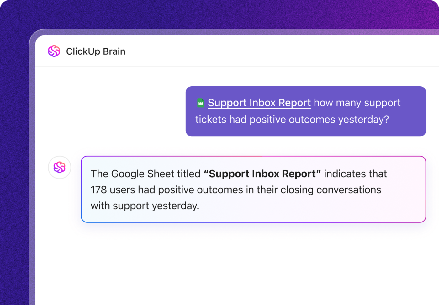
And instead of digging through five tools to find what happened last quarter, you can just ask:
“Summarize Q4 progress across strategic initiatives.”
And Brain will pull the highlights, risks, delays, and progress into a clean, shareable summary.
The result? You’re not just reporting. You’re communicating. You’re connecting the dots between data and decisions.
Each framework serves a different purpose, and many organizations use them together.
| Framework | Primary Focus | Best Audience | Update Frequency | Effort to Implement |
|---|---|---|---|---|
| Balanced Scorecard | Multi-dimensional performance | Executives, board | Monthly | Medium |
| OKRs | Cross-functional alignment | All levels | Weekly | Low |
| Dashboards | Real-time operational visibility | Operations, PMO | Continuous | Medium |
| Narrative Reports | Strategic storytelling | Leadership, board | Quarterly | Medium |
And with ClickUp, they all live in one place. Not scattered across docs, spreadsheets, and platforms that don’t talk to each other. Strategy stays visible, execution stays connected, and reporting becomes part of the way your team works, not a monthly panic.
You don’t need a 12-month overhaul to build a strong reporting system. You need a place to start—and a structure that scales. That’s how real teams go from scattered updates and stale spreadsheets to full strategic visibility without derailing their day jobs.
Here’s a practical, five-phase rollout that any team (yes, even yours) can use to start reporting like an actual business—not a group chat with a budget.
Let’s retire goals like “improve efficiency” or “launch project on time.” What does “success” look like?
Think like a CFO:
These aren’t just goals. They’re proof points.
In ClickUp, you define these as goals, set targets, and link them directly to the tasks that drive them. So progress isn’t anecdotal. It’s visible, automatic, and quantifiable.
💡 Pro Tip: Avoid the trap of measuring completion instead of impact. “Deployed CRM” is an activity. “Customer NPS increased from 62 → 75 post-CRM rollout” is a result.
Progress updates shouldn’t require a weekly scavenger hunt across Slack, Google Sheets, and memory. The moment work changes, reports should reflect it.
In ClickUp, Dashboards update live. Assignments shift. Tasks close. Risks rise. Your data moves with your work—no manual refreshes required.
You can customize views by stakeholder:
Need to go deeper? Just drill down from any chart into the actual tasks behind the trend.
Start simple. Build a Dashboard that shows:
Phase 3: Automate what slows you down
If your team spends more time reporting than executing, it’s time to automate.
In ClickUp, you can link task activity to your KPIs and let ClickUp Brain generate summaries before the meeting even starts. No more exporting data. No more cobbling together 10-slide decks at midnight.
That alone can save hundreds of hours per year across teams—and give leaders visibility that’s fresh, not fossilized.
ClickUp AI Agents continuously monitor your workspace. They detect status changes, update fields automatically, generate weekly initiative summaries, and notify stakeholders when milestones slip or risk scores spike. This keeps reporting consistently without requiring anyone to manually compile data.
Voice updates become possible with ClickUp BrainGPT. Leaders can voice-record decisions, risks, or insights directly into their phone, and Brain transcribes it into structured tasks or report-ready notes. Meeting decisions captured in real time don’t get lost in email threads.
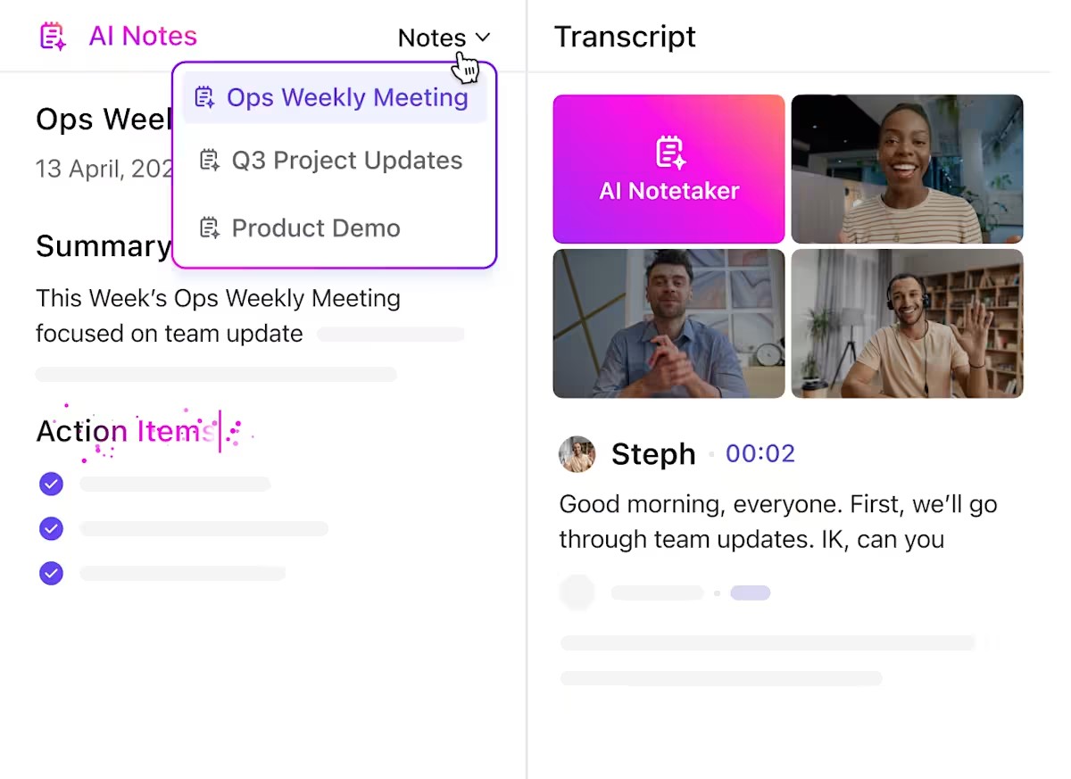
ClickUp AI Notetaker automatically captures meeting discussions and links them to relevant initiatives, creating an audit trail of strategic decisions.
When a meeting discusses three different initiatives and their interdependencies, Notetaker threads that context directly into the workspace rather than burying it in a meeting recording.
💡 Pro Tip: Pair risk summaries with automated alerts. When a task tied to a high-risk milestone is delayed, ClickUp can automatically tag relevant owners or escalate it to the PMO.
📮 ClickUp Insight: 32% of workers believe automation would save only a few minutes at a time, but 19% say it could unlock 3–5 hours per week. The reality is that even the smallest time savings add up in the long run.
For example, saving just 5 minutes a day on repetitive tasks could result in over 20 hours regained each quarter, time that can be redirected toward more valuable, strategic work.
With ClickUp, automating small tasks—like assigning due dates or tagging teammates—takes less than a minute. You have built-in AI Agents for automatic summaries and reports, while custom Agents handle specific workflows. Take your time back!
💫 Real Results: STANLEY Security reduced time spent building reports by 50% or more with ClickUp’s customizable reporting tools—freeing their teams to focus less on formatting and more on forecasting.
Phase 4: Catch risks early—before they snowball
You shouldn’t need a quarterly review to discover that three projects are slipping due to the same vendor delay. By then, you’re weeks behind.
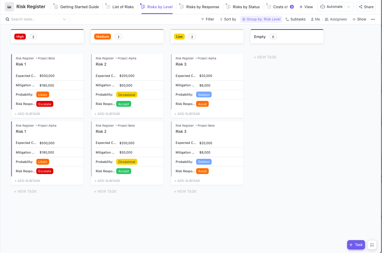
Set up a Risk Register in ClickUp and actually use it. Track:
And then: monitor it. With Custom Fields, Automations, and AI Agents, you can flag risks as they emerge—not after they explode.
Example: If 3 tasks tied to a milestone are all overdue by 2+ days, ClickUp can auto-escalate that as a potential delay risk. No more surprises.
Pair quantitative Dashboards with narrative context. Combine live charts with prose that explains what’s happening and why it matters. Different audiences can drill into the data they care about while getting the big picture story.
Inside ClickUp Docs, you can embed live dashboards, charts, and status blocks—and use ClickUp Brain to generate a rolling summary of what’s changed since the last update. You don’t have to rewrite the whole thing every week.
You can layer in:
So instead of vague “green/yellow/red” updates, you’re sharing a report that actually helps people make informed decisions.
This is where storytelling matters as much as analytics. A dashboard shows that an initiative is at risk. A narrative explains why it’s at risk and what you’re doing about it. The combination creates confidence rather than anxiety.
Even the best frameworks fall apart when they collide with real-world complexity. These are the most common mistakes organizations make when building their reporting rhythm—and how to sidestep them with smarter systems and simpler workflows inside ClickUp.
Anyone can fill in a dashboard that says, “90% of tasks complete.” But what if the only outcome is “nothing actually changed”?
Activity feels productive. Outcomes prove value.
ClickUp helps you measure both—but prioritize the second. Use track and goals to track actual business impact (like NPS, revenue per feature, hours saved) instead of just task completion. Tie tasks to outcomes so you always see whether the work moved the needle.
When dashboards feel like surveillance, people game the metrics. They inflate status updates. They close tasks early. They hide problems.
Visibility shouldn’t feel punitive—it should feel empowering.
With ClickUp Dashboards, everyone sees the same data in real time, which means less guessing and more collaboration. And with Forms and Brain-powered sentiment analysis, you can capture team feedback in context—not just at retro time.
Marketing uses a slide deck. Product sends a Google Doc. Finance sends an Excel sheet. Executives get lost in translation.
ClickUp solves this with consistency. Create reporting templates inside Docs that include live dashboards, decision logs, goal tracking, and task links—all in one place. Whether you’re reporting weekly or quarterly, everyone speaks the same language.
💡 Pro Tip: Use ClickUp’s “last updated” block in Docs so stakeholders always know they’re looking at current data.
If someone’s spending 6 hours building a slide deck each month, they’re not driving outcomes—they’re formatting boxes.
Automate it. Let ClickUp Automations and Brain do the legwork:
Free up your PMs to lead—not just report.
Monthly reports often show up after the problems they describe are already irreversible. You can’t steer a ship from the rearview mirror.
With ClickUp, you get live visibility—and custom cadences:
You see shifts as they happen, not after they’ve spiraled.
Metrics show progress. Team sentiment shows whether that progress is sustainable.
Use ClickUp Forms to gather structured feedback and ClickUp Brain to analyze tone across comments, tasks, and threads. You’ll catch problems before they blow up your roadmap.
Most reporting systems stop at surface-level visibility. They tell you what’s happening—but not what to do next. That’s the real failure point.
Reporting isn’t just about keeping leadership in the loop or checking a compliance box. It’s about building organizational intelligence.
Every project teaches you something. Every risk resolved becomes repeatable knowledge. Every metric tracked reveals what actually drives outcomes. Over time, the right reporting system evolves into a learning engine. You stop guessing. You start spotting signals. You move faster and make better decisions—because your organization is learning as it works.
That’s the compound advantage: the more you report well, the smarter your system gets.
ClickUp makes that possible by converging everything into a single, AI-powered workspace.
Goals show you what success looks like. Dashboards track it in real time. Docs give you narrative context. Brain ties it all together—surfacing insights, risks, and opportunities before they slip through the cracks.
You don’t just get reports. You get answers.
Ask: “Which initiatives are off track and why?”
ClickUp Brain gives you real context, not just numbers.
No more chasing updates. No more decision-making blindfolded.
Start with one initiative. Make it visible. Track real outcomes. Share the truth.
Learn as you go.
Everything else builds from there. Sign up for free and find out just how seamless this can be!
A complete report should include:
ClickUp helps streamline this process by automatically generating executive summaries, visualizing KPIs, and linking reports to live project data.
Most organizations report monthly or quarterly, but with AI, that cadence is becoming continuous.
Using ClickUp Dashboards, teams can access live progress data and update leadership asynchronously, eliminating manual report cycles.
💡 Pro Tip: Use ClickUp Automations to schedule recurring report updates or AI-generated summaries at custom intervals.
Three popular frameworks stand out:
ClickUp supports all three with Goals, Dashboards, and AI summaries that align daily execution to long-term strategy.
AI improves both speed and accuracy.
With ClickUp Brain, you can:
In short, AI replaces manual reporting with living intelligence that learns from every update.
ClickUp unifies every component of strategic reporting into one workspace:
The result? Leadership always sees the full picture — without waiting for the next reporting cycle.

© 2026 ClickUp

There’s an easier way. Try a free AI Agent in ClickUp that actually does the work for you—set up in minutes, save hours every week.