


Still downloading templates?
There’s an easier way. Try a free AI Agent in ClickUp that actually does the work for you—set up in minutes, save hours every week.
Sorry, there were no results found for “”
Sorry, there were no results found for “”
Sorry, there were no results found for “”
Who doesn’t love charts?
They’re visually appealing and can make even the most snore-worthy presentations slightly more bearable.
And when it comes to project management, they serve another important function:
A project management chart breaks down project-related data into easily digestible pieces and helps keep everyone on the same page.
The use of charts in project management can be traced back to the early days of industrial engineering.
Henry Gantt, a pioneer in scientific management, developed the Gantt chart in the early 1900s to visualize project schedules.
Since then, various charts have emerged, each offering unique insights into different aspects of project execution. These charts are significant in modern project management because they simplify complex information, enhance communication, and facilitate better decision-making.
This blog post will explore different types of project management charts, their significance, and how they can be applied in the real world.
Project management charts are a fundamental tool for any project manager. They offer a structured approach to:
By using the right charts at the right time, project managers can make informed decisions, improve communication, and ultimately deliver complex projects on time and within budget.
A diverse range of project management charts caters to various planning and monitoring needs. Let’s look at 12 such popular charts and their strengths and limitations.
Many of these charts are available in ClickUp, a comprehensive task and project management software.

A Gantt chart is a chart that illustrates the project schedule. It shows tasks along the y-axis and time along the x-axis. Each task is represented by a horizontal bar that depicts its duration and start and end dates.
Use ClickUp Gantt Charts to organize and set task priorities easily. Key highlights of this feature include:
Best for: Projects with well-defined tasks and dependencies, such as software development or construction projects
Limitations: Less flexible for projects with changing requirements or an uncertain project timeline. It can become cluttered for complex projects with many tasks

A flowchart is a visual representation of a process, showing the sequence of steps, decisions, and outcomes.
ClickUp Mind Maps is a great feature for creating flowchart diagrams. It allows you to gain the perspective you need by drawing connections between tasks, mapping out workflows, organizing messy layouts, and more.
Best for: Mapping out processes, identifying decision points, and visualizing workflows
Limitations: Can become complex for intricate processes and may not effectively represent parallel tasks

A Work Breakdown Structure or WBS is a hierarchical outline that breaks down the project deliverables into smaller, more manageable components.
Best for: Defining project scope, identifying deliverables, and assigning ownership to tasks
Limitations: Not suitable for visualizing workflows and dependencies
ClickUp’s Work Breakdown Structure Template helps create this outline quickly and easily. It integrates with your team’s communication tools to receive real-time updates on task progress and with file storage tools to manage documents directly within the WBS.
💡Quick tips:
The critical path method is a network diagram that identifies the critical path, or the sequence of tasks that determines the overall project duration.
Best for: Identifying the most critical tasks and potential delays in a project
Limitations: Requires a certain level of project management expertise to create and interpret. May not adapt well to projects with frequent changes
ClickUp’s Critical Pathway Analysis Template is a great project management tool for this chart type. It allows you to set task dependencies, clearly mapping out which tasks need to be completed before others can begin.
Use dependencies to highlight the sequence of tasks that directly impact your project’s completion date. This ensures everyone knows which tasks are critical and which ones can be delayed without affecting the overall project timeline.
It also helps you focus resources and attention on tasks within the critical path to avoid delays. It is essential to regularly reassess the critical path as tasks are completed or when the project changes.
Also known as a fishbone diagram or Ishikawa diagram, a cause-effect chart visually depicts the potential causes of a specific problem or outcome.
Best for: Identifying and analyzing the root causes of problems that may arise during a project
Limitations: Not suitable for project planning or scheduling tasks; can become cluttered with too many potential causes
The ClickUp Cause and Effect Whiteboard Template can help you quickly set up this diagram and understand the root causes of project problems.
Highlights of the template:

A Kanban board is a visual workflow management system that uses columns to represent different stages of work (e.g., To Do, In Progress, Done).
With the ClickUp Board View feature, you can view tasks in customizable columns, drag tasks through phases, and add subgroups to track projects on a Kanban board easily.
It helps:
Best for: Agile project management, where tasks are prioritized and completed in short iterations
Limitations: It may not be suitable for projects with complex resource allocation needs or projects with long-term dependencies between tasks
A Pareto chart is a bar graph that ranks data points in descending order of frequency or impact. It combines a bar chart and a line graph, where the bars represent the frequency of each data point, and the line represents the cumulative frequency.
Best for: Identifying the most significant factors contributing to a problem or issue
Limitations: Not suitable for visualizing project timelines or dependencies
Also Read: How to Create a Pareto Chart in Excel

A pie chart is a circular statistical graphic representing numerical proportions by dividing a circle into sectors.
ClickUp Dashboards offer a powerful way to visualize data and track performance through customizable widgets. One of the most effective project management tools within the dashboard is the ability to create pie charts.
You can customize these pie charts to fit your team’s specific needs. You can adjust colors, labels, and data ranges, ensuring that the chart aligns perfectly with your reporting goals.
💡Quick tips:
Best for: Showing the relative size of different data points as a proportion of a whole
Limitations: Less practical for comparing multiple data points or showing trends over time
A control chart is a statistical process control tool used to monitor and analyze process variations over time. It displays process data points plotted over time, helping to distinguish between common cause variations (inherent to the process) and special cause variations (indicative of issues that need attention).
A control chart typically includes a central line representing the process average, along with upper and lower control limits that define the boundaries of expected variability. By monitoring these variations, control charts allow for early detection of trends or shifts, enabling timely corrective actions to maintain process stability and quality.
Best for: Identifying trends, patterns, and anomalies in project data, such as quality control metrics or resource utilization
Limitations: Requires statistical knowledge to interpret and implement effectively

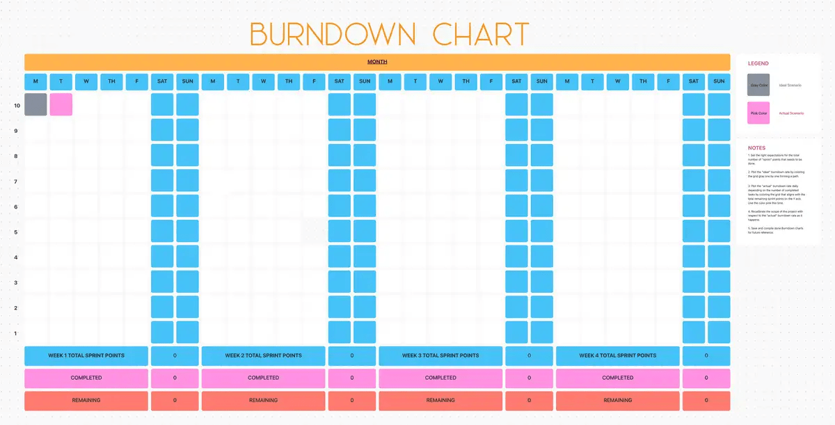
Burn-up and burn-down charts are used to track project progress over time. A burn-up chart shows the cumulative work completed, while a burn-down chart shows the remaining work to be done.
Best for: Monitoring project progress, identifying potential risks, and making necessary adjustments to the project plan
Limitations: Less practical for projects with changing requirements or unpredictable workloads
The ClickUp Burndown Chart Template is a valuable tool for simplifying the creation of both burn-up and burn-down project management charts.
Here’s how:
A matrix diagram is a visual tool for analyzing and prioritizing relationships between two or more data sets.
Best for: Identifying patterns and correlations between different variables, such as resources, tasks, and risks
Limitations: Can become complex for large datasets and multiple variables
Prebuilt tools, like the ClickUp Matrix Whiteboard Template, simplify the creation of matrix diagrams.
The template offers flexible and customizable matrix layouts, such as 2×2 grids, allowing you to map out different variables or criteria that are important for your project.
Additional benefits of this template include:
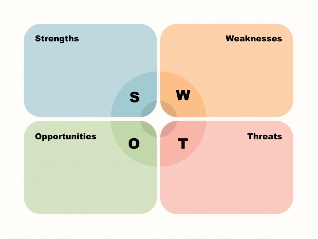
A SWOT analysis is a strategic project planning technique for identifying a project’s Strengths, Weaknesses, Opportunities, and Threats.
Best for: Evaluating a project’s internal and external factors and developing strategies to capitalize on strengths and address weaknesses
Limitations: It provides a snapshot of the current situation and may not account for future changes. It relies on subjective assessments of strengths and weaknesses
The ClickUp Personal SWOT Analysis Template is designed to streamline the process of conducting a SWOT analysis in project management.
This template helps a project manager and teams systematically evaluate their projects, identify key internal and external factors, and make informed decisions to enhance project success.
Here’s how it simplifies SWOT analysis:
A project management chart becomes an indispensable tool in the real world across industries.
Organizations like NASA employ Gantt charts to manage project timelines and dependencies in missions, such as the Mars Rover projects.
These charts help visualize the intricate tasks involved in space exploration and ensure that all elements are synchronized.

Another historic application of project management charts is the use of CPM (Critical Path Method) by Du Pont in the late 1950s. The American multinational chemical company wanted to optimize maintenance schedules at its Louisville plant, which was crucial in neoprene production.
By applying the critical path method to analyze and refine the maintenance schedule, Du Pont engineers were able to significantly reduce downtime from 125 to 93 hours, with further improvements projected to bring it down to 78 hours. This reduction in downtime led to a substantial increase in plant performance, producing an additional one million pounds of neoprene in 1959.
Now, let’s explore how various charts are employed in different project scenarios:
While a project management chart can be created manually, project management software significantly eases its creation, management, and analysis. Tools like Microsoft Project, Excel, and ClickUp offer a range of features to support chart creation and utilization.
ClickUp’s Project Management solution, in particular, stands out due to its flexibility and adaptability.

It allows users to customize charts to fit specific project needs, collaborate in real time, and integrate with other tools for a seamless workflow. Moreover, ClickUp’s pricing plans cater to various team sizes and budgets, making it accessible to various organizations.
Project management charts are invaluable for visualizing project information, improving communication, and making informed decisions. By understanding the different types of charts and their applications, project managers can select the most appropriate tools for their projects.
Software like ClickUp has made chart creation and management immensely easy, simplifying teams’ collaboration and progress tracking.
Try ClickUp today.

© 2026 ClickUp

There’s an easier way. Try a free AI Agent in ClickUp that actually does the work for you—set up in minutes, save hours every week.