

Noticing a recurring mistake or struggling to pinpoint the root cause of a critical issue? Worry not! Mistakes and errors are crucial in facilitating process improvements.
That’s right—facilitate, not hinder. 🤯
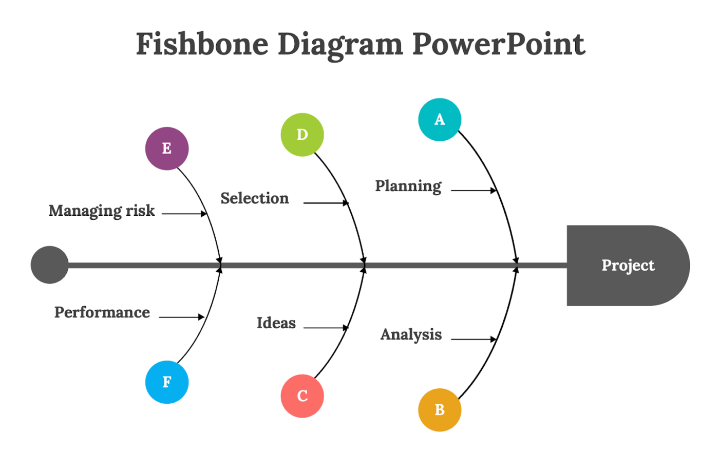
The key lies in promptly identifying and managing errors with the right cause-and-effect analysis tool. Fishbone diagrams are an excellent choice here. This Japanese visualization solution maps issues and helps you address them.
But, creating a fishbone diagram from scratch is tedious. That’s why ready-to-use templates are a game-changer. These pre-designed solutions reduce creation effort, simplify problem-solving, and drive quicker insights.
This article showcases seven top PowerPoint templates to kickstart your journey. What’s more? We’ll cover some versatile alternatives from project management experts like ClickUp. 🧐
Best Fishbone Diagram Template PowerPoint for Effective Presentations
- What Makes a Good PowerPoint Fishbone Template?
- Top 7 PowerPoint Fishbone Diagram Templates
- 1. 4M Root Cause Analysis Template by SlideModel.com
- 2. PowerPoint Cause and Effect Infographic Template by SlideModel.com
- 3. PowerPoint Ishikawa Diagram Template by SlideModel.com
- 4. PowerPoint Fishbone Diagram Template by Slideegg
- 5. Manufacturing’s Problem Fishbone Diagram Template by Slide Team
- 6. Crisis Management Strategy Fishbone Diagram Template by Slide Team
- 7. Value Gap Analysis Fishbone Diagram by Slide Team
- Limitations of Using PowerPoint for Fishbone Diagrams
- Alternative PowerPoint Fishbone Templates
What Makes a Good PowerPoint Fishbone Template?
An effective fishbone template elevates brainstorming sessions to reach the end solution with a compelling analysis process. With that in mind, here are five essential elements every template must have:
- Easy-to-read design: Clear labels, lines, and logical structures keep readability high for viewers to follow each cause to its effect smoothly
- Customizable features: Simple-to-tweak designs, from branch lengths to colors and themes, allow users to adapt features to meet unique project requirements
- Visually engaging layout: Prefer templates with visually appealing designs and high brand theme alignment. Opt for clean, modern aesthetics to keep your audience engaged
- Shareable format: Opt for templates designed for multiple devices. Facilitate smooth PowerPoint presentations and collaboration with efficient sharing and editing options
- Pre-set structure: Start with templates offering predefined branches for common causes (e.g., methods, materials). Save setup time and guide organized input with these ready-made structures
🚀 Fun Fact: Fishbone diagrams are also called Ishikawa diagrams, herringbone diagrams, and cause-and-effect diagrams. So, if someone throws one of these into the discussion, you now know what to expect! 🤭
Top 7 PowerPoint Fishbone Diagram Templates
With the key elements in mind, here are seven PowerPoint fishbone diagram templates for effective problem analysis.
1. 4M Root Cause Analysis Template by SlideModel.com
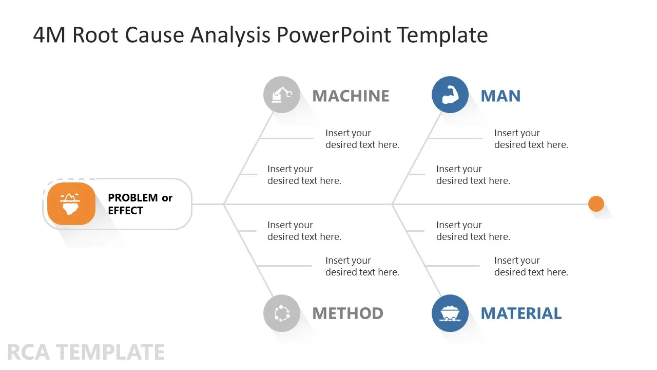
The SlideModel.com 4M Root Cause Analysis Template is a standard solution for analyzing issues. Designed with the standard Man, Material, Machine, and Method branches, this template provides a comprehensive root cause analysis.
Its clear visual icons make it easy for problem-solvers and analysts to follow. The template’s fish skeleton structure includes text labels for quick data updates, making your analysis process efficient, effective, and collaborative.
🏅 Key features:
- Adapt the solution for any application, including software development or brainstorming
- Make every analysis in-depth with its four key root cause branches
🔮 Ideal for:
Small teams and businesses focused on issue resolution and quality defect prevention. It is great for teams that adopt Six Sigma solutions in quality control and risk management
2. PowerPoint Cause and Effect Infographic Template by SlideModel.com
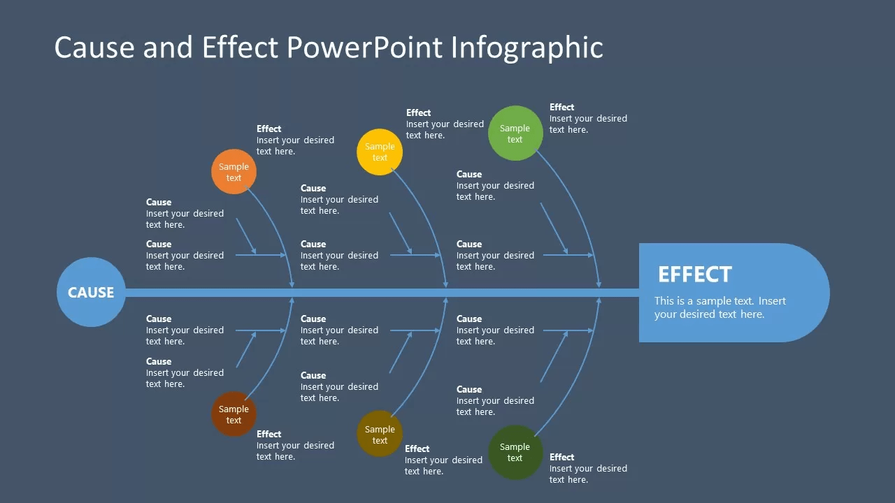
Pick SlideModel.com PowerPoint Cause and Effect Infographic Template for a presentation-style effect diagram. The solution is easy to update with 100% editable text fields and shapes.
The template also offers ample space for adding specific data points. It is downloadable in multiple formats, perfect for offline or focused discussions.
🏅 Key features:
- Keep your presentations versatile with multiple themes and backgrounds
- Communicate the impact of processes on end objectives through its infographic design
🔮 Ideal for:
Projects targeting process improvement and presentations to executive management for data-driven analyses
3. PowerPoint Ishikawa Diagram Template by SlideModel.com
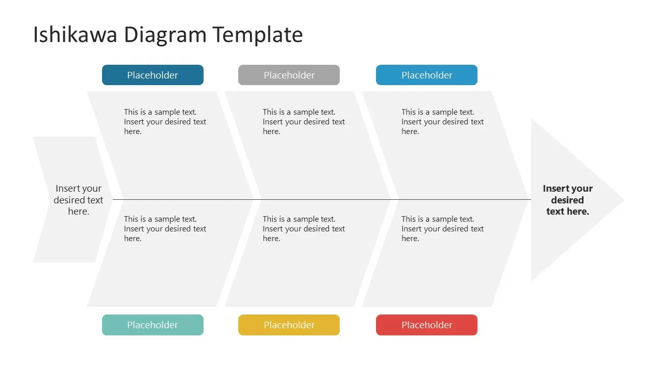
If you need an all-purpose presentation, the PowerPoint Ishikawa Diagram Template by SlideModel.com is a great fit. The solution’s simple lines form the diagram’s spine, and colorful placeholders clarify the branch category.
With every text field blank, it’s perfect to adapt to brainstorming, problem-solving, and even issue analysis. Its clean and professional design also keeps your presentations polished and impactful.
🏅 Key features:
- Easily segment and present key information with its appealing design and color schemes
- Apply the visualization for both professional and academic presentations with zero fixed data fields
🔮 Ideal for:
Students, professionals, and team leaders who want to present and explain core issues or identify potential factors causing them
4. PowerPoint Fishbone Diagram Template by Slideegg
Slideegg’s PowerPoint Fishbone Diagram Template is an all-in-one presentation solution. It comes with six diagrams to suit various Ishikawa diagram applications. Each diagram has a detailed explanation of its approach and purposes.
The template is versatile, with a striking color scheme and layout. It offers hundreds of icons for easy visualization and includes instructions to maximize its use.
🏅 Key features:
- Access six diverse diagrams for applications like strategy, production, plant site, and risk management
- Enhance presentations with a vibrant design and access to PowerPoint’s shape library
🔮 Ideal for:
Teams looking for an all-in-one analysis solution in PowerPoint format
5. Manufacturing’s Problem Fishbone Diagram Template by Slide Team
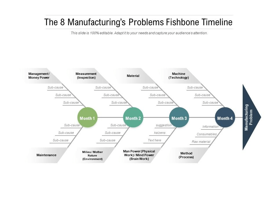
Need something dedicated to the manufacturing line problems and goals? Choose Slide Team’s Manufacturing’s Problem Fishbone Diagram Template.
This template maps a problem’s causes under the 6Ms of production planning. It adopts a dedicated timeline for each branch or leading cause, helping to cover every contributing factor across functions and departments.
The systematic visualization helps incorporate improvement solutions directly against each sub-cause.
🏅 Key features:
- Track improvements and suggestions across clear timelines and cause
- Specialize your visualization for production lines and manufacturing segments
🔮 Ideal for:
Manufacturing teams and product-based businesses and those who target improvements in sprints
6. Crisis Management Strategy Fishbone Diagram Template by Slide Team
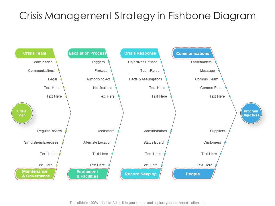
The Crisis Management Strategy Fishbone Diagram Template maps what must be done during a crisis or ad hoc situation. It records elements moving from regular program objectives to an effective crisis plan.
This Ishikawa diagram’s objective spectrum covers key elements like communication, stakeholders, equipment, and documentation.
The fishbone template also records the crisis spectrum details, which include crisis response, escalation processes, governance, and core crisis team roles.
🏅 Key features:
- Strategize clear and quick action with the entire crisis management process visualized
- Ensure goal-oriented crisis management with objectives and escalation processes in a single space
🔮 Ideal for:
Crisis management teams, organizations looking to improve their escalation processes, and stakeholders needing a clear visual guide for roles and escalation
📌 Bonus: Need to map your escalation processes and information? Check out How to create a flowchart in PowerPoint 🧵
7. Value Gap Analysis Fishbone Diagram by Slide Team
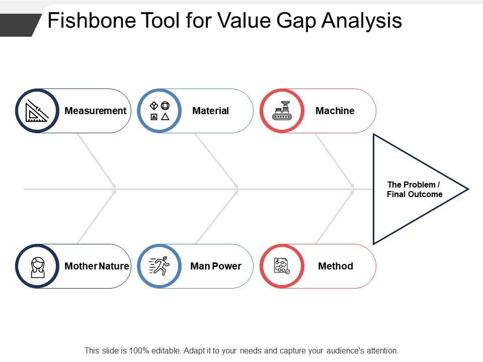
Slide Team’s Value Gap Analysis Fishbone Diagram shows the root causes or driving forces behind a business’s performance. The template establishes a goal or issue and branches out different categories as contributing factors.
It includes hundreds of icons and step-by-step instructions, making customization easy. It’s valuable for conducting value gap analysis, optimizing value chain processes, and performing due diligence.
🏅 Key features:
- Identify root causes of performance gaps with a clear and simple framework
- Adapt the diagram for diverse discussions (such as review meetings) with an extensive list of icons and customizations
🔮 Ideal for:
Small businesses and value chain teams targeting improvement through a gap analysis approach
Limitations of Using PowerPoint for Fishbone Diagrams
PowerPoint is great for presentations but not so much as a visual project management tool.
Here are a few limitations of a fishbone diagram template on PowerPoint:
- Manual construction: Lacks intuitive features for customizing fishbone diagrams. Often requires users to manually draw each component, which is time-consuming and prone to errors
- Limited customization: Only offers basic shapes and connectors and does not have elements specialized for fishbone diagrams. Involves additional design work to fit specific needs
- Inadequate data integration: Lacks integration with data sources, analytics tools, or task management features. Fails to create data-driven fishbone diagrams or quickly act on real-time insights
- Difficult collaboration: Clunky for multiple users to diagram fishbone diagrams simultaneously or in real-time, which may lead to version control issues
- Scalability Issues: Less efficient for complex fishbone diagrams and insights. Becomes more cluttered and leads to information overload on each slide
- No automation: Lacks key elements like workflow automation that teams need to make effective use of root cause analysis
Alternative PowerPoint Fishbone Templates
Fishbone diagrams are goal-oriented project visualization tools. However, PowerPoint’s limitations hinder the fishbone visualization process, which can lead to several inefficiencies in the analysis.
That’s why finding an alternative is crucial. One excellent option is ClickUp.
As a project management tool, ClickUp features superior visualization, relationship mapping, and AI-powered analytics. It’s the perfect pairing for fishbone diagrams to produce quality analyses and results.
Here’s a quick comparison between the two:
| Features | PowerPoint | ClickUp |
|---|---|---|
| Ease of Use | ❌Requires basic technical knowledge before use. Less intuitive | ✅🏆Intuitive drag-and-drop interface. Thousands of specific pre-built templates |
| Customization | ➖Customization available for only basic shapes and formatting; Requires manual adjustments | ✅🏆Extensive customization for data fields, shapes, data flow, and relationship mapping. Comes with adaptable analytical insights from created diagrams |
| Collaboration and Task Management | ✅🏆Extensive customization for data fields, shapes, data flow, and relationship mapping. Comes with adaptable analytical insights from created diagrams | ✅🏆Live editing. Real-time collaborationInstant tagging and commentsSeamless task assignmentsShareable in multiple formatsDiverse permissions features |
| Integration | ➖Limited integration capabilities. Data transfers are mostly manual | ✅🏆Seamless integration with other project management tools and productivity apps. Comes with over 1000+ external integrations and a custom API |
| Dynamic Features | ❌Static presentation tool. Only comes with animations related to a presentation | ✅🏆AI-powered shape suggestionsAutomatic task generation. Advanced analytics |
| Cost | ➖One-time purchase or subscription-based; costly for large teams | ✅🏆Affordable pricing for all teams. Comes with a Forever Free plan |
With ClickUp’s advantages in mind, here are seven must-have fishbone diagram templates.
1. ClickUp Fishbone Diagram Template

The ClickUp Fishbone Diagram Template is an all-purpose solution for every type of cause and effect analysis.
This Whiteboard template starts with a ‘legend’ to keep the diagram easy to understand. Its compelling layout covers problems at the head of the fish and causes in the visually appealing skeleton.
It has additional space to add data report links, tables, and supporting documents. This fishbone diagram template is great for various stakeholder presentations. Plus, ClickUp lets you create tasks from any text on the canvas.
🏅 Key features:
- Keep the audience engaged with its visually appealing layout and clear data labels
- Boost accountability and quick action plans with instant task creation and assignment
🔮 Ideal for:
Teams looking to identify potential factors causing issues or achieve a goal with an understanding of its primary drivers
📌 Bonus: Assign tasks based on the departments responsible for the main cause branch. This simplifies task creation logic and drives accountability. 📊
2. ClickUp Root Cause Analysis Template
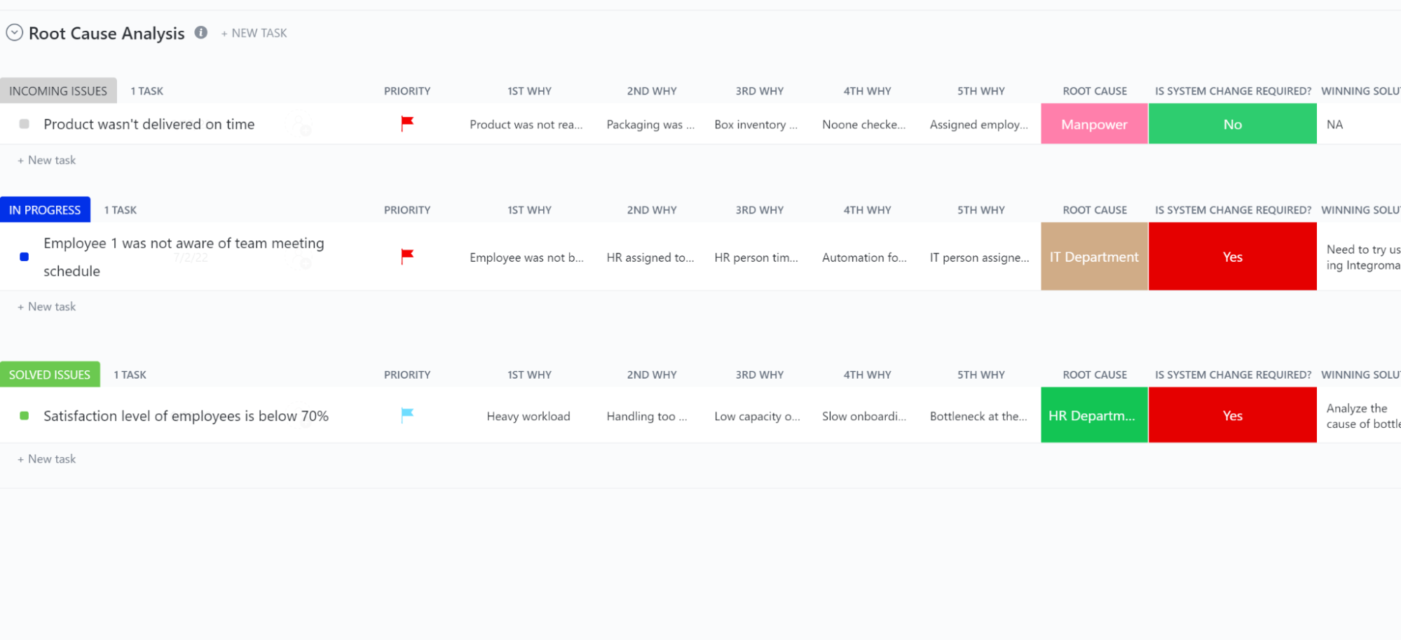
Need to blend task management with problem-resolution plans? The ClickUp Root Cause Analysis Template is your go-to solution.
The template maps the issue, the five whys, the root cause, the solution, and the responsible teams. Its ‘List of Issues’ View consolidates all key details for a comprehensive overview. It includes a ’Priority List’ to help you focus on what to address first.
Additionally, the solution offers a board view, grouping each task card by status and team member. This keeps your team focused on solving the root cause.
🏅 Key features:
- Use reporting and resolution dates to track your team’s overall efficiency
- Integrate the systematic data fields and views to maintain priorities and workflow accountability
🔮 Ideal for:
Teams aiming to solve problems strategically. Also great for a focus on coordination and accountability
➡️ Read More: 6 Best Root Cause Analysis Tools if you need dedicated software for problem-solving. 🕵️
3. ClickUp IT Root Cause Analysis Template
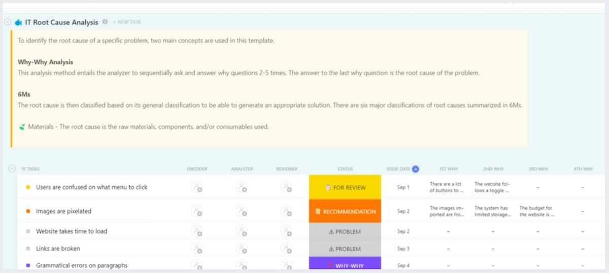
Need help with troubleshooting efficiency? Visualize everything with the ClickUp IT Root Cause Analysis Template. This template is made for logging and resolving IT issues seamlessly.
It starts with a dedicated form to record problems and their dates easily. Each issue then moves through five custom statuses: “problem,” “why-why,” “for review,” “recommendation,” and “done.” This structured task flow resolves every issue methodically.
The template’s board view lets team leaders track task statuses and helps prioritize team capacity for resolution efficiency.
🏅 Key features:
- Strengthen your issue tracking with dedicated forms and clear task statuses
- Improve capacity management and prioritization with an in-depth board view
🔮 Ideal for:
IT teams and businesses in the service industry. Also great for teams handling asset management
💡 Pro Tip: Use the AI tool platform ClickUp Brain to generate quick progress updates or summaries. This helps you stay ahead of issues and escalations effortlessly. 🧘
4. ClickUp Cause & Effect Whiteboard Template

The ClickUp Cause & Effect Whiteboard Template is a canvas-style solution perfect for revealing intricacies in analysis. It has a vibrant space to record legends and maps problems to every minute cause.
The data flow diagram has a mind map feature that visualizes relationships between sub-causes to convey each element’s impact.
As a Whiteboard template, it comes with numerous creative shapes, icons, and drawing brushes. This makes it easy to adapt to various applications, such as brainstorming and visualization.
🏅 Key features:
- Highlight core targets for crucial projects with in-depth visualization to identify focus areas and quantify the possible impact (e.g., sales, time savings)
- Tweak design and theme to align with audience preferences to enhance engagement and visual appeal
🔮 Ideal for:
Teams and project managers seeking clear, customizable visuals to tackle core project challenges. It’s also the perfect foundation for your flowchart software or contingency plan
📌 Bonus: Read the 25 mind-blowing mind map examples to create powerful relationship connections in your diagrams. 🎯
5. ClickUp 5 Whys Template

Need a structured approach to investigate an issue? The ClickUp 5 Whys Template offers a vibrant, organized Whiteboard for data flow. With such a visual blend to the 5 Whys approach, identifying root causes is guaranteed.
The solution captures problems, reasons, and each “why” with sticky notes, keeping each step clear and accessible. It also has a list view to track any actionable tasks created from a “why” or insight.
🏅 Key features
- Insert data reports and applications to support the reasoning
- Integrate web links and AI summaries to improve decision-making and the investigation process
🔮 Ideal for
Great for presenting investigations, sharing insights, and data-driven escalations to top management.
➡️ Read More: Free 5 Why Templates for more solutions with this logical analysis and visualization approach. 🤔
6. ClickUp Performance Improvement Action Plan Template

The ClickUp Performance Improvement Action Plan Template is designed to spot issues, set goals, and outline improvement steps. The template has a dedicated Goals view to map these issues and assign responsibilities. Plus, it comes with live progress bars for seamless tracking.
Its “Action Steps” List View organizes improvement steps by day of the week. It also records clear task status, responsible department, and task complexity.
Team members can add notes and priorities to ensure streamlined action and collaboration.
🏅 Key features
- Keeps the team focused on improvement steps instead of just root cause analysis
- Help leaders address issues proactively based on transparent deadlines and task complexities
🔮 Ideal for:
Project managers, department leaders, and businesses looking to foster a continuous improvement culture
📌 Bonus: Check out 10 Workflow examples and use cases to learn how to enhance efficiency and processes in your business. 📈
7. ClickUp Project Retrospective Template
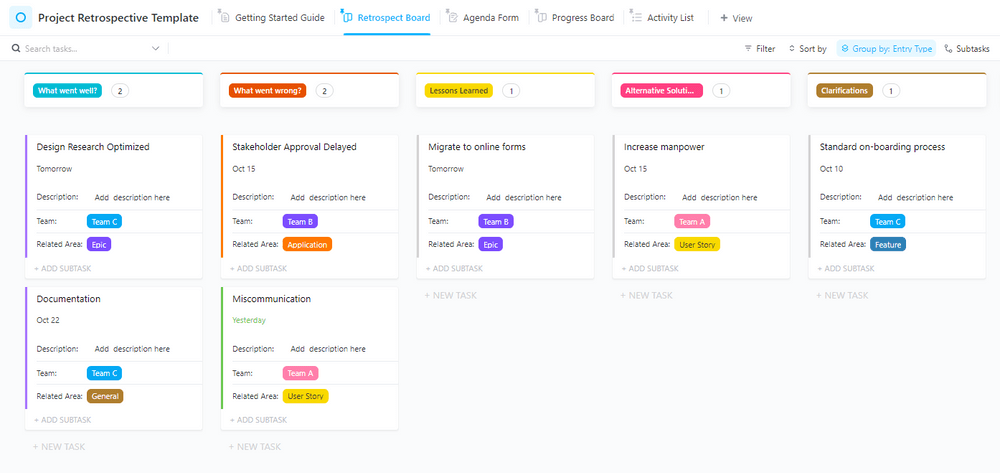
The ClickUp Project Retrospective Template helps assess project performance and adapt improvement strategies. It features a retrospect board to map what went wrong, what went well, lessons learned, alternative solutions, and more.
Each insight or task is linked to related areas and responsible teams. The template also includes an agenda form for quickly submitting project insights and thoughts. It also features a progress board for an overview of actions from discussions.
🏅 Key features:
- Map each stakeholder’s insights and visualize project learnings with a dedicated retrospective board
- Keep elements accountable and improvement points focused on project-specific and customizable data fields
🔮 Ideal for:
Businesses and teams looking to learn and exchange insights across functions. Plus, it’s great for improving customer experiences and project delivery.
➡️ Read More: Top 12 project management charts if you want a visualization tool to keep project-related data digestible and manageable. 🧶
Level Up Root Cause Analysis With ClickUp
Understanding the issue is the first step toward project improvement. For customized root cause analyses (RCA), visualization tools like fishbone diagrams are highly effective. In fact, ready-to-use templates supercharge insights and save valuable time.
The PowerPoint templates we’ve covered are a decent solution for problem-solving. However, they’re not the best choice if you want to embed Fishbone and RCA into your projects.
For that, you need a more comprehensive partner. A great choice here is ClickUp.
ClickUp delivers automation, task management, AI-powered insights, and visualizations. It strengthens your improvement plans. Want to lead change and drive process improvement? Sign up with ClickUp today!


Everything you need to stay organized and get work done.

