


Still downloading templates?
There’s an easier way. Try a free AI Agent in ClickUp that actually does the work for you—set up in minutes, save hours every week.
Sorry, there were no results found for “”
Sorry, there were no results found for “”
Sorry, there were no results found for “”


It’s Saturday evening. You’re making dinner and decide that your “Wine and Dine playlist” would be the perfect musical accompaniment. You pick up your phone, open the app, and the music starts playing. You barely even looked at your phone, but your fingers unerringly tapped on Spotify.
In a world where we’re bombarded with thousands of images and messages daily—from physical billboards to digital popups—a strong brand identity isn’t just nice to have. It’s your ticket to standing out.
Think about how Google’s playful doodles make you smile or how Airbnb’s warm, inviting visuals make you dream of your next getaway. These aren’t happy accidents; they’re the result of powerful brand management and meticulously designed brand kits that speak volumes without saying a word.
In this blog post, we’ll explore the world of brand kits and the best brand kit examples in the world. From the building blocks that make them tick to inspirational tips, we’ll share how you can craft a brand identity that’s not just seen but felt and remembered.
A brand kit is a comprehensive collection of visual and conceptual elements that define your brand’s identity. It serves as a blueprint for how a brand presents itself to the world, ensuring consistency across all marketing channels and touchpoints.
While often confused with a brand style guide, a brand kit encompasses a broader range of components. A brand style guide typically focuses on the rules and guidelines for using brand elements, while a brand kit includes those elements and additional resources that help in executing the brand strategy effectively.
Key components of a brand kit include:
Unlike a traditional style guide, which can be a lengthy document, a brand kit is designed for practical, everyday use. It’s a living toolkit that evolves with your brand, allowing for quick updates and easy distribution to team members and stakeholders.
A brand kit centralizes brand guidelines and assets, empowering your team to create consistent on-brand content, whether it’s a social media post, a promotional email, or a full-scale advertising campaign.
According to a 2021 study, brand consistency led to a revenue jump of at least 10% for over 67% of the companies surveyed.
Let’s explore 10 exceptional brand kit examples that set the standard in brand identity management.
These brand kits showcase how top companies maintain consistency while allowing for creativity and adaptation across various platforms.
Google’s branding focuses on simplicity, accessibility, and innovation. The design is clean and user-friendly, reflecting the company’s mission to organize the world’s information and make it universally accessible.
Google’s open-source Material Design system is a highly adaptable design language that permeates its brand identity and extends across its entire product ecosystem.

The use of primary colors—blue, red, yellow, and green—and a clean, sans-serif font make room for adaptability across various platforms while maintaining a recognizable identity and creating a cheerful and inviting aesthetic.
Whether you were fascinated or annoyed by Spotify Wrapped, Spotify’s famous end-of-the-year campaign, which showcases user data in a visually appealing and shareable format, you know that Spotify’s brand kit is a masterclass in translating audio experiences into visual identity.

The brand embraces duotone imagery, combining a grayscale image or portrait with a pop of bright colors to capture the energy and creativity of music. Their color palette is inspired by album art and concert lighting. It’s complemented by custom typography that mimics sound waves—notice the ‘Burst’ logo, the three curved lines emanating from the circle that represent sound waves, and the diffusion of music.
Their branding strategy includes dynamic visuals that adapt to different campaigns. These showcase their innovative approach to music streaming and resonate with their youthful audience.
Did you see a bold red N and hear a phantom “ta-dum” just as you read this?
Sonic branding has become an integral part of modern brand identity, and Netflix is a prime example of how sound can enhance brand recognition and user experience.

The “ta-dum” sound was designed to evoke a cinematic experience, aligning with Netflix’s identity as a leader in the entertainment industry. It aims to create anticipation and excitement, signaling to viewers that they are about to engage with content that is both high-quality and immersive.
The “ta-dum” has transcended its role as a mere sound cue; it has become a cultural reference point. Netflix even hosted a global fan event named “TUDUM,” celebrating the sound and its connection to the brand.
Their brand kit includes guidelines for using imagery that evokes emotion and storytelling, echoing their content-driven strategy.
When AirBnb had outgrown their original brand identity, they approached DesignStudio to help them create a brand that could express their vision.
As the team researched, they discovered that Airbnb was not just about renting places, but about creating a sense of belonging, comfort, and community in the places people visited. This insight became the foundation for their brand strategy and for their iconic “Bélo” logo—a combination of a heart, a location pin, and the letter ‘A’—symbolizing “belonging anywhere.”
The message? No matter where you went, you could feel at home with Airbnb.

The rebrand was critically acclaimed, sparking a social media frenzy and winning numerous prestigious awards that recognized its creativity and impact. Most significantly, in the years following the rebrand, Airbnb’s valuation skyrocketed, surpassing that of its nearest competitor by a staggering $29 billion in less than four years.
Other key elements of their brand kit include:
Slack’s brand kit balances professionalism with playfulness, reflecting the company’s role in making work communication more engaging and efficient. However, the kit didn’t always feature the current logo with four droplets (or speech bubbles) and four lozenges.
In a press release announcing the new logo, the company said:
Our first logo was created before the company launched. It was distinctive, and playful, and the octothorpe (or pound sign, or hash, or whatever name by which you know it) resembled the same character that you see in front of channels in our product.
It was also extremely easy to get wrong. It was 11 different colors—and if placed on any color other than white, or at the wrong angle (instead of the precisely prescribed 18º rotation), or with the colors tweaked wrong, it looked terrible. It pained us.
Slack wanted a logo that would scale better, work in one color, and still capture the brand’s fun, energetic personality.
The logo redesign:

The simplified color palette and clean lines also give Slack a more elevated, professional look that aligns with their push into the corporate market. The redesign positions them as a serious business tool, not just a fun messaging app.
ClickUp’s brand kit is characterized by bright and modern colors, primarily featuring purple, pink, light blue, and yellow. These colors reflect our commitment to making productivity fun and delivering the best user experience, which is also our top core value.
We value clarity and readability in our communication and, consequently, use the modern sans-serif font Axiforma for all text.

Our logo includes several variations—black on a white background, white on a colored background, and the original featuring an upward arrow in a gradient of our brand colors—to be adaptable across different contexts while maintaining brand recognition.
The brand kit also includes legal guidelines for using ClickUp’s trademarks, protecting the brand’s integrity while allowing partners and users to promote ClickUp appropriately.
Hulu’s approximately 100-page brand style guidelines emphasize clarity and efficiency, true to its mission to provide an easy and enjoyable streaming experience.
The most interesting thing about their brand kit is perhaps their primary brand color, dubbed Hulu green. In the company’s words:
It represents the fresh distinctiveness of our brand and stands out from more traditional entertainment palettes.
The signature bright green paired with black creates a striking visual identity that is instantly recognizable.

The bold color palette is combined with straightforward typography to create a modern, user-friendly design that stands out against various backgrounds.
The brand kit also includes detailed instructions on logo usage, spacing, and placement to maintain consistency. It also includes a section on tone of voice, ensuring that all communications align with the brand’s identity.
Yelp’s brand kit emphasizes the company’s commitment to connecting people with great local businesses through user-generated reviews and ratings.
The brand is built around a few key elements:
The Yelp name and logo
The Yelp name and logo represent the company’s mission to help consumers find businesses they can trust. The “burst” symbol in the logo is meant to capture the feeling of discovery when someone finds a great local business.

Brand guidelines
Yelp provides clear guidelines on how to use their branding assets, including:
Community focus
Yelp’s brand is built around its community of reviewers, known as “Yelpers”. The company encourages reviewers to use real names and photos, and recognizes top contributors through the Yelp Elite Squad program. Yelp employs community managers to engage with reviewers and host events.
By clearly defining its brand elements and fostering a vibrant community, Yelp aims to provide a trusted platform for consumers to discover and connect with local businesses. The brand guidelines ensure consistent representation of Yelp’s identity across all touchpoints.
Shopify’s brand kit is designed to empower and inspire entrepreneurs. Their aesthetic is approachable, reflecting the brand’s mission to make e-commerce accessible to everyone. Their visual identity combines a clean, professional look with elements that represent growth and possibility.

Highlights of Shopify’s brand kit:
Did you know Mailchimp started as a side project by the co-founders to help small businesses with their marketing? The company has come a long way since, expanding its offerings to marketing automation, and the brand has evolved to keep pace with it. The wordmark is updated and made bolder to reflect the brand’s broader capabilities, with the “c” in Mailchimp now lowercase to signify its evolution beyond email.
Mailchimp’s brand kit is designed to be fun and approachable. The playful design elements, including the winking chimp mascot, Freddie, create a friendly and engaging user experience.
Other key elements:
👀 Fun Fact
Mailchimp’s brand kit also has an FAQ section for founders, business owners, and marketers who want a quick 101 or refresher on developing their own brand assets.
Creating a solid brand kit isn’t about following a rigid set of rules. It’s about capturing the essence of who you are as a company and translating that into every visual and verbal touchpoint.
It’s about being so consistent yet flexible that whether someone encounters your brand on a tiny smartwatch screen or giant CGI (computer-generated imagery) installations, they instantly know it’s you.
This is why thorough marketing research is crucial before designing your brand kit. Understanding your target audience, competitors, and market trends will help shape your unique value proposition and brand positioning. This will ensure that your brand kit resonates with your intended audience.
After you’ve completed your market research, follow these six steps to create your own brand kit using ClickUp’s Design Project Management Platform.
Begin by defining your brand strategy. This essential step involves articulating your brand’s mission, vision, and values, identifying your unique selling proposition (USP), and developing your brand personality and voice.
Use ClickUp’s document management solution, ClickUp Docs, to collaboratively draft and refine these foundational elements.
The Brand Identity Template by ClickUp provides a structured framework to guide you through this process, ensuring you cover all essential aspects of your brand management strategy.
Use the template to:
Next, move on to designing your brand’s visual identity. This phase encompasses creating your logo and its variations, choosing your color palette, selecting typography, and developing custom icons and graphic elements.
ClickUp’s Whiteboards feature is handy here, allowing your design team to brainstorm and sketch ideas for multiple brand kits collaboratively in real time.

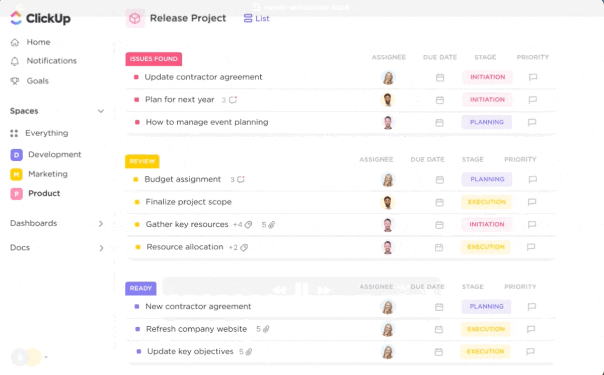
As you finalize designs, use ClickUp’s Task Management system to assign responsibilities and track progress on each element of your visual identity.
With your visual elements in place, establish comprehensive brand guidelines. Set rules for logo usage, define color applications, create typography hierarchies, and establish image and photography styles.
ClickUp’s Brand Guidelines Template offers a pre-built structure for recording these guidelines and creating living document that can be easily updated and shared across your organization, ensuring everyone has access to the latest brand standards.
Key benefits of using such branding templates include:
Design templates for various marketing materials, create social media profile images and cover photos, and develop email signatures and business card designs. ClickUp’s file storage and version control features are perfect for managing these assets.
💡Pro Tip: Set up Custom Views in ClickUp to organize assets by type or usage, making it easier for team members to find and use the correct files.
Finally, compile all your brand assets into a comprehensive, easy-to-use guide. Include examples of correct and incorrect usage, and provide downloadable assets and templates.
The ClickUp Brand Book Template offers an excellent starting point for this compilation.
It ensures a consistent look and feel for all marketing materials by providing clear guidelines for brand representation for employees and partners. Use it to document your brand’s origin story and defining narratives.
Regularly review your brand guidelines to ensure they remain relevant. Set up periodic reviews in ClickUp using Recurring Tasks or reminders to keep everything up to date.
Throughout this process, leverage ClickUp’s collaboration features to streamline workflow and gather feedback—Comments and Proofing tools help facilitate discussions on design elements, and Automations notify relevant team members when new assets are added or guidelines are updated.
ClickUp’s Brand Style Guide Template can serve as a central hub for all these elements, providing a clear overview of your brand kit’s development progress.
A strong and consistent brand identity is a powerful differentiator. Your brand kit is the key to unlocking this potential, enabling impactful brand experiences across all channels
The brand kit examples we’ve explored demonstrate that they go beyond mere aesthetics. They encapsulate a brand’s personality, values, and unique market position. Whether it’s Google’s adaptable design system or Airbnb’s community-centric approach, each brand kit supports specific business goals and audience expectations.
Creating and maintaining a comprehensive brand identity kit is an ongoing process that requires careful planning, creativity, and collaboration. Leveraging brand management software tools like ClickUp can help streamline this process, ensuring your brand kit remains a living, evolving asset that grows with your business.
Invest the time and resources in developing a robust branding kit, and you’ll build a foundation for long-term brand recognition, loyalty, and success. Sign up for ClickUp today!

© 2026 ClickUp

There’s an easier way. Try a free AI Agent in ClickUp that actually does the work for you—set up in minutes, save hours every week.