


Still downloading templates?
There’s an easier way. Try a free AI Agent in ClickUp that actually does the work for you—set up in minutes, save hours every week.
Sorry, there were no results found for “”
Sorry, there were no results found for “”
Sorry, there were no results found for “”
Manually creating charts sounds simple, but it’s a grind:
Someone exports CSVs into Google Sheets, and half the columns import incorrectly.
They can spend hours fixing formatting, filling in missing values, and rebuilding dashboards.
By the time it’s done, the data may already be outdated. And you burn payroll on manual work that’s easy to get wrong.
Thanks to AI, your team can skip a lot of that cycle. Scroll down to see how to use AI for data visualization and the best tools to help you out.
AI data visualization uses machine learning (ML), natural language processing (NLP), and automation to turn raw data into charts and dashboards.
These tools let anyone ask questions in plain English, suggest the right chart types, and surface patterns you might miss in a dense report.
Here’s how this works in practice:
🧠 Fun Fact: In 1854, physician John Snow used data visualization to fight a cholera epidemic in London. By plotting deaths as dots on a city map, he noticed a cluster around a specific water pump on Broad Street. This visual analysis proved the disease was waterborne, leading to the replacement of the pump handle and saving countless lives.
AI for data visualization doesn’t replace spreadsheets or BI tools. It adds an intelligence layer that reduces friction between data, understanding, and action.
Here’s how it helps:
📮 ClickUp Insight: 35% of respondents switched from spreadsheets to another tool and stayed with it, and another 25% are actively considering switching.
That level of movement suggests teams aren’t tied to spreadsheets as much as they’re tied to familiarity. Many seem to be looking for systems that offer more support as work becomes more complex.
ClickUp gives teams a way to make that transition without losing momentum. The platform includes ready-made templates for project tracking, CRM, inventory, time management, and hundreds of other use cases, allowing teams to start with a structured approach instead of recreating them from scratch.
Views like List, Table, Board, and Gantt feel familiar to spreadsheet users, while Automations, AI assistance, and integrated, no-code Dashboards help teams grow beyond manual updates.
📚 Read More: Top AI Dashboard Generator Tools for Busy Teams
Most tools promise the same basics, so compare them on what affects real adoption:
⭐ Bonus: We’ve created a walkthrough of the top AI tools for data visualization 👇
👀 Did You Know? William Playfair is the man who gave us the bar, line, and pie charts in the early 1800s. Before his inventions, data was just long, boring lists of text. Playfair, who also lived a colorful life as an engineer and occasional secret agent, argued that the human eye could process a picture of data much faster than a brain could read a table.
Now that you know what to look for, here are tools teams actually use.
Now, let’s explore the top three AI data visualization tools for teams in the market today:
ClickUp is a converged AI workspace that combines project management, data visualization, knowledge management, and AI in a single place. Instead of bouncing between BI tools, docs, and chat, you can track work, crunch numbers, and ask natural‑language questions directly inside ClickUp.
Here are the key features that make this possible:
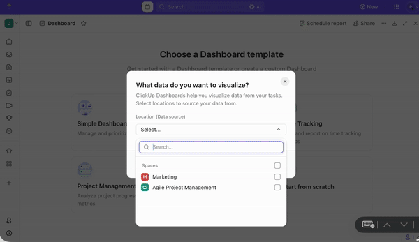
ClickUp Dashboards offers a hassle-free way to visualize complex data without coding. These dashboards are fully customizable and built with cards/widgets that pull live data from your tasks, docs, projects, goals, time trackers, and connected tools.
To get started, simply add the cards you want to display—such as a pie chart, bar graph, or workload breakdown. You can move and resize them freely to design a layout that fits your workflow.
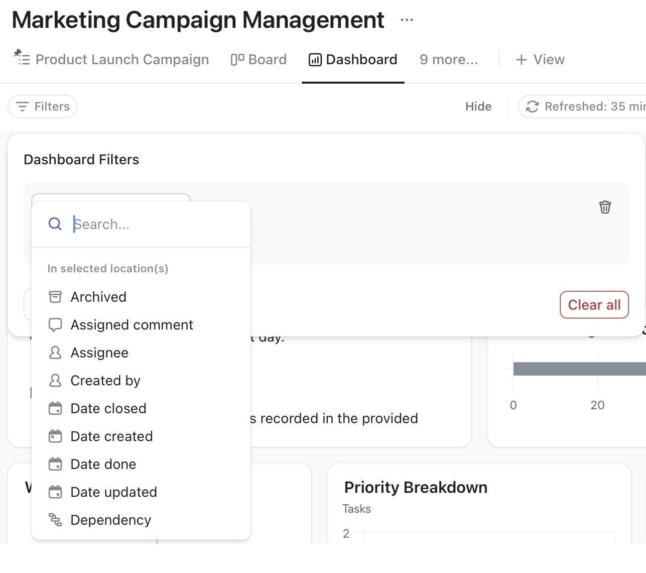
For custom data presentation, use Dashboard Filters and tailor insights for different use cases, roles, departments, projects, etc. Since ClickUp Dashboards auto-refresh every 30 minutes by default, you can trust that you’re always working with the most relevant information.
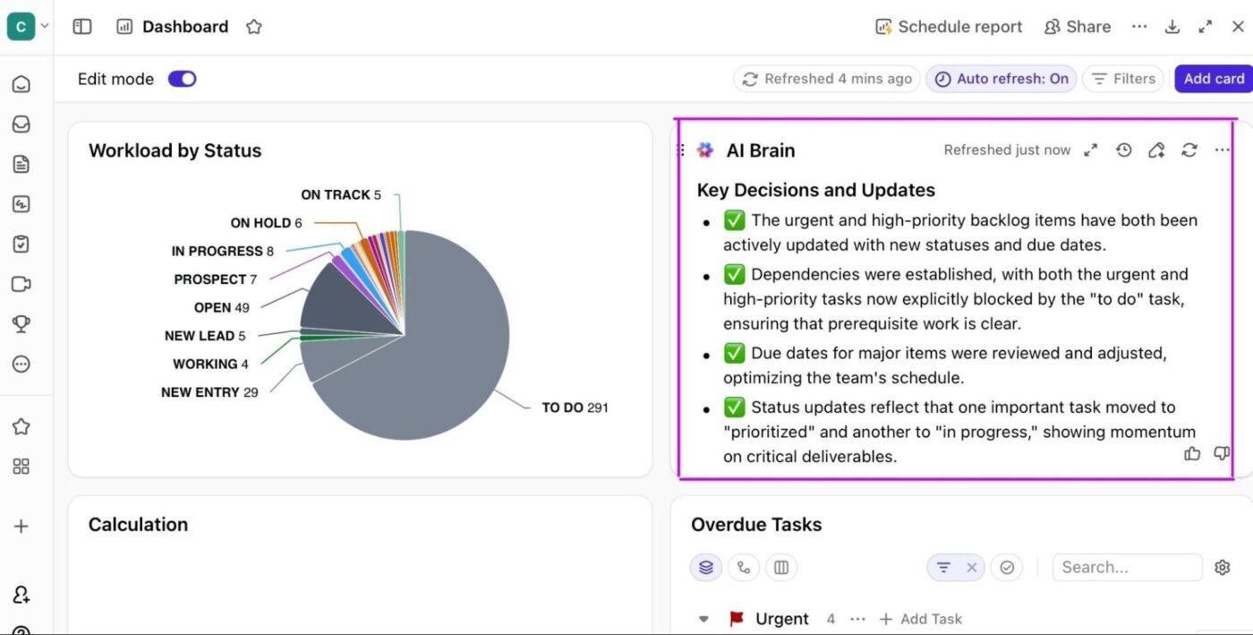
AI Cards are specialized Dashboard widgets that use ClickUp AI to generate narrative insights, summaries, and updates directly on top of your charts and metrics.
They are perfect for summarizing accomplishments, identifying blockers, or listing next steps without manual effort.
Below are the five main AI Card types and what they’re great for:
Suppose you want to know which employees are overbooked next week.
In a traditional data visualization tool, you would have to open a workload dashboard, manually compare everyone’s availability, and compile a list yourself.
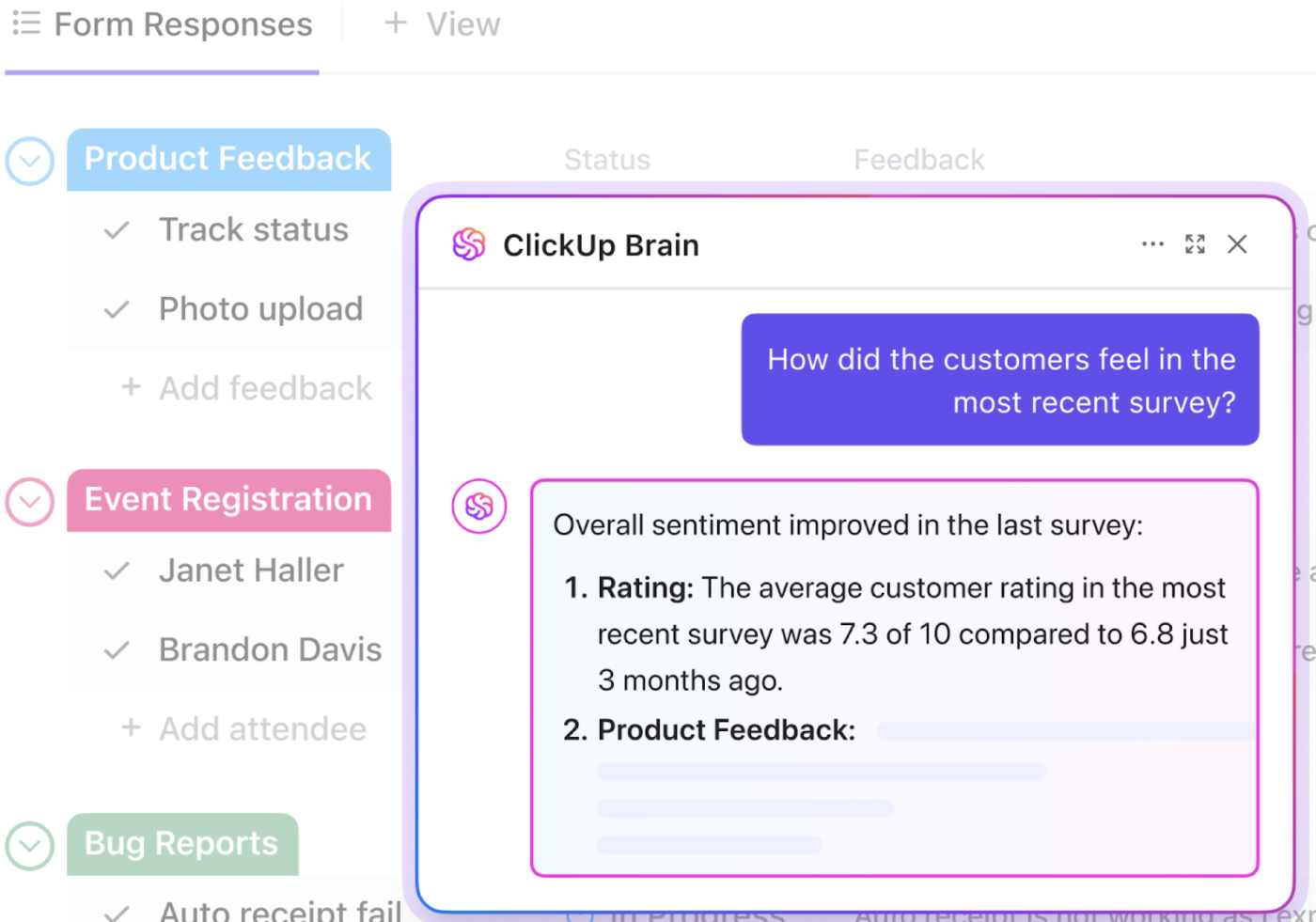
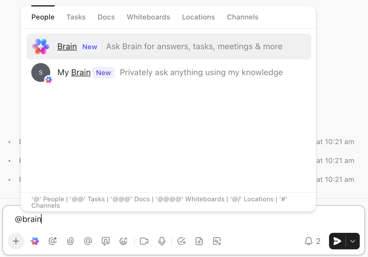
ClickUp Brain, the platform’s native AI-assistant and knowledge manager, offers a faster way to analyze this data. It indexes your tasks, docs, comments, chat threads, and even connected third‑party tools to answer questions and offer AI-powered insights.
For example, simply ask Brain which employees are overbooked next week (or any other query), and it will provide a detailed list of all the employees with exceeded hour limits.
ClickUp Brain’s key capabilities for data visualization also include:
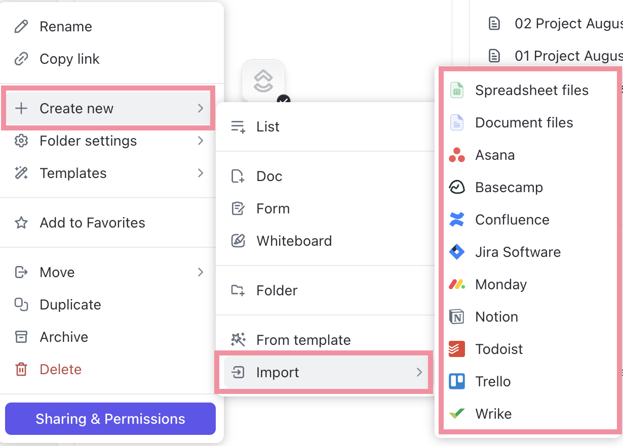
Got half of your reports in some other tool like Power BI or Tableau? No need to jump between multiple tabs and lose focus due to context switching.
With ClickUp Integrations, you can embed these reports directly inside your ClickUp Dashboard and see the complete picture. On top of that, you can connect to external data sources such as Google Sheets, Snowflake, SQL databases, and more to pull live data for automated visualization in ClickUp.
G2: 4.7/5 (10,200+ reviews)
Capterra: 4.6/5 (4,500+ reviews)
💡 Pro Tip: You can also use AI to edit your dashboard on the fly. For instance, try a prompt like: “Make this dashboard look professional and minimalist using a dark theme and brand colors.”
📮 ClickUp Insight: 34% of respondents wish their spreadsheet could automatically build dashboards for them. Assembling reports from scratch, selecting ranges, formatting charts, and keeping everything up to date becomes a job in itself.
With ClickUp, your raw data and visualization options converge. So simply use no-code cards in ClickUp Dashboards for charts, calculations, and time tracking. The best part? They update in real-time with data from live tasks.
AI is available across your workspace to help make sense of that information, generating summaries, highlighting patterns, and explaining what’s changing. Finally, AI Agents can step in to collate, synthesize, and post those updates to your key channels.
That’s your entire reporting workflow handled with ease.
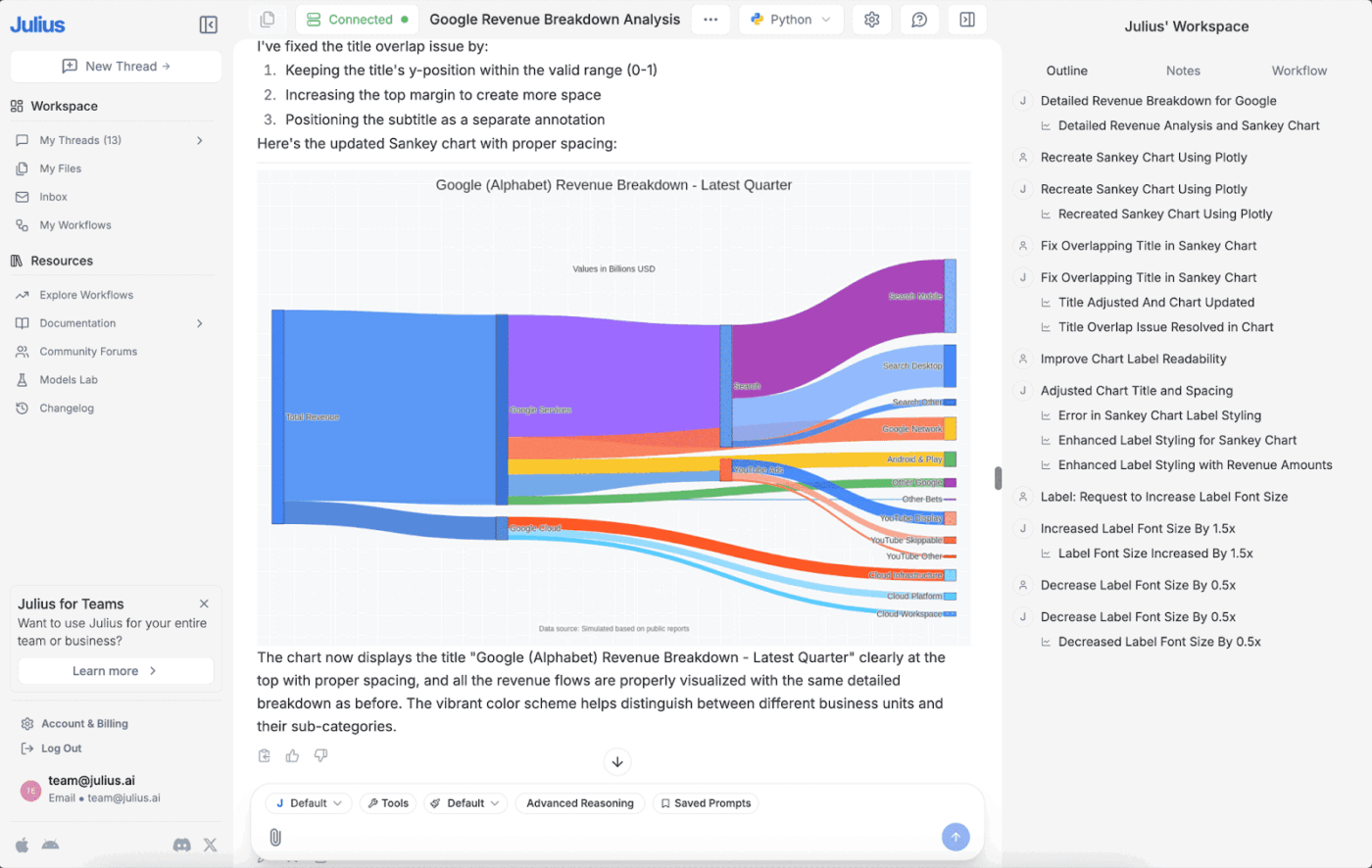
Julius AI is an intelligent data analyst that uses a chat-based interface to analyze raw data and present answers in both natural language and eye-catching visuals.
The process is simple: you upload your data, share Excel files, or connect the platform to your preferred data source. From there, you can ask natural questions like, “Calculate the total amount for me” or “Please analyze this data.”
Julius AI instantly converts your query into code that you can verify, visualizes your data using multiple views (charts, tables, summaries, and full reports), and identifies complex patterns to provide clear narratives.
📚 Read More: Best Data Dashboard Examples for Inspiration
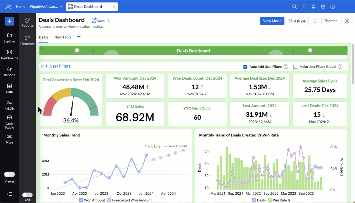
Zoho Analytics is Zoho’s dedicated business intelligence software that sits on top of your operational tools to analyze scattered business data.
It is built for both non‑technical business users and analysts, featuring a drag‑and‑drop interface and self‑service workflow that lets you create charts, pivots, and dashboards without writing SQL.
Zoho Analytics offers 50+ visualizations, including charts, widgets, pivot tables, and tabular views. It also offers powerful AI suggestions to help you choose the right interactive data visualization format for your data.
⚡ Template Archive: Free Data Flow Diagram Templates for ClickUp and PowerPoint
Below are three ways you can use AI features to visualize data and enhance your team’s reporting capabilities:
If most of your time goes into whipping up unique dashboards for different departments or roles, this one’s for you. 👇
Instead of manually building a separate dashboard every time, simply feed your dataset to the generative AI. Give it a clear, solid prompt to analyze the data and generate the specific dashboards you need.
📌 Example: “Generate four dashboards from this project data: an Executive ROI view, a Developer velocity tracker, a Marketing campaign funnel, and a client-facing progress report.”
The AI instantly generates four distinct views—each with its own filtered data, chart types, and security permissions—without you having to touch a single setting.
Another highly recommended use case for AI in data visualization is automating repetitive steps such as cleaning, analysis, chart preparation, and stakeholder notifications.
Here are two simple, no-code ways to make that happen:
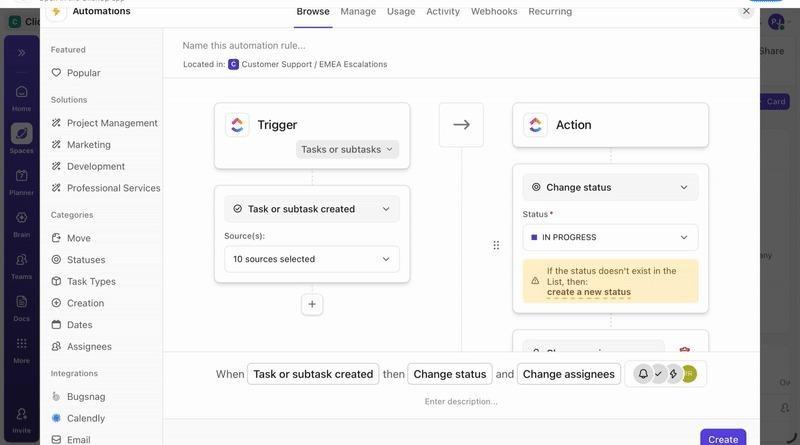
ClickUp Automations are ideal for automating parts of your data visualization workflows, often the simpler ones. This includes sending updates, scheduling alerts, generating reports tailored to different teams, etc.
For example, you could set an automation to post a summary to Slack or email the moment a task status changes to Complete.
ClickUp Super Agents take automation to the next level by using natural language instructions and intelligent workflows. Most importantly, they operate 24/7 in the background, so you never have to worry about manual tasks.
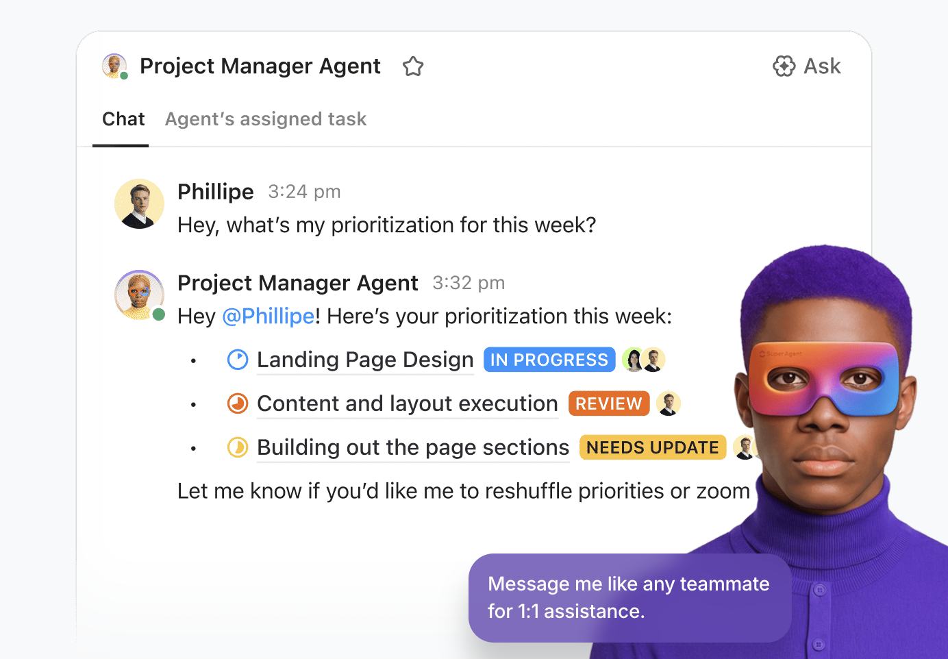
You can configure a single ClickUp AI Agent for:
What do AI Agents look like in action? Here’s an example 👇
AI makes forecasting both visual and interactive. You can feed it your current data and run what-if scenarios—such as how increasing your budget or changing your team size will impact your deadlines and revenue.
The AI then spots patterns in your current numbers and projects them forward with confidence ranges, like: “There is only a 40% chance we complete this project on time next month if you remove three team members from this task.”
You can also play with sliders or enter additional prompts to test further scenarios, such as: “What if we hire two more people?” or “What if we cut spending by 10%?”
AI can fix duplicates, missing values, and formatting issues, but it can also make assumptions you didn’t approve (like filling blanks, standardizing names, or merging similar fields). The chart looks clean, and that’s the danger.
Do this instead:
AI summaries can slide into storytelling. A spike becomes “this campaign worked,” a dip becomes “this channel failed,” when the chart only shows correlation.
Do this instead:
When dashboards pull from multiple tools, it’s easy for people to see more than they should, especially with natural-language querying on top.
Do this instead:
Different connectors refresh on different schedules. One dataset updates, another lags, and your dashboard contradicts itself.
Do this instead:
AI makes it easy to generate ten dashboards, which usually means nobody uses any of them. Dashboards should drive decisions, not just exist.
Do this instead:
AI can absolutely speed up reporting, but speed is useless if the dashboard is built on messy data, unclear definitions, or stale sources. The best teams treat AI visualization like an accelerator, not an autopilot: they standardize inputs, validate key metrics, and keep the insight connected to the work that needs to happen next.
That’s where ClickUp fits. Instead of exporting spreadsheets, rebuilding charts, and chasing context across tools, ClickUp Dashboards pull live workspace data into shareable views, and ClickUp Brain helps you interpret what’s changing without writing formulas or digging through tabs. Add Automations and AI Cards, and your reporting loop becomes something you run continuously, not something you rebuild every week.
Start with one dashboard that matters (exec status, workload, campaign performance), define the metrics, and let it update itself. Try ClickUp for free and turn reporting from a monthly scramble into a daily advantage.
Absolutely. Modern tools use natural language processing, allowing anyone to build charts by simply typing questions in plain English for workflow visualization. The drag-and-drop interfaces and AI-assisted layouts make professional reporting accessible to everyone, from HR managers to sales representatives.
Traditional dashboards are built manually. Team members have to upload data by hand and often write code for integrations, dashboard logic, and visuals. Plus, these dashboards lack real-time insights and often display charts/graphs with no clear explanations.
AI, on the other hand, automatically collects, cleans, analyzes, and visualizes live data. It provides actionable insights alongside the visuals so team members can take the next step with confidence. Most importantly, you can simply chat with the AI in plain English to generate interactive visuals and dashboards from scratch.
It can be, as long as the underlying data is clean and the tool is reliable. AI reduces human errors in formatting and chart building, but teams should still validate key metrics and data sources. Used correctly, AI visuals are accurate enough for most business reporting and planning.

© 2026 ClickUp

There’s an easier way. Try a free AI Agent in ClickUp that actually does the work for you—set up in minutes, save hours every week.