


Still downloading templates?
There’s an easier way. Try a free AI Agent in ClickUp that actually does the work for you—set up in minutes, save hours every week.
Sorry, there were no results found for “”
Sorry, there were no results found for “”
Sorry, there were no results found for “”
Figuring out why a process is stalling from a spreadsheet is tedious.
Manually calculating drop-off rates between stages is tedious and often hides the real story in a sea of numbers. This guesswork leads to wasted time and resources, as you might try to fix the wrong part of your workflow.
Most teams know their processes are leaking somewhere, but pinpointing the exact stage where things fall apart is nearly impossible when you’re drowning in raw numbers.
In this blog, we’ll take you through funnel charts: what they are, when to use them, and how to read them correctly. You’ll also learn how to build live, automated versions directly inside ClickUp without touching a single spreadsheet.
A funnel chart is a data visualization tool that solves this problem.
It displays values across the sequential stages of a process, with each stage represented by a progressively narrower segment. The shape itself is a funnel diagram that communicates conversion at a glance—wider sections show high volume, while narrower sections instantly reveal where people or tasks are dropping out.
This turns abstract, stage-by-stage data into a scannable visual, allowing you to spot bottlenecks without digging through rows of figures.
It’s a go-to tool for sales teams tracking pipeline metrics, marketers analyzing campaign conversions, and project managers monitoring task progression
Choosing the right chart to visualize your data can be tricky. A bar chart doesn’t show flow, and a pie chart only gives a static snapshot of the whole picture.
Using the wrong chart can be more misleading than using no chart at all, causing you to misinterpret data and leading to poor decision-making.
Funnel charts are specifically designed for tracking linear workflow management processes with a clear, start-to-finish sequence where volume is expected to change at each step. They excel at showing the health of a sequential workflow.
Use a funnel chart for scenarios like these:
They are most effective when you have discrete, ordered stages and want to emphasize the proportional drop-off between them. However, they are less useful for cyclical processes or workflows where stages can occur in any order.
A funnel chart in a report looks simple at first glance. But if you don’t understand what each shape is actually encoding, it’s easy to draw the wrong conclusions or overlook the real problem hiding in the data.
In simple terms, a funnel chart visualizes how a group of items, people, or actions move through a sequence of steps, and where they drop out along the way.
Each horizontal segment in a funnel chart represents a stage in your process. The width of that segment is proportional to the volume at that stage, whether that’s users, leads, deals, applications, or tasks. As the funnel narrows, it visually encodes attrition.
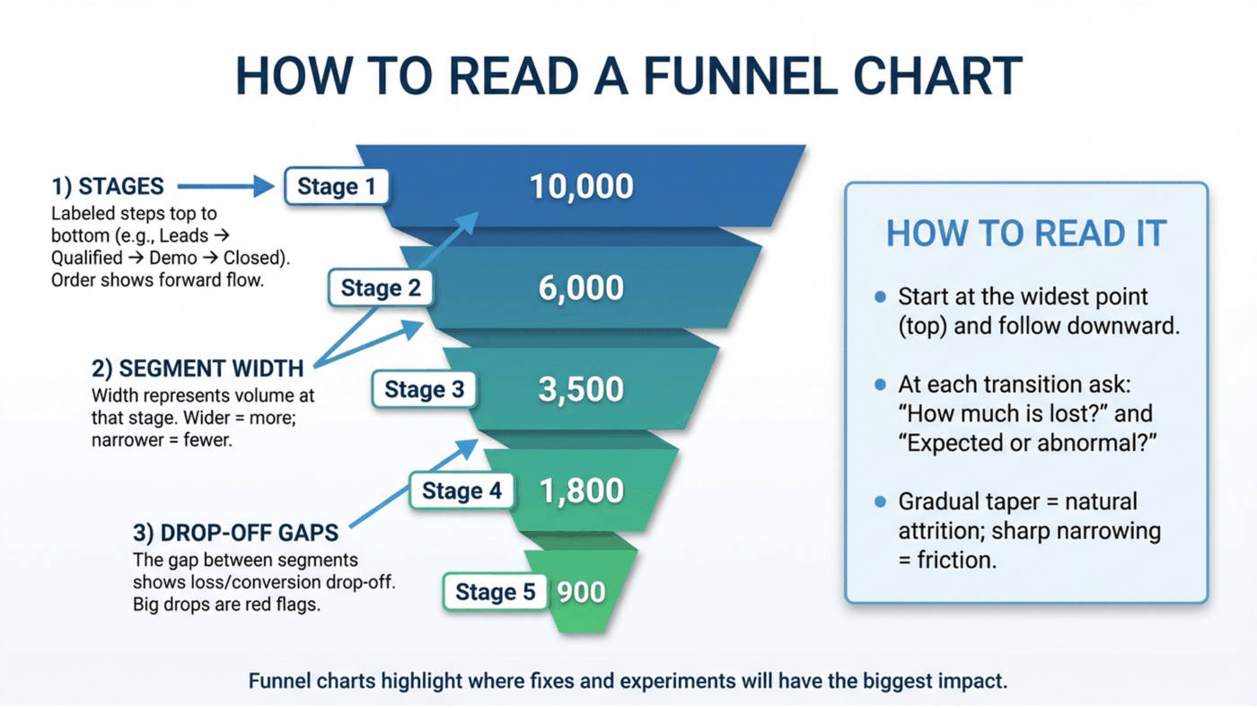
Here’s the basic anatomy of a funnel chart and what each part really tells you:
These are the labeled steps in your process, arranged from top to bottom in the order they occur. In a sales funnel, this might be “Leads → Qualified → Demo → Closed.” In a product funnel, it could be “Signed up → Activated → Retained.” The order matters because funnel charts assume a directional flow. You’re always reading movement forward, not back and forth.
The width of each segment represents the absolute value at that stage. Wider segments mean more volume; narrower ones mean fewer items made it through. This makes funnel charts especially effective for quick, visual comparisons between stages without having to read exact numbers.
The visual difference in width between two adjacent segments is the most important insight in a funnel chart. That gap represents loss: users who didn’t convert, deals that stalled, or tasks that never progressed. Large, sudden reductions act as immediate red flags, showing you exactly where momentum breaks down.
To read a funnel chart correctly, start at the widest point, usually the top, and follow the flow downward one stage at a time. Ask two questions at each transition:
A gradual taper often indicates natural attrition. A sharp narrowing usually signals friction, misalignment, or a broken step in the process that deserves investigation.
When used correctly, funnel charts don’t just show performance. They show where attention, experimentation, or fixes will have the biggest impact.
💡Pro Tip: Funnel charts only work when the data is consistent across stages. Mixing raw counts with percentages, changing time windows between stages, or including stages that don’t apply to the same cohort will distort the visual and lead to false conclusions. A funnel should always track the same population as it moves through the same sequence.
Not all funnel charts communicate information the same way. In fact, choosing the wrong style can either make it harder for your audience to compare values or dilute the core “funnel” story you’re trying to tell.
The key trade-off is simple: Do you want to emphasize the visual narrative of drop-off, or the precision of the numbers themselves?
There are two main funnel chart styles, and each serves a different purpose.
A standard funnel chart uses the classic tapered shape most people recognize. Each stage appears as a trapezoid stacked vertically, widest at the top and progressively narrowing toward the bottom.
This design mirrors the real-world idea of a funnel: many inputs enter at the top, and fewer outputs make it through each successive stage. The visual immediately communicates loss, filtering, and conversion without requiring explanation.
Standard funnel charts are best when:
This makes them especially effective for sales pipelines, marketing funnels, and executive dashboards, where the goal is fast comprehension rather than detailed analysis. The metaphor does the work for you.
The trade-off is precision. Because viewers are comparing areas, not straight lines, it’s harder to accurately judge small differences between stages.
A bar-style funnel chart removes the tapered shape entirely. Instead, each stage is shown as a horizontal bar, ordered from largest to smallest. The length of each bar represents the value at that stage.
While this format loses the literal funnel metaphor, it gains analytical clarity. People are much better at comparing lengths than areas, which makes it easier to see exact differences between stages.
Bar-style funnel charts are best when:
This style works well for performance reviews, diagnostics, and optimization work, where the question isn’t “Where do we lose people?” but “How big is the loss, exactly, and how does it compare across stages?”
To sum it up, standard funnels prioritize intuition. Bar-style funnels prioritize accuracy. The right choice depends on whether your audience needs a story they can absorb instantly or numbers they can analyze closely.
📮 ClickUp Insight: The average professional spends 30+ minutes a day searching for work-related information—that’s over 120 hours a year lost to digging through emails, Slack threads, and scattered files.
An intelligent AI assistant embedded in your workspace can change that. Enter ClickUp Brain.
It delivers instant insights and answers by surfacing the right documents, conversations, and task details in seconds—so you can stop searching and start working.
💫 Real Results: Teams like QubicaAMF reclaimed 5+ hours weekly using ClickUp—that’s over 250 hours annually per person—by eliminating outdated knowledge management processes. Imagine what your team could create with an extra week of productivity every quarter!
So we’ve already established that seeing data in funnel charts can make a concept click faster.
If you’re struggling to imagine how it applies to your work, you’re missing out on a powerful tool for spotting inefficiencies. Without concrete examples, the idea remains abstract and unusable.
Here’s how different teams use them:
A sales team’s process is often a messy spreadsheet of deals, making it hard to see where things are stalling. A sales funnel dashboard transforms that data into a clear story.
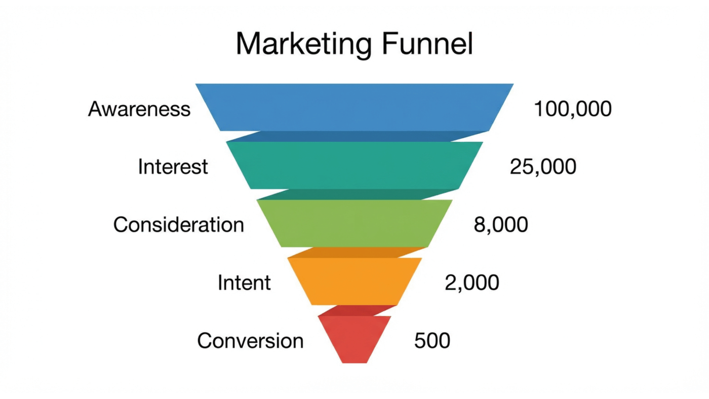
Imagine a funnel with these stages: Lead → Qualified → Proposal Sent → Negotiation → Closed Won.
If the chart shows a huge drop between “Qualified” and “Proposal Sent,” the sales manager instantly knows there’s a bottleneck.
According to Salesforce’s lead-conversion benchmarks, only 20-25% of leads advance past qualification, while 80-90% of opportunities in negotiation actually close.
It tells them to investigate why proposals aren’t going out, rather than just shouting “get more leads!”
Marketers are often buried in analytics, looking at final conversion numbers without knowing where in the journey they’re losing people. A marketing funnel graphic pinpoints the leaks.
Consider these stages: Website Visitors → Landing Page Views → Form Submissions → Customers.
A steep drop-off between views and submissions is a major red flag.
It tells the marketing team that the landing page itself is the problem—maybe the copy is unclear, or the form is too long—saving them from wasting money driving more traffic to a broken page.
⚡️ Template Archive: Free Marketing Campaign Templates
Project managers struggle when tasks pile up, but it’s not always clear why. A project management workflow funnel helps diagnose where work gets stuck.
With stages like Tasks Created → In Progress → In Review → Completed, a manager might see that the “In Review” stage is massively bloated. T
his shows that the review process itself is the bottleneck, not the team’s productivity. It’s a clear signal that the review workflow needs more resources or clearer guidelines—a direct outcome of effective process analysis—to get projects flowing smoothly again.
🎥 Watch this step-by-step tutorial to see how to create a project management dashboard in ClickUp that can display your funnel data and other key metrics in real time.
A funnel chart should tell a story at a glance.
When it’s cluttered or inconsistent, the story breaks—and so does the insight.
Use the best practices below to ensure your funnel charts stay clear, trustworthy, and actionable. ✨
| Best practice | What to do | Why it matters | What goes wrong if you don’t |
|---|---|---|---|
| Limit stages to what matters | Include only the major steps where a real decision, conversion, or handoff occurs. Remove micro-steps that don’t materially change outcomes. | Fewer stages make the funnel easier to scan and help viewers focus on meaningful drop-offs instead of noise. | The chart becomes tall and cluttered, hiding the true bottlenecks behind insignificant steps. |
| Order stages logically | Arrange stages sequentially from first interaction to final outcome, following the real process flow. | Logical ordering reinforces the funnel metaphor and makes drop-offs easy to interpret. | A misordered funnel looks visually “wrong” and confuses viewers about where losses actually occur. |
| Use consistent data units | Use the same unit across all stages (e.g., raw counts, percentages, or revenue). | Consistent units ensure segment widths accurately reflect relative size and loss. | Mixing units distorts proportions and creates misleading visuals that can lead to bad decisions. |
| Label stages clearly | Display both the stage name and its value directly on or next to each segment. | Clear labels remove cognitive load and let viewers understand the chart without extra explanation. | Audiences are forced to guess what each segment represents or hunt for a legend. |
| Add context with benchmarks | Include targets, historical averages, or comparison ranges when possible. | Benchmarks turn observations into insights by showing whether performance is above or below expectations. | Viewers see drop-offs but can’t tell if they’re normal, concerning, or exceptional. |
| Choose colors intentionally | Use a single color gradient or a restrained, consistent palette across stages. | Thoughtful color choices guide the eye and reinforce progression through the funnel. | A rainbow palette distracts from the data and shifts attention away from the actual story. |
📖 Read More: How to Make a Decision Effectively and Quickly
Funnel charts can unintentionally mislead teams into making questionable decisions or even into analysis paralysis.
Acting on flawed data can be worse than having no data at all, causing you to waste resources on the wrong initiatives.
Here are some common mistakes that can undermine your chart’s integrity. 👀
❗️Including too many stages: Cramming every small step into the funnel makes it unreadable. Consolidate minor steps into broader, more meaningful categories
❗️Mixing data types: Never combine percentages with raw numbers in the same funnel. This creates false comparisons and distorts the visual proportions of the stages
❗️Ignoring time frames: A funnel showing “all-time” data is practically useless for action. Segment your data by week, month, or quarter to spot recent trends and timely issues
❗️Forgetting the audience: A funnel for executives should be high-level and simple. A funnel for analysts can afford to be more granular. Tailor the complexity to who will be reading it
❗️Overcomplicating the design: 3D effects, shadows, and other flashy decorations make funnels harder to read, not better. Keep the design flat and simple to let the data speak for itself
❗️Assuming causation: A funnel chart shows what is happening, not why. A drop between stages is a correlation, not a cause. Use it as a starting point for investigation, not a final answer
Most funnel charts fail for a simple reason: they’re built after the work happens.
Data gets exported from half a dozen tools, cleaned up in a spreadsheet, and shaped into a chart that looks polished but already belongs to yesterday.
By the time anyone reviews it, the situation has changed, and the insight has expired.
As a converged AI workspace, ClickUp approaches funnels from the opposite direction. Instead of treating the funnel as a reporting artifact, it treats it as a natural reflection of how work moves.
Every funnel starts with something concrete: a lead, a deal, a request, an opportunity.
In ClickUp, each of those lives as a ClickUp Task. Not a row in a report, but an active object that carries ownership, history, files, comments, and decisions with it. As the task progresses, nothing is re-entered or reconstructed. The context stays attached to the work.
This is the foundation that makes funnel tracking reliable. If the task is real, the funnel is real.
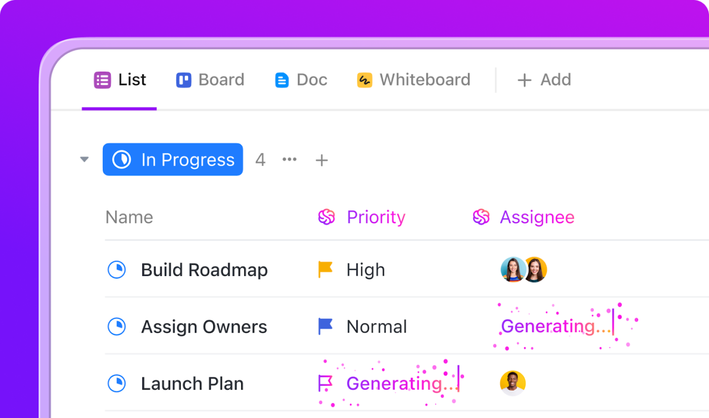
As work advances, tasks move through Custom Statuses that reflect actual stages in your process. Qualification becomes Negotiation. Review becomes Approved. Trial becomes Closed.
Because statuses are ordered and time-aware, ClickUp can tell you not just where work is sitting, but how long it’s been sitting there. That’s where funnels stop being descriptive and start becoming diagnostic.
Instead of asking, “How many deals are here?” You’re asking, “Why do they stall here?”
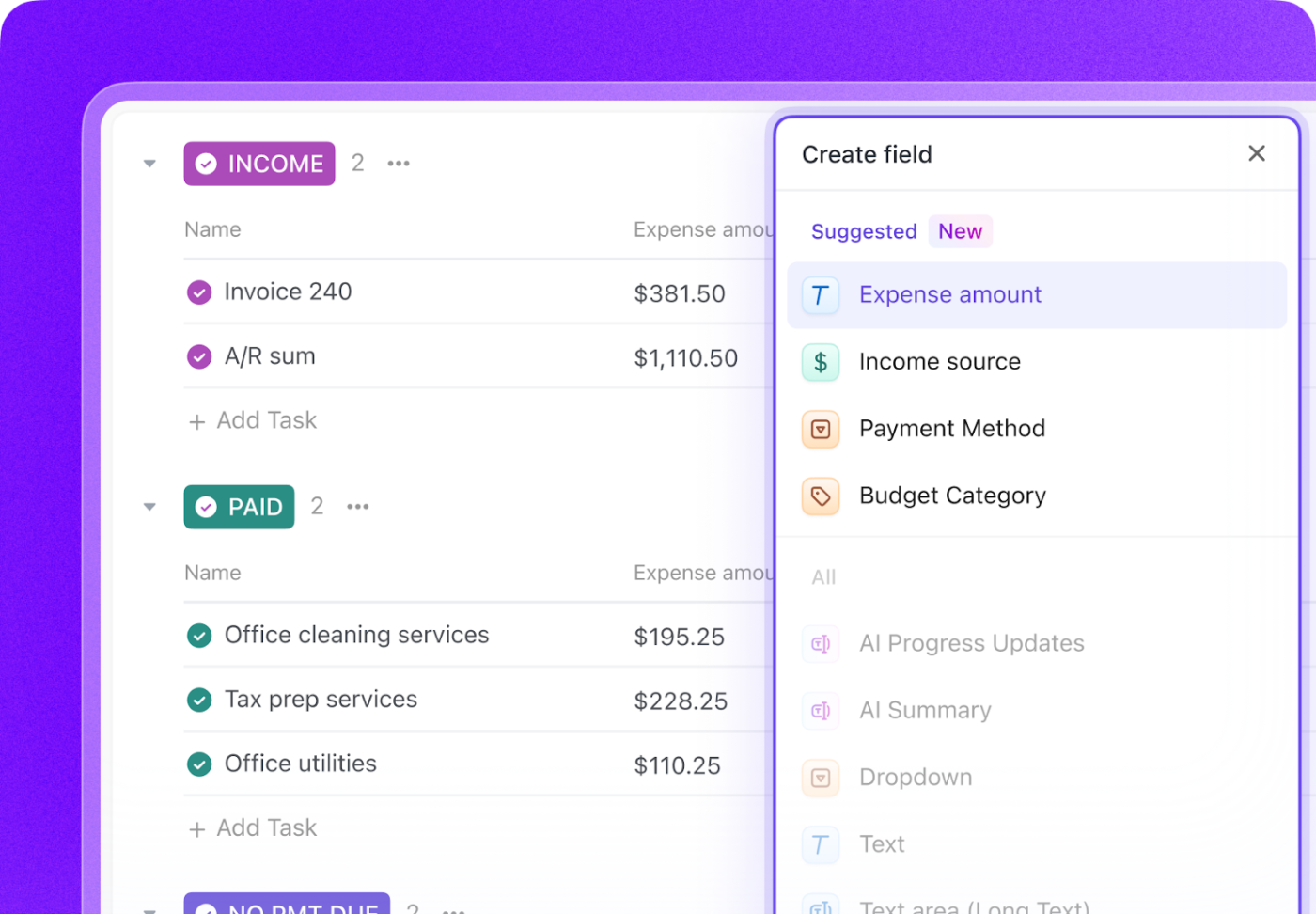
A funnel based on counts alone is shallow. Real decisions require context. Custom Fields in ClickUp let you layer meaning onto each task as it moves:
Because this information lives on the task itself, it stays intact as the task progresses. You don’t lose nuance when something changes stages, and you don’t need separate reports to explain what the numbers mean.
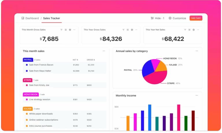
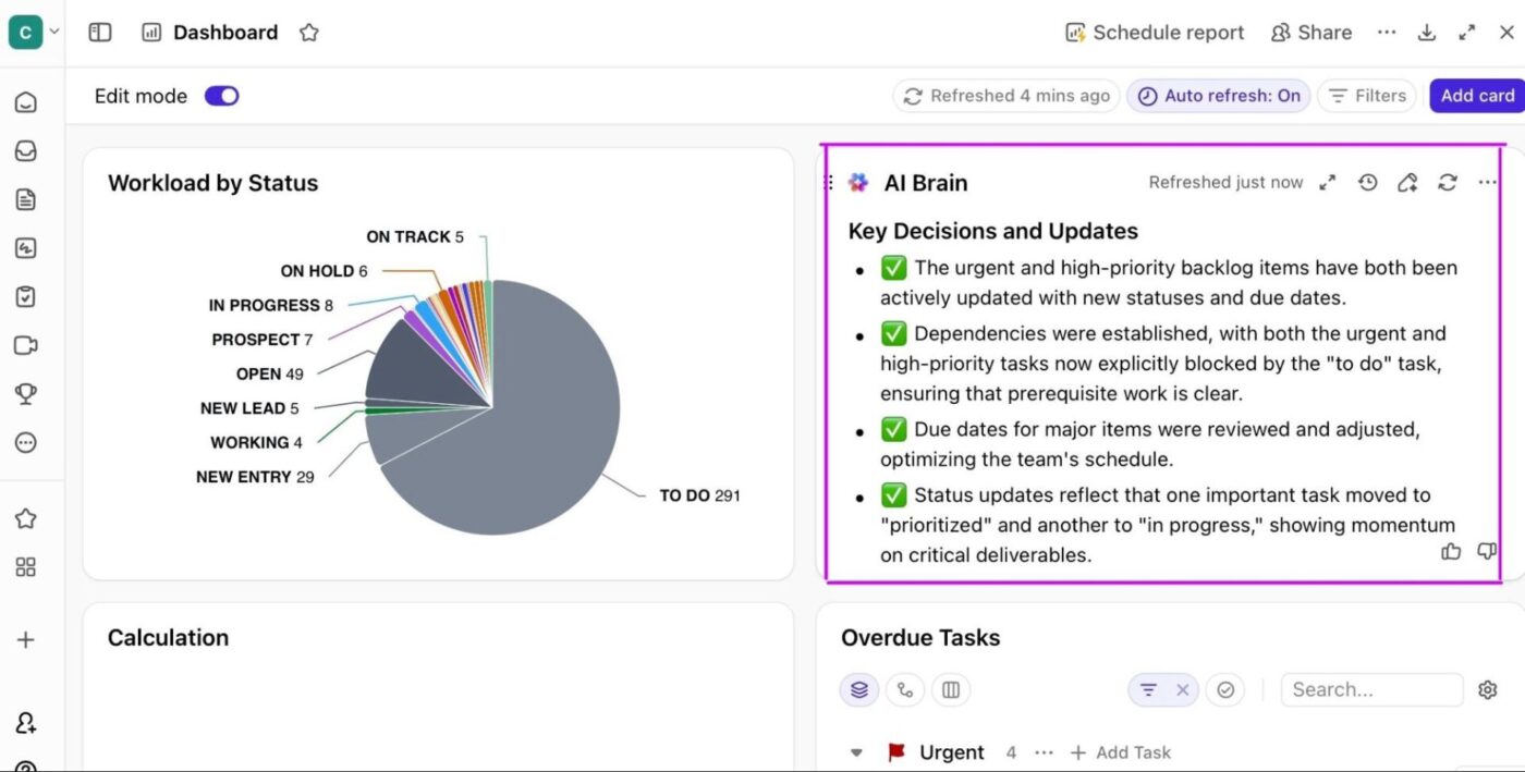
Once work, stages, and context are in place, ClickUp Dashboards simply reveal what’s already true. Instead of exporting data, you’re looking at live funnel behavior:
And because Dashboard charts link back to the underlying tasks, every insight is explorable. You can move from pattern to cause without switching tools or asking for a follow-up report.
The next step is understanding why. Because your funnel data lives inside the workspace, you can ask ClickUp Brain direct questions like:
Brain reads your live task data, statuses, and fields to surface patterns instantly, without creating a new report or exporting anything.
Visibility alone doesn’t move work forward. Knowing where your funnel is leaking only matters if something happens as a result.
This is where Automations and AI-powered agents close the loop between insight and action.
At a basic level, ClickUp Automations handle the mechanical response. When a task crosses a defined threshold, such as sitting in one stage too long, changing priority, or entering a critical status, ClickUp can react immediately.
Follow-ups get assigned, stakeholders are notified, and escalation paths trigger without anyone needing to watch a dashboard or run a report. The system responds the moment risk appears, not days later in a review meeting.
On top of that, Super Agents add interpretation, not just execution. Instead of scanning charts and guessing what matters, teams can ask direct questions like what’s stalling, what changed since last week, or which deals need attention first. The agent reads live task data, status history, and field changes to surface patterns that aren’t obvious at a glance.
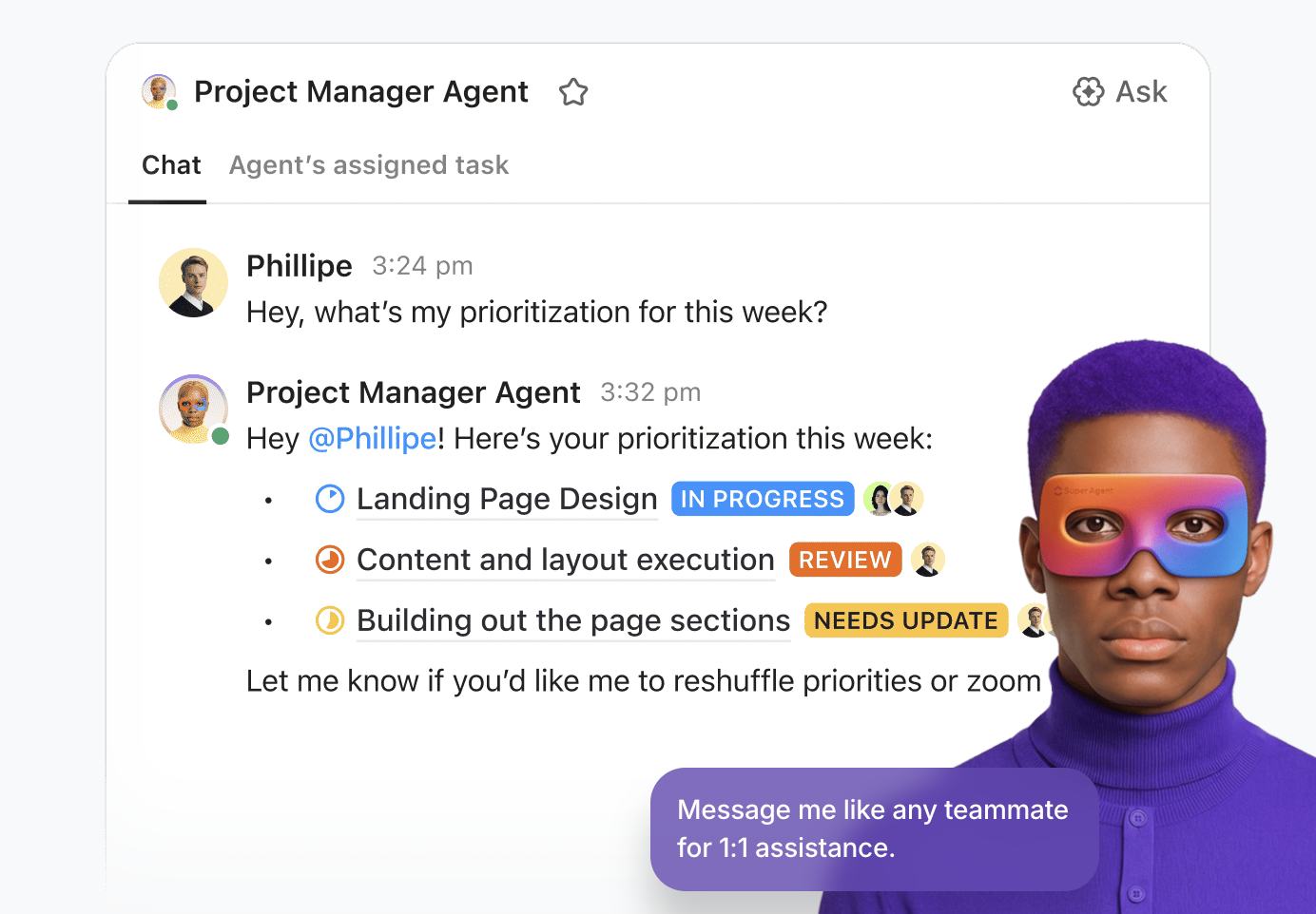
Together, automation handles the predictable responses, while agents help teams decide where to intervene. The result is a funnel that doesn’t just show performance after the fact, but actively pushes work forward while there’s still time to change the outcome.
The result: Suddenly, your funnel isn’t something you check at the end of the month. It’s something you operate inside of every day. The work moves. The data updates. The insights surface. And the next step is already waiting.
Funnel charts aren’t the right tool for every visualization. But when you try to visualize a complex, branching user journey with a simple, linear funnel, it just doesn’t work. Forcing your data into the wrong chart type is confusing and leads to bad conclusions.
A funnel chart isn’t always the right tool for the job. Knowing the alternatives helps you tell the right story with your data.
| Visualization type | When it works better than a funnel chart | Why a funnel chart falls short |
|---|---|---|
| Bar charts | Use bar charts when you need to compare values across categories that aren’t sequential, such as performance by channel, region, or campaign. | Funnels imply progression and drop-off. When order or flow doesn’t matter, the funnel metaphor adds unnecessary distortion. |
| Sankey diagrams | Use Sankey diagrams to visualize multi-path journeys with branches, loops, or parallel flows, such as users taking different onboarding paths. | Funnel charts assume a single, linear path. They can’t represent divergence or convergence without oversimplifying reality. |
| Pie charts | Use pie charts to show the composition of a single whole, like lead sources at the top of a funnel. | Funnels show movement between stages. Pie charts show proportions at one point in time, not progression. |
| Line charts | Use line charts to track how a metric changes over time, such as weekly conversion rates or monthly pipeline volume. | Funnel charts are static snapshots. They don’t show trends, momentum, or seasonality. |
| Pipeline charts (Kanban boards) | Use pipeline charts (Kanban boards) to manage individual items as they move through stages, tracking ownership and next actions. | Kanban visualizes where work is, not aggregate drop-off rates or conversion efficiency between stages. |
When you can’t see where your process is losing momentum, you can’t fix it. Funnel charts make the invisible visible, showing you exactly where things go off the rails.
They empower teams to spot bottlenecks, prioritize fixes, and track progress without getting lost in spreadsheets.
As workflows become more complex, having a clear, real-time view of how work flows helps teams make faster, better decisions.
Ready to build funnel views directly from your project data? Get started for free with ClickUp.
A funnel chart shows flow through sequential stages, while a pyramid chart displays hierarchical levels where size represents proportion, not progression.
Aim for three to seven stages for clarity. Fewer than three doesn’t require a funnel, and more than seven becomes cluttered and difficult to read.
No, funnel charts are designed for single, directional flows. For processes with branches or loops, a Sankey diagram is a much better choice.
Use a centralized platform where all teams log data consistently. ClickUp Dashboards can pull data from multiple Lists and Folders, giving you cross-functional visibility in one place.

© 2026 ClickUp

There’s an easier way. Try a free AI Agent in ClickUp that actually does the work for you—set up in minutes, save hours every week.