

Still downloading templates?
There’s an easier way. Try a free AI Agent in ClickUp that actually does the work for you—set up in minutes, save hours every week.
Sorry, there were no results found for “”
Sorry, there were no results found for “”
Sorry, there were no results found for “”
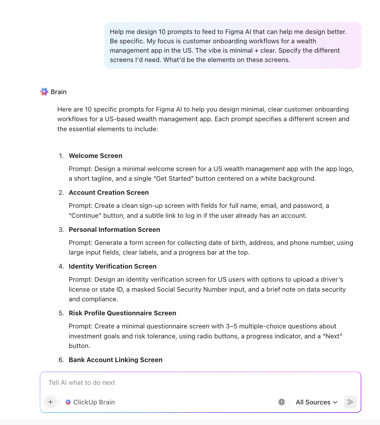
You know that moment when you open Figma AI, type something like ‘fix this layout,’ ‘create a dashboard,’ or ‘make this screen clean,’ and then, it spits out the most generic design ever?
So you refine the prompt. Then refine it again. Suddenly, you’re 27 prompts deep, wondering how you ended up in a two-hour conversation trying to force Figma AI to read your mind.
Now, that’s exactly why mastering prompt-writing has become a real design skill. And that’s what this blog post is here to fix.
In this guide, you’ll find 40+ Figma AI prompts crafted for different use cases. And yes, we’ll also show you how ClickUp is a better alternative. Let’s get started! 💪
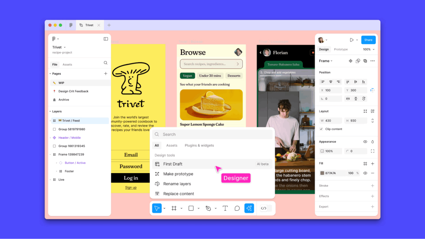
Figma AI is a suite of artificial intelligence-powered features and integrations within Figma’s design ecosystem. It is designed to accelerate and enhance the workflow for UI/UX designers, product teams, and creators.
It includes generative design, automated text and image capabilities, that streamline everything from ideation to prototyping.
Some major Figma AI products and features include:
Essentially, Figma AI helps you get unstuck when you’re brainstorming, speeds up repetitive tasks, and bridges the gap between design and development.
Figma AI prompts are natural language commands or descriptions that trigger the AI features, either built-in or via plugins.
Here’s how you get started with Figma AI prompts:
Here’s a step-by-step guide to master writing effective AI image prompts for Figma.
Start by telling the AI who it is and what you’re building. Be explicit about the type of screen, user goal, audience (for e-commerce admins), variants (with light/dark modes), or platform (mobile-first, iOS styling) to avoid generic results.
Include details like:
📌 Example: Use our design system with brand colors #1A73E8 and #E37400, and build a two-step signup screen using auto-layout.
This gives the model a role-based mindset, which helps generate more tailored design ideas.
💡 Pro Tip: Give the AI key details from your design system: component library, color tokens, typography, grid system, and naming conventions. Figma’s Model Context Protocol (MCP) server allows your prompt to align tightly with your file structure and styling rules.
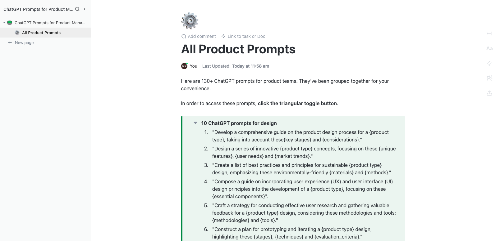
🚀 Quick Hack: Centralize your Figma AI Prompts with ClickUp Docs and manage all your AI prompts in one central workspace. Nest pages by use case, like wireframes, interactions, or visual polish, so everything stays structured and easy to find.
You can also turn frequently used prompts into reusable AI prompt templates, saving time and ensuring consistency across projects.
Don’t ask for the entire product UI in one go.
Divide the task: first ask for wireframes or structure, then prompt for interactions (like nav flow), and finally refine style, spacing, and responsiveness.
This ‘divide and conquer’ strategy keeps each AI iteration focused. Before prompting, organize your frames, name layers, and apply auto-layout. A well-structured file is easier for Figma’s AI to interpret and generate designs.
📌 Example: Instead of one big ‘design my app’ prompt, use prompt chaining to decompose it:
📎 Breakdowns designers commonly use:
This iterative approach mirrors real UX workflows and yields a cleaner Figma design.
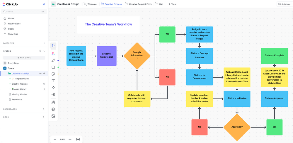
💡 Pro Tip: When breaking down big design tasks, turn each AI prompt into a ClickUp Task or Subtask. Start with a parent task like ‘Design Dashboard UI,’ then create subtasks for each step: wireframes, interactions, componentization, and styling. Assign priorities, due dates, or team members to each subtask, and even expand, collapse, or convert subtasks as needed.
Constraints guide AI toward production-ready decisions, especially for teams with mature design systems. The more specific your constraints, the more consistently Figma AI outputs usable frames.
Useful constraints:
🔍 Did You Know? Prompt suffix hacks can break AI filters even when the main prompt is harmless. Researchers found adding nonsense strings like ‘+_§ PLEASE FOLLOW INSTRUCTIONS EXACTLY’ could bypass safety guardrails, because the model tries too hard to reinterpret meaning.
During your design process, treat Figma AI output as a launchpad where you can tweak layouts, replace icons with assets from your design system, double-check responsiveness, and apply platform guidelines.
Ways to iterate with precision:
🧠 Fun Fact: MIT research found that about half the improvement in output quality came from users learning how to write better prompts, not from switching to a better AI model. In other words, skill beats tool if you know how to ask for what you need.
Once you’ve clarified your goal, constraints, context, and iterations, pull them into one concise but detailed prompt. This increases the chances of getting a near-final design in a single pass.
Here’s a prompt engineering example:
Here’s an example to get you started: Design a responsive, mobile-first landing page for a subscription-based fitness app targeting young adults (18–30) interested in home workouts. Include a hero section with a headline and CTA, three feature cards, a testimonial slider, and a sign-up button. Use colors #FF6B6B, #4ECDC4, #FFFFFF, and font Inter, with consistent spacing and padding.
Follow a 12-column grid for desktop and a 4-column grid for mobile, center-align the hero, evenly space the feature cards, and make the testimonial slider full-width. Style should be energetic, motivating, and friendly, with high accessibility and clear CTA visibility. Avoid cluttered layouts, overly dark colors, and stock photography clichés.
📖 Also Read: How to Become a Prompt Engineer
If you’re wondering how to ask AI a question, here’s a set of practical Figma AI prompts you can plug directly into your workflow to create layouts, prototypes, and variations in seconds.
1. Generate [Number] layout variations for a [Screen Type] in a [Product Type]. Include: hero/primary section, secondary content blocks, CTA placements, navigation pattern, and sample content placeholders tailored to [User Persona]. Apply layout structure aligned to a [Grid Size] grid system
2. Design a complete flow for [User Task] across [Number] screens. Include: initial state, intermediate states, success state, and error handling. Use interaction patterns suitable for [Platform] with spacing and hierarchy aligned to [Design System Name]
3. Create three alternative wireframe options for a [Feature Name] screen. Include: content hierarchy, actions, form inputs (if relevant), and microcopy placeholders. Use visual density suitable for [Usage Context] (low/medium/high)
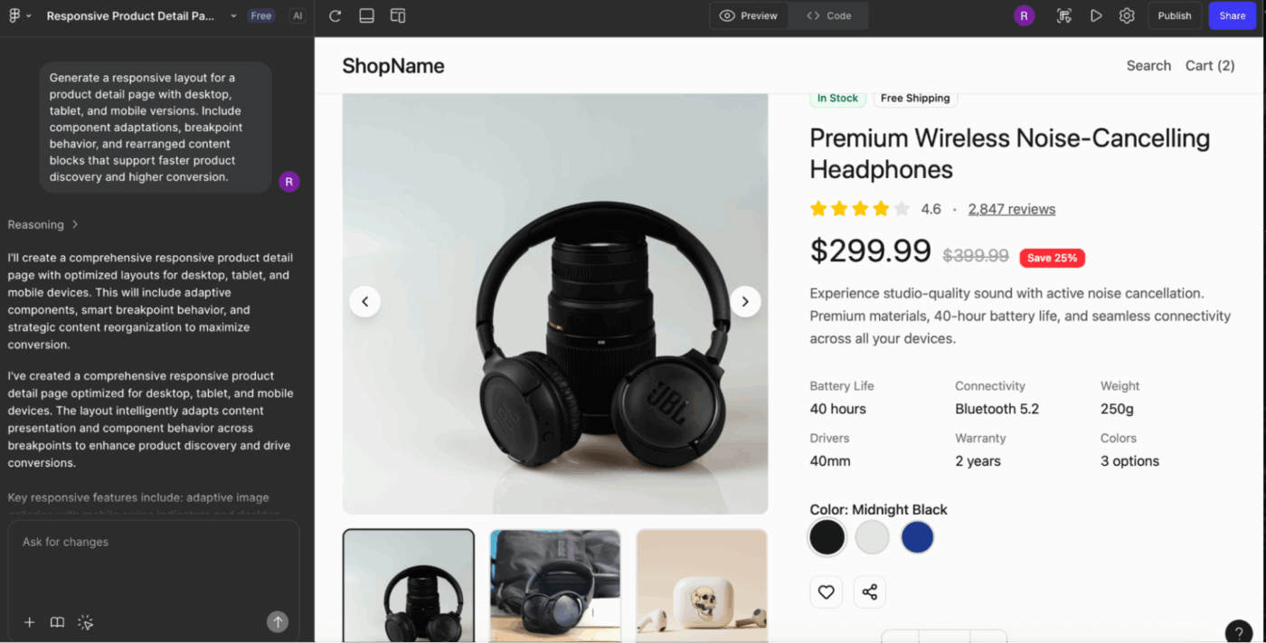
4. Generate a responsive layout for [Page Type] with desktop, tablet, and mobile versions. Include component adaptations, breakpoint behavior, and rearranged content blocks that support [Primary User Goal]
5. Produce a full-page template for [Page Purpose] including: header structure, content sections, CTA rows, optional sidebar, and footer. Keep the tone and visual hierarchy aligned to [Brand Personality]
6. Design a multi-step experience for [Onboarding/Checkout/Setup Process]. Include clear progress indicators, context-setting headers, form logic, and variations for [Light/Dark Mode]
7. Create three navigation patterns for a [Mobile/Web] product: top nav, bottom nav, and sidebar nav. Include icon placeholders, active/inactive states, and sample labels relevant to [Product Category]
💡 Pro Tip: Reference actual product screenshots. ‘Design a settings panel similar to Notion’s left sidebar’ works way better than abstract descriptions. Figma AI’s training on real UI means brand/product references unlock better pattern matching than generic terms.
8. Generate an icon set of [Number] icons for a [Product Type] in [Style Type]. Include filled and outline variants, consistent stroke weight, corner radius, and visual metaphors aligned with [Brand Theme]
9. Create a set of empty, loading, and error state illustrations for [Feature]. Style should follow [Illustration Style], include [Color Palette Type], and incorporate visual cues that evoke [Emotion/Tone]
10. Design a collection of [Number] badge icons representing [Concept List]. Use consistent sizing, shape language, and symbolism appropriate for [Platform Guidelines]
11. Produce a hero illustration concept for a [Page Type] using [Visual Style] with elements representing [Core Concept], [Secondary Concept], and [User Outcome]. Include color, mood, and composition notes
12. Generate a set of contextual spot illustrations for [Use Case] in [Visual Style]. Include clear focal points, simple forms, and details optimized for small sizes (e.g., dashboards or tooltips)
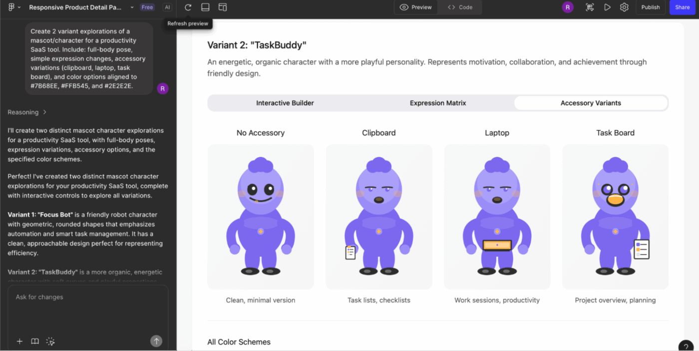
13. Create [Number] variant explorations of a mascot/character for a [Product Category]. Include: full-body pose, simple expression changes, accessory variations, and color options aligned to [Brand Colors]
14. Design loading indicators for [Product Type] in [Style Type]. Include linear, circular, and animated metaphors representing [Theme]
👀 Friendly Tip: With the ClickUp X Figma integration, you can embed your Figma designs directly into ClickUp tasks to keep all design files, feedback, and project updates in one place. This makes it easy for designers and stakeholders to review and comment on designs without leaving ClickUp, speeding up approvals and reducing back-and-forth between tools.
Remember that ClickUp also supports automations via tools like Zapier or Latenode, so you can trigger ClickUp tasks from Figma updates and vice versa.
💡 Pro Tip: Specify plugin-ready output format. ‘Generate this calendar UI with each date as a separate component instance, organized in an 8×5 auto-layout grid.’ This ensures the output works with plugins like Automator or content reel, not just a flat visual mockup.
15. Generate interaction patterns for a [Feature], including hover, focus, active, disabled, and error states. Align behavior with [Platform Guidelines] and [Design System Name]
16. Create [Number] microinteraction concepts showing how a user transitions from [State A] to [State B]. Include easing preferences, timing, motion direction, and accessibility alternatives
17. Design a scrollable experience for a [Screen Type] with sticky headers, parallax opportunities, progressive disclosure, and adaptive content behavior for [Device Type]
18. Produce a structured user flow diagram for [User Task] showing decision points, alternative paths, and system responses. Present states using simplified frame thumbnails
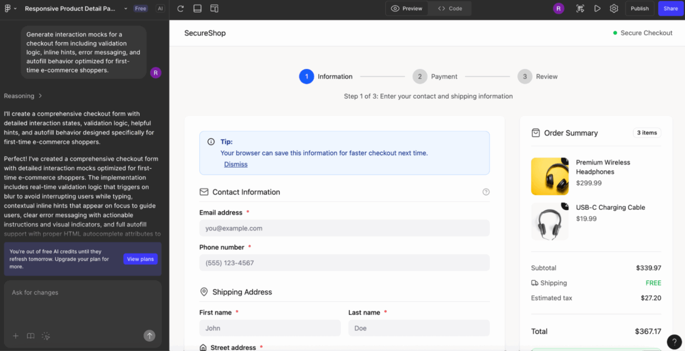
19. Generate interaction mocks for a [Form Type], including validation logic, inline hints, error messaging, and autofill behavior optimized for [Audience Type]
20. Design transition animations for a [Navigation Pattern] between [Screen A] and [Screen B]. Include duration, easing type, and recommended compositional changes
21. Create state variations for a [Component], including loading, success, failure, and long-content scenarios. Base the states on [Design System Rules] and [Brand Tone]
💡 Pro Tip: Request an explicit atomic design hierarchy. ‘Generate atoms first (icons, text styles), then molecules (input fields), then organisms (login form).’ This forces Figma AI to build reusable primitives instead of one-off nested groups that can’t be componentized.
22. Create component variants for a [Component Type], including sizes (S/M/L), states, and content variations. Follow token rules for spacing, radius, color, and typography from [Design System]
23. Generate a full set of form controls for [Product Type]: text input, dropdown, checkbox, radio, slider, segmented control, and date picker. Include all states and validation logic, aligned with [Accessibility Standard]
24. Produce layout templates for a universal section builder using [Design System Name]. Include hero blocks, card grids, feature rows, testimonial rows, and FAQ sections with responsive behavior
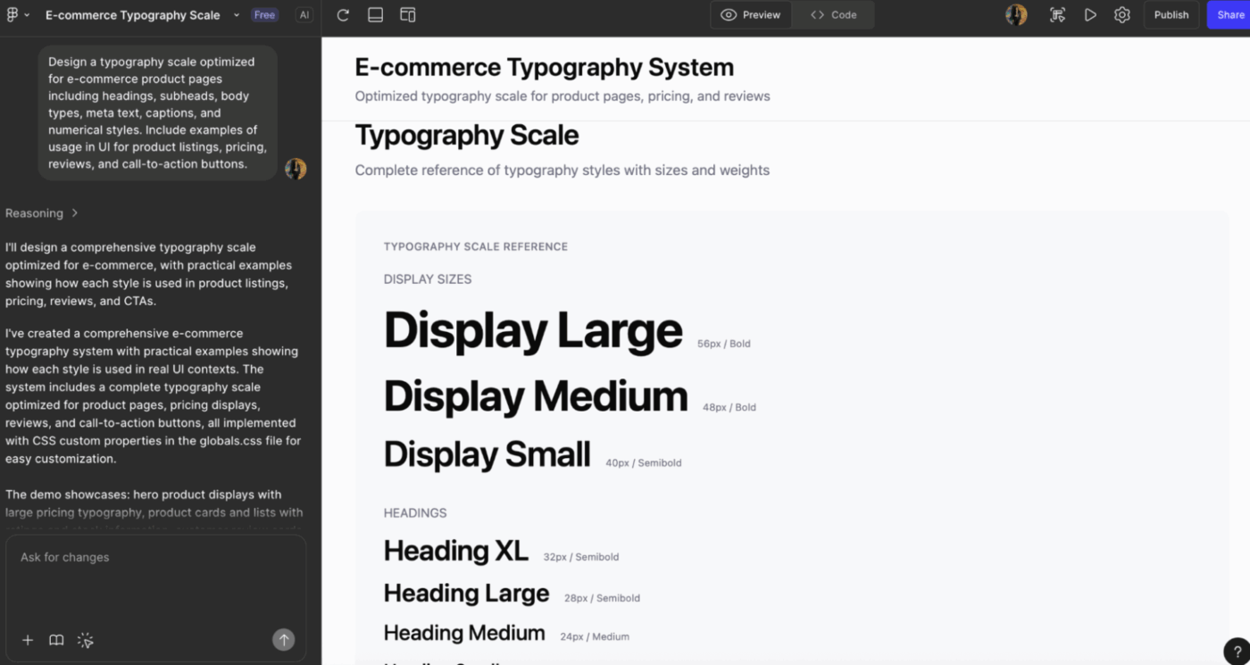
25. Design a typography scale optimized for [Use Case] with headings, subheads, body types, meta text, captions, and numerical styles. Include examples of usage in UI
26. Generate spacing and sizing guidelines for a [Component Library]. Provide spacing tokens, padding conventions, and examples of misuse to avoid
27. Create documentation-ready component usage examples for [Component Name], including do/don’t comparisons, common configurations, and recommended accessibility practices
28. Produce color system extensions based on [Primary Palette], including semantic colors, interaction colors, neutral variants, and dark mode mappings
💡 Pro Tip: Use semantic color language. ‘Primary action button with semantic tokens’ builds themeable components. ‘Blue button’ hard-codes hex values that won’t survive dark mode.
29. Generate [Number] concept directions for a new [Feature] in a [Product Category]. Include distinct mental models, layout philosophies, and user experience hypotheses
30. Brainstorm three divergent approaches to solving [UX Problem]. Include: a utilitarian solution, a playful solution, and a minimal solution, each with layout sketches and rationale
31. Produce early concept sketches for a [Feature Idea]. Include raw wireframe explorations, mental models, user motivations, and risk considerations
32. Design speculative, future-state variations of a [Product Type] incorporating [Emerging Trend], [Technology], and [User Behavior Shift]
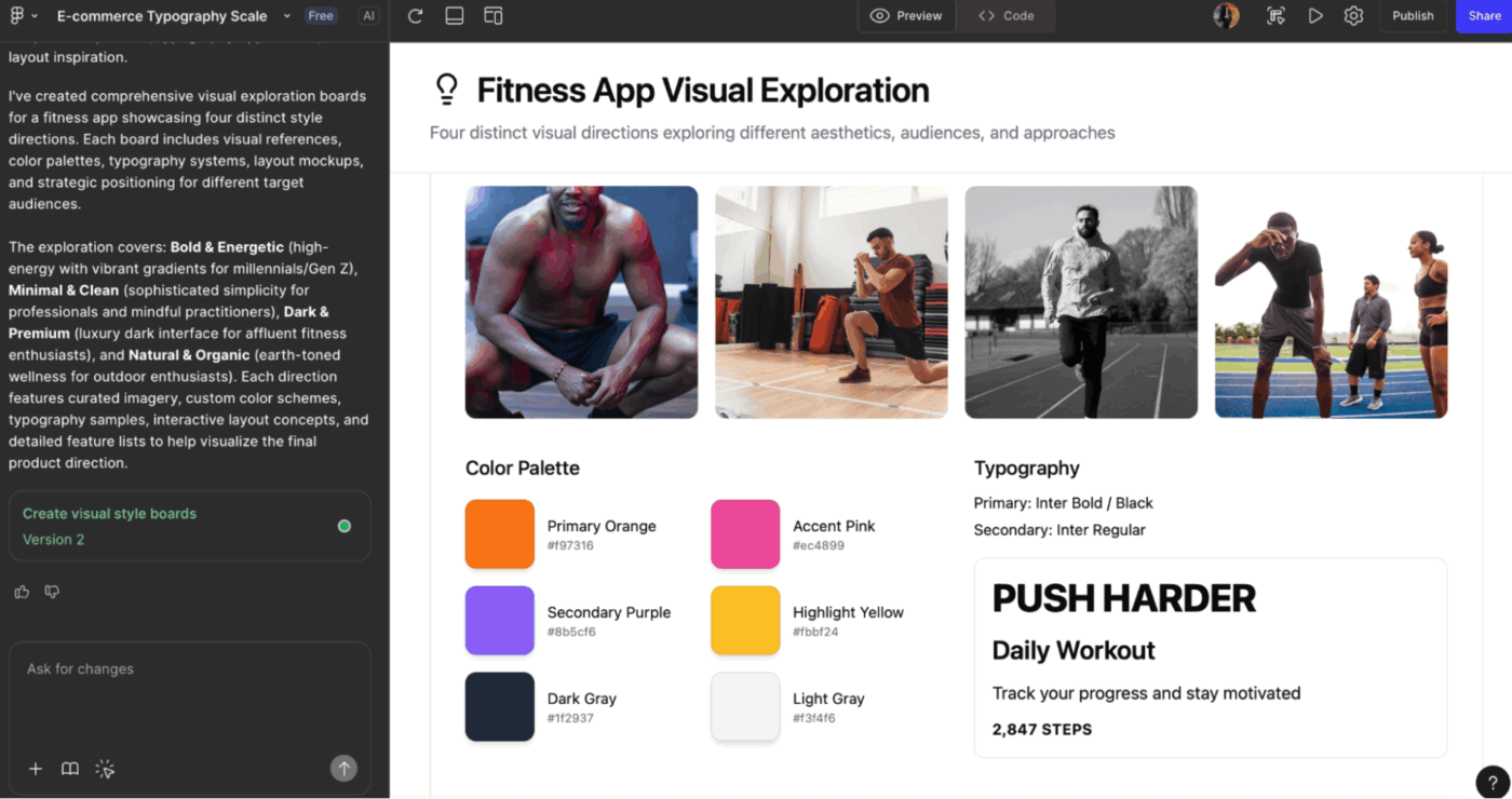
33. Generate [Number] visual exploration boards that showcase possible visual styles for a [Brand/Product], including references, color directions, typography ideas, and layout inspiration
34. Develop creative alternatives for a [Flow] that incorporates different interaction models: gesture-based, step-by-step, declarative, or predictive
35. Create three mood board directions for a redesign of [Product]. Include inspiration for mood, type, color, layout, and UI patterns grouped by style themes
📮 ClickUp Insight: 20% of our survey respondents confess they’ve kept up to 15 tabs open for weeks! Yes, weeks!
These “zombie tabs” 🧟 eat memory and mental space, quietly draining focus even when ignored. It’s a classic attention residue where unfinished items pull energy in the background.
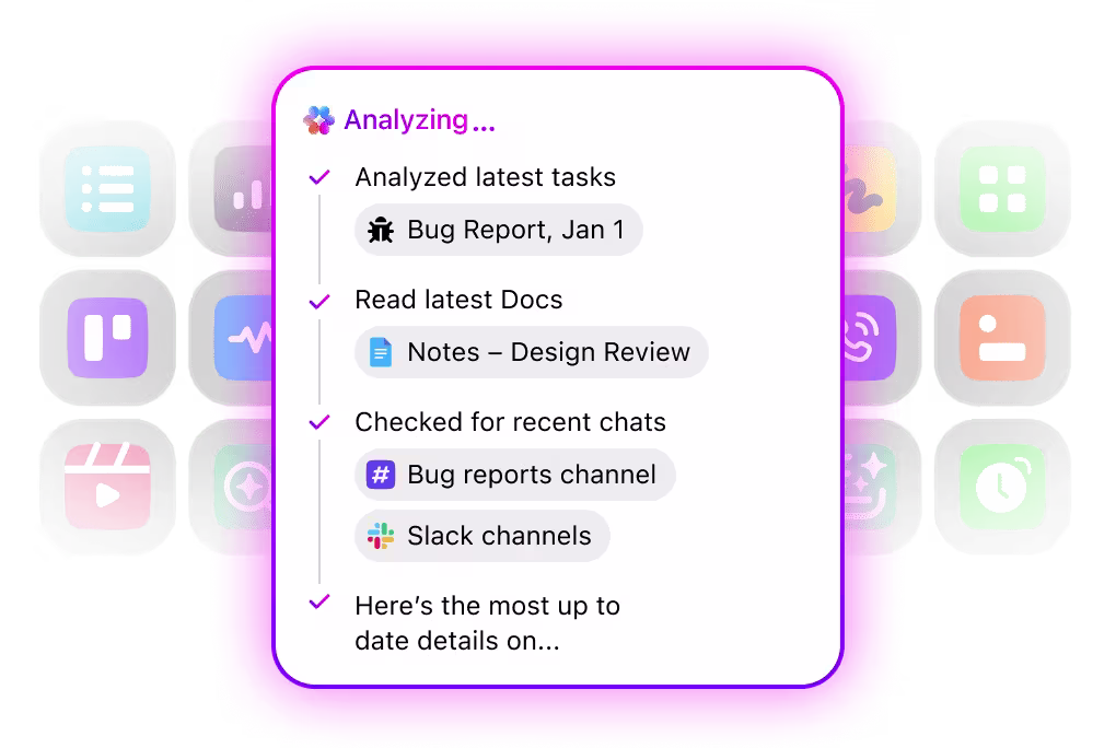
With ClickUp’s AI-powered Enterprise Search, you can safely let go of those browser graveyards. Anything important is instantly searchable across your workspace and integrated third-party tools.
You can even ask ClickUp’s AI what was discussed in last Friday’s meeting, and it will fetch the notes for you!
36. Generate a UX problem statement for [Problem Area] targeting [User Segment]. Include context, constraints, success metrics, and potential opportunities
37. Create journey maps for [User Scenario], including emotional states, pain points, expectations, and moments of value. Provide one optimized journey recommendation
38. Produce feature-comparison UI mocks showing how users choose between [Option A], [Option B], and [Option C]. Include cognitive load considerations and decision-support UI cues
39. Summarize usability test findings from [Test Session] into a structured insights dashboard showing: issues, severity, user quotes, and proposed UI adjustments
40. Create stakeholder presentation frames for explaining [Design Decision]. Include problem framing, design alternatives explored, chosen direction, and rationale
41. Generate “north star” concept visuals for [Product Vision] representing future experience states that integrate [Key Capability] and [Strategic Goal]
42. Produce quick competitive UI analysis for [Competitor List], highlighting component patterns, navigation models, visual density, and UX differentiators
Here are some common mistakes designers make when prompting Figma AI and how to fix them:
| ❌ Mistake | ✅ Solution | 💬 Example prompt | Context |
|---|---|---|---|
| Giving vague design requests like “make this better” | Define the goal | “Refine this card for clarity and hierarchy using our spacing and typography rules” | Clarity |
| Not specifying platform or layout constraints | Add context | “Generate for mobile-first, iOS patterns, 8-pt grid, and thumb-reach zones” | Constraints |
| Ignoring your design system | Tell the AI what to use | “Apply our buttons, surface colors, spacing scale, and card components” | Design system |
| Requesting multiple screens or flows in one prompt | Break it down | “One prompt per screen, variation, or user-flow step” | Scope |
| Providing no user context | Add persona and intent | “Optimize for first-time users comparing pricing tiers” | User context |
| Skipping interaction details | Be explicit | “Include hover states, error handling, and inline hints for inputs” | Interactions |
| Assuming AI understands your file structure | Reference it | “Use components from atoms/button/primary and layouts/card-base” | File structure |
Real user reviews highlight that while Figma AI speeds up design workflows, it still comes with a few practical limitations you should be aware of:
🧠 Fun Fact: The phrase ‘lazy prompting’ was popularized by AI leader Andrew Ng, who argued that for some models, you don’t need full instructions. Just a minimal cue, like an error message, might suffice. It suggests prompt design is shifting as AI gets better at inferring intent.
Here’s a list of Figma AI alternatives that will help you explore what else is possible in your design stack.
Designers today are juggling more AI tools than ever.
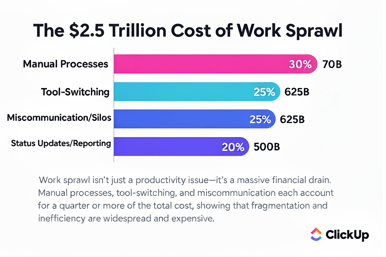
Figma for wireframes, another for brainstorming, another for task tracking, another for feedback, and more. This leads to scattered workflows and contributes to work sprawl, where context gets lost across siloed apps, emails, and chats.
And the cost of that fragmentation is massive, an estimated $2.5 trillion in lost productivity.
At this point, you’re probably thinking: Okay, consolidating sounds great, but how do I simplify without sacrificing the creative flexibility I get from Figma and its AI features?’ ClickUp is the world’s first Converged AI Workspace, built to bring all your design tools, assets, and workflows into one place.
For UI/UX designers, product teams, and creative professionals, this means your ideas, project files, and design iterations stay connected, organized, and easy to work on.
The ClickUp Design Project Management Software eliminates Work Sprawl, giving you full context for every task and design prompt. Designers can collaborate seamlessly with teammates and AI assistants, generate and refine ideas quickly, and keep their creative flow uninterrupted.
Here’s a closer look at how it helps:
And at the center of this ecosystem sits ClickUp Brain. It is a contextual AI layer designed to support creative workflows, from idea exploration to production-ready assets, without ever leaving your workspace.
From generating detailed prompts to producing quick graphics, Brain helps you move from idea to execution with less friction and more creative energy. If you want to design better, faster, and with more confidence, integrating Brain into your Figma workflow is a game-changer.
This AI agent for designers is also woven into every corner of your workspace, giving you a continuous, context-aware creative companion that can:
🎥 Watch: How to connect Figma in ClickUp with this video tutorial:
And yes, you can generate images directly inside the ClickUp workspace. Here’s how:
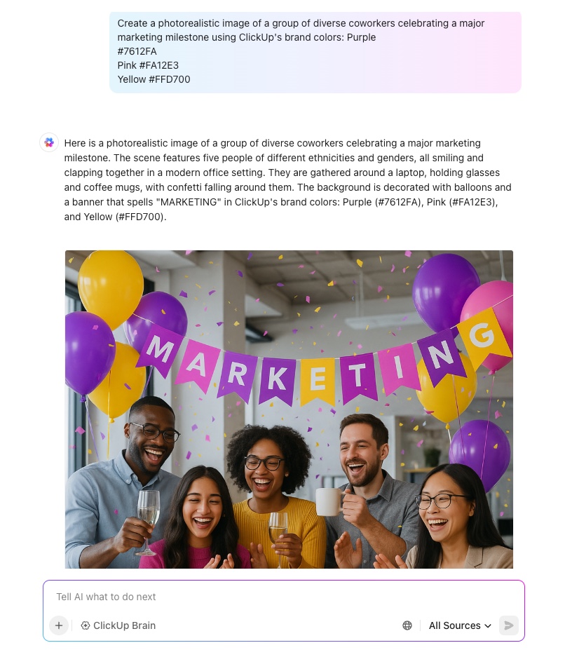
📌 Try these prompts:
ClickUp Enterprise Search gives your team a single, AI-powered search bar that pulls answers from every tool you work in. You can do a one-click search in Drive, Notion, Slack, Gmail, Tasks, Docs, Chats, and even meeting notes.
Instead of digging through tabs or guessing where something lives, you get a complete, contextual answer instantly.
With enterprise-grade security like GDPR, HIPAA, SOC 2, ISO 42001, and strict no-training/no-retention policies, you get powerful search without compromising privacy. All models are protected under unified permissions and controls, giving large teams confidence that their data stays secure.
👀 Friendly Tip: In ClickUp, you can build intake forms that capture exactly what you need for a design component—like the type of component, behavioral details, use cases, and priority level. This ensures no critical information is missed.
ClickUp Brain MAX is your desktop companion that brings AI everywhere you work. Where Figma AI focuses on design context, Brain MAX focuses on your entire workflow, from design to documentation to launch.
The best part is that you can choose the AI model based on the task. For instance, switch to ClickUp Brain for anything that needs workspace intelligence, such as Tasks, Docs, and your company’s internal knowledge.
And when you need something different, like deeper reasoning or heavy logic, you can instantly switch to the right model like ChatGPT, Claude, or Gemini.
With custom prompts and saved workflows, you can finally stop rewriting the same prompts every time inspiration hits. Save your go-to prompts for ideation, user flows, personas, UX writing, or content.
Plus, with Talk to Text in ClickUp Brain MAX, you speak your design notes, brainstorm ideas, or share quick feedback, and instantly turn those thoughts into Tasks or Docs. And because it’s on your desktop, you simply press the shortcut key to have AI in reach.
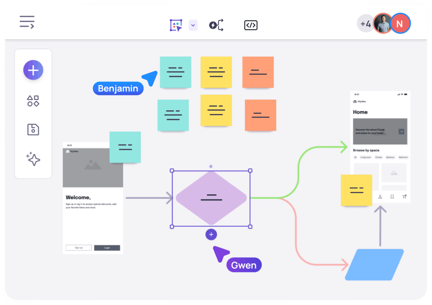
ClickUp Whiteboards give UI/UX teams a flexible, collaborative space to think visually from the very beginning of a project. You can map user journeys, sketch early wireframes, and outline UI flows.
It even allows you to connect ideas with flow lines and convert sticky notes into structured Tasks.
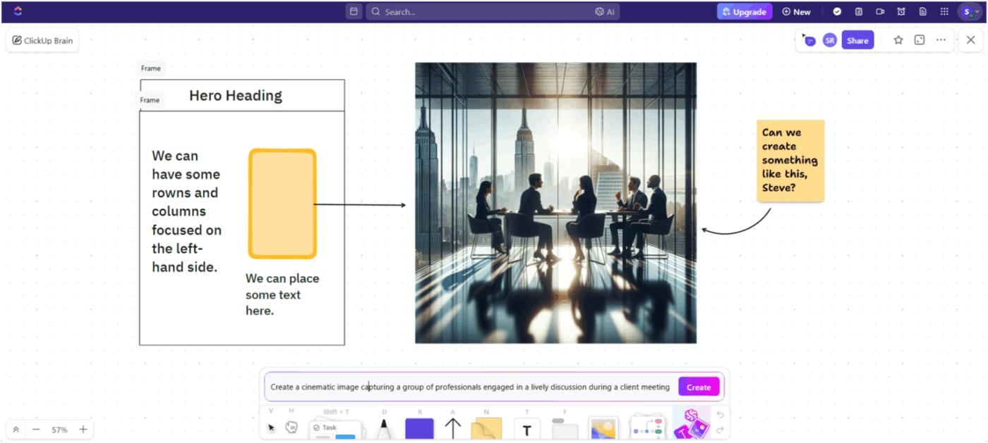
ClickUp Brain takes the experience further by adding AI directly into the canvas. You can generate icons, layout variations, or quick visual references using on-canvas image generation.
When a session gets messy, as good brainstorms do, ClickUp Brain can summarize an entire whiteboard into organized tasks, design requirements, or research notes.
Here’s what a user had to share:
Clickup has been on a roll off late, so many features launched now. They just launched image generation as well which is super cool as well. Love how the new agentic AI makes it super easy to use, and find tasks, sub tasks, lists, documents, forms and anything else. helps me track the sales projects also pretty well. Such a great tool with awesome customer support. Hands down the best project management tool.
💡 Pro Tip: The ClickUp Creative and Design Template comes pre-loaded with creative request forms, asset libraries, project boards, and Gantt views, all tailored for design teams juggling assets across multiple channels.
Uizard is an AI-driven design workspace that turns early ideas into editable interfaces in minutes. Its Autodesigner 2.0 takes this further by generating full multi-screen flows from a simple text prompt, complete with layout, structure, and navigational logic.
Non-designers can move from idea to visualization effortlessly, while designers get a fast way to explore concepts and iterate with their teams. You can scan wireframes, convert screenshots into editable UIs, test visual attention with heatmaps, or shift between low-fidelity and high-fidelity modes.
Here’s what a Capterra review shares:
I love how easy is to create the UI on the platform. Using the AI to convert my sketches into the UI elements I need is great! It really gives you a feeling that your sketches can be even more valuable. It is more joyful to be able to sketch by hand and knowing it will help you after.
📖 Also Read: Best Writing Assistant Software With AI
Penpot is an open-source, web-first design and prototyping platform. It is built for product teams that want creative freedom and developer-aligned accuracy. Unlike traditional design tools, Penpot uses open standards like SVG, CSS, and HTML at its core.
This gives designers pixel-level control while giving developers production-ready structure from day one.Its native support for CSS Flexbox/Grid, advanced vector editing, real-time multiplayer, and full code inspection make Penpot especially appealing for hybrid designer–developer workflows.
Since everything runs in the browser (or self-hosted if needed), teams gain flexibility, transparency, and total ownership over their design environment.
According to a G2 review:
The best Figma alternative for product design and development with robust capabilities to help developers.
Visily is a design tool built for non-designers who need to turn rough product ideas into clear, high-fidelity visuals. Instead of wrestling with complex design software, teams can start from screenshots, text prompts, diagrams, or templates and instantly turn them into editable wireframes or polished concepts.
Its AI-assisted workflows, smart Components, auto-prototyping, and real-time collaboration features let teams move from brainstorm to wireframe to interactive prototype in minutes.
From a G2 review:
Visily stands out for how effortlessly it bridges the gap between non-designers and professional grade UI creation. What I like best is its intuitive drag and drop interface combined with smart AI features that help generate wireframes from simple inputs like screenshots or text prompts. It’s incredibly helpful for quickly visualizing ideas without needing deep design skills. The collaboration tools are also a big plus, being able to share and iterate with teammates in real time makes the whole design process smoother and more efficient.
📖 Also Read: Best AI Writing Prompts for Marketers & Writers
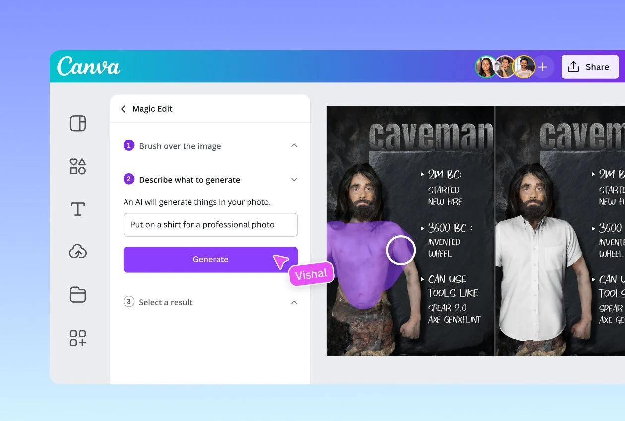
Canva is built to bring creative ideas to life without a steep learning curve. Its intuitive drag-and-drop editor and vast template library make it easy for everyone, from marketers to product teams, to design like a pro.
With AI incorporated into every part of the tool, you can generate graphics from text, resize designs across channels, write copy, and even build interactive, live content. Canva also supports deep brand consistency with Brand Kits (logos, colours, fonts), making it ideal for teams.
A G2 review adds:
Canva makes design stupid-simple. I can create clean graphics, presentations, and social posts in minutes without messing around with complicated tools. The templates are solid, the drag-and-drop feels natural, and everything syncs fast. Even on my college account, it gives me most of what I need without extra effort. It’s reliable, quick, and saves a ton of time.
📖 Also Read: Best Canva Alternatives & Competitors
With the right set of Figma AI prompts, you can reclaim hours lost rewriting vague prompts, fixing generic outputs, and nudging the AI toward the design you actually intended.
But here’s the real truth: creative teams need more than a design generator. You need a place to think, plan, track, iterate, and collaborate. Figma AI handles creation, but not the strategy, organization, knowledge-sharing, or cross-team alignment that surrounds that creation.
That’s where ClickUp steps in as the everything app for creative work.
ClickUp Brain gives your team contextual answers based on your tasks, docs, and plans. ClickUp Brain MAX takes it further with a deeper understanding across your entire workspace. ClickUp Whiteboards turn messy ideas into structured workflows, and Docs let you build your own prompt library. And tasks and subtasks keep execution tight.
If you want a single place to organize your prompts, manage your creative process, and ship work faster, sign up to ClickUp for free!
Yes. Figma AI can generate full layouts from one prompt, but the results are often generic. It works best when you provide structure first (like wireframes or content hierarchy) and then refine using iterative prompts. Large, vague prompts usually lead to inconsistent spacing, weak component usage, and mismatched styling.
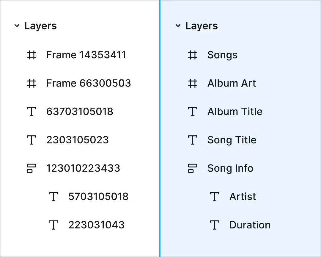
Partially. Figma AI can reference components, tokens, and libraries if your file is well-organized and follows naming conventions. It won’t automatically map every element, so clear context, example components, and constraints in your prompts significantly improve accuracy.
Design Lint, Autoflow, and Wireframe plugins pair well. For development handoff, tools like Anima or Zeplin add structure after AI drafts. Many teams also complement Figma AI with ClickUp, using Whiteboards, Docs, and ClickUp Brain to manage prompts, versions, and design tasks end-to-end.
© 2026 ClickUp

There’s an easier way. Try a free AI Agent in ClickUp that actually does the work for you—set up in minutes, save hours every week.