Sorry, there were no results found for “”
Sorry, there were no results found for “”
Sorry, there were no results found for “”
Excel dashboard templates can help visualize data fast—but they’re static, error-prone, and hard to scale. ClickUp replaces them with real-time dashboards, custom widgets, integrations, and automation. This article lists 8 free Excel templates, but ClickUp is the future-ready dashboard solution your team actually needs.
Ever spent hours staring at your Excel spreadsheet, trying to make sense of sales figures?
In today’s data-driven world, information is power. But raw data alone doesn’t reveal much—transforming it into actionable insights is where the magic happens. 🔮
That’s where free Excel dashboard templates come in. These pre-built layouts turn rows and columns of proportional data into a dynamic chart, giving you a clear snapshot of everything. 📝
Whether you’re tracking team performance or your sales funnel, the right dashboard template strengthens your strategy. The best part? All you need to do is import your data into your Excel workbook and let these tools do the rest. 🧘
Join us as we explore some of the best free Excel dashboard templates and introduce a few powerful alternatives by ClickUp to improve your workflow. 📈
Why spend hours building Excel KPI dashboards from scratch? These templates turn complex data into clear, impactful visuals—no tedious setup is required.
Here’s what makes each of these Excel dashboard templates stand out:
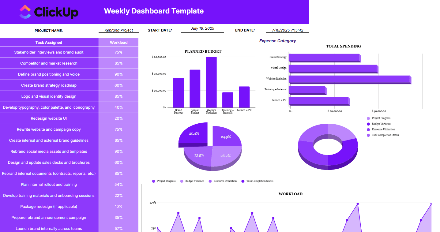
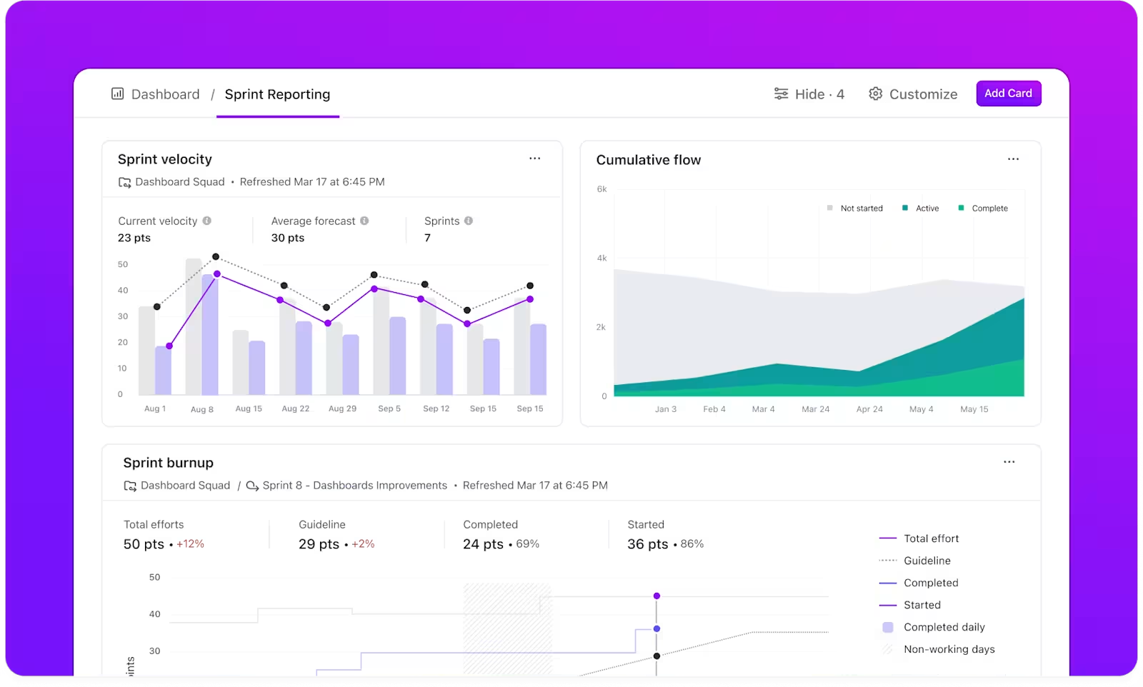
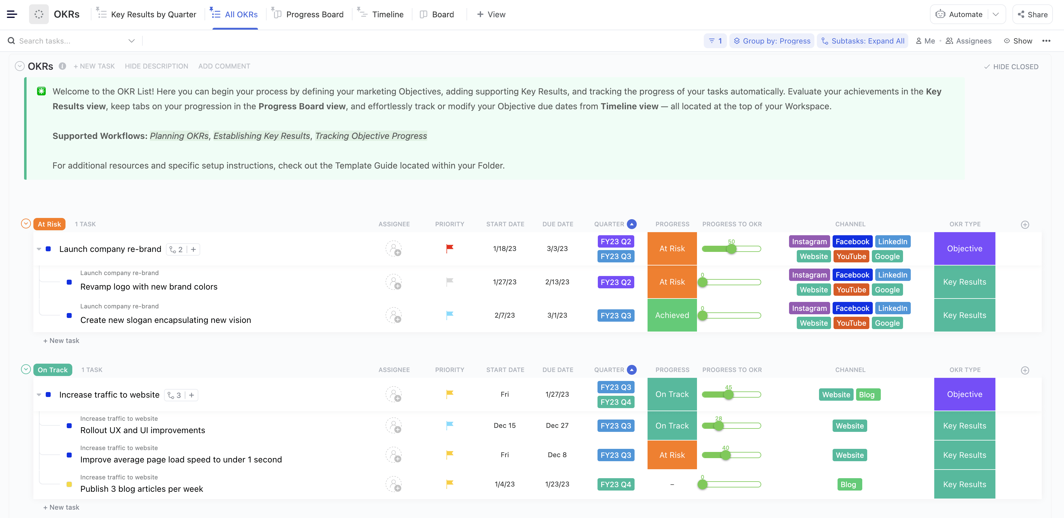
The Weekly Dashboard Template by ClickUp is a visual reporting tool built to help teams monitor project progress, track workload, and stay aligned on key deliverables. It combines task data with performance charts, giving stakeholders a complete overview of where things stand—at a glance.
You can track workload percentages for each task, compare planned budget vs. actual spending, and review category-wise expenses. Pie and bar charts visualize key metrics like project progress, budget variance, resource utilization, and task completion status. It’s structured to support quick weekly reviews and informed decision-making.
🌟 Why you’ll love it:
📌 Ideal for:
Perfect for project managers and team leads who want a visual, data-backed overview of progress, performance, and resource allocation—without manual reporting.
Keep tabs on your team’s progress with this KPI dashboard template from Template.net. It provides a clear snapshot of each team member’s tasks, deadlines, and milestones, allowing managers to monitor project health seamlessly.
With color-coded indicators and progress bars, you can quickly track the progress of your team members. The easy-to-read layout provides real-time insights into milestones and potential bottlenecks, ensuring nothing slips through the cracks.
🌟 Why you’ll love it:
📌 Ideal for:
Best for team leads and department heads who need a quick, clear snapshot of each team member’s productivity, performance, and project completion timelines.
Handling multiple projects is challenging, but this specialized Excel dashboard template from Template.net is an agile solution. It provides a consolidated view of all active projects in one organized hub.
Offering complete oversight of timelines, budget distribution, and resource allocation, it’s ideal for managing several initiatives. Clear visual summaries help you prioritize tasks, track milestones, and identify resource needs.
🌟 Why you’ll love it:
📌 Ideal for:
Ideal for project portfolio managers, providing a high-level view to allocate resources and manage timelines and budgets.
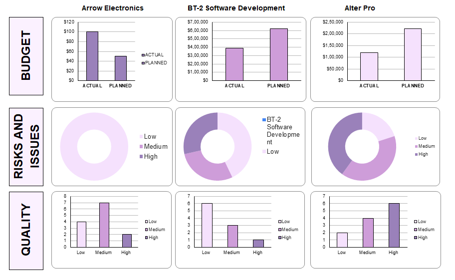
Is constant oversight dragging down your team? The ClickUp Project Management Dashboard Template is here to change that. It consolidates all project essentials—progress, deadlines, task statuses, and resource allocation—into one powerful, interactive hub.
Customizable widgets and dynamic charts provide an instant, real-time snapshot of project health and performance.
Packed with executive dashboard features, this dashboard template delivers high-level visibility, empowering you to stay informed and in control without micromanaging.
🌟 Why you’ll love it:
📌 Ideal for:
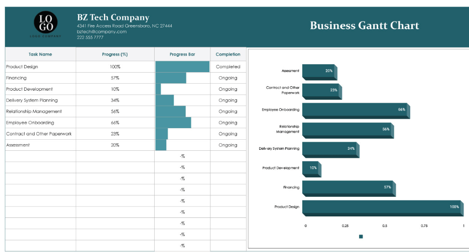
Managing complex projects with overlapping tasks and tight deadlines? The Business Gantt chart template by Template.net makes project planning accessible with a structured approach.
This Excel dashboard template is ideal for projects that need detailed timelines and task dependencies. With its Gantt chart layout, you can map project phases, spot potential bottlenecks, and adjust schedules—all in an intuitive, visual format.
🌟 Why you’ll love it:
📌 Ideal for:
Tailored for project planners and schedulers managing long-term, phase-based projects. It lets you organize timelines and tasks while staying on top of dependencies and deadlines.
The ClickUp Gantt Chart Dashboard Template is your visual command center for planning, tracking, and executing projects with precision. Whether you’re managing timelines, dependencies, or shifting priorities, this dashboard brings complete clarity to your project roadmap. With drag-and-drop scheduling, real-time progress updates, and team workload visibility, you can align resources, prevent bottlenecks, and deliver on deadlines—every time.
🌟 Why you’ll love it:
📌 Ideal for:
Project roadblocks can derail timelines, frustrate team members, and escalate costs. Microsoft’s Project Issue Tracker Template offers a structured space to log, categorize, and prioritize issues, allowing you to act swiftly on what matters most.
It comes with dedicated fields for issue descriptions, priority levels, current status, and resolution steps, making it easy to organize problems systematically. This streamlined approach means you have an actionable list that keeps everyone accountable and focused.
🌟 Why you’ll love it:
📌 Ideal for:
Aids managers and quality assurance teams in logging and resolving issues. It minimizes project disruptions and keeps teams productive and aligned.
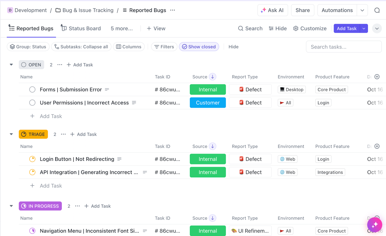
The ClickUp Issue Tracker Dashboard Template is your centralized system for capturing, tracking, and resolving issues before they escalate. Whether it’s bugs, blockers, or recurring pain points, this dashboard brings total visibility into the lifecycle of every issue—across teams, products, or releases. With real-time status updates, priority tagging, and workload views, you can triage faster, assign owners clearly, and prevent critical delays.
🌟 Why you’ll love it:
📌 Ideal for:
A cluttered sales workflow leads to missed opportunities and forecasting headaches. Microsoft’s sales management dashboard template helps sales teams clarify their processes, from lead generation to closed deals.
The solution enables you to focus on high-value opportunities and close deals faster. This sales management template turns complex sales processes into a straightforward journey by organizing each lead’s stage, value, and likelihood of closing.
🌟 Why you’ll love it:
📌 Ideal for:
This sales dashboard template is perfect for sales managers and teams seeking an organized way to manage leads and identify high-impact opportunities for improved sales performance.
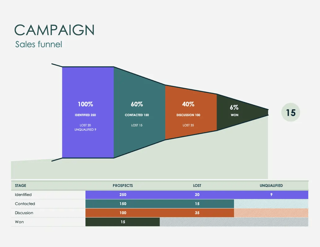
The ClickUp Sales Pipeline Dashboard Template is your visual command center to turn sales chaos into clarity. Designed for fast-moving teams, this template centralizes every lead, status update, and rep activity into one streamlined view. It helps you track sales momentum, surface bottlenecks early, and focus your efforts where they count—on deals that are ready to close.
Whether you’re managing outbound outreach or nurturing warm leads, this dashboard gives you real-time insights to prioritize smarter, collaborate better, and confidently forecast revenue.
🌟 Why you’ll love it:
📌 Ideal for:
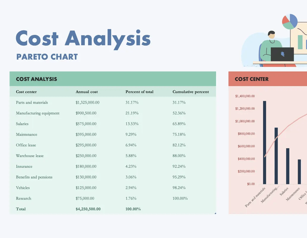
Want to identify and control your most significant cost factors? Microsoft’s Cost Analysis with Pareto Chart Template is essential for identifying and managing high-impact expenses.
This Excel dashboard report uses the 80/20 rule to highlight the ‘vital few’ expenses that contribute the most to overall costs, so you focus on how you can save.
With sections for itemized costs and visual insights, it’s ideal for making data-driven decisions to optimize spending and improve profitability.
🌟 Why you’ll love it:
📌 Ideal for:
This Microsoft Excel dashboard template is perfect for financial analysts, business owners, and operations managers. Identify the 20% of expenses that account for 80% of costs for targeted cost reduction.
Also Read: How to Create a Pareto Chart in Excel
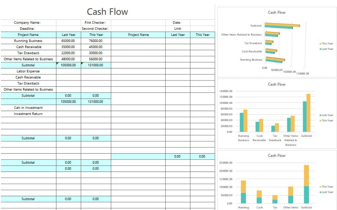
The Simple Cash Flow Chart Template by WPS is excellent for straightforward financial tracking. It offers a clear view of cash inflows and outflows, helping you to manage finances better.
Get monthly and yearly cash flow summaries to monitor your financial health at a glance. Use the simple input fields to log income, expenses, and net cash balances for effective project management.
🌟 Why you’ll love it:
📌 Ideal for:
Perfect for business owners and freelancers who must monitor cash flow without dealing with complex accounting systems.
💡 Pro Tip: Looking to level up your dashboards? Check out these project dashboard examples for a fresh dose of inspiration. 🚀
Here’s how this will benefit you:
With ClickUp Dashboards, track goals and view multiple KPIs—in one interactive hub. Use the KPI Dashboard for precise, at-a-glance analysis with simple charts, while the operations dashboard streamlines workflows and keeps processes running smoothly. ✨
Curious to know how? Let’s find out! 🎯
Excel dashboard templates are great, but alternative solutions bring the flexibility to elevate your workflow. ClickUp offers a suite of customizable templates to streamline tasks, identify trends, capture critical insights, and boost efficiency across projects.
Organizations like Wake Forest University have experienced a significant transformation with ClickUp. 🛠️
We are amazed by ClickUp’s customization and integration capabilities. Most importantly, ClickUp’s Dashboards have transformed our reporting process. We can now easily monitor workload, present data, and get a high-level overview of all our projects in one single view.
Explore these eight ClickUp dashboard templates and experience this transformation for your organization:
Tracking analytics is essential for business growth and strategy. The ClickUp Analytics Report Template simplifies this process by bringing critical insights into one space without the hassle of creating multiple reports.
With just a few clicks, it helps you track metrics, visualize trends, and assess team performance. With real-time data syncing and customizable views, you’re not just collecting data—you’re turning it into actionable insights.
🌟 Why you’ll love it:
📌 Ideal for:
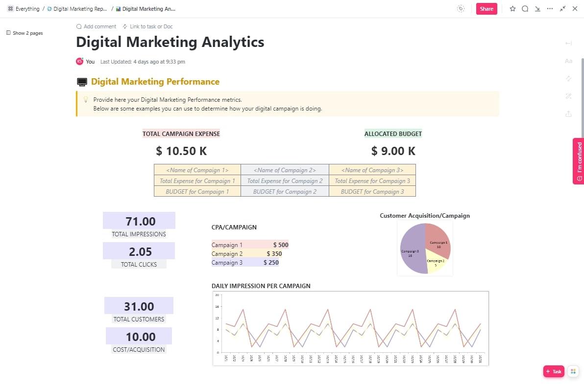
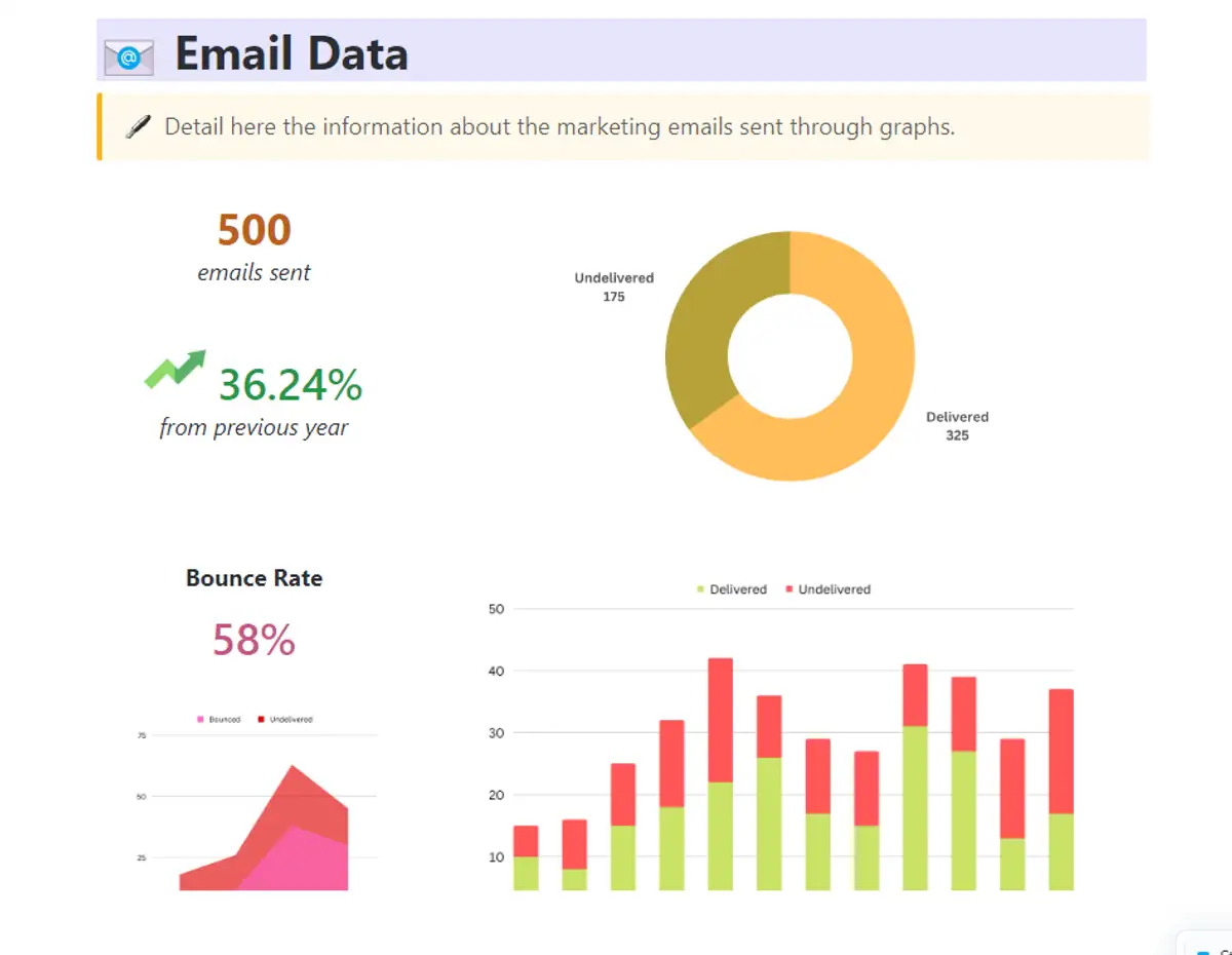
The ClickUp Digital Marketing Report Template is built for digital marketers who need a clear, all-in-one view of their campaign performance. It allows you to track conversion rates, social reach, email clicks, and ad ROI without hopping between KPI dashboards.
This template captures every marketing funnel stage in one dynamic dashboard, from lead generation to customer retention. Customizable fields and visuals make adjusting KPIs to your goals super easy.
🌟 Why you’ll love it:
📌 Ideal for:
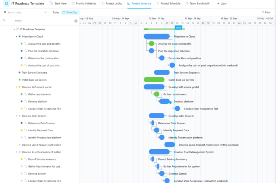
A structured roadmap is the backbone of successful project execution for IT teams. The ClickUp IT Roadmap Template brings order to complex projects, helping you set priorities, optimize resources, and keep each project phase in sync with broader goals.
This intuitive template simplifies project planning with Gantt charts that assess task impact and effort. It allows data-driven decisions and has specialized views that provide tailored insights into each project layer.
For example, Project Lobby View serves as a central hub to prioritize IT projects. Meanwhile, Project Itinerary combines all tasks and statuses into a cohesive view for real-time project tracking.
🌟 Why you’ll love it:
📌 Ideal for:
Marketing performance isn’t just numbers; it reflects your brand’s evolution and impact. The ClickUp Marketing Report Template provides an exceptional, high-level view of your overall strategy, capturing insights beyond individual campaigns.
This KPI dashboard template emphasizes big-picture data, such as customer satisfaction insights, lead quality, and long-term brand influence. It helps you understand what resonates and how each initiative contributes to broader goals, optimizing resource allocation.
🌟 Why you’ll love it:
📌 Ideal for:
The ClickUp Marketing Timeline Template is your ultimate ally for precisely hitting every deadline, launch, and content release. A clear, top-down view of your marketing calendar helps you coordinate complex timelines, ensuring no detail slips through the cracks.
Are you planning a series of quarterly campaigns or prepping for a high-stakes product launch? Use this template to schedule tasks, assign responsibilities, and align your team on upcoming milestones.
What’s great? The flexible Gantt and calendar views enable instant adjustments, keeping all stakeholders in sync and prepared to adapt as priorities evolve.
🌟 Why you’ll love it:
📌 Ideal for:
The ClickUp Strategic Marketing Plan Template helps you map out every phase of your marketing journey—from setting ambitious goals to detailing individual campaigns.
This tool goes beyond traditional planning by allowing you to define and track OKRs (Objectives and Key Results) to ensure every objective supports your broader business goals. Categorize tasks by status—Planned, In Progress, Complete, or create custom statuses for your workflow—so your team prioritizes and executes chores efficiently.
🌟 Why you’ll love it:
📌 Ideal for:
Consistency is vital for smooth HR operations. That’s where the ClickUp HR SOP Template steps in. It provides a centralized hub to document and manage your standard operating procedures.
Establish step-by-step guidelines for every HR function, from onboarding to performance evaluations and employee exits. It ensures you adhere to best practices, enhance compliance, and deliver a seamless employee experience.
🌟 Why you’ll love it:
📌 Ideal for:
💡 Pro Tip: Looking to elevate your HR processes even further? ClickUp’s HR Dashboard offers added structure and insight for HR operations. Here’s how it streamlines your workflow:
A top-notch Excel dashboard template does more than visualize data—it organizes and delivers actionable insights. The best solutions are adaptable and intuitive and analyze critical data seamlessly.
Here are key components to look for:
➡️ Read More: Project Management Dashboard Examples & Templates
While Microsoft Excel is a powerful tool for creating dashboards, it struggles with the demands of data-heavy, dynamic projects. Here’s why Excel often falls short for data visualization and decision-making:
Excel dashboards rely on manual data refreshes, so you’re often working with outdated information. This lag might work for smaller projects, but tracking fast-paced metrics like sales data or financial health could lead to missed opportunities and delayed responses.
Excel doesn’t support seamless teamwork. When multiple users edit the same Excel file, you risk version conflicts, lost updates, and overwritten changes. Without cloud-based synchronization, it’s challenging for multiple teams to work on shared dashboard templates.
Excel dashboards lack interactivity and feel rigid. Features like drill-downs and quick filters aren’t built-in, making it hard to create Excel dashboards that dive deeper into any data point. Customizing them for specific needs requires complex formulas, adding to the hassle.
Excel spreadsheets slow down when handling large data sets and complex calculations. They lack advanced features like operational dashboards and dynamic visuals like clustered column charts or interactive graphs. The result? Frequent performance lags and a higher risk of file corruption, especially when importing data points.
Dashboard in Excel lacks the advanced automation capabilities of dedicated tools, meaning you must import data and perform repetitive tasks manually. This is time-consuming, mainly for projects that demand ongoing data adjustments, increasing the chance of errors.
But don’t let these Excel limits slow you down! A more flexible, dynamic dashboard software like ClickUp helps transform your static data into actionable insights, making every goal and project result-driven. 📊
Effective visual representation is the backbone of intelligent decision-making.
While dashboard Excel templates are great starting points, they lack the dynamic, customizable features modern business professionals need for impactful data analysis.
ClickUp bridges this gap with powerful data visualization tools, real-time updates, and interactive dashboards. Track chart data, streamline workflows, and make informed decisions—all from one central hub that’s as flexible as your goals require.
Ready to improve your decision-making? Take the next step in data visualization—try ClickUp today and create strategic dashboards that evolve with your projects.

Praburam Srinivasan
Max 21min read
Praburam Srinivasan
Max 14min read
Praburam Srinivasan
Max 27min read

© 2026 ClickUp