Still downloading templates?
There’s an easier way. Try a free AI Agent in ClickUp that actually does the work for you—set up in minutes, save hours every week.
Sorry, there were no results found for “”
Sorry, there were no results found for “”
Sorry, there were no results found for “”

The beauty of card sorting is that it puts real users in control—they organize your content into categories that make sense to them, not just to your internal team. This gives you incredible insights into website organization.
Instead of endless meetings debating where content should live or multiple rounds of navigation revisions, card sorting tools provide concrete data to guide your decisions to build a more intuitive navigation experience.
Looking to streamline your design process with some card sorting? Here are 10 card sorting tools worth trying. 👥
These are our picks for the best digital card sorting tools:
A clunky design thinking tool can turn a simple study into a headache, and no one wants that. The best tools make research easier, not harder.
So, how do you pick the right one? Here’s what to look for. 👀
🧠 Fun Fact: Steve Krug popularized card sorting for UX. In his book Don’t Make Me Think, Krug emphasized how card sorting helps designers understand how users expect information to be structured.
Too many options, not enough time? To save you the trouble, here are the best ones that make research smoother, insights clearer, and your job a whole lot easier. 📝
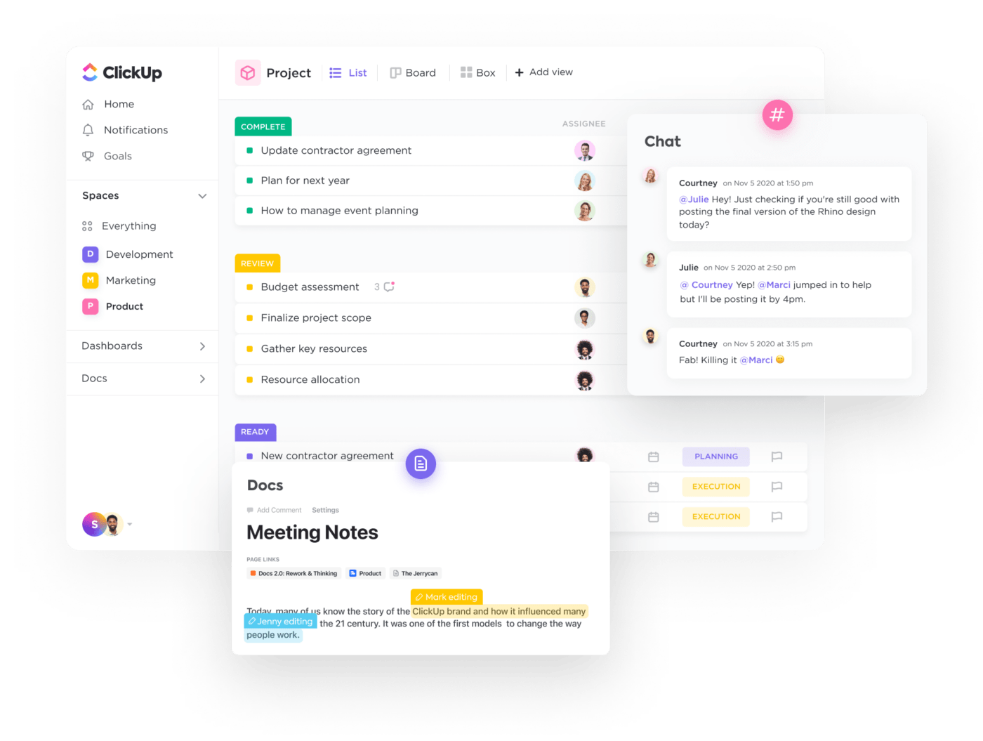
When running a card sorting study, keeping track of research plans, participant data, and analysis can quickly become overwhelming. With task automation, real-time collaboration, and customizable workflows, ClickUp streamlines UX research and information architecture planning.
ClickUp brings everything into one place, helping UX teams conduct user research, visualize insights, and document findings efficiently. It is the everything app for work that combines project management, knowledge management, and chat—all powered by AI that helps you work faster and smarter.
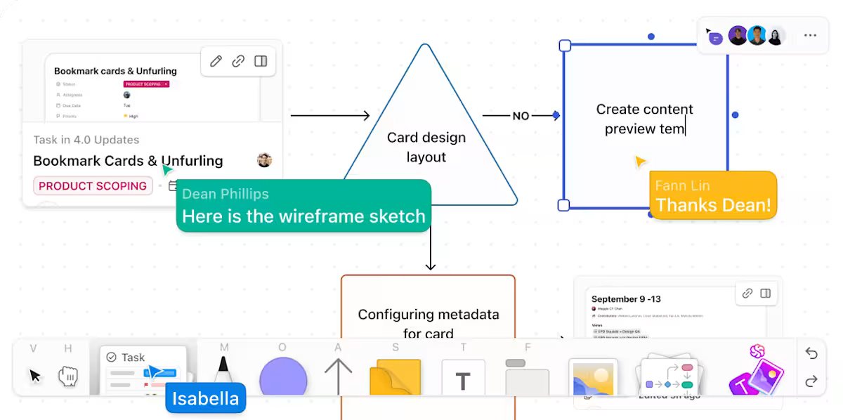
Researchers often brainstorm potential categories and plan the research flow before setting up a card sorting study. ClickUp Whiteboards make this process easier by providing an interactive space to map out ideas. Suppose a UX researcher is preparing a study to refine an e-commerce site’s navigation. They can use the digital whiteboard with sticky notes to represent different product categories and add connectors to visualize relationships between them.
As the team discusses and refines the groupings, they can make real-time updates, ensuring the study is structured effectively before launching.
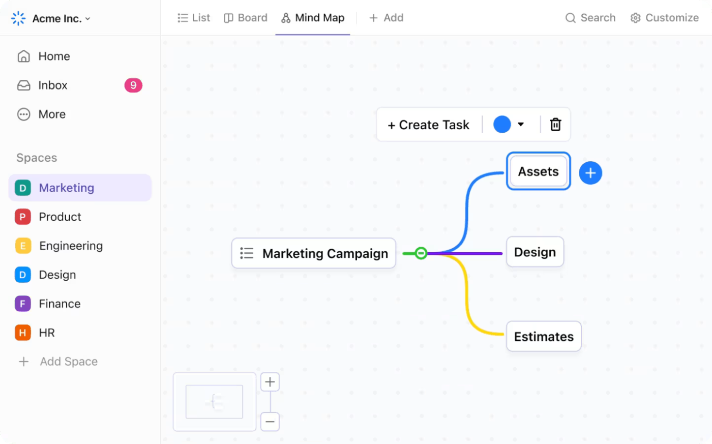
Once the study is complete, the next challenge is organizing and analyzing the results. ClickUp Mind Maps help teams make sense of user-generated categories by turning raw data into a clear visual structure.
A UX team running a closed card sorting session for a financial services website might find that participants grouped investment options, loan products, and banking services into unexpected categories. Manually sorting through scattered feedback can be time-consuming, but a Mind Map allows them to arrange user-created labels, connect related groups, and explore alternative structures.
After organizing the findings, the next step is documenting key takeaways and sharing insights with stakeholders.
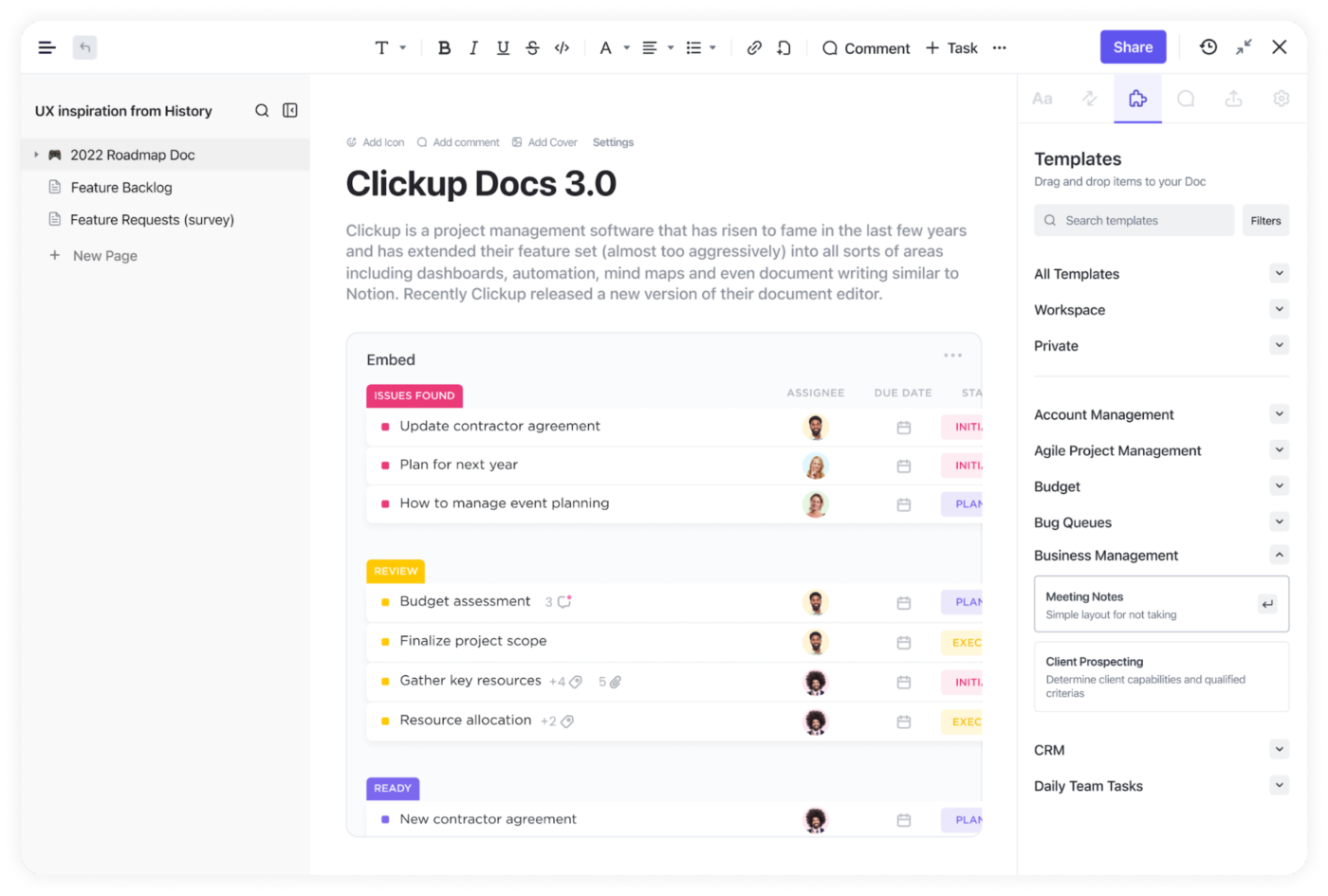
ClickUp Docs provide a collaborative space to compile research summaries, study guidelines, and analysis reports. For instance, a UX team working on a healthcare app can create a Doc to record participant feedback, outline usability concerns, and draft recommendations for navigation improvements.
Team members can comment on specific insights, suggest edits, and track revisions without switching between multiple tools.
To make things even easier, try the ClickUp Card Sorting Template designed specifically for UX teams.
It helps teams define research objectives, create cards representing key topics, and guide participants through sorting exercises. Open, closed, and hybrid sorting methods are all supported, making it adaptable to different research needs.
Beyond qualitative data, the template also streamlines quantitative analysis. Researchers can spot trends, measure agreement levels, and identify statistically significant relationships.
A G2 user says:
ClickUp’s flexibility is its biggest strength — the ability to customize views, statuses, and workflows means it can adapt to almost any team’s process. The sheer number of features allows us to manage everything from daily tasks to long-term roadmaps in one place. It’s great to have all our work centralized, and the customizable dashboards make reporting clear and tailored to what we need.
🔍 Did You Know? Bad IA = lost users. A poor information architecture (IA) leads to frustrated users who can’t find what they need. Card sorting helps prevent this by aligning navigation with user expectations.
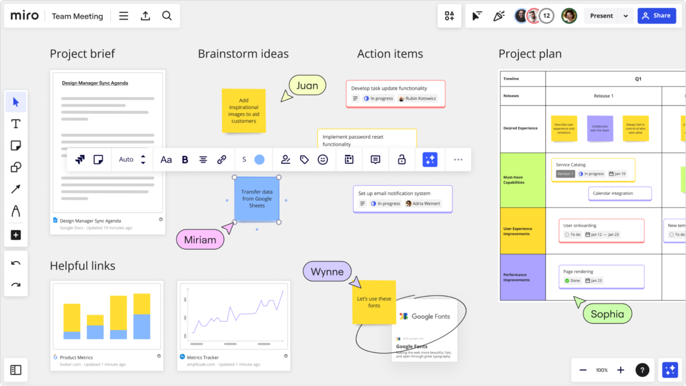
Miro transforms card sorting into a dynamic team activity with its infinite canvas. This digital whiteboard tool extends beyond simple card sorting to support the entire UX workflow—from research to wireframing. Teams add notes, comments, and reactions directly on digital cards, capturing insights in real time.
You’ll find yourself switching between synchronous and asynchronous testing methods, adapting as your team’s needs change. Miro also lets you visualize connections that might otherwise get lost in spreadsheets.
📮ClickUp Insight: A typical knowledge worker has to connect with 6 people on average to get work done. This means reaching out to 6 core connections on a daily basis to gather essential context, align on priorities, and move projects forward.
The struggle is real—constant follow-ups, version confusion, and visibility black holes erode team productivity. A centralized platform like ClickUp, with Connected Search and AI Knowledge Manager, tackles this by making context instantly available at your fingertips.
A G2 user says:
Miro s fantastic for real-time collaboration. I use it for brainstorming, running retrospectives and building product roadmaps, Its ability to collaborate asynchronously is really useful.
🧠 Fun Fact: Don Norman, a cognitive scientist and co-founder of the Nielsen Norman Group, coined the term ‘user experience’ in the 1990s while working at Apple. He emphasized the importance of designing products with the user in mind, focusing on usability and how users feel when interacting with a product.
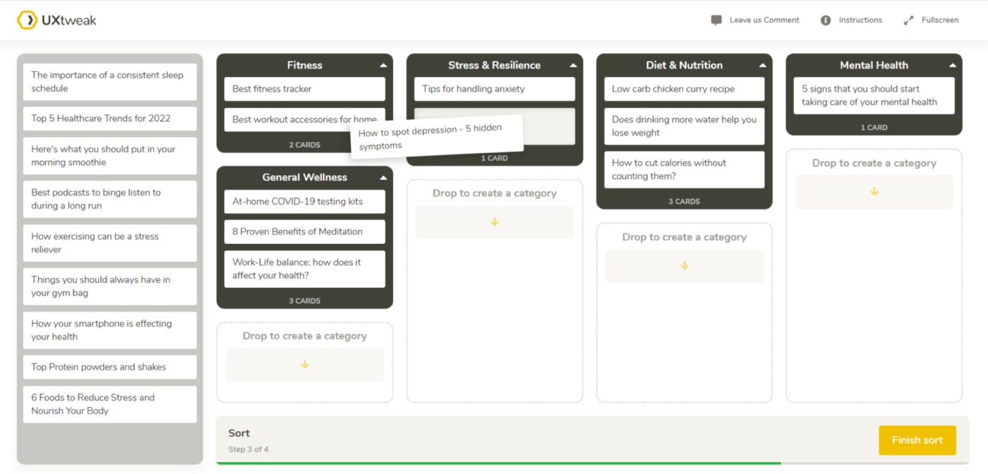
UXtweak integrates card sorting into a broader UX testing ecosystem. The platform handles both open and closed card sorting studies and offers automatic categorization suggestions based on participant behavior. You can customize how cards appear, add descriptions or images, and even set test session time limits.
Ever wonder what happens before a participant makes their final decision? UXtweak tracks hesitations, changes, and final placements, giving you quantitative data to back up your IA decisions.
A G2 user says:
UX Tweak’s tree test tool is extremely useful. You simply build your navigation and then set up a number of questions. You forward the test to multiple test persons through email. Through the UX Tweak results page you can track exactly how your users understood your navigation.
🔍 Did You Know? The first-ever website (created by Tim Berners-Lee in 1991) had just one page with black text on a white background—no images, no styling, no navigation. It was pure function over form!
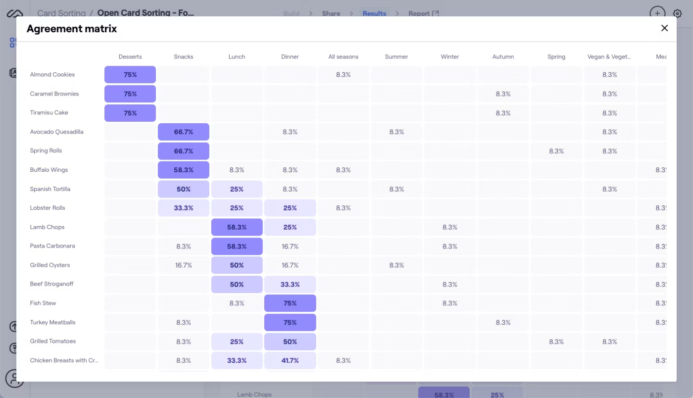
Maze approaches card sorting as one component in rapid design validation. The platform integrates with design tools like Figma and Sketch, creating a seamless workflow from concept to testing.
You’ll appreciate how card sorting studies sit alongside usability tests and surveys, giving context to categorization decisions. Maze emphasizes speed and accessibility—participants jump into studies without accounts, and researchers get preliminary results while testing continues.
And if you need to justify your IA, Maze’s detailed reports translate participant behavior into concrete recommendations.
A G2 user says:
Maze not only provides option to test a developed product but also gives an option to test in the progress figma prototypes. This helps in getting UX insights at the early stage of product development cycle.
🧠 Fun Fact: The undo button brought a transformation in UX. The first widely used version appeared in 1980 in Apple’s Lisa computer, forever saving users from their own mistakes.
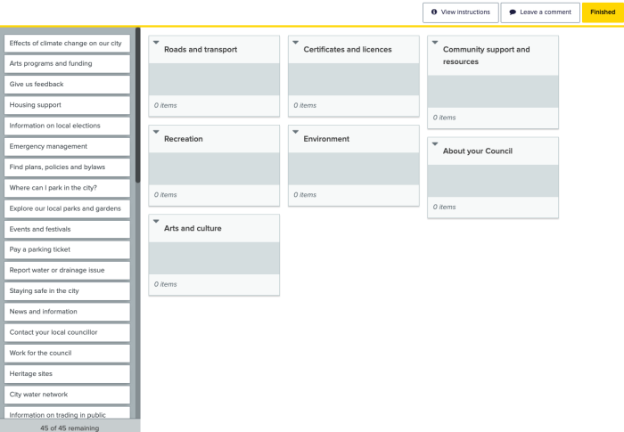
Optimal Workshop treats card sorting as a science, offering robust statistical analysis of participant behavior. The platform specializes in information architecture research, with tools specifically designed for both exploratory and validation testing. You can run open, closed, and hybrid card sorts, then analyze results through multiple visualization methods.
Researchers particularly value the standardized participant recruitment and screening features, ensuring consistent data quality across studies.
🔍 Did You Know? The Netflix autoplay feature was designed to keep users engaged, but it sparked so much backlash that they had to introduce an option to disable it. A perfect example of UX that needed tweaking!
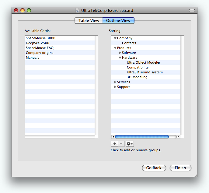
xSort takes a different approach as a downloadable application rather than a web service. This macOS application focuses exclusively on card sorting without subscription fees or participant limits. Researchers appreciate the streamlined interface that eliminates distractions for participants while providing robust data collection.
The offline functionality ensures testing continues regardless of internet connectivity, making xSort practical for field research. It offers support for individual and group sorting sessions, with options to merge results for comprehensive analysis.
🧠 Fun Fact: The hamburger menu (three horizontal lines) was invented in 1981 for an early computer interface. It became widely used on mobile apps in the 2010s but has been criticized for hiding important navigation options.
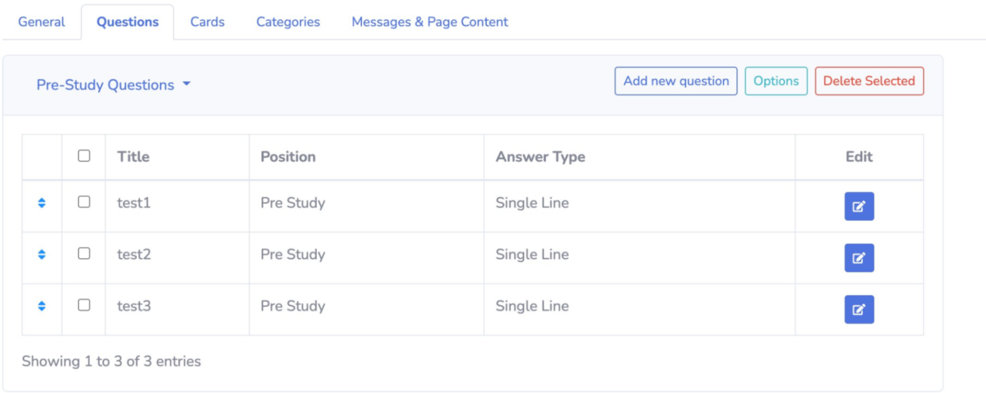
kardSort strips card sorting down to its essentials. You won’t find fancy features here—just straightforward card sorting that gets out of your way. This web-based tool reduces the time between deciding to run a study and collecting your first results.
Additionally, kardSort’s clean interface requires almost no explanation. The platform emphasizes simplicity in setup and analysis, making it perfect for teams needing quick insights without a research background.
📖 Also Read: Best Customer Journey Mapping Software Tools
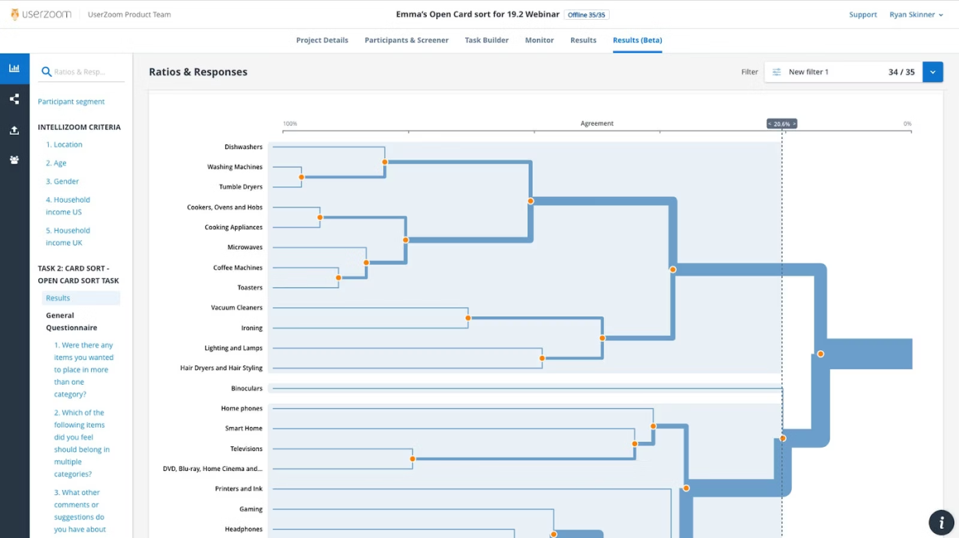
UserZoom embeds card sorting within a comprehensive enterprise UX research platform. The tool connects card sorting results to broader research initiatives, creating a continuous feedback loop between information architecture and other UX metrics. You’ll get robust participant management with detailed demographic filtering and automated incentive distribution.
Got stakeholders who need convincing? UserZoom’s professional reporting features translate research data into executive-ready presentations. Teams particularly value the platform’s emphasis on research governance and compliance for sensitive industries.
🔍 Did You Know? The first graphical user interface (GUI) was created at Xerox PARC in the 1970s. Apple and Microsoft later adapted the concept, revolutionizing how people interact with computers.
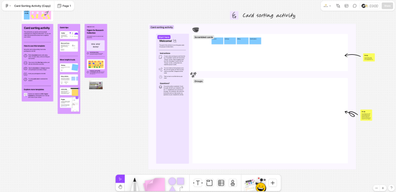
FigJam brings card sorting directly into the design ecosystem. This collaborative whiteboard lives alongside your Figma designs, creating a natural bridge between research and implementation.
It keeps everything connected. Designers appreciate how card sorting exercises can immediately inform navigation structures and information hierarchies without context switching. The casual, sticky-note style interface makes participation feel more like a workshop than a formal study.
A G2 user says:
It has some great features like sections for sticky notes, lots of templates for common whiteboarding tasks, AI summaries of sticky notes, and then also lots of fun features too, such as the Polaroid widget and other interactive games and widgets.
🧠 Fun Fact: Jakob’s Law says users spend most of their time on other sites—so they expect yours to work the same way. Deviating too much from common UX patterns can frustrate people instead of delighting them.
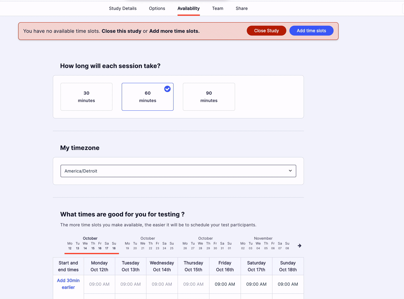
UserZoom GO cuts through the complexity of UX research with a streamlined approach to card sorting. Unlike its enterprise sibling, this platform focuses on getting studies up and running without sacrificing methodological rigor. The interface walks you through each decision with contextual help and suggestions.
It incorporates proven patterns from thousands of previous studies into ready-to-use templates. Think of it as research with training wheels—comprehensive enough for meaningful insights but simplified enough for teams without dedicated researchers.
🔍 Did You Know? The ‘Uncanny Valley’ applies to UX too. If an AI chatbot or virtual assistant sounds almost human but not quite, users find it creepy rather than helpful—hence the careful balance companies like Apple and Google strike with Siri and Google Assistant.
Card sorting is great for understanding users, but wrangling all that data? Not so fun. The right tool helps you collect insights, analyze patterns, and actually do something with the results.
ClickUp does the heavy lifting with Whiteboards for mapping ideas, Docs for keeping research structured, and Automations to handle the repetitive stuff. Drag, drop, and rearrange cards in real time, store all your notes in one place, and let ClickUp sort, tag, and notify your team automatically. Less busywork, more ‘aha!’ moments.
Sign up for ClickUp today! ✅

© 2026 ClickUp

There’s an easier way. Try a free AI Agent in ClickUp that actually does the work for you—set up in minutes, save hours every week.