

In an era where data floods every corner of our lives, Google Docs offers a simple solution for visualizing and clarifying your information with charts.
Charts transform mundane numbers into compelling visuals easily interpreted at a glance. Whether you’re crafting a sales report, preparing a presentation, or updating stakeholders, charts bring clarity and structure to your data.
Given the importance of charts in communicating key insights, it is essential to know how to create and utilize them effectively.
Read on as we explore how to create and customize charts in Google Docs to enhance your data presentation.
How to Make a Chart in Google Docs
How to Make a Chart in Google Docs: A Quick Guide
Google Docs, a key component of Google Workspace, is a versatile word processor that simplifies document creation and presentation. Features like bullet points, tables, and charts help you present information clearly.
Here’s how to add a chart to your Google Docs document:
Step 1: Insert the chart

Start by opening Google Docs. Whether starting a new document or working with an existing one, navigate to the upper-left corner of the screen and click on the ‘Insert’ option. This will reveal a drop-down menu with various options.
Read more: How to make a checklist in Google Docs
Step 2: Choose a chart type

From the drop-down menu, select the ‘Chart’ option. A sidebar will open, presenting various chart types, such as bar, column, line, and pie. Choose the type of chart that best suits your needs. For instance, if you select the line chart, a default line graph will be inserted into your document.
Step 3: Open the chart in Google Sheets
After inserting the default chart, a pop-up will appear in the bottom-left corner with the option ‘Edit in Sheets.’ Click on this to open the chart in Google Sheets for further customization.

Since the pop-up only appears briefly, you might miss it. Alternatively, click on the chart, then select the three vertical dots in the upper-right corner. From the drop-down menu, choose ‘Open source,’ and a Google Sheets tab will open for you to edit the chart.
Also read: How to make a flowchart in Google Docs
Step 4: Edit the chart
In the Google Sheets tab, click on the chart and select the three vertical dots in the upper-right corner. A drop-down menu will appear with options such as Edit chart, Delete chart, Download chart, Publish chart, and Copy chart. Choose ‘Edit chart’ to make changes.

A Chart Editor sidebar will appear next to the graph. This sidebar has two tabs: ‘Setup’ and ‘Customize.’ Click on the ‘Setup’ tab to choose your chart type, define the data range and X-axis range, and add the data series you want to display.
Read more: How to make a line chart in Google Sheets

Step 5: Customize the chart
Click on the ‘Customize’ tab to access various options for tailoring your chart or graph.
You can adjust the following chart elements:
- Chart style: Choose the background color, border color, font size, and overall layout of your chart
- Chart and axis titles: Set titles for your chart and axes, including their font style, size, and color
- Series: Customize the appearance of lines in your chart, including their color, opacity, thickness, and point shapes, as well as labels for the data series

- Legend: Set the position of the legend (top, bottom, left, right, etc.), along with its color and font size
- Horizontal axis: Format the font style, size, and text color of the labels for the horizontal axis of your chart
- Vertical axis: Adjust the font style, size, and color of the vertical axis label. You can also set the minimum and maximum data values and select the number format, such as percentage or currency
- Gridlines and ticks: Improve the readability of your chart by formatting the spacing, count value, color, position, and length of the major and minor gridlines and ticks

Step 6. Update and format your chart in the document
After customizing your chart, return to your Google Docs document and double-click on the chart. An ‘Update’ option will appear in the top-right corner of the chart. Click this to apply all the changes made in the Google Sheet to the chart.
Next, adjust the chart’s size and position within the document. Click on the chart and select the ‘Image Options’ tab from the menu above it. A pop-up menu will appear with options for resizing, rotating, text wrapping, recoloring, adjusting, and adding alt text. Use these settings to format the chart to fit your needs and preferences.

To streamline chart creation in Google Docs, use a Google Sheet to create and insert them directly. First, design your charts in the spreadsheet, then copy and paste them into your Google Docs document for a more efficient process.
Bonus tip: Explore Google Docs hacks to streamline document collaboration and boost productivity. You can use hidden features and shortcuts to enhance teamwork and efficiency.
Limitations of Making a Chart on Google Docs
While Google Docs is a valuable tool, it has some limitations when it comes to chart creation. These constraints can impact the overall effectiveness and flexibility of your charts.
Here are some fundamental limitations to consider:
- Basic chart-type templates: The chart-type templates in Google Docs are pretty basic and generic. You can only make these four charts in Docs: line charts, bar charts, column charts, and pie charts. For accessing other chart-type templates and creating advanced charts, you will need to use other chart-making tools
- Data editing restrictions: You cannot directly edit chart data within Google Docs. Since charts in Docs are linked to data in Google Sheets, you must go back to Sheets and make updates and modifications to the data there. Going back and forth can be inconvenient if you need to make adjustments frequently or quickly
- Limited features on the mobile version: The mobile version of Google Docs lacks many features available on the desktop version. While you can view charts on mobile devices, creating or modifying them is impossible. For chart creation and fine-tuning, you must use Google Sheets or the desktop version of Docs
- Glitches and hang-ups with complex charts: Google Docs may struggle to accurately display complex charts with multiple layers or large datasets, leading to visual glitches and data inaccuracies. Complex charts can also cause performance issues, such as slow document load times and unresponsiveness
- Limited interactivity and integration: Charts in Google Docs are static and don’t support interactive features like filtering or drill-down capabilities. Additionally, while Docs integrates well with Google Workspace components, its integration with third-party tools is limited
In this regard, ClickUp offers a powerful solution to overcome the limitations of Google Docs. It can help streamline chart creation and enhance your data visualization experience. This provides a more efficient and flexible approach to managing your charts and data.
Bonus: How to Make a Family Tree on Google Docs!
Meet ClickUp: The Ultimate Alternative to Google Docs
As an all-in-one productivity tool, ClickUp is a powerful alternative to Google Docs. It not only syncs seamlessly with Google Workspace tools like Docs and Sheets but also integrates smoothly with various third-party tools such as Microsoft Excel and Zoho.
With its robust features, ClickUp allows you to create, edit, and format simple and complex charts effortlessly across multiple devices, including mobile phones, laptops, and desktops.
Here are some ways you can create and customize charts in ClickUp.
a. Create line and other simple charts
To create a line chart in ClickUp’s Dashboard, follow these steps:
- Open an existing Dashboard or create a new one
- Click the + Add Card button in the top-right corner
- In the pop-up window, select the Custom option
- Choose the Line Chart card from the available chart options
- Configure and customize the chart using the card settings to match your preferences
- Click the Add Card button in the lower-right corner to save the Line Chart card to your Dashboard
Similarly, you can create various custom and sprint chart cards in ClickUp’s Dashboard, including:
- Bar chart
- Pie chart
- Battery chart
- Calculation chart
- Portfolio chart
- Text block chart
- Velocity chart
- Burnup chart
- Burndown chart
- Cumulative flow chart
Customize these charts
ClickUp goes beyond the basic customization options found in Docs and Sheets by providing advanced features, including:
- Custom data selection: Choose a specific space, folder, or list of data to include in your charts
- Flexible X-axis data: Select data for the X-axis based on this year’s, this month’s, or this week’s data, or specify a custom date range
- Adjustable Y-axis scale: Define the Y-axis scale with time-range options such as days, weeks, or months
- Workload grouping: Organize and view workload by status categories, including Pending, In Progress, Editing, In Review, and more
In addition to these customization options, ClickUp offers interactive features like drill-down capabilities.

Here’s how you can use the Chart drill-down view:
- Open a chart card (e.g., a Pie chart) that supports the drill-down view
- Click on a slice, segment, data point, or column of the chart to open the drill-down view
- On the left side of the pop-up, see an enlarged chart with the selected segment highlighted
- On the right side, view a detailed list of tasks within the highlighted segment
b. Create powerful Gantt charts using ClickUp
Gantt charts are essential for managing priorities, tracking dependencies, identifying bottlenecks, and monitoring project progress in real time. They excel at visualizing diverse project workflows.
Gantt charts can be handy for managing marketing campaigns, design projects, construction initiatives, or other projects.
While creating Gantt charts in Google Sheets can be time-consuming, ClickUp streamlines this process, allowing you to create detailed Gantt charts with just a few clicks.
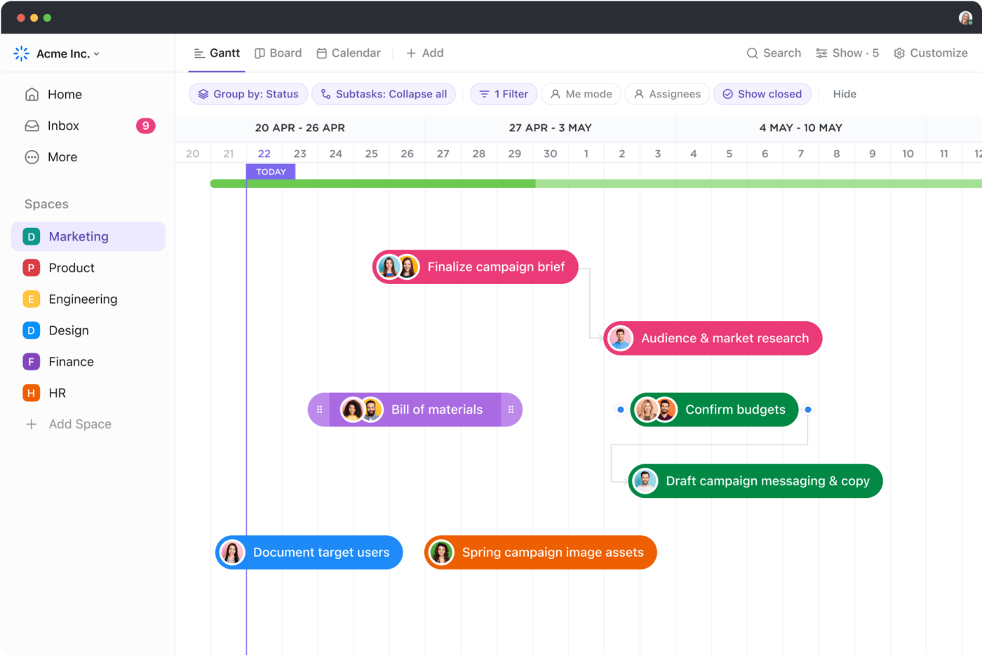
To create a Gantt Chart view in ClickUp, follow these steps:
- Click the + Add option in the Views bar
- Choose the Gantt option
- A blank Gantt chart will open—give it a name
- Use the Gantt view sidebar to add Folders, Lists, tasks, and subtasks
- Click on the Week/Day option in the upper-left corner to access the Timescales menu
- Choose from options like day/hour, week/day, month/day, year/month, or year to set the desired time frame for your chart
- Next, select the Customize option in the top-right corner of the chart. In the drop-down menu, choose Gantt options. A sidebar will open, allowing you to adjust the chart according to your preferences
c. Create charts in ClickUp with Whiteboards and templates
ClickUp Whiteboards is a virtual collaboration tool that you can use to ideate, document processes, draw workflows, and more. You can quickly create a variety of charts in a few simple steps with Whiteboards—for example, an organizational chart.
An organizational chart provides a practical way to record all employees and track team structures in an organization.
To build an org chart with ClickUp’s Whiteboards, follow these steps:
- Start a new Whiteboard view and use the left sidebar to arrange shapes and create your chart structure
- As you place shapes on the board, an editing menu will appear. Use this menu to adjust the color, outline, position, and other attributes of each shape
- Include images, names, and relevant information in each shape, and connect them with arrows
Once you’ve completed it, you can share the chart with others using a link or convert it into a task in ClickUp Tasks.
To save you time, ClickUp has also pre-built a range of Whiteboard templates for some commonly used chart types. Let us tell you about some of them and how you can benefit from them.

ClickUp’s Organizational Chart Template allows you to dynamically visualize your organization’s structure, easily edit and update charts, and enhance communication between teams and departments.
This functionality helps you:
- Clearly see team roles and relationships
- Quickly adjust and revise organizational structures
- Facilitate better communication and understanding across departments
Read more: 11 free org chart templates

ClickUp’s T Chart Template allows you to compare the advantages and disadvantages of ideas, concepts, and action plans. Use this Whiteboard template to visualize and evaluate both sides of a decision and identify the better fit for a given situation.
You can also use this template to:
- Gain a clear understanding of challenges and opportunities for improvement
- Identify key trends and patterns
- Improve your decision-making abilities
- Enhance your business efforts

Additionally, ClickUp’s Alignment Chart Template enables you to map out initiatives, tasks, and respective strategies for their execution. This Whiteboard template helps you assess how individual efforts align with your organization’s goals and identify and address communication gaps.
This helps you:
- Identify areas of weakness within your organization
- Identify individuals’ skills and capabilities
- Allocate resources more accurately
- Improve focus and efficiency in your organization
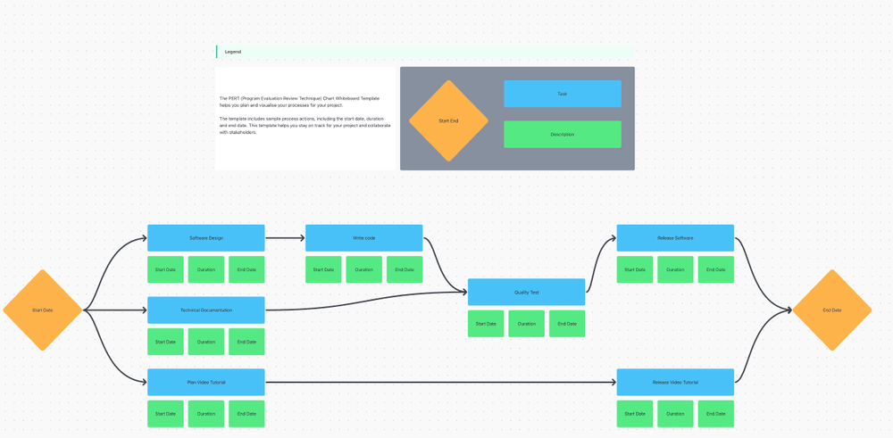
ClickUp’s PERT Chart Template allows you to plan and visualize processes for various projects. Use this template to create a detailed project timeline and track progress against milestones to complete projects on time.
You can use this Whiteboard template to:
- Break down the big projects into manageable chunks
- Identify task duration and dependencies
- Spot and resolve potential scheduling conflicts
- Communicate better with your team and stakeholders
Streamline Your Chart Creation Process with ClickUp
Charts transform complex data into visually appealing insights that are easy to grasp at a glance. While Google Docs allows chart creation via Google Sheets, it comes with limitations that can be challenging and time-consuming to work around.
Consider switching to a more robust solution like ClickUp to address these challenges.
ClickUp offers many features, from Dashboard cards and Whiteboards to Gantt chart project templates and more. This way, it simplifies the creation, editing, and formatting of charts and enhances your ability to manage and visualize data effectively across multiple devices.
Sign up on ClickUp to explore all these features and more today!


Everything you need to stay organized and get work done.


