

Sorry, there were no results found for “”
Sorry, there were no results found for “”
Sorry, there were no results found for “”
Most users still use Google Sheets and other traditional options to manage their spreadsheet data. While it is an excellent and straightforward solution for most companies, it gets tricky when you want to create line graphs or other chart types.
It can often be overwhelming and require some hand-holding, especially if you are a beginner. To help you, here is a step-by-step guide on making a line chart in Google Sheets.
We’ll walk you through the creation process, explore best practices for crafting impactful charts, and even explore alternative options to help you get the job done faster and more efficiently.
A line chart is a graphical representation of numbers or data points that change over time. It excels at showcasing trends and changes over time (e.g., monthly sales figures, website traffic over a year, etc.).
The horizontal axis (x-axis) typically represents time or categories, while the vertical axis (y-axis) displays the corresponding data values. These can be created using simple data visualization tools or spreadsheet tools like Google Sheets, Microsoft Excel, etc.
Line charts offer several benefits for businesses, which include:
To make a line graph in Google Sheets, you first organize your dataset, insert a chart, switch it to a line chart, and then customize and share it for reporting.
Now that you appreciate the power of line charts let’s explore how to create them using Google Sheets, a familiar tool for many businesses. Here’s a step-by-step guide:
Start by preparing the data you want to use to create a line chart. Organize your data in a clear and concise table format without any missing data or blank cells. Ensure each column represents a single data series, with labels in the first row to define the data points.

Highlight the entire data range you want to include in the chart, encompassing the data points and their labels.

Navigate to the ‘Insert’ menu and select ‘Chart.’ Google Sheets will automatically generate a default chart type.


From the chart type options displayed on the right, select ‘Line chart’ to convert the default chart into a line chart. You can choose a regular line chart, smooth line chart, or multiple line graphs depending on your requirements. Once you are done, click on the insert chart option.

While the new chart will be created in the same sheet, you can move it to a separate sheet. This helps you segregate the data and the visualization, and you can even use the ‘move to own sheet’ option in Google Sheets to create a separate sheet in the same spreadsheet.

While Google Sheets generates a basic chart, you can customize it for better clarity and impact. Here are some key aspects to consider:

Add clear and concise titles in your preferred font, size, format, and text color to make the chart more visually appealing.

Similar to the title, you can also edit the Axis titles, including the ‘Horizontal Axis Title’ and ‘Vertical Axis Title’ or X and Y labels to match your chart’s data. The idea is to make it more appealing while communicating information.

In the chart editor, you can also go to the ‘Edit Chart Style’ section to modify the font, color of the border, background color, and more.

Once you have your line chart, you can share it with your team or external stakeholders by managing Sharing Options. Alternatively, you can publish the chart or download it in your documentation.
You must follow a few guidelines to ensure the data looks visually appealing and communicates information. Here are some tips for impactful line charts:
When creating line charts for multiple entities, distinctive colors help track and compare each entity. Use thick lines and strong colors that contrast between elements.
Different line styles (solid, dashed, dotted) can be used to differentiate between data sets visually. This improves readability and helps viewers easily identify trends for each data series.
Make sure that your chart clearly defines each label. These include:
Gridlines can enhance readability by providing visual reference points, particularly for complex charts with many data points. However, excessive gridlines can create clutter and detract from the overall impact of the chart. So consider the complexity of your data and visual hierarchy when using grid lines as necessary.
Utilize Google Sheet’s chart editor formatting options to adjust font size, line thickness, and marker styles. Consistent formatting throughout your chart creates a professional and polished look and should ideally be in sync with your brand guidelines.
Bonus: How to Make a Pie Chart in Google Sheets!
While Google Sheets line chart offers a convenient and accessible option for creating basic line charts and other visualizations, it has limitations. The basic features of this spreadsheet and data entry software might fall short when dealing with complex data and advanced visualizations.
Some of these limitations include:
While Google Sheets is great for basic chart creation, it lacks advanced features and offers few integrations. There are only two ways to import data:
Importing or exporting data from other tools onto Google Sheets can be tricky. Google Sheets line charts will limit your options if you want to use advanced features and AI data visualization tools to work on your data.
Imagine working on sheets with millions of records. Working with Google Sheets can be difficult if you have a huge dataset that is constantly updating.
In Google Sheets, every new sheet has 26,000 cells (1000 rows and 26 columns) by default. You can increase this to about 5,000,000 cells, but you will experience lags or frequent crashes long before you reach this figure. So, you must find alternative flowchart software or offload this heavy dataset for visualization.
Do you often work with a team on your charts or datasets, updating and making real-time changes? This is possible with the best whiteboard software, making it the ideal brainstorming option. However, with Google Sheets, real-time collaboration and updates to a chart are next to impossible.
While Google Sheets allows some collaborative editing features, real-time teamwork on charts can be clunky and cumbersome. This can hinder efficient data analysis in fast-paced business environments.
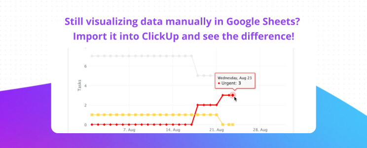
ClickUp is a better alternative to Google Sheets for line charts when you need your charts to live inside a real workflow—so teams can visualize trends, collaborate, and take action from the same place.
Line charts often go beyond simple plotting or creating dependency graphs. Organizations usually use it to track changes over time, brainstorm using the data, and convert the chart from one format to another depending on the requirement.

ClickUp is an all-in-one project management software that makes designing, visualizing, and editing line charts more straightforward. It provides free chart templates and custom ClickUp Dashboards that allow you to visualize your data in multiple formats.
Here’s a quick walkthrough of setting up a dashboard in ClickUp.
It also packs advanced features that allow you to go beyond simple line charts, including the ability to:

ClickUp empowers you to create informative line charts and leverage them within a powerful project management workspace. Imagine integrating your line charts with tasks, roadmaps, and workflows, creating a central hub for data-driven decision-making and project execution.
📮ClickUp Insight: Knowledge workers send an average of 25 messages daily, searching for information and context. This indicates a fair amount of time wasted scrolling, searching, and deciphering fragmented conversations across emails and chats. 😱
If only you had a smart platform that connects tasks, projects, chat, and emails (plus AI!) in one place. But you do!
To make a line chart with two sets of data in Google Sheets, you can follow the steps below:
Select the data you want to create a line chart for and ensure that it is in separate columns with labels in the first row
Highlight the entire data range, including both sets of data and their labels in the first row and first column
Go to the ‘Insert’ Tab and Select ‘Chart’
In the ‘Setup’ Tab, select ‘Line Chart’ in the ‘Chart Type’ Section
Once selected, Google Sheets will automatically generate a chart with two lines representing each data set
Use the chart editor to differentiate the lines with colors and styles, add labels for the axes and data series, and adjust the chart title for clarity
To create a line graph in Google Sheets, you can follow the steps below:
Open Google Sheet and ensure that it has the data that you want to create a line chart for
Select the data and the column headers you wish to include in the chart
Go to the ‘Insert’ Tab and select ‘Charts’
In ‘Setup Type,’ select ‘Line Chart’ in the Chart Type section
Confirm the data and adjust the range or other variations as required
While Google Sheets is great for basic line charts, it may not work for highly complex datasets. For instance, if you must create line charts for dynamic databases where the data changes in real-time or with advanced customization requirements, there may be better options than Google Sheets.
No. Google Sheets doesn’t allow data to be added directly to an existing line chart. To update your line chart, you will need to update the table in the spreadsheet and then update the chart in the chart editor to get the updated chart.
Yes. Your team can collaboratively update the data in the original table and the line chart. However, real-time editing on charts with multiple stakeholders can often be challenging and prone to errors. Instead, you can use a collaborative spreadsheet and project management solution like ClickUp. It offers a smoother collaborative experience where team members can edit and update charts simultaneously.

Manasi Nair
Max 24min read

Praburam Srinivasan
Max 22min read
Praburam Srinivasan
Max 13min read

© 2026 ClickUp


