


Still downloading templates?
There’s an easier way. Try a free AI Agent in ClickUp that actually does the work for you—set up in minutes, save hours every week.
Sorry, there were no results found for “”
Sorry, there were no results found for “”
Sorry, there were no results found for “”


If you’ve ever had a project with multiple deadlines, you know having a visual aid for understanding how all tasks will fit together is invaluable.
One project management tool for demonstrating this is called a Gantt chart. In this post, we’ll show you how to create a Gantt chart in PowerPoint while pointing out that PowerPoint may not be the best tool for this purpose—other Gantt chart platforms do it much better.
Regardless of your tool, Gantt charts are an excellent method for visually depicting the status of your project!
Frustrated with building Gantt charts in PowerPoint? Try ClickUp’s free Simple Gantt Template to create clean, dynamic timelines—no clunky slides or manual edits needed.
A Gantt chart is a bar chart showing a project’s progress over time. They can be used for projects of any size and scope, from small tasks to large-scale endeavors. Project managers use Gantt charts to help them plan and track their projects more effectively. They can also help communicate with others involved in the project, such as team members and clients.
Some project managers make PowerPoint Gantt charts. If you’re considering this, read on to find out how to do it!
First, you’ll need to have your data filled into Excel. Once you have your Excel data, import it into PowerPoint. Click on the insert tab and choose “Chart” from the drop-down menu. You will then see options for charts.
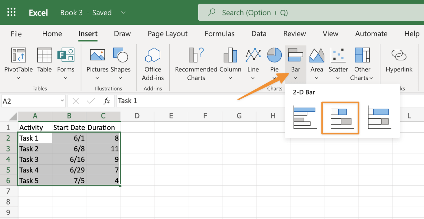
Select the stacked bar chart as your desired chart type and click OK to confirm.
Next, click Border Color at the bottom left corner of the same window where you just edited colors used within borders around each rectangle shape created earlier; highlight the border color option with the cursor – it’ll turn blue once highlighted – then click “More Options” button beside “Border Style” drop-down list box containing four different types: Dashed Line (default), Dotted Line (default), Double Border (no effect)and None (no border).
To change line weight between individual cells within larger areas like columns or rows with lots of small boxes placed inside intersecting lines forming an overall grid pattern shape, make sure no lines intersecting each other are selected first before choosing another line style such as dashed style instead so lines don’t overlap when trying changing its thickness level via the Properties Bar options.
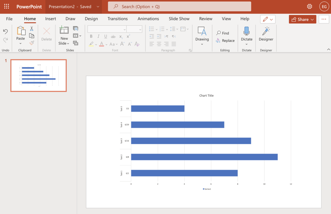
Now that you’ve created your chart, here are the steps you need to take to complete it.
You must decide which Gantt chart template you would like to use. The Gantt chart templates come in numerous varieties: you can choose one that has been designed specifically for a project management application or create your own from scratch. Whichever option you select, the template must have the right amount of detail and information on each bar so that everyone who views the chart understands what is happening.
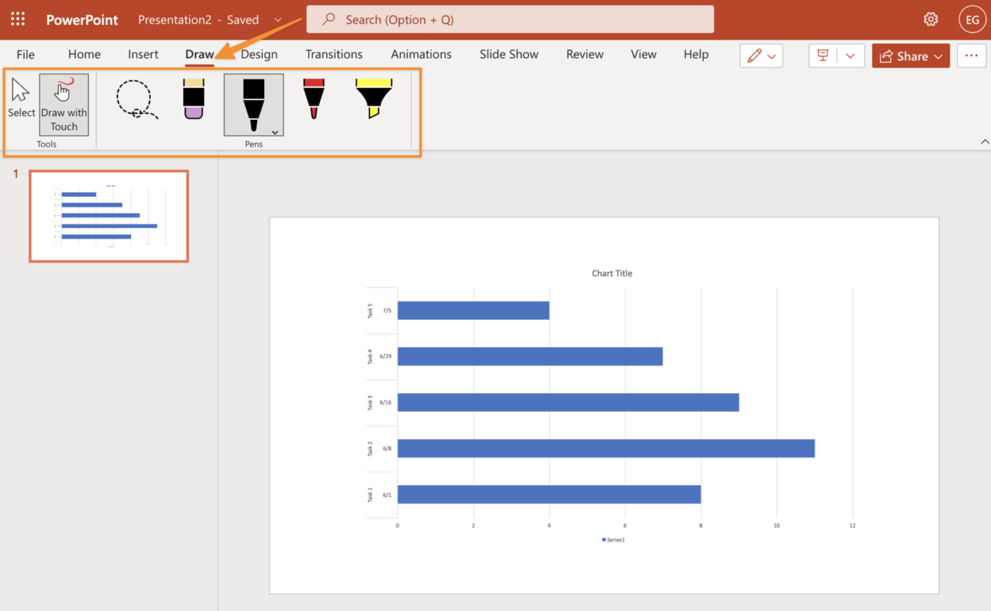
Once you have chosen your Gantt chart template, customize it if necessary. For example, if tasks or milestones are missing from your project plan, add them into empty cells using PowerPoint’s drawing tools. You could also change the font color for certain elements to make it easier for people to view the slide show on different screens.
The Gantt chart template allows you to access many formatting options, including fonts and colors. You can also use the Smart Guide feature to align items on your Gantt chart quickly. In addition, there are plenty of tools for customizing your template.
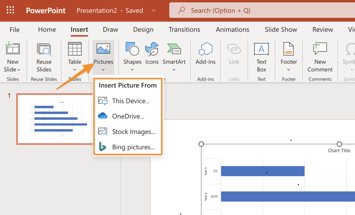
The Format tab allows you to change font styles, colors, alignment, and borders for textboxes or shape fills/outlines. The Insert tab has an extensive gallery of elements that can be used in your project including images and shapes like arrows and calendars.
Finally, there’s a built-in textbox tool if you want to add text without using PowerPoint’s default fonts.
Milestones are a critical component of your Gantt chart, as they allow you to monitor your progress. You can add milestones in two ways:
To add bars to your Gantt chart, click on the Bars tab in the Ribbon. You will see two types of bars: Task (or Start) and Duration (or Finish). Click on one of these options, and you will see a drop-down list with all the bar styles available for this type of bar.
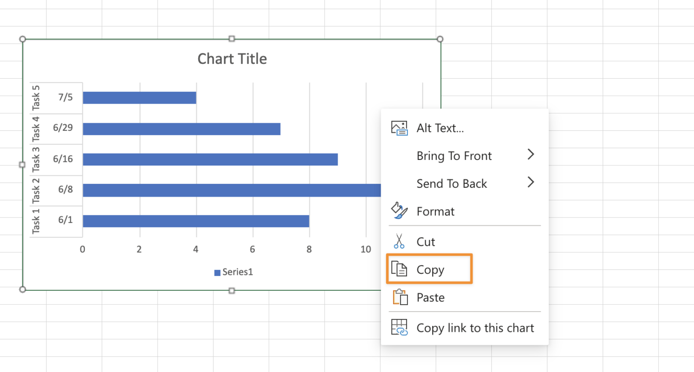
This list includes predefined styles and custom ones you can create using PowerPoint’s artistic tools. If you want to change an existing bar’s color, thickness, or style, click inside its shape, and select Format Shape from the contextual menu.
There you can make changes in the Format Shape dialog box that appears on the screen.
The labels on your Gantt chart should be short and descriptive. They should also be in the same font as your text, in the same color, and the same size. This will help ensure that the information is easy to read and understand at a glance.
It’s time to complete your Gantt chart with some graphics. Try using images of people to represent tasks, equipment for resources, supplies for Milestones, and animals for delayed tasks.
This makes it more visually appealing and helps you convey the project better. Remember that above all else, the Gantt chart is a communication tool. You’ll want it to communicate integral aspects of your project in a way that’s easy to understand.
Related Resources:
To edit your Gantt chart in PowerPoint, follow these steps:
Now that you understand the steps for building a Gantt chart using PowerPoint, here are a few tips you can use to strengthen your chart.
To change the font, size, color, and line style of your text:
While these tips will help with basic usage, Powerpoint still has some limitations compared to other tools. If you need a more powerful Gantt chart solution, try ClickUp.
Smart Guides are available in the View tab and can be turned on or off. They’re very useful for aligning labels with tasks and bars. Keeping your Gantt chart organized helps your audience better understand it, which is where Smart Guides help.
Smart Guides are helpful because as soon as you start dragging that task around with your mouse cursor, it will snap right into place right where it belongs as needed until you change them manually.
You can add an image to the taskbar that provides additional visual context to your Gantt chart. The image should be relevant to the project and use a contrasting color that stands out against the background so it is always easy to see.
Now that we’ve covered how to build a Gantt chart as well as tips for how to improve it, let’s address one of the most critical components of building a Gantt chart in PowerPoint: importing data.
Once you have created your Powerpoint Gantt chart, you will need to import data into it. For this, you can use the Paste option. This will allow you to paste the data into the cells of your Gantt chart. You can also copy data from another source directly into your Gantt chart or use an Import function if no other option is available.
Finally, if none of these methods work for what you’re trying to do with your Gantt chart, then try using an Import As Feature instead.
If you want to pull data into PowerPoint, you can do this in one of two ways: use the Excel connector for PowerPoint, a free add-in for PowerPoint, or export data from Project and import it into PowerPoint. The Excel connector makes it easier to pull data because it allows you to connect directly with Excel—you don’t have to export from Project first.
The first option is to copy and paste either a single row or column at a time. This can be done by selecting the rows, columns, or both and selecting Copy from the Home tab on the Ribbon. Next, select your presentation and paste it onto the Ribbon Home tab. You will now have a duplicate set of data in your PowerPoint file.
If you need to do this for multiple rows or columns, it may be easier to use Excel or Word (or even Google Sheets from Google Docs) as an intermediary step. First, select all desired rows or columns in Excel, then select File > Save As… Enter a name for your new File (you can keep .xlsx) and click Save.
Once you have all of your data in one spreadsheet, you can use the ‘Select Data’ tool to select a single column. You can then copy this column into PowerPoint.
You’ll need to repeat this process for each row in your File—one at a time.
If your Gantt chart is already created in Excel, then you can use the following steps to convert it into individual images and insert them into PowerPoint.
If all of this sounds complicated, you’re right. Even if you understand how to make a Gantt chart in PowerPoint, it’s not intuitive software to manage the ongoing needs of a project. If you want something more powerful and flexible, a better alternative is ClickUp.
The ClickUp Simple Gantt Chart Template makes it easy to bring all of your tasks, deadlines, and project details into one place—without the need for advanced setup or customization.
Check out the video below to see what a Gantt chart in ClickUp looks like in action!

© 2026 ClickUp

There’s an easier way. Try a free AI Agent in ClickUp that actually does the work for you—set up in minutes, save hours every week.