


Still downloading templates?
There’s an easier way. Try a free AI Agent in ClickUp that actually does the work for you—set up in minutes, save hours every week.
Sorry, there were no results found for “”
Sorry, there were no results found for “”
Sorry, there were no results found for “”

Think of a company that’s generating millions in revenue. With bar graphs or pie charts, tracking changes from the initial value and cumulative effect becomes tricky, as there’s no clear visual comparison.
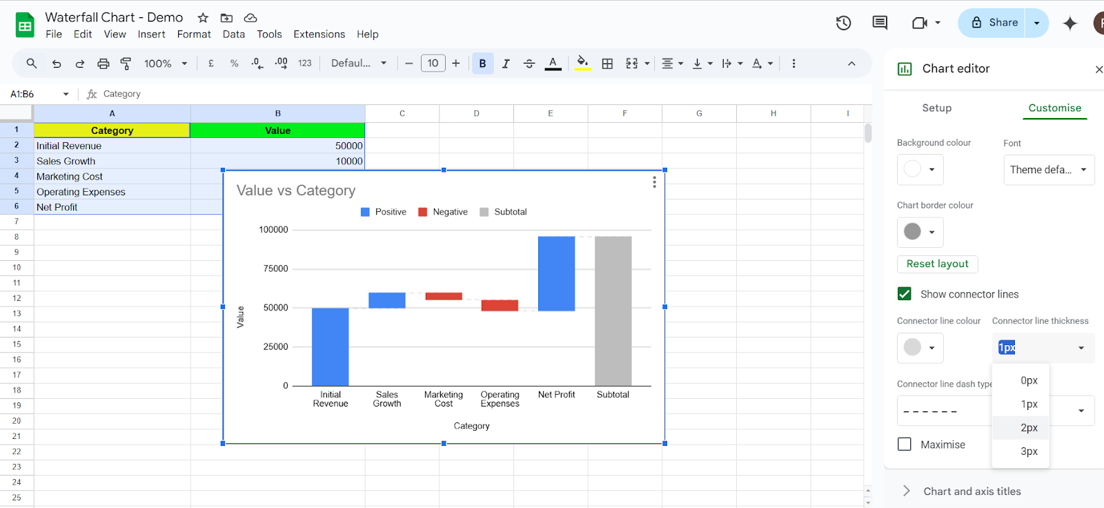
A waterfall chart in Google Sheets solves this problem by ensuring that the beginning of each bar starts where the previous bar ends.
This approach makes it easy for viewers to understand how positive values and negative values impact overall results.
Even though these are imperative data visualization tools, many experienced professionals struggle with how to make a waterfall chart in Google Sheets.
In this article, we will go through a step-by-step guide that’ll make it easy for you to make waterfall charts.
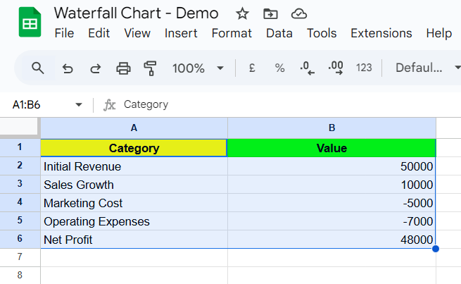
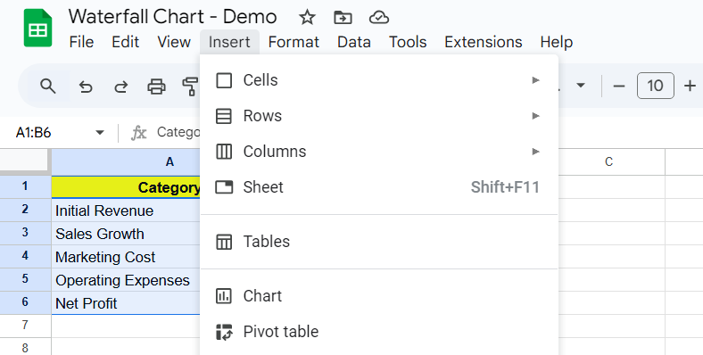
Before creating a waterfall chart, organize your data table correctly. You’ll need:
✅ A first column for category labels (e.g., Revenue, Expenses, Profit)
✅ A second column for numeric data, including:
Here’s an example data set:
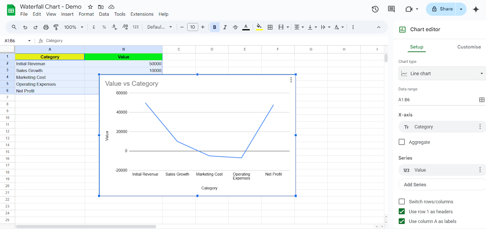
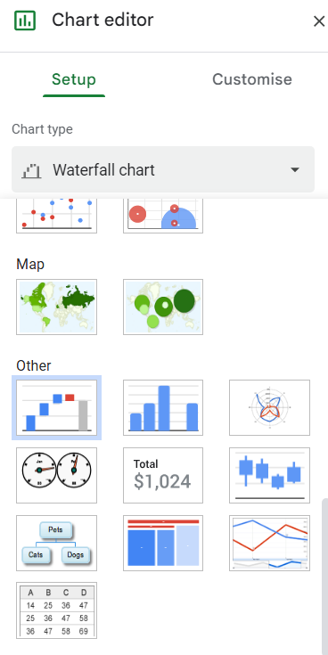
Now, let’s start with the step-by-step guide to creating a waterfall chart.
💡 Pro Tip: Struggling to track financial progress and value shifts in your projects? How To Create a Waterfall Chart in Excel: Steps & Templates breaks down the process step by step—so you can visualize data effortlessly and make informed decisions without spreadsheet stress
💡 Pro Tip: Struggling to make sense of complex data in Excel? How To Create A Dashboard In Excel walks you through building dynamic dashboards that simplify data analysis.
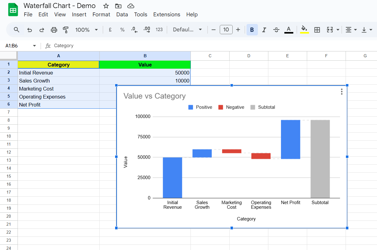
Your waterfall chart will now appear in the spreadsheet, showing how each data point contributes to the final total.
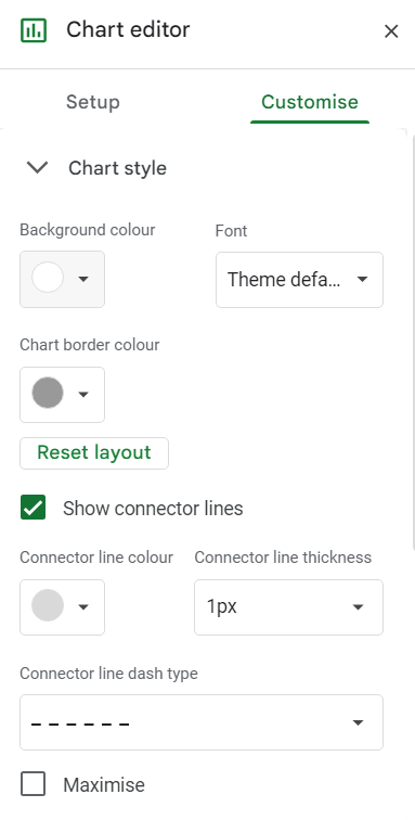
Here are some best practices to keep in mind when adding this feature to your Google Sheets:
📮 ClickUp Insight: 13% of our survey respondents are eager to leverage AI for complex decision-making, yet only 28% use AI regularly at work.
Why? Security concerns. Many hesitate to share sensitive decision-making data with external AI tools. ClickUp eliminates this worry by integrating AI-powered problem-solving directly into your secure Workspace. With SOC 2, ISO compliance, and enterprise-grade security, ClickUp ensures you can safely harness generative AI technology without compromising data privacy.
More recently, Google Sheets has become frustratingly slow for some users. As one Reddit user described:
The data entry form takes forever to complete, and I can’t even type in the fields. Tabs take too long to finish running queries. I can’t believe that 270 rows can bring a spreadsheet to a grinding halt. Maybe it’s the cascading queries, but still—270 is not a large number.
There’s no doubt that Google Sheets is a powerful tool for businesses and everyday tasks, but at times, it can become more of a hassle than a solution, especially when working with charts and large datasets.
Here are some flaws to be aware of:
💡 Pro Tip: Struggling to turn raw data into clear, impactful visuals? How to Make a Chart in Google Docs walks you through the simple steps to create, customize, and enhance charts—so you can present data with clarity
While Google Sheets offers a simple way to visualize data, its performance limitations and lack of advanced customization can make it frustrating for businesses handling large datasets.
You might try reducing the load by introducing additional tools, but the process often leads to a new challenge—relying on multiple platforms for different functions. As information becomes fragmented, tracking progress becomes difficult, and the outcome uncertain.
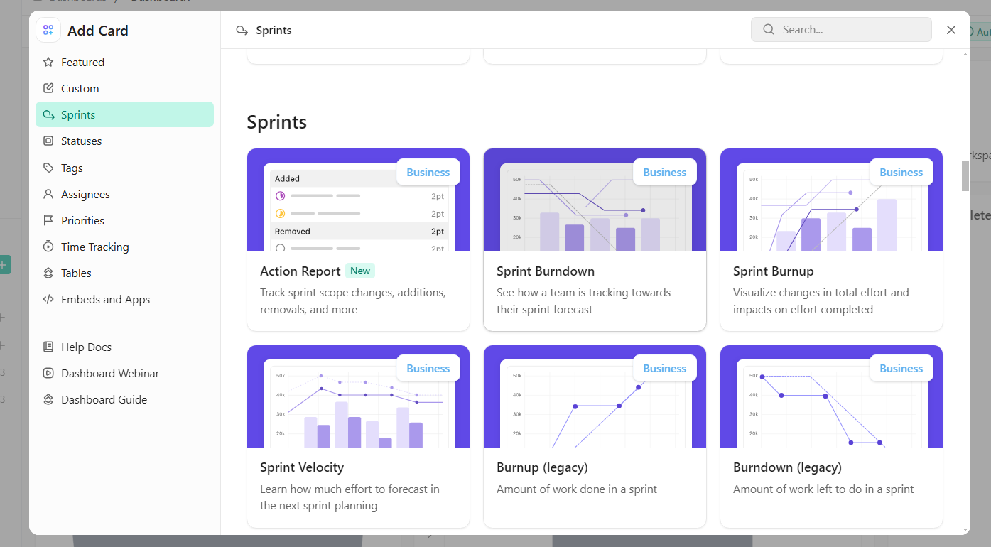
ClickUp, the everything app for work, steals the show here. With ClickUp, you get a powerful data visualization and collaboration platform that allows you to create waterfall charts, bar charts, donut charts, line graphs, and more, all without the limitations of Google Sheets:
ClickUp Dashboards offer customizable visual workspaces that consolidate key data points, charts, and reports in one place.

Unlike Google Sheets, where users must create separate sheets for different reports and update them manually, ClickUp Dashboards automatically pull in live data from tasks, lists, and projects. Here’s how:
💡 Pro Tip: Drowning in endless rows of data? How to Make a Graph in Excel simplifies the process of turning spreadsheets into insightful graphs—so you can analyze and present data without the headache.
When you create waterfall charts using ClickUp, you get automatic updates to track value changes in real-time based on task or project progress. ClickUp also allows dynamic grouping of income, expenses, and net changes without manual data manipulation.
Don’t have time to start from scratch? It’s okay. ClickUp has your back.
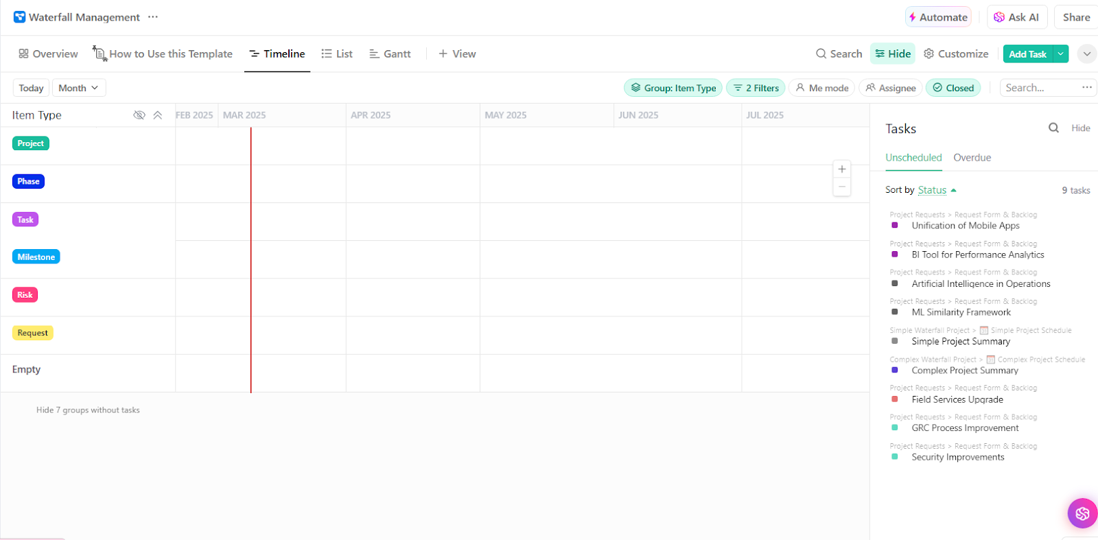
ClickUp’s Waterfall Management Template provides clear project visibility. Meaning your team can easily track tasks, deadlines, and dependencies with precision.
By offering structured planning and real-time adjustments, this template helps organizations anticipate delays, improve collaboration, and reduce the risk of missed milestones, making project execution more efficient and predictable.
Everybody loves a good chart (even your boss.) With ClickUp, you don’t even have to put in much effort to create tables that perfectly align your data.
Here are some options for you to try out:
A Line Chart is perfect for tracking changes over time, such as:
✅ Revenue trends
✅ Sales performance
✅ Project progress
Unlike Google Sheets, ClickUp:
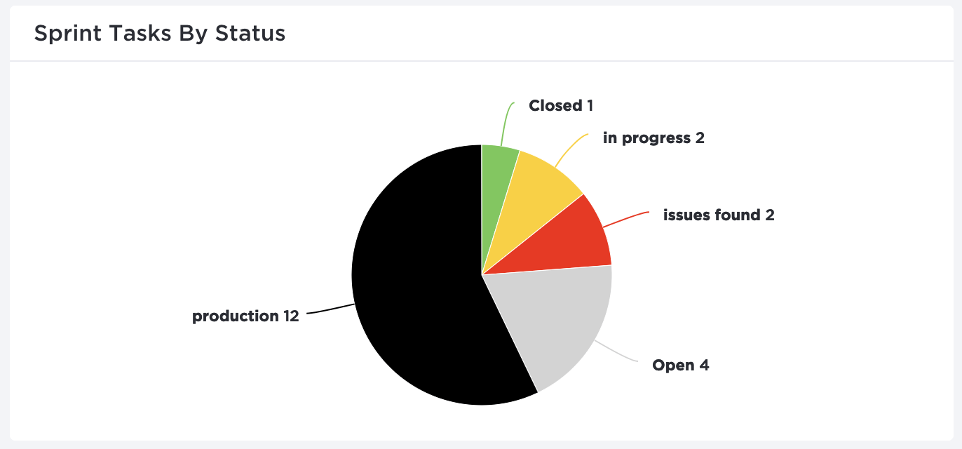
Bar and pie charts provide a clear, quick comparison of different data points.
While creating pie charts in Excel or Google Sheets requires you to memorize often complex formulas, with ClickUp:
💡 Pro Tip: Want to compare multiple data categories at a glance? How to Create a Stacked Bar Chart in Google Sheets walks you through the step-by-step process using the chart editor, so you can build clear, insightful visualizations effortlessly!
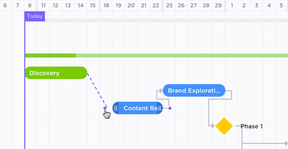
A Gantt Chart is essential for tracking project timelines, dependencies, and task progress.
Instead of manually doing things on Google Sheets, allow ClickUp to take care of the following:
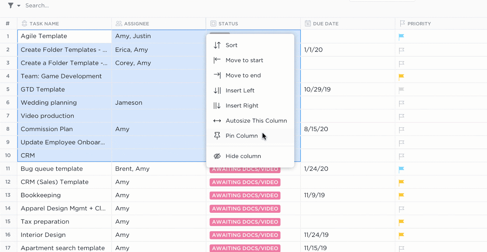
If you’re used to Excel-style data organization, ClickUp’s Table View is the ideal replacement.
Here’s how it stands against Google Sheets:
✅ Eliminate the need for QUERY() functions—Tables update dynamically
✅ Modify multiple rows at once with bulk edit capabilities
✅ Transfer data easily between ClickUp and spreadsheets with export & import compatibility
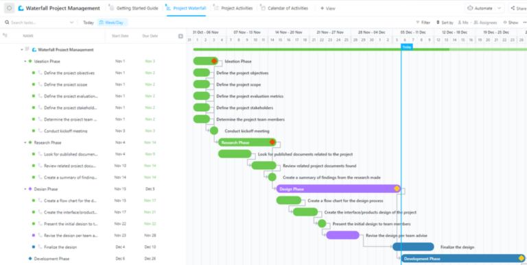
Delays are harmful for your projects. But with clear task organization, real-time progress tracking, and deadline management—you are guaranteed success.
That’s what the Waterfall Project Management Template by ClickUp delivers.
The template structured, phase-by-phase project execution, helping teams stay on schedule and maintain quality throughout the project lifecycle.
Chandu Prasad T. S., Senior Account Executive at Smallcase Technologies Pvt Ltd, shares a few things to say about ClickUp’s charting features and ClickUp Dashboards:
There are many tracking tools, such as time trackers and various charts (pie, line, bar), that help efficiently manage projects in ClickUp. The ability to create and customize multiple Dashboards is extremely useful, providing valuable insights for teams to work more effectively.
Productivity skyrockets when progress is visual. A well-structured dashboard keeps teams motivated and informed.
With ClickUp’s Waterfall Management Template, dynamic dashboards, and real-time charting features, teams can track tasks, analyze performance, and optimize workflows effortlessly without worrying about outdated spreadsheets.
Sign up on ClickUp today and turn your data into actionable insights!

© 2026 ClickUp

There’s an easier way. Try a free AI Agent in ClickUp that actually does the work for you—set up in minutes, save hours every week.