Sorry, there were no results found for “”
Sorry, there were no results found for “”
Sorry, there were no results found for “”
Ever stared at a messy Miro board packed with half-baked ideas and asked yourself, “Now what?”
That was me during our last quarterly planning sprint. Our marketing team had dumped dozens of ideas onto the board—SEO content angles, partner campaigns, email experiments, webinar themes, social hooks. Everyone contributed, but nothing was connected. It was a creative free-for-all… and totally overwhelming.
So, we paused. Then started grouping the ideas—Top-of-Funnel, Mid-Funnel, Retention, Brand Plays. That one simple step turned a flood of input into a clear, strategic roadmap.
That’s the power of an affinity diagram. It helps you organize scattered ideas into focused categories so your team can move from brainstorm to execution—faster and with alignment.
In this post, I’ll show you how to use affinity diagrams to simplify complex decisions, align teams, and bring clarity to your next big marketing challenge. But first, let’s start with the basics.
Whether you’re sorting through customer research, planning your next campaign, or aligning cross-functional input, affinity diagrams can help you turn scattered data into clear, actionable themes.
Here’s how I use them to simplify decision-making and bring structure to the chaos—step by step:
Before we dive into the sprint, I always rally the team around a single question:
“What’s the real marketing problem we’re trying to solve?”
During our last quarterly planning sprint, ideas were flying from every direction—SEO tweaks, email revamps, content gaps, campaign overlaps. But we were solving ten problems at once.
So, we kicked things off with a ClickUp Doc and dropped one prompt:
“What’s slowing down our pipeline impact across marketing?”
Everyone jumped in—SEO flagged conflicting priorities, the lifecycle team mentioned drop-offs in nurture, and the content lead pointed out gaps in messaging. In 20 minutes, we had a shared definition of the challenge—and something solid to build the affinity diagram on.
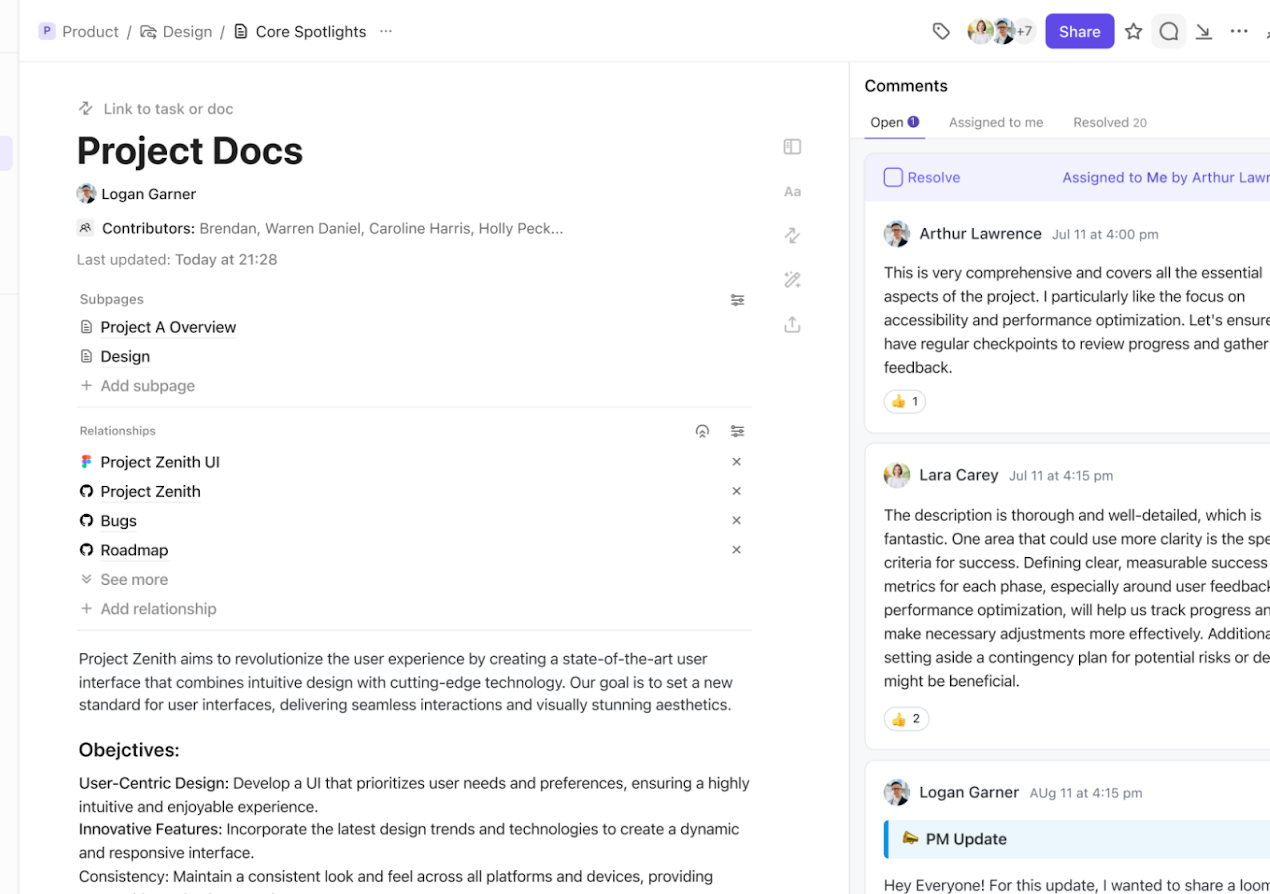
ClickUp Docs is perfect for this early step. It lets my remote team collaborate in real time, throw in raw thoughts, and react to each other’s input—without needing a full meeting. We get clarity fast, and we’re ready to move forward with focus.
Once I’m clear on the problem, the next step is gathering input—and that starts with brainstorming.
I make sure to involve cross-functional teams like marketing, product, and even support. Everyone brings a different lens, and that’s what makes the input rich. Sometimes, I’ll loop in external partners too, especially if they’re close to the user journey.
No idea is too small or offbeat. I capture everything—raw, unfiltered.
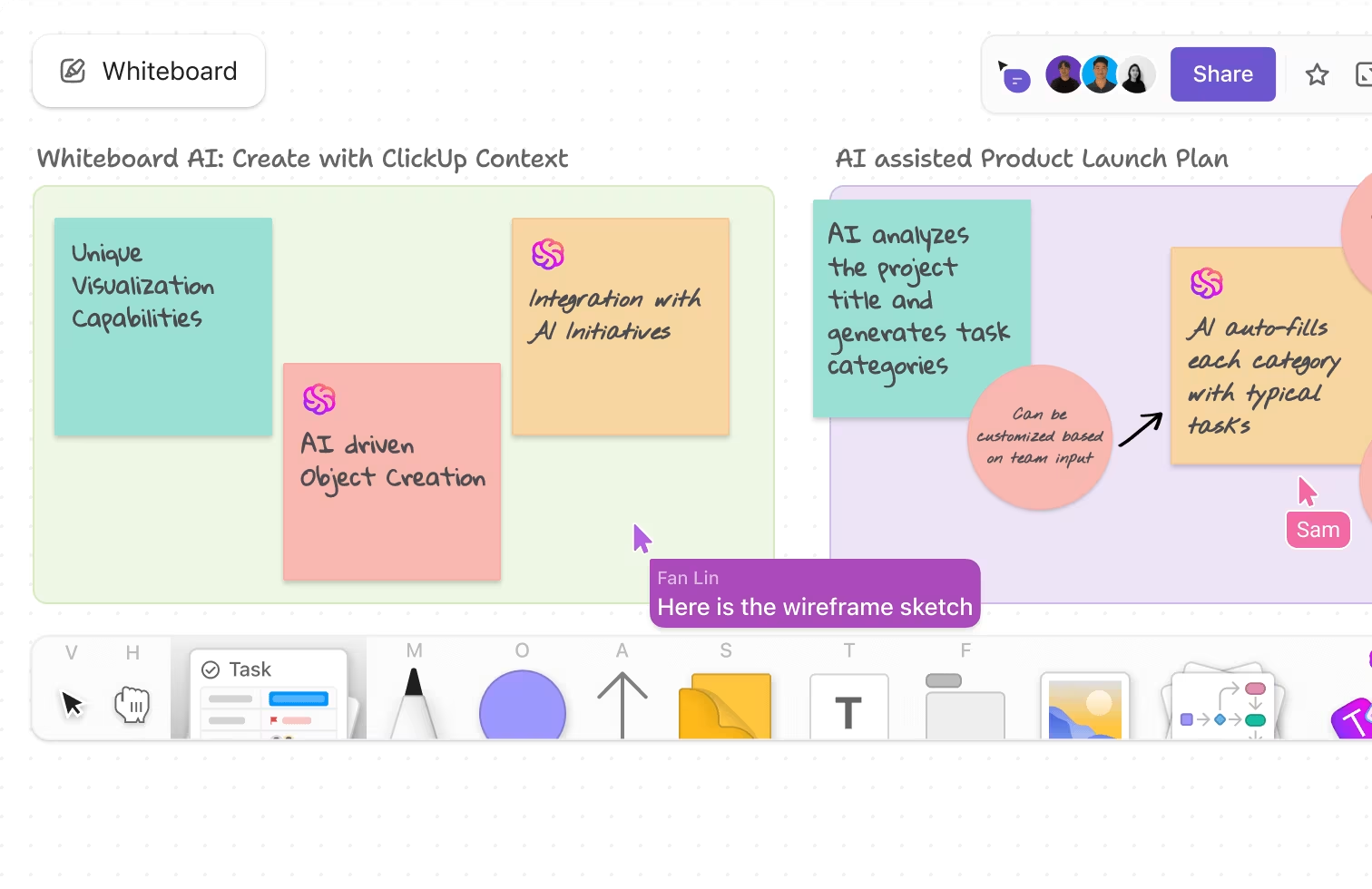
For example, during our last campaign retro, the marketing team dropped ideas from SEO data, webinar feedback, social comments, and sales calls into a shared ClickUp Whiteboard. The range was huge, from “we need more TOFU content” to “let’s test LinkedIn Live again.”
The goal here? Gather as much insight as possible without judgment. We’ll sort it out later.
When the volume’s high, sticky notes just don’t cut it. ClickUp Whiteboards, a platform for real-time visual collaboration, would be a great fit for your brainstorming session. The tool offers a creative canvas where your team members can write notes, add shapes, draw freehand, and put their best ideas on the table.
You can also link relevant tasks, files, and documents from your ClickUp Workspace to make the notes more contextual.
ClickUp users love Whiteboards:
ClickUp has helped our team communicate on a remote team in different time zones and know what is going on in the project without having to have unnecessary meetings or ask people for information by email or Slack. The whiteboard feature helps us brainstorm processes and workflows and assign tasks in real-time.
Once all the ideas are on the board, it’s time to make sense of the chaos. I start by scanning through everything and looking for patterns or recurring themes.
I don’t rush this step. Instead, I drag and group similar ideas together. It’s less about being perfect and more about getting a high-level view of what’s really going on.
Take our recent marketing sprint, for example. We had input from SEO, email, events, and product marketing. As we grouped the ideas, clear categories started to emerge—like Lead Gen Experiments, Content Gaps, Brand Awareness, and Retention Plays. Once we labeled these, the clutter disappeared, and we could actually see a strategic direction forming.
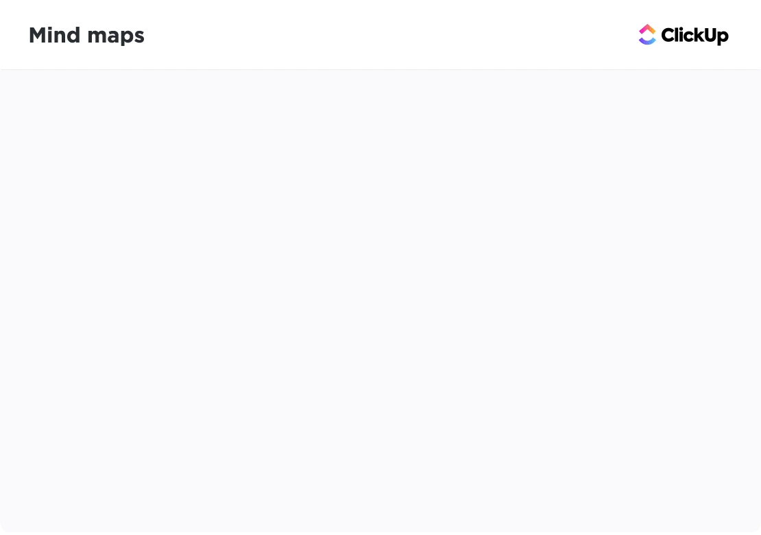
To go deeper, I switch to ClickUp Mind Maps—right inside the Whiteboard view. It’s the easiest way to visualize how everything connects.
With Mind Maps in ClickUp, I can:
It’s a massive time-saver—and more importantly, it helps the team move from brainstorming to execution without missing a beat.
Once the map feels aligned, we’re ready to prioritize and build the plan.
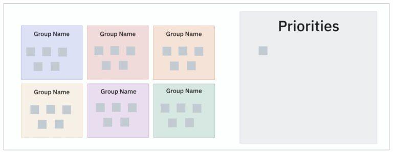
Now that the ideas are grouped and mapped, it’s time to bring them all together into a complete affinity diagram.
I start by arranging the categories and sub-ideas on a whiteboard in a way that visually shows how they relate. I’m not aiming for a polished layout right away—just something that tells the story clearly.
Then, I use connectors—lines, arrows, even color codes—to show relationships between themes. For example, in our marketing planning map, Lead Gen Experiments was tied to both Content Gaps and Partner Strategy, so I linked them visually to show that interdependency.
If I’m working inside ClickUp Whiteboards, this step is smooth. I can drag and drop ideas, rearrange on the fly, and use built-in visual elements like arrows, sticky shapes, and color tags to create a clear structure. The flexibility really helps as the diagram evolves.
And honestly, I don’t hesitate to move things around. The goal isn’t to create a perfect chart—it’s to build a visual that helps the team quickly grasp connections, spot gaps, and align on the next steps.
Once everything’s in place, we’re no longer just staring at a wall of ideas. We’re looking at a roadmap.
Once the diagram’s in place, I shift into action mode.
I start by identifying the clusters with the most weight. In our recent marketing sprint, the Retention Plays category had the most input—from gaps in onboarding emails to inactive user journeys. That told me exactly where we needed to focus first.
From there, I outlined a simple plan: fix what’s broken, test what’s new. We assigned owners, broke down each idea into actionable items, and set clear deadlines.
The best part? ClickUp Whiteboards makes this transition seamless. As we reviewed the board, I converted sticky notes like “Revamp Day 3 onboarding email” directly into ClickUp Tasks. Each one showed up in the right space, with owners, priorities, and timelines already set.
This helped us move straight from ideation to execution—without dropping the momentum. Everything stayed connected, and the team always had visibility into what was being done and why.

Once our action plan is in motion, I rely on different ClickUp Views to keep everything on track—whether I need a big-picture snapshot or a deep dive into individual tasks.
During our marketing sprint, once we mapped out tasks under Retention Plays, I used a mix of views to stay in control:
If I’m short on time, I’ll sometimes skip the manual steps and use the ClickUp Affinity Diagram Template. It’s pre-built and customizable—perfect for quickly listing ideas, grouping them, and jumping straight into task creation.
Bottom line: whether we’re ideating, planning, or executing, ClickUp keeps the entire workflow connected—from whiteboard to done.ar ideas into categories, prioritize critical items, and visualize task progress, all within a unified space.
With ClickUp’s Affinity Diagram Template, I don’t have to start from scratch. It’s flexible, easy to use, and perfect for fast-paced marketing teams like ours.
Here’s what I get out of it:
Whether I’m mapping user research, improving campaign workflows, or planning a new content strategy, this template adapts to any use case. Once we’ve laid everything out, I can track progress using ClickUp’s built-in views—List, Gantt, Calendar, or Workload—depending on what I need to see.
It’s how we went from scattered feedback and isolated team inputs to a unified, actionable plan for our next GTM launch—without ever leaving ClickUp.
Over time, I’ve found affinity diagrams to be incredibly useful across different parts of our marketing engine. Here are five moments where they’ve helped me bring order to the chaos:
After running interviews or collecting feedback from NPS surveys, I usually end up with a ton of scattered insights. To make sense of them, I dump everything onto a board and group similar comments together—like onboarding confusion, missing features, or unexpected product wins.
💡 How it helps me: It makes it easier to align with product marketing on what messages to highlight in our next campaign. Instead of assumptions, we write based on real user language.
Each quarter, content ideas pour in—from SEO, lifecycle, product launches, brand awareness pushes—you name it. I collect everything, throw them into an affinity diagram, and sort them based on funnel stage, campaign priority, or persona fit.
💡 How it helps me: I can quickly spot gaps (like too few MOFU articles) and overlaps, so we build a more balanced content plan that actually moves the needle.
After big launches like a GTM or major webinar series, we do a retro. I gather feedback from the team, sales, and performance dashboards. Then, I map it into an affinity diagram with clusters like “What Worked,” “Needs Optimization,” and “Bottlenecks.”
💡 How it helps me: It gives us a bird’s-eye view of takeaways without wading through long retro docs. Plus, we can immediately act on what we learned.
When our paid media team runs dozens of ad variants, the results and learnings pile up fast. I use affinity diagrams to group outcomes—say, which pain-point hooks performed better, which formats tanked, and what drove the best conversions.
💡 How it helps me: Instead of just looking at numbers, I can see clear narrative themes that inform our next round of messaging.
Between tool requests, analytics tweaks, and process updates, our backlog can spiral. I regularly host a session to map everything in an affinity diagram, tagging items by urgency, owner, or workflow dependency.
💡 How it helps me: It brings structure to internal chaos and helps the team rally behind what’s urgent and impactful—without burnout.
Before any product launch, we gather inputs from product, sales, support, and marketing. It’s a lot—positioning ideas, enablement needs, email cadences, landing page content, and so on. I use an affinity diagram to group these into themes like “Enablement Assets,” “Persona Messaging,” “Channel Strategy,” etc.
💡 How it helps me: I can see what’s missing, eliminate overlaps, and make sure everyone’s marching in the same direction—before we even kick off the campaign.
We run monthly webinars and often brainstorm a list of ideas from CSMs, customer feedback, and product roadmaps. The list gets long and noisy. I use affinity diagrams to group suggestions into categories like “Feature How-Tos,” “Success Stories,” “Thought Leadership,” and “Partner Content.”
💡 How it helps me: It gives me a clear content track roadmap for the next few months and makes prioritizing guest speakers or co-marketing initiatives a breeze.
When analyzing competitors, I often end up with a massive dump of observations—taglines, features, positioning, pricing strategies, and creative tactics. With an affinity diagram, I can organize this into smart clusters like “Differentiators,” “Gaps We Can Fill,” and “Positioning Plays.”
💡 How it helps me: I turn raw notes into battlecards, value props, and strategy tweaks much faster—and it’s easier to align the wider team on what makes us stand out.
When we’re brainstorming ideas for an upcoming event or experiential campaign (virtual or physical), the range of ideas can be wildly diverse—from swag concepts to speaker pitches. I group ideas by theme—“Brand Impact,” “Engagement Hooks,” “Budget Stretchers,” etc.
💡 How it helps me: We avoid shallow brainstorming and instead cluster ideas that support the same objective, so we build a campaign with depth—not just flashy elements.
When planning co-marketing campaigns with influencers or partners, we usually start with a bunch of raw ideas—webinars, co-written blogs, joint reports, giveaways. I sort them in an affinity diagram based on goals like “Lead Gen,” “Brand Reach,” “Sales Enablement.”
💡 How it helps me: It helps us decide which partners align best with each goal, so we don’t spread our efforts thin or pursue feel-good but low-impact collaborations.
Affinity diagrams aren’t just for workshops—they’re part of how I stay sane and strategic. And with ClickUp’s Affinity Diagram Template, I never have to start from scratch. It’s quick, collaborative, and perfectly built for how modern marketing teams operate.
If there’s one thing I’ve learned leading fast-paced marketing sprints, it’s this: ideas are never the problem—alignment is. We’re often sitting on a goldmine of input from SEO, content, product marketing, and events, but it’s all scattered until we bring it together visually.
That’s exactly where affinity diagrams—and ClickUp—have changed the game for me.
Instead of juggling sticky notes or switching between tools, I now build out our diagrams right inside ClickUp. I can group ideas, draw connections, assign tasks, and track execution—all without leaving the workspace.
It’s how we took the chaos of our last GTM planning sprint and turned it into a clean, prioritized roadmap within hours.
If your team is drowning in input but struggling to act on it, ClickUp gives you the clarity, structure, and speed you need to move forward.
Less chaos. More clarity. Try affinity diagrams in ClickUp and make your next sprint your most productive yet.

Manasi Nair
Max 12min read

Praburam Srinivasan
Max 13min read

© 2026 ClickUp