

If you’re new to Agile development, figuring out sprint velocity and velocity charts can be one confusing ordeal. Well, it’s all about keeping score!
Sprint velocity is like the points in a high-stakes basketball game. It helps agile and scrum team members know whether they’re winning or losing against time.
By understanding and employing sprint velocity, development teams can improve their work rhythm and streamline their Agile development processes. The general idea is that the higher the velocity, the more ground you cover in each sprint and the closer you get to winning the game under constraints like time and budget.
Consider this guide as the Phil Jackson of calculating and optimizing your team’s sprint velocity. We’ll also offer insights and strategies for boosting team productivity over sprint cycles to help you alley-oop your way to victory.
Ready to dominate the agile court? Let’s go! 🏀
Ready, Set, Sprint! Your Master Guide to Measuring Sprint Velocity
- What Is Sprint Velocity?
- How to Calculate Sprint Velocity: Formula and Steps
- Example #1 Calculating sprint velocity using story points
- Example #2 Calculating sprint velocity using hours
- Example #3 Calculating sprint velocity using ideal days
- 6 Strategies to Improve and Stabilize Your Team’s Velocity
- 1. Document and optimize your workflow
- 2. Visualize progress through velocity reports
- 3. Maintain stable velocity by keeping variables in check
- 4. Review your sprint backlog regularly
- 5. Watch out for external dependencies and technical glitches
- 6. Dedicate a sprint retrospective for velocity optimization
- Potential Challenges of Using Sprint Velocity
What Is Sprint Velocity?
Agile teams work in short developmental phases known as sprint cycles. Each cycle, usually spanning one to four weeks, divides the project into measurable components of work necessary to ship the software.
Sure, your teammates plan, code, address product backlog, and rework features every sprint, but how do you estimate the optimized time required for delivery? That’s exactly why you calculate velocity. ⚡
Sprint velocity effectively tracks your team’s progress and estimates how much work they can handle in a sprint cycle. Every cycle will have a particular velocity regarding what the team completed. The average velocity over the last three to ten cycles will help you predict the standard amount of work your product or development team completes per sprint.
What’s the purpose of a sprint velocity estimate?
Sprint velocity is not a measure of success but an estimate to understand your team’s capacity. It can be a rather arbitrary metric that may change based on factors like project complexity, team composition, or external influences.
But you still need to measure sprint velocity to:
- Evaluate when your team can complete a particular project
- Adjust the scope of future sprints and design workload based on current progress rates
- Review and manage stakeholder expectations with greater precision
Sprint velocity also indicates the continuous improvement in a team as far as productivity is concerned. In most cases, the velocity estimates steadily trend upward, suggesting that the team has become more efficient over time.
Pro Tip: Your team’s velocity is all about how reliably you meet sprint goals. If you want to improve the efficiency of your workflows, use the ClickUp Sprints Template. It comes with preset agile metrics and Custom Fields to help you calculate team velocity at any scale. And the best part? It’s absolutely free!

How to Calculate Sprint Velocity: Formula and Steps
Calculating sprint velocity in software development is simple once you grasp the basic formula, which is:
Sprint velocity = Total work completed in x number of past sprints ➗ The number of past sprints, i.e., x
To use this formula, though, you first need to figure out a variety of stuff, such as the metric to calculate the work done and your sprint backlog. Let’s break the process down for you through three standard steps followed by examples:
Step 1: Determine a metric to track progress over several sprints
Calculating velocity requires measuring work across variable dimensions like team, project, and client, which can be challenging. That’s why you need to determine a suitable metric to accurately estimate the work done. The three common metrics used are:
- Story points: A user story concisely describes required features from the customer’s viewpoint. Completing each story takes a particular amount of time and effort based on the complexity of the work involved, which is quantified through story points. To find the amount of work done in a sprint, you have to think in terms of—How many story points were completed in the sprint? Let’s say your team finished user stories worth 26 points in Sprint 1, so the work done in this cycle is 26. You can read this quick guide to calculating story points in Agile
- Hours: If you prefer a more traditional metric, you can calculate sprint velocity in hours by finding the number of hours spent on completed user stories each sprint—say, 120 hours. This method may offer a less granular value of work done compared to story points, especially if time estimates are unpredictable
- Ideal days: Many teams may calculate sprint velocity in ideal days, with each ideal day indicating the number of work hours in a normal workday (say 8 hours). For example, the 120 hours of work done in Sprint 1 can be expressed as 120/8 or 15 ideal days
Most teams find story point-based calculations more appropriate for tracking a team’s progress as they factor in the varying complexity levels of different development tasks, often using a Fibonacci-based sequence.
You can pick a metric during sprint planning, ideally before the first sprint. Whatever metric you choose will also determine how your team expresses velocity—whether through story points, hours, or ideal days.
Step 2: Calculate the work done for each sprint under consideration
Use your preferred metric to quantify the work your team managed for a series of sprints. The work can include clearing backlog items, fixing glitches, and working on new features proposed by the product owner.
Ideally, you should consider the work done in three sprints to establish a benchmark team velocity. However, if the work done fluctuates heavily, you may need more sprints to stabilize your progress rate.
Step 3: Find the average sprint velocity for your team
Once you have your numbers for the work done over the selected sprints, just find the average. Add up the total story points, hours, or ideal days and divide the result by the number of sprints completed.
Let’s go over some practical examples for greater clarity.
Example #1 Calculating sprint velocity using story points
Let’s say we keep a log of the story points completed in the three previous sprints:
Sprint 1: The team completed 10 user stories worth 3 points each and another complicated user story worth 6 points. That’s 36 story points in total (exclude fractionally completed stories)
Sprint 2: We could manage 9 user stories worth 5 points each, so that’s 45 story points
Sprint 3: 38 story points worth of work done
Now add up the story points and apply the formula: (36+45+38 story points)/3 sprints, and the result is 39.67.
In this case, our average sprint velocity is 39.67 story points per sprint. That’s essentially how much effort your team can put in each sprint.
Example #2 Calculating sprint velocity using hours
Calculating sprint velocity using hours as a measure follows a similar approach to the previous example, but here, tasks are translated into hours.
Sprint 1: 160 hours for completing 5 tasks
Sprint 2: 240 hours for 8 tasks
Sprint 3: 180 hours for 6 tasks
Across the past three sprints, the team invested a total of 580 hours. That’s roughly 193.33 hours per sprint, making the average sprint velocity 190 hours.
Using hour estimates helps understand how many hours a team can realistically devote to project work without over-committing. In our example, you’ll notice a noteworthy crunch during sprint 2 that may not be realistic and needs addressing.
Example #3 Calculating sprint velocity using ideal days
Using days as a measure often begins by determining the ideal day. You may have to tally the total output from several sprints before. For our example, let’s consider an ideal day to be 8 hours long.
Sprint 1: 96 hours worked. 96/8 is 12 ideal days
Sprint 2: 120 hours—15 ideal days
Sprint 3: 108 hours—13.5 ideal days
Adding the ideal days for each sprint gives us 40.5, so the average is 13.5 ideal days for each sprint.
6 Strategies to Improve and Stabilize Your Team’s Velocity
Sprint velocity must be stable for it to be reliable or useful for sprint planning. Still, you can expect highly fluctuating velocity due to issues like:
- An over-complicated agile project
- Unnecessary tests and meetings
- Limited input from the product owner
- Unrefined product backlog
- Staff shortage
While some of these issues are beyond your control, you can avoid common productivity setbacks by using a quality project management solution like ClickUp. The software helps you run projects effectively and maintain higher velocity as the workflow progresses.
We have compiled six expert-approved strategies for improving and stabilizing team velocity. We’ll also demonstrate some handy functionalities with the ClickUp Agile Suite, ideal for tracking sprint velocities and keeping teams productive. 👇
1. Document and optimize your workflow
Agile teams can get sidetracked due to poorly optimized workflows, which tends to bring down their velocity. Picture this: Miriam, a skilled coder, spends 4 hours of her workday asking team members for precise product requirements. What if this happens with other teams as well? Your velocity tanks.
The only way to streamline various work processes and minimize errors every sprint is to document everything—from user case studies and project requirements to backlog items.
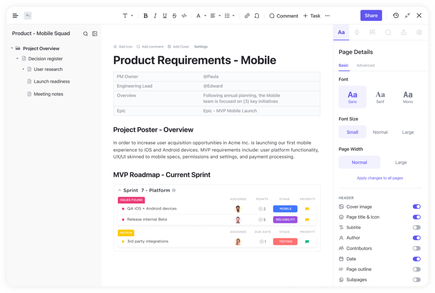
Take ClickUp Docs, for instance—it helps you centralize your product documentation in an easily searchable format. Detail the required specs, share and collaborate on prototypes, and organize backlogs for each sprint, all in one spot.
As a one-stop sprint planning tool, ClickUp offers several other features to optimize your team’s workflows, such as:
- ClickUp AI: The platform’s AI assistant has an extensive library of industry-specific prompts designed to cater to your unique roles. Your teammates can use the tool as a writing and brainstorming partner, leveraging it for tasks like:
- Writing case studies, test plans, and technical project documents
- Summarizing meeting notes and other data
- Brainstorming feature names
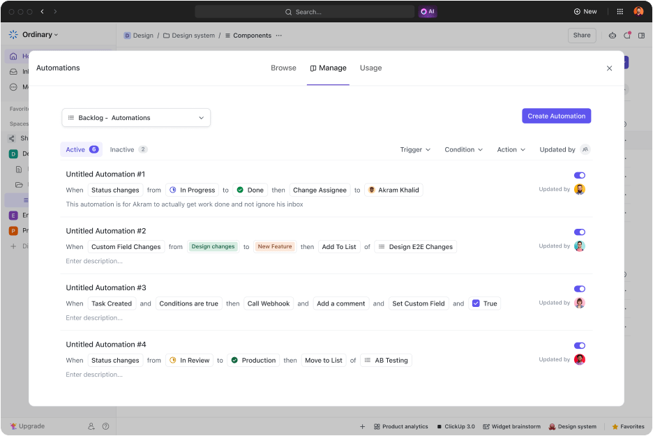
- ClickUp Automations: Use seamless automation to fast-track time-consuming and routine tasks. Your teammates can choose from 100+ pre-built automations or build their own, allowing them to speedrun workflows and boost capacity for critical development tasks
- Collaboration Detection: This feature allows teammates to see when another colleague is working on the same task or document as them, preventing instances of duplication of effort
2. Visualize progress through velocity reports
You don’t have to wait for three sprints to end to get an idea about your velocity. Many teams now use visual reports to keep tabs on their sprint velocity estimates in real time.
Two popular methods to track velocity are:
- Sprint velocity chart: It’s a simple graphical representation of your work done (represented by the Y-axis) across sprints (represented by the X-axis)
- Burndown chart: A burndown chart is another graphical representation to track velocity, giving you an overview of the tasks left to do mapped against time
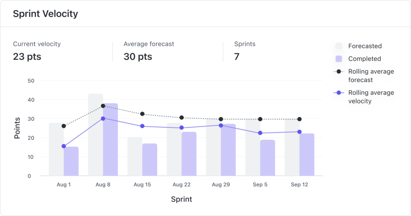
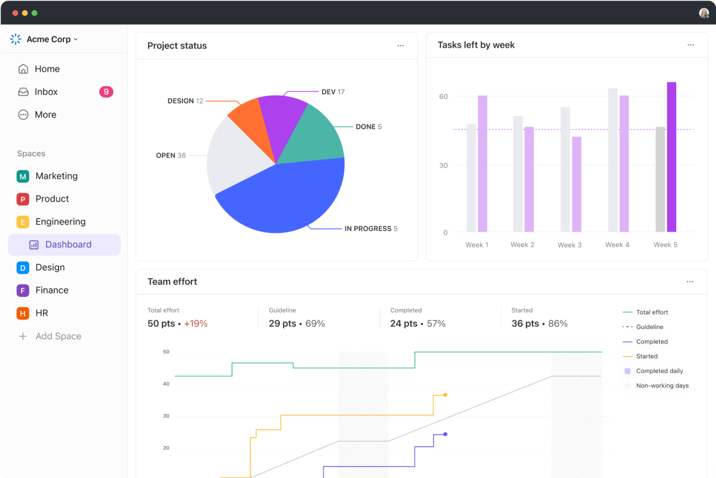
Explore Sprint Velocity cards in ClickUp to visually represent and track your team’s progress in a clear format. Setting up these report cards hardly takes time as they automatically tune into the configurations in your default Workspace or Sprint Folder.
Additionally, you can also create Burnup and Burndown cards within ClickUp to gain insights into pending work. These real time reports enhance your sprint velocity estimate and lead to more productive planning meetings.

3. Maintain stable velocity by keeping variables in check
Consistency is key when it comes to maintaining your team’s sprint velocity. Altering too many variables across multiple sprints can leave you with wildly oscillating progress rates.
In general, make an effort to keep the basics like sprint length, team turnover, and story point estimations balanced over sprints. You can always make adjustments if you predict delays due to an overworked team. For example, adding a new member usually boosts workload capacity and helps increase velocity.
Keeping tabs on project variables is a breeze with ClickUp Sprints. It offers a set of functionalities for scrum masters to navigate each project aspect efficiently. Set sprint dates, assign points, manage backlogs, specify UX design tasks, and adjust priorities, ensuring everyone is aligned on tasks and timelines.

With ClickUp, you can track sprint points by task and assignee and get a granular overview of progress. Implement changes anytime based on user demands and current business goals, and review how everything impacts your velocity right away.
Got leftover tasks? You can automatically push unfinished work to the next sprint and even integrate with third-party tools like GitHub, GitLab, or Bitbucket to synchronize progress.

4. Review your sprint backlog regularly
A well-refined backlog is a treasure trove of details in scrum workflows, providing team members with comprehensive information when starting a new sprint. Backlog refinement ensures that teams prioritize executing necessary and/or high-value tasks to maintain higher velocity.
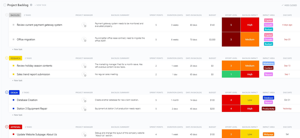
You may want to use the ClickUp Project Backlog Template to organize and oversee important tasks and deadlines each sprint. It’s crafted to streamline task capture, helping you through real-time progress tracking, built-in team synchronization, prioritization, and scrum tools.
5. Watch out for external dependencies and technical glitches
While velocity is often measured at the team level, both internal and external factors can impact the metric. Shifts in requirements, missing critical software, slow customer feedback, or the absence of a key team member can bring down the overall velocity.
The best practice here is to create a cohesive map of dependencies during sprint planning. Factor in all potential pitfalls, such as disrupted approval processes and technical hindrances like outdated testing servers, to review the interconnected tasks affected.
Need a quick start? ClickUp Dependencies can help! The feature lets you create and track links between tasks, documents, and deliverables. You can use the platform’s Gantt Charts to get a consolidated view of everything, such as the connection between customers and orders, clients and deals, or users and bug reports.

6. Dedicate a sprint retrospective for velocity optimization
When identifying additional velocity optimization opportunities, it’s smart to conduct a sprint retrospective session. Discuss previous sprints with your team and register individual opinions on what seems like a doable workload for the next sprint.
Keep in mind that trying to aggressively optimize sprint velocity can be counterintuitive at times. For instance, if you push for more features in the next sprint, it’s likely that the quality gets compromised, and the product ends up with a lot of bugs.
You can access a host of agile reports for your sprint retrospectives with ClickUp Dashboards. Engage in data-backed discussions around progress blockers. For instance, you can use Sprint cards to measure performance for the current sprint or Time Tracking cards to compare the estimated work done by employees against individual hours.
Tip: Make use of ClickUp’s retrospective and sprint planning templates to document your sessions in an organized manner.
Potential Challenges of Using Sprint Velocity
Sprint velocity, when used the wrong way, can be a nuisance for any development team. Here are some icky situations to watch out for:
Poor contextual usage of your team’s sprint velocity
As Goodhart’s Law suggests, “When a measure becomes a target, it loses its effectiveness.”
Sprint velocity is not the ideal tool for driving change within a team. Its primary purpose is only to assist in planning future sprints and reporting estimations.
Comparing velocities between different teams or using them to micromanage employees can lead to burnout and compromised work quality. Velocity should strictly be a support tool for aligning the team to deliver value and satisfaction to customers and meet stakeholder expectations.
Ignoring technical debt considerations
Trying to increase sprint velocity can trigger a potential trade-off between velocity and quality, creating technical debt. Pressure to get work done quickly can cause teams to skip essential practices like unit testing and code reviews.
Know that steeper velocity does not equate to business value. Prioritize having stable velocity that works for your team.
No idle time for future sprints
While sprint velocity is an essential metric in agile project management, new teams often make the mistake of over-stuffing their upcoming sprint with tasks, leaving no room for idle time. This can impact team performance and deliverables, especially when addressing service disruptions.
Benefits of measuring sprint velocity consistently
The challenges presented above are largely avoidable if you use sprint velocity with the right mindset. Teams that regularly use this metric enjoy three distinct benefits:
- Enhanced sprint planning: Sprint velocity offers a dependable method to assess team workloads and avoid unforeseen roadblocks in your development process
- Improved communication with stakeholders: It simplifies communication with project stakeholders. You can offer precise timeframes for tasks by relying on data-driven reports
- Greater visibility into work patterns: Regular checks on sprint velocity provide deeper insights into your team’s efficiency and deep work patterns, helping identify performance fluctuations early on
Make Projects Sprint Ahead with ClickUp
Elevate your team’s efficiency and productivity with ClickUp—the ultimate tool for tracking sprint velocity and navigating the entire software development lifecycle.
With AI-enabled tools and agile templates, ClickUp provides the boost you need to lead the pack and secure epic wins in every project. Sign up for free and give your team that little oomph it needs to dunk the ball in every task hoop! 🌺


Everything you need to stay organized and get work done.

Recent Articles
What is Agile Budgeting in Project Management and How to Implement It? 
What is Agile Budgeting in Project Management and How to Implement It?
What is Agile Project Management? Explanation & How To Start 
What is Agile Project Management? Explanation & How To Start
Burnup Chart vs. Burndown Chart: What’s the Difference?
Burnup Chart vs. Burndown Chart: What’s the Difference?
