


Still downloading templates?
There’s an easier way. Try a free AI Agent in ClickUp that actually does the work for you—set up in minutes, save hours every week.
Sorry, there were no results found for “”
Sorry, there were no results found for “”
Sorry, there were no results found for “”
Imagine you’re a baseball general manager. Traditionally, you’d scout players based on their physical attributes, past performance, and gut instincts. You might prioritize players who hit home runs or strike out many batters.
Billy Beane, the general manager of the Oakland Athletics in the early 2000s, challenged this traditional approach. He turned to Sabermetrics, a statistical analysis of baseball data. Instead of focusing on flashy stats like home runs, he looked at metrics that more accurately measured a player’s overall contribution to winning, like on-base percentage.
By using Sabermetrics, Beane was able to identify undervalued players to build a competitive team on a tight budget.
Similarly, a people analytics dashboard allows you to manage your team with data, not just intuition. It provides clear insights into critical areas like team engagement, turnover risks, and growth opportunities, all in one place.
71% of HR executives who use people analytics report that it is essential to their organization’s HR strategy.
Creating this dashboard might seem complex, but with the right tools and a data-driven approach, it becomes a powerful asset for making informed decisions. In this article, we’ll guide you through creating a people analytics dashboard and provide examples to get you started.
People analytics involves using data and statistical methods to understand and improve how organizations manage employees. It helps HR professionals make data-driven recruitment, performance, and employee satisfaction decisions.
A people analytics dashboard is a visual tool that consolidates and displays vital HR metrics and data. Its purpose is to provide a clear, real-time view of employee-related data, enabling quick and informed decisions based on the workforce dashboard.
People analytics is vital in HR because it helps organizations optimize their workforce. It provides insights into:
It empowers HR professionals to address issues proactively and improve overall organizational effectiveness.
A common question is how people analytics dashboards differ from traditional reports.
Reports typically provide detailed, static data snapshots, summarizing past performance with comprehensive analysis. For example, an annual HR report might include in-depth data on employee turnover, compensation, and engagement levels, usually in a fixed format like a PDF or printed document.
In contrast, people analytics dashboards deliver dynamic, real-time visualizations of key metrics. They enable interactive data exploration, allowing you to see trends as they develop and make informed decisions quickly.
For instance, an HR dashboard might showcase live data on employee satisfaction scores, turnover rates, and recruitment metrics, with features that let you drill down into specific details or timeframes.
Creating an effective people analytics dashboard begins with understanding your data and how to present it meaningfully. Raw data can be overwhelming, especially when dealing with complex HR metrics.
Here’s how to make it work:
Despite the importance of people analytics, only 22% of HR professionals believe their organizations use it effectively. This highlights a significant opportunity to use data visualization tools to transform data into actionable insights.
By presenting data clearly and focusing on key metrics, you can make informed decisions that drive better human resources outcomes without getting lost in the details.
Choosing the right HR metrics is crucial for building a human resources dashboard that delivers real value. Start by considering what business questions you need to answer:
Each goal will require a different set of metrics.
For example, if you’re focused on employee retention, you’ll want to track metrics like turnover rates, employee satisfaction scores, and tenure. For the talent flow dashboard, metrics like time-to-hire, promotion rates, and performance ratings might be more relevant.
The key is to select metrics that align with your organization’s strategic objectives, ensuring that the dashboard is not just a collection of data but a tool for driving business decisions.
Once you’ve selected the key metrics, the next step is designing the HR dashboard to maximize data insights.
A well-designed people analytics dashboard should be intuitive, allowing users to navigate and understand the information presented easily. Group related metrics together, use color coding to highlight important data and ensure that the most critical information is displayed prominently.
You should use a mix of visualizations to accommodate different data types. Bar charts can effectively compare different groups or periods, while pie charts show proportions.
The design should also allow for interactive dashboards, enabling users to drill down into specific data points for deeper insights. The goal is to make the dashboard not just informative but also actionable.
Also Read: 10 Best AI Tools for Human Resources in 2024
To make your HR analytics dashboards effective, directly connect human resources metrics to your organization’s business objectives. Use the table below to map key HR metrics to relevant business outcomes, ensuring every insight contributes to achieving these goals.
For example:
Linking these metrics to business goals demonstrates their impact and helps secure leadership buy-in by showing how people analytics drive tangible results.
Implementing a data-driven human resources department might sound like a big task, but it’s crucial for making wiser decisions and driving better results. Here’s a straightforward approach to get you started:
HR teams often rely on multiple HR software—HRMS for data management, BI software for analytics, and Excel for HR reporting. While these tools are practical, they can be cumbersome to manage.
ClickUp integrates multiple HR functions into one platform, making managing and analyzing your team’s data easier. It’s a people management software that goes beyond project management to help you create and maintain effective people analytics dashboards.
ClickUp’s Human Resource Team Management Platform can help you build the ultimate system to streamline hiring, onboarding, and employee development.

You can use this platform to:
Here’s how you can use ClickUp to enhance your people analytics capabilities:
ClickUp Dashboards offer deep customization and seamless integration with other HR tools, allowing HR teams to tailor essential people analytics dashboards precisely to their needs. This integration helps you efficiently track and analyze key HR metrics like employee engagement, retention rates, and performance indicators.
You can use it to monitor metrics in real time and set automated alerts for critical thresholds, ensuring you can act quickly on important changes in your workforce dynamics.
For example, you can use ClickUp Dashboards to visualize project data through charts and HR key performance indicators (KPIs), such as recruitment pipeline and time-to-hire, employee satisfaction scores, training completion rates, and diversity and inclusion metrics.

You can use them to
Leverage ClickUp Brain to analyze trends and generate actionable workforce analytics. This AI-powered tool can help you identify patterns in employee performance, predict turnover trends, and suggest improvement strategies.
You can identify a rising turnover trend and highlight the departments or roles most at risk. With ClickUp Brain integrated into your HR dashboard, you can receive personalized reports pinpointing these trends, enabling your team to take targeted action before issues escalate.

Managing HR tasks can be overwhelming, but ClickUp’s templates make it easier so you don’t have to start from scratch.
ClickUp’s HR SOP Template, for instance, helps you document standard operating procedures, ensuring consistency and clarity across your HR functions.
You can use this template to:
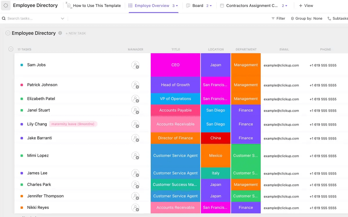
Next, you can use ClickUp’s Employee Directory Template to maintain an organized and comprehensive record of your workforce. It helps you manage employee information, track roles, and ensure easy access to contact details.
Use this template to:
A well-constructed people analytics dashboard transforms raw data into actionable insights, helping organizations make informed decisions. Here’s a breakdown of key metrics to include:
Employee turnover is an indicator of organizational health. High turnover can signal underlying issues like poor management or workplace culture. But tracking turnover is only the start. With predictive analytics, you can forecast potential turnover and identify at-risk employees, enabling proactive retention strategies.

Also Read: 10 Best Employee Monitoring Software in 2024
DEI isn’t just a box to check—it’s crucial for fostering a fair and inclusive workplace. Key metrics to track are gender diversity, representation of minority groups, and pay equity.
By regularly monitoring DEI metrics in a diversity dashboard, you can assess the effectiveness of your inclusion initiatives and adjust strategies as needed to promote a more equitable work environment.

Productivity metrics such as output per employee, project completion rates, and time-to-productivity for new hires offer insights into team efficiency and performance.
These key performance indicators help you identify areas for improvement, optimize workflows, and ensure resources are used effectively, boosting overall productivity.

💡Pro Tip: You can use employee productivity tracking tools to monitor performance, set goals, and optimize workflows, ensuring your team stays on track and meets objectives efficiently.
Effective workforce management is key to organizational growth. Metrics like time-to-hire, employee development progress, and internal mobility rates clearly show how well you’re managing and nurturing talent.
Tracking these key metrics helps identify skill gaps, enhance training programs, and create robust career paths, ensuring your top talent remains engaged and progressing.

Retaining top talent is crucial for stability, especially for early-stage startups. Metrics such as employee engagement scores, department-wise retention rates, and reasons for leaving provide deep insights into your retention strategies’ effectiveness.
A comprehensive understanding of these metrics allows for targeted retention strategies—improved benefits, better work-life balance, or a stronger sense of community—to satisfy and engage your workforce.

When it comes to Diversity, Equity, and Inclusion (DEI) in people analytics, it’s about more than just tokenism. DEI monitoring helps organizations understand the true makeup of their workforce and the dynamics at play.
Here’s how you can use your HR dashboard to enhance DEI efforts:
Implementing a people analytics dashboard comes with ensuring data privacy and dealing with data inaccuracies. Here’s how to tackle these issues effectively:
Failing to safeguard sensitive employee data can lead to breaches, erode employee trust, and expose your organization to legal penalties. The impact extends beyond immediate legal issues; it can damage your company’s reputation and undermine employee morale.
Solution
Inaccurate or inconsistent data can lead to misguided decisions, skewed insights, and ineffective strategies. They result in operational inefficiencies and misaligned business goals, affecting overall performance.
Solution
With a people dashboard, you’re not just collecting data; you’re arming your HR team with the tools they need to optimize workforce strategies, improve employee retention, and drive better business results.
Real-time insights into key metrics like employee turnover, productivity, and diversity enable HR departments to proactively address challenges, predict trends, and make decisions that contribute to overall organizational success.
Ready to transform your HR with data-driven insights? Sign up for ClickUp and start harnessing the power of your people’s data today!

© 2026 ClickUp

There’s an easier way. Try a free AI Agent in ClickUp that actually does the work for you—set up in minutes, save hours every week.