Still downloading templates?
There’s an easier way. Try a free AI Agent in ClickUp that actually does the work for you—set up in minutes, save hours every week.
Sorry, there were no results found for “”
Sorry, there were no results found for “”
Sorry, there were no results found for “”

Color coding is a great technique for making a document easily readable and scannable. Whether you’re highlighting important callouts or data within cells, color coding grants a focused approach to organizing information.
When done right, color coding can also be a powerful tool for sorting your Google Sheets database. Strategically using a color scale allows you to highlight critical information, monitor cell values, quickly identify trends and patterns, and perform data analysis.
The visual appeal is just an added plus. 🌈
This guide walks you through how to color code cells in Google Sheets and highlight information better.
To effectively color code data in Google Sheets, you need to learn the basics of conditional formatting. Conditional formatting is a tool available in most spreadsheet software. It allows users to automatically apply a specific formatting style to cells based on preset conditions.
Tired of messy, color-coded chaos in your spreadsheets? Try ClickUp’s free Spreadsheet Template—it brings clarity and structure with no formulas, no fuss, just organized data that makes sense.
For example, you’re tracking a metric that averages 10 with a variation of +/- 2. You can use conditional formatting to highlight the cell if it drops below 8 or exceeds 12 since it would indicate an anomalous situation.
Similarly, you can use conditional formatting-based color coding to identify trends and patterns, assign priority levels, or initiate action based on visual cues. This approach sharpens your decision-making and data analysis using Google Sheets.
Now, circling back to how to color code in Google Sheets.
We’ll be covering three methods you can use to color code cells in Google Sheets. To illustrate each approach better, we’re using a fictitious Google Sheets of the highest-grossing Hollywood movies of 2023, which looks like this:

Let’s explore how you color code on this Google Sheet.
As the name suggests, manual color coding is a fairly straightforward process. Here, you select the cells and apply the formatting options manually without any rules or formulas.
For example, if we wanted to highlight films from the same studio. Say, Disney. Here’s how you would do it:


Sure, the manual color coding technique is simple. However, it can quickly become overwhelming when working with a large database or complex data points. You can use conditional formatting to handle this.
Conditional formatting automates color coding based on user-defined criteria.
For example, you want to color code the sheet based on the run time of the movies. Consider you have three categories—short films (runtime ≤ 120 minutes); mid-length films (runtime between 120 to 140 minutes); feature-length films (runtime ≥ 140 minutes). We’ll be coloring the cells of short films green, mid-length films yellow, and feature-length films red.
Here’s a step-by-step guide for this:


| Formatting rule | Short film | Mid-length films | Feature-length films |
| Format cells if… | Less than or equal to | Is between | Greater than or equal to |
| Cell Value | 120 | 120 and 140 | 140 |


When done right, conditional formatting is an absolute powerhouse. That said, custom formulas are an upgrade to conditional formatting.
Custom formulas offer the highest degree of control for color coding your Google Sheets data. It allows you to select and define complex conditions to apply specific formatting rules based on calculations or criteria.
For example, you might wish to identify which of the highest-grossing films belong to the Action and Adventure genres. We could’ve used the “Text contains” formatting rule just to identify Action or Adventure, but for the custom formatting rules, we’re looking for movies that fit both genres.
To locate this, follow this guide:


Your spreadsheet will never stay the same once you master the art of color coding. Once you format cells, it’s so much easier to segregate data, identify patterns, and analyze information with just a visual scan!
Just take our sheet for highest-grossing films, for example:

On that note, here are some tips and tricks to enhance the conditional formatting functionality on spreadsheets.
Set multiple rules for complex color coding
Combine multiple conditional formatting rules or logic for more intricate data analyses. For instance, while identifying movies belonging to the Action and Adventure genres, we combined three rules to highlight cells:
Similarly, you can layer different color coding highlights to identify nuanced trends or patterns within the spreadsheet.
Follow a consistent color-coding scheme
Your color palette sets the tone for data interpretation. Use high-contrast colors that are accessible to users with color vision deficiencies. Standardize the use of color schemes depending on data categories, priorities, etc.
Embrace the “less is more” philosophy
Avoid the temptation to splash colors all over your spreadsheet. Excessive color coding will erode the value proposition and readability of your spreadsheet as each cell screams for attention. Prioritize only the essential information and use the technique sparingly to highlight critical values.
Utilize configurable templates
There’s no point in reinventing the wheel. So, in case of recurring tasks or activities, consider creating spreadsheet templates that you can configure and reuse for different settings. This makes work quick, easy, and efficient. At the same time, it ensures consistency across spreadsheets or departments to make analysis easier.
Explore beyond color coding
While color coding is highly effective, it may pose accessibility issues, especially for those with color vision deficiencies. To cater to this segment of users, explore other ways to interpret or present data. You’ll find Google Sheets add-ons that translate findings into graphs, charts, infographics, patterns, symbols, or text labels.
The movie example was just one of the many ways in which you can use color coding to make spreadsheet data usable. Here are some classic use cases where you can apply color coding:
Add color coding to your inventory database templates. This will offer a quick, high-level overview of the stock status. For instance, you can use red for out-of-stock items, yellow for stock running low, and green for adequate inventory. You can focus on red and yellow cells. Based on this formatting, you can stay in control of your inventory and ensure your products are readily available (or in the pipeline to be available).
Teachers and educators can format cells to gain a high-level view of student performance. They can use a custom formula to color high scores or grades as green, yellow for average performance, and red for those that need assistance.
There are so many ways in which you can use color coding to manage budgets. For one, you can use color coding to differentiate between income, expenses, and savings categories. Alternatively, you can set a custom formula to track your financial discipline based on historical data. The visual depiction of your budget will make it easier for you to track your financial inflows and outflows.
Whether you follow conditional formatting-based color coding or highlight cells using custom formulas, color coding definitely offers an edge over plain, boring spreadsheets.
That said, the function has a few limitations:
Given the limitations discussed above, it is natural to look for Google Sheet alternatives that offer more than basic color coding functionalities.
This is where ClickUp comes to the rescue. As a full-feature project management platform, ClickUp offers a suite of tools and features that can make your data sing.
Since we’re focusing on the visual aspect, here’s how ClickUp empowers you:
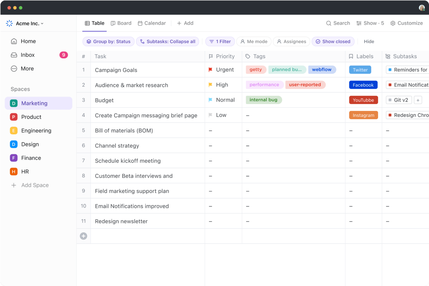
The Table View on ClickUp goes beyond static spreadsheets. It offers an interactive and highly dynamic experience, which is ideal for color coding data. You can customize the column background, text color, progress bar, and other formatting options to reflect different conditions. The resulting data visualization table makes it easier to spot trends and insights.
ClickUp Brain is your AI assistant that makes data organization and management a breeze. Plus, you can use it for nuanced tasks such as creating a branded style guide, generating color schemes, and more. If color coding on ClickUp using custom fields seems like a hassle, ClickUp Brain is perfectly capable of acting as an AI for Google Sheets! While it does not directly color code cells, it can definitely streamline the process of getting you there.

We’ve talked about how color coding cells present accessibility and inclusivity issues. To address this, ClickUp Dashboards supplement color-coded spreadsheets into other visual formats. Think project metrics, progress bars, graphs, or charts. Most importantly, these dashboards update in real time, sharpening your decision-making capabilities.
ClickUp offers a rich template of pre-built, configurable templates that help you jumpstart color-coding sheets. Here are two of the highlights:
ClickUp Spreadsheet Template
ClickUp’s Spreadsheet Template offers a flexible platform for managing data. Its customizable features allow you to track finances, create content calendars, or organize any information efficiently. With options for custom fields, views, and statuses, you can tailor the template to fit your specific needs. Plus, ClickUp’s collaboration tools make it easy to work with your team on spreadsheets.
ClickUp’s Editable Spreadsheet Template
ClickUp’s Editable Spreadsheet Template is your one-stop shop for data management. Customize and adapt it to suit your unique needs, from financial tracking to project planning. The template helps you with automated data input, complex calculations, and visual representations. Streamline your workflow and make informed decisions with custom views like:
Cell-based color coding has a transformational effect on spreadsheets. It elevates the readability and usability of the spreadsheet by converting raw data into actionable insights.
Plus, when you use the right rule for color coding, the process becomes easier to automate. Simply enter your data and watch it change its colors (in a good way).
While there’s quite a lot that you can do with Google Sheets, it does have its limitations.
In contrast, ClickUp unlocks a world of possibilities with its advanced features, integration capabilities, and AI assistant. Instead of spending hours manually setting up color coding rules, you can use ClickUp’s ready-to-use custom templates to get a head start on your data analysis process.
So, sign up for ClickUp today to elevate your data visualization and decision-making process.

© 2026 ClickUp

There’s an easier way. Try a free AI Agent in ClickUp that actually does the work for you—set up in minutes, save hours every week.