Category archives: Software
How we review software at ClickUp
At ClickUp, our software reviews are designed to be fast, fair, and helpful. Here’s a detailed rundown of how we review software at ClickUp.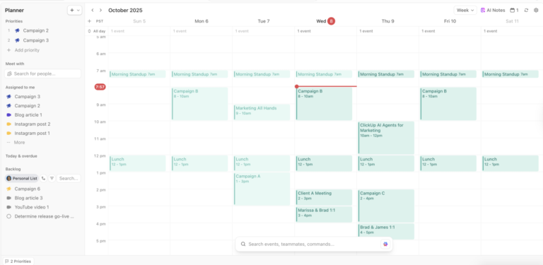
Software
9 Best Digital Planner Apps in 2026 for Tasks, Time Blocking & Handwriting

Software
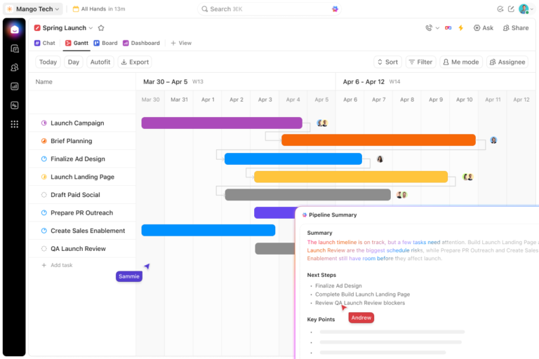
9 Best Project Timeline Software Tools in 2026

Software
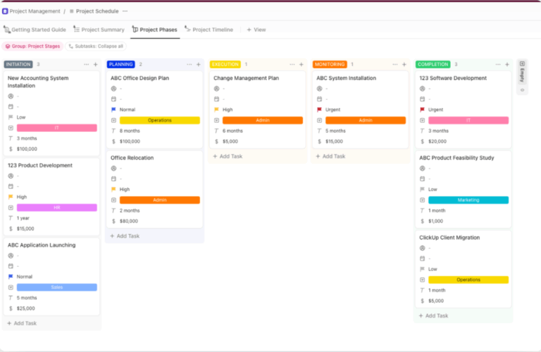
10 Best Project Scheduling Software for Teams in 2026
Software
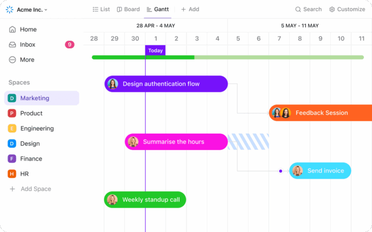
8 Best Free Gantt Chart Software Tools, Honestly Compared
Microsoft Excel
How to Create a Client Database in Excel in 7 Steps
Software
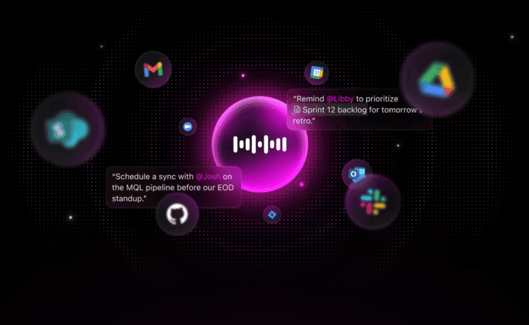
Top 11 AI Voice Assistants for 2026
Software
10 Best Online Sticky Notes Apps in 2026

Software
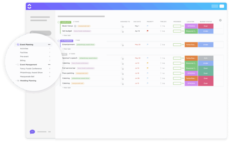
10 Best Event Planning Software in 2026
Software
8 Best AI Gantt Chart Software in 2026
Software
10 Best Productivity Tools & Apps in 2026
Software
8 Best Workfront Alternatives & Competitors in 2026
