
Sorry, there were no results found for “”
Sorry, there were no results found for “”
Sorry, there were no results found for “”
You can hit your targets, impress your team, and still miss out—just because you didn’t track your KPIs.
There goes the proof of your work, the promotion you’ve been aiming for, and your patience.
To ensure you get your metrics right, you need efficient KPI software—a system that tracks everything you do, down to the smallest task.
To help you stay on top of your key performance indicators, here’s a list of 11 top-rated tools that handle KPI tracking and make it easier to turn business data into measurable progress—saving you time, stress, and missed opportunities.
Here’s our pick for the top 11 KPI software with data analytics capabilities to track performance:
| Tool | Best For | Key Features | Pricing* |
| ClickUp | All-in-one KPI tracking and project management | Goals, Tasks, Dashboards, Collaboration, Templates | Free plan available; Customization available for enterprises |
| Geckoboard | Real-time KPI dashboards and data sharing | Custom Dashboards, 90+ Integrations, Alerts, Snapshots | Free trial available; Customized paid plans available for enterprises |
| Tableau | Visual data exploration and enterprise dashboards | Drag-and-Drop, Data Connectors, Rich Visuals, Forecasting | Custom pricing |
| Power BI | Microsoft users and budget-friendly dashboards | Drag-and-Drop, 300+ Sources, AI Insights, Real-Time Updates | Free plan available; Customization available for enterprises |
| Databox | Marketing teams needing quick, visual dashboards | 120+ Integrations, Predictive Analytics, Benchmarks | Free plan available; Customization available for enterprises |
| Klipfolio | Custom dashboards from 100+ data sources | 130+ Sources, Custom Formulas, Scheduled Reports | Free trial available; Customized paid plans available for enterprises |
| SimpleKPI | Small teams needing flat-rate unlimited dashboards | Unlimited KPIs, Real-Time Dashboards, Custom Reports | Free trial available; Customized paid plans available for enterprises |
| Sisense | Enterprise-grade advanced internal BI | Unified Data Layer, Embedded Dashboards, AI Insights | Custom pricing |
| Qlik Sense | Powerful self-service dashboards | Natural Language Queries, AI Suggestions, Alerts | Customized paid plans available for enterprises |
| Zoho Analytics | Small teams starting with BI | Auto Dashboards, AI Assistant, SQL Support | Free plan available; Customization available for enterprises |
| Domo | Large orgs with complex data | ETL + AI, Real-Time Refresh, Embedded Dashboards | Custom pricing |
A Reddit user noted, “Look at people’s output and its impact on company goals.”
While that’s a solid start, relying on intuition alone doesn’t scale. You still need key performance indicators—and you need a smart way to track them.
So, your ideal KPI tool will let you:
💡 Pro Tip: Struggling to turn vague career aspirations into clear action steps? 25 SMART Professional Goal Examples & Ideas for Work shows you how to set goals that actually move the needle.
These KPI software tools allow continuous improvement by simplifying tracking KPIs—making it easy for you to align teams around shared business metrics.
Our editorial team follows a transparent, research-backed, and vendor-neutral process, so you can trust that our recommendations are based on real product value.
Here’s a detailed rundown of how we review software at ClickUp.
When teams utilize multiple tools for performance tracking, they fail to document anything properly. Data becomes fragmented, workflows break down, and it becomes harder to streamline processes.
ClickUp protects you from paying that price by centralizing everything—from KPIs to tasks and reports—in one place.
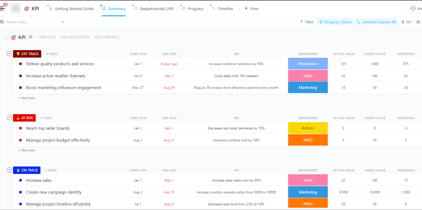
The first step to tracking KPIs is defining them. ClickUp Goals makes the process easy by letting you break large objectives into smaller, trackable milestones.

You can set numerical, monetary, or task-based targets—perfect for managing everything from code coverage to net promoter score. It gives teams a concrete starting point to align on measurable outcomes.
If you want to start by laying out your goals to track progress year-round, ClickUp’s OKRs Template offers excellent structured planning and organized goal lists.
Another gem is ClickUp’s SMART Goals Template. This template helps you set clear, actionable objectives and track progress effectively to keep your team focused, organized, and goal-driven.
Once you define KPIs, ClickUp Tasks assists you in managing their execution. You can assign priorities, set reminders, and automate updates to ensure your team stays up-to-date.
These features ensure accountability while reducing the mental load of manual tracking. However, not every team needs the same metrics.
With ClickUp Dashboards, you can create custom dashboards to visualize only what matters—whether you’re tracking deployment frequency, analyzing data on customer satisfaction, or code churn.

You can even bring in data from multiple data sources to get a complete view of team performance. Learn more about how to create your own custom ClickUp Dashboard 👇🏻
Wondering what to do with stakeholder feedback? With ClickUp, all updates are instantly turned into tasks. Thanks to ClickUp’s real-time collaboration, updates happen live, ensuring the entire team and project managers stay aligned and no input is lost.

If you want to get started right away and maintain focus on what matters most—try ClickUp’s KPI Template.
It centralizes all your key metrics into one visual, easy-to-use dashboard so everyone stays aligned. Whether you’re analyzing trends or making strategic decisions, this template gives you the insights you need fast.
A G2 user says:
I love how everything is in one place. I have used many tools over the years to help me keep track of work, and clickup solves all the problems for me. I like the flexibility that clickup offers.
🔎 Fun Fact: The concept of performance measurement dates back to the 3rd century during China’s Wei Dynasty, where emperors employed a nine-rank system to evaluate the performance of royal family members.

Geckoboard is a simple KPI software built for teams that need to communicate key performance indicators clearly and quickly.
This tool’s drag-and-drop interface makes it easy to build customizable KPI dashboards that showcase business-critical metrics. Whether you’re tracking your key performance indicators (KPIs) from Google Analytics, Salesforce, or Excel, Geckoboard pulls in performance data from over 90 data sources.
These dashboards can be embedded on websites, displayed on office TVs, or shared via email or Slack—ideal for teams working across platforms and locations.
A Capterra user says:
The information can be seen in a compelling way, which is super important considering that sometimes you need to communicate hard to understand KPIs. Another positive thing is how the Geckoboard Team constantly adds new data sources to increase compatibility.
💡 Pro Tip: If your team keeps setting goals that fizzle out halfway through, 12 Best Goal Setting Software for Teams can help you stay focused, aligned, and actually hit those targets.

Between meetings, shipping code, handling customer issues, or closing deals, most teams don’t have hours to spare to figure out how to build a dashboard.
Tableau’s drag-and-drop interface makes it easy even for non-technical users who need to turn raw data into something clear and useful.
Without writing a single line of code, teams can build sleek, interactive dashboards that track everything from customer satisfaction to software development KPIs.
A G2 user says:
It is a good tool to manage data and to have data analysis; it provides clear information and also good comparisons from date to date. It is easy to understand once you have spent enough time learning about it.
💡 Pro Tip: Struggling to pinpoint what’s slowing down your dev team? Our post on the 25 Software Development KPIs with Examples provides the exact software development metrics needed to track progress, improve workflows, and ship faster.

If you’re already buried in Excel spreadsheets, switching to full-scale KPI dashboard software might feel like another project no one has time for. Power BI is an ideal solution for numerous teams due to its power, familiarity, and surprising ease of use.
With its drag-and-drop dashboard builder, Power BI makes it simple to turn raw data into meaningful key performance indicators.
You also get AI-powered features, strong data integration options, and visual alerts—so you’re always in the loop.
A Capterra user says:
It is easy to link with existing datasets in the Microsoft ecosystem and external databases such as SQL servers. Reports can be customized to display information however you want to.
📖 Also Read: 10 Free Quarterly Business Review (QBR) Templates

Marketing teams are often buried in tools—Google Analytics, HubSpot, Meta Ads, and spreadsheets galore. Who has time to log into five platforms just to check what’s working?
That’s where Databox shines. This KPI software brings all your performance data into one place, giving you an instant, visual snapshot of your marketing KPIs without switching tabs.
Databox provides a user-friendly drag-and-drop dashboard builder that is suitable for even non-technical team members, enabling access from desktop, mobile, or even a TV screen in your office.
A Capterra user says:
Overall, it’s very friendly to use, especially the way to organize templates to share across client accounts, create alerts, and native integrations with the most used platforms.
📮 ClickUp Insight: Half of the teams we surveyed say Friday is their most productive day. Why? Likely fewer meetings, and momentum was built throughout the week. With fe/wer interruptions, people get more space for focused, meaningful work.
Want that Friday flow every day? Try async communication with ClickUp—your all-in-one work hub. Record updates with ClickUp Clips, generate instant transcriptions using ClickUp Brain, or let the ClickUp AI Notetaker summarize meetings for you in seconds!

For data-driven teams with a million tabs open and multiple platforms, getting a bird’s-eye view of performance seems almost impossible.
That’s why Klipfolio’s product Klips is so useful—it combines your most critical business metrics and presents them in interactive dashboards you can use.
With over 130 integrations, Klipfolio Klips adapts to your data stack without requiring advanced technical skills.
🔎 Fun Fact: In the 15th century, Venetian merchants practiced an early form of return on investment (ROI) by comparing the costs of their trading expeditions to the profits earned from selling imported goods.

When you’re trying to keep a fast-moving team aligned, the last thing you need is a clunky dashboard tool or pricing that penalizes you for growing.
That’s where SimpleKPI comes in—true to its name, it simplifies performance tracking without nickel-and-diming you for every user.
This cloud-based KPI software gives you real-time monitoring, clean visual dashboards, and flexible KPI reporting tools—all under one flat rate.

As businesses grow, so does their data—across marketing, ops, finance, and customer platforms. Making sense of it all, especially at scale, is no simple task.
Suppose you’re dealing with high-volume, high-complexity valuable data and need a way to model, connect, and explore it across teams or products. In that case, Sisense offers the kind of flexibility you’d need.
This KPI software is particularly helpful for internal BI teams who want to centralize insights and deliver them across different business functions.
Sisense also supports embedding, so if you’re building client-facing apps or dashboards and want analytics built in, you can integrate analytics where your users already work.
A Capterra user says:
The Elasticube is at the core of the SiSense product – it allows an administrator to connect to multiple disparate data sources to create a logical grouping of data. The dashboards are attractive and functional.
💡 Pro Tip: Still managing OKRs in spreadsheets? You’re missing out on visibility and alignment—the best OKR software helps you find tools built to scale your team’s goals and results.

Managing multiple data streams, such as sales platforms and customer feedback tools, can easily lead teams to lose sight of the larger picture.
Qlik gives you the tools to explore your data intuitively and make smart, rapid decisions without waiting on data analysts or IT. This KPI software especially stands out for its interactive dashboards, strong search capabilities, and AI-powered insights.
Qlik’s primary focus is—anyone on your team should be able to ask a question and get a meaningful answer, without knowing SQL or advanced stats.
A G2 user says:
In my organization, we use Qlik Sense for interactive data visualization and analysis through dashboards, charts, and graphs. I liked how customizable it is and the flexibility in allowing us to work with a wide range of data sources and connectors.
🔎 Fun Fact: In the 19th century, a Scottish miller used colored wooden cubes placed on employees’ desks to indicate performance levels—green for good, red for poor—serving as an early visual KPI system.

If you’re running lean and still want access to serious analytics capabilities, Zoho Analytics might be the right fit.
What makes Zoho stand out is its balance: it’s accessible for non-technical users yet still offers depth for analysts. Teams can use drag-and-drop dashboards and pre-built connectors to get AI-powered suggestions for reports.

When your business starts running on dozens of tools—each with its reports, metrics, and dashboards—it gets tough to answer even simple questions like “How are we doing?”
This KPI software is built for teams that want one centralized space to connect all their data and translate it into decisions—whether that’s through interactive dashboards, real-time alerts, or AI-driven insights.
Domo also supports connections to over 1,000+ data sources, from AWS to SAP, making it a perfect fit for businesses with diverse tools and systems.
💡 Pro Tip: Struggling to turn big dreams into actionable steps? One-Year, Five-Year, and Ten-Year Goal Examples for Long-Term Goal Planning gives you a practical roadmap to set and achieve long-term goals with clarity and confidence.
While these KPI tools didn’t make it to our top list, they’re still quite effective for tracking KPIs in certain scenarios:
Tracking KPIs = Visibility
Without visibility into performance, even your best efforts can go unnoticed (or worse, unproven).
That’s where ClickUp shines. With Goals, Dashboards, and real-time collaboration built into one platform, ClickUp helps you stay focused on outcomes—not just outputs.
As Christian Gonzalez, Administrative Coordinator at Cámara Nacional de Comercio, Servicios y Turismo de Guadalajara, highlighted:
We simplify all the processes of our departments by integrating business intelligence platforms, mailing tools with automation, and storing KPIs, forms, process documents, and dependencies in one app (ClickUp).
Never lose sight of what project success looks like—sign up for ClickUp now!
Get started with ClickUp today!

Manasi Nair
Max 24min read
Manasi Nair
Max 20min read
Manasi Nair
Max 24min read

© 2026 ClickUp