
Sorry, there were no results found for “”
Sorry, there were no results found for “”
Sorry, there were no results found for “”
Most agency ops dashboards fail before they’re even finished because the data lives in too many places to stay up to date.
PwC’s Global Treasury Survey found that even among billion-dollar companies, 52% still manually consolidate their forecasting data, a problem that hits resource-strapped agencies even harder.
This guide walks you through how to build an agency operations dashboard in Google Sheets. We’ll cover which metrics matter, how to structure and visualize your data step-by-step, and where spreadsheets hit their limits for teams ready to move to a live, connected workspace.
We’ll also show you exactly which unified platform you need: ClickUp, the world’s first Converged AI Workspace! 🤩
An agency operations dashboard is a single-screen view that aggregates your most important operational metrics and data. It displays project status, team workload, revenue, and client health.
Agency owners, ops leads, project managers, and account directors all rely on this tool. But each role cares about a slightly different slice of the pie.
Building one in Google Sheets is a practical first step since most agencies already have data in spreadsheets. The real challenge is turning those raw rows into something scannable and actionable.
Dashboards quickly become useless when they are cluttered with vanity numbers. Tracking the wrong things wastes time and obscures your agency’s actual health.
Only track metrics you’ll actually act on. Every metric on your dashboard should answer a question someone asks at least once a week. The right mix depends entirely on your agency model, so here are some necessary metrics to track:
In Google Sheets, each of these needs a corresponding column in your data source tab. Deciding on your metrics first saves you from having to restructure everything later.
These resource management metrics often require time-tracking data. If your agency doesn’t track time consistently, start with person-level task counts as a lightweight proxy.
Financial KPIs and metrics are often the hardest to maintain in Google Sheets because the data lives in accounting tools. Manual entry introduces lag and errors that we’ll address later.
🎥 See how this small business moved away from disconnected tools to one centralized workspace:
We were spending too much time updating different systems that weren’t talking to each other. It slowed us down and increased the chance of things falling through the cracks
The following five steps take you from a blank sheet to a functional agency operations dashboard. Each step builds on the previous one.
Open a blank Google Sheet and follow along. This process assumes you already have operational data that can be exported to your spreadsheet. 🫡
The data source tab acts as your Google Sheets database and foundation. Every chart, summary, and filter on the dashboard pulls directly from this tab.
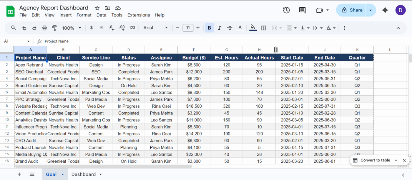
Create a clean ‘Goal’ tab so you spend less time debugging your dashboard later in your Google Sheet
🚀 ClickUp Advantage: Most dashboards stop at showing you data. Even with AI, you’re often switching between tools, creating Tool Sprawl. ClickUp Brain MAX removes that fragmentation entirely. It acts as a central AI layer across your entire agency stack, pulling context from your tasks, docs, dashboards, and even external tools like Google Drive or GitHub.
You can:
For instance, when you’re reviewing your agency dashboard and notice a performance dip, you can just ask ClickUp Brain MAX, ‘Why did Client X’s performance drop this week?’ It pulls campaign data, task updates, and team conversations and gives you a context-aware answer.
Create a new tab called Dashboard. This is the visual layer where no raw data should live.
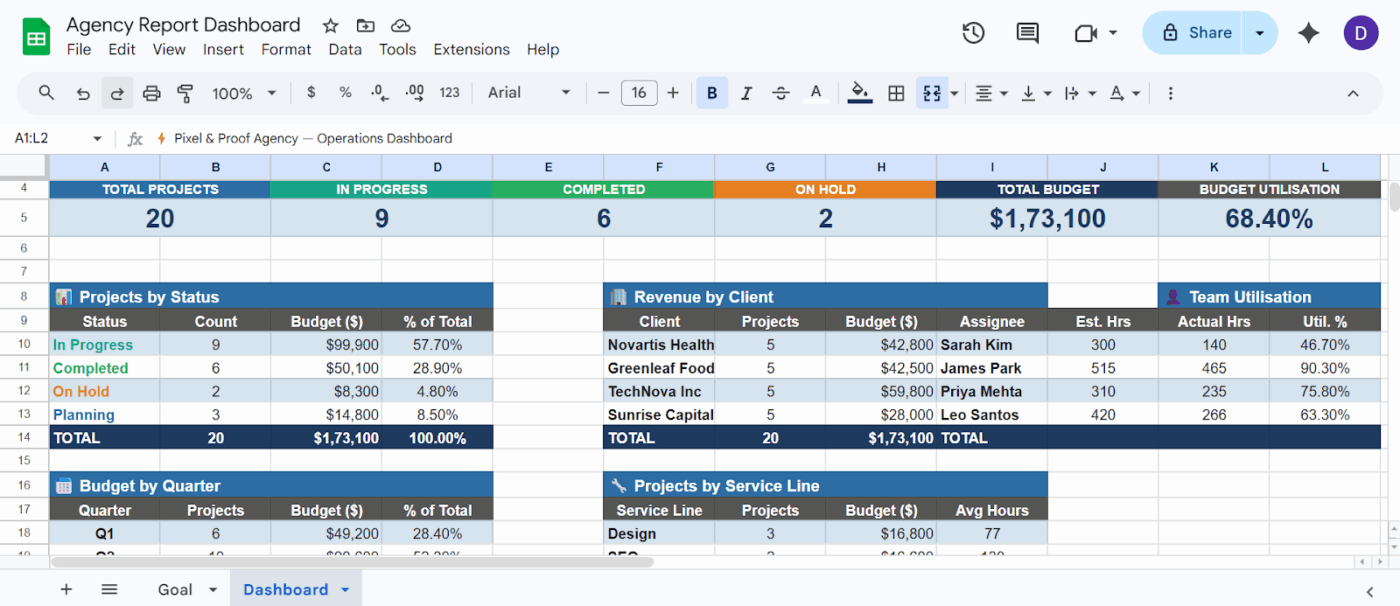
Create a Dashboard tab with KPIs in your Google Sheet
A good default layout for KPI reports mirrors how agency leaders scan information. You want the big picture first, followed by the drill-down details.
Optimize your next marketing campaign:
Pivot tables let you slice your raw data without writing complex formulas. They are especially useful for grouping projects by client or team member.
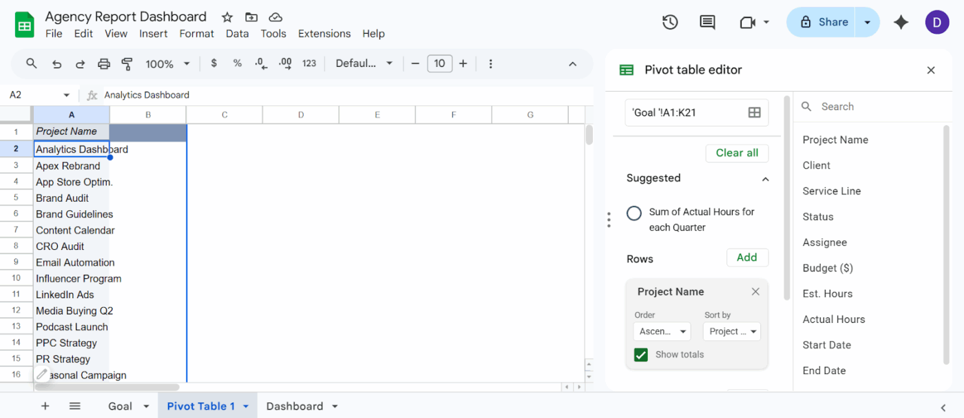
Insert > Pivot Table > New tab > Add rows and columns based on the view you want in your Google Sheet
Pivot tables update automatically when the source data changes, reducing manual maintenance. Use them as intermediate calculation layers and display the results on your Dashboard tab.
Charts turn numbers into recognizable patterns for effective data visualization. Here is how to add them to your Dashboard tab:
Use bar charts to compare values and line charts to track trends over time. Limit the dashboard to a maximum of eight charts to avoid information overload.
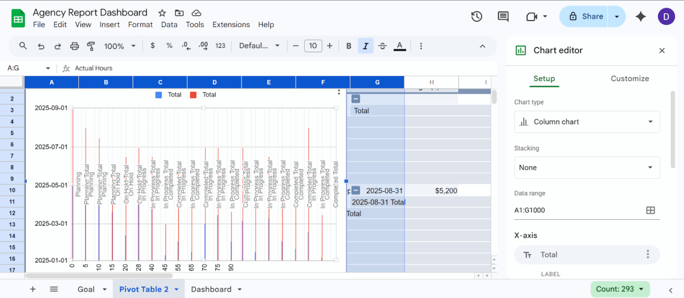
Select the data > Insert > Charts > Pick from different chart options in your Google Sheet
Slicers are built-in interactive filters in Google Sheets. They let anyone viewing the dashboard filter data without editing formulas.
Slicers only filter charts that share the exact same data range. If your dashboard pulls from multiple sources, you must consolidate them into a single tab first.
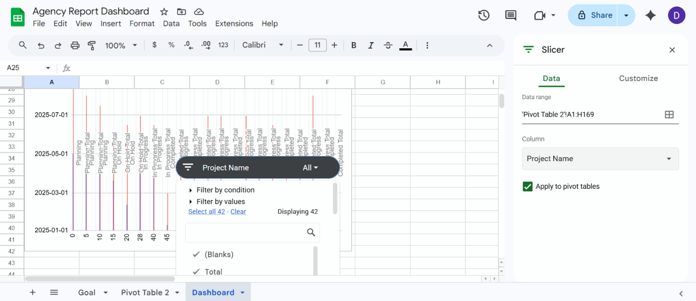
Select the chart you created > Data > Add slicer > Select column name > Add filters in your Google Sheet
A poorly executed dashboard design creates more confusion than clarity for your team. Trying to serve everyone with one massive view creates noise that leads people to ignore the tool entirely.
📮ClickUp Insight: Low-performing teams are 4 times more likely to juggle 15+ tools, while high-performing teams maintain efficiency by limiting their toolkit to 9 or fewer platforms. But how about using one platform?
As the everything app for work, ClickUp brings your tasks, projects, docs, wikis, chat, and calls under a single platform, complete with AI-powered workflows. Ready to work smarter? ClickUp works for every team, makes work visible, and allows you to focus on what matters while AI handles the rest.
Maintaining a dashboard in your spreadsheet software eventually becomes a tedious part-time job. Manual data entry introduces lag and errors that force leaders to make decisions based on outdated reality.
Here’s what a real-life user had to say about ClickUp:
With ClickUp, we went one step ahead of the game and created dashboards where our clients can access and monitor performance, occupancy, and projects in real time. This allows clients to feel connected to their teams, especially given that they are located in different countries, and sometimes even on different continents
For a growing small business, relying on a fractured tech stack is a massive drain on your time and budget.
When you use disconnected tools—like tracking projects in one app, communicating in another, and trying to pull performance reports in Google Sheets—you separate where your data lives from where your actual work happens.
This multi-app chaos creates severe Work Sprawl. It forces your team to constantly context-switch and manually copy-paste updates across different platforms, making your dashboard stale the exact moment you finish building it.
ClickUp Small Business Suite eliminates this “SaaS Tax” by consolidating your everyday apps and enterprise-grade features into a single converged AI workspace at a fraction of the cost.
The result? You get real-time, big-picture visibility into your business’s health without the duct-taped integrations, expensive software bloat, or endless manual data entry. Let’s understand how:
In Google Sheets, your entire dashboard depends on how well you structure rows, tabs, and formulas. But in ClickUp Table View, you get a database-like system where your ‘rows’ are actually live ClickUp Tasks connected to real work.
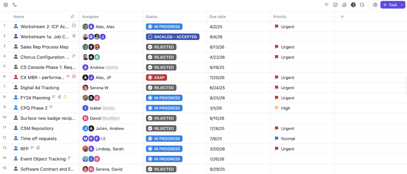
Organize your data systematically with ClickUp Table View
What makes you powerful:
For instance, you’re running a performance marketing agency managing 15 clients. Each campaign is a Task, Custom Fields capture Ad Spend, Revenue, Channel, and a Formula Field calculates ROAS automatically.
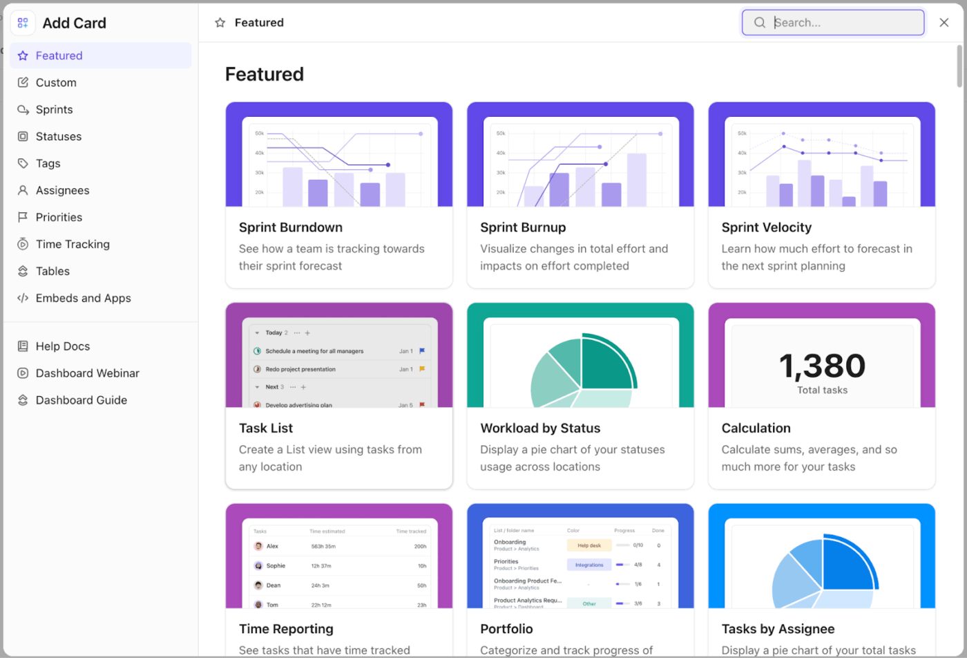
ClickUp Dashboards replace static KPI sheets with live, customizable reporting pulled directly from your workspace.
Create your own custom ClickUp Dashboard with specific cards
You can mix and match different types of cards depending on what your agency tracks:
🚀 ClickUp Advantage: Tailor the exact same underlying data for different audiences with ClickUp Role-Based Views. The CEO sees high-level financials, while the project manager sees task details without duplicating any effort. Create a client dashboard:
ClickUp Brain sits on top of your entire workspace and lets you ask questions instead of building formulas. It understands your tasks, projects, docs, and dashboards, so you can generate insights without manually analyzing data.
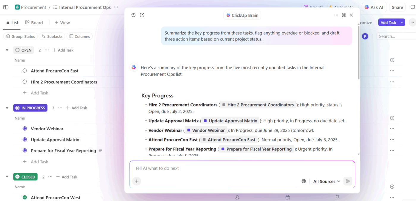
Get insights into your campaign progress with ClickUp Brain
📌 Example prompts:
Which team members are over capacity and why?
Which clients are at risk based on delayed tasks and low activity?
Summarize this week’s project performance and highlight blockers
Additionally, it’s built into Dashboards in the form of AI Cards.
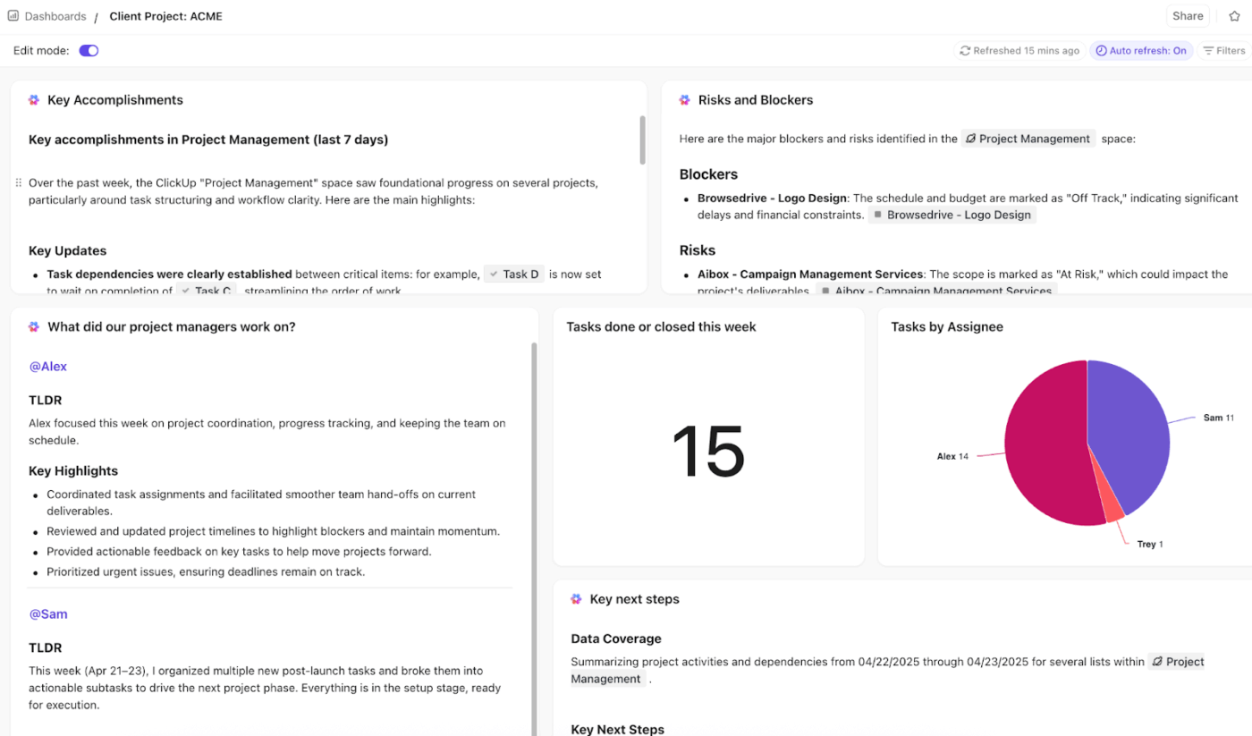
Get instant analyses of Dashboard insights with ClickUp Brain’s AI Cards
Access:
🎥 Want your marketing workflows to run autonomously? Build a Super Agent to manage your campaigns. See how. 👇🏼
At some point, every agency hits the same wall with Google Sheets. You start with a simple dashboard. Then come more clients, more campaigns, more metrics. Suddenly, you’re maintaining formulas, fixing broken tabs, and chasing updates.
Instead of stitching together data, dashboards, and workflows across tools, ClickUp brings everything into one place. When something changes, your ClickUp Dashboard updates instantly and you can prompt ClickUp Brain to give you weekly updates. When you spot an issue, you can act on it right there.
Sign up to ClickUp for free today! ✅
A spreadsheet dashboard visualizes data you manually enter or import, so it is only as current as your last update. A project management dashboard pulls live data from active tasks and timelines to keep the view up to date without manual intervention.
Google Sheets supports cross-sheet data and external add-ons, but these require setup and often have refresh delays. A workspace with native integrations removes the need for middleware, delivering truly live data.
Aim for at least weekly updates in Google Sheets to keep the data actionable for your team. In a tool that updates in real time, such as ClickUp, the dashboard stays current automatically, so you only need to decide how often to review it.

Manasi Nair
Max 25min read
Manasi Nair
Max 12min read
Manasi Nair
Max 12min read

© 2026 ClickUp