Still downloading templates?
There’s an easier way. Try a free AI Agent in ClickUp that actually does the work for you—set up in minutes, save hours every week.
Sorry, there were no results found for “”
Sorry, there were no results found for “”
Sorry, there were no results found for “”
The day we’ve all been waiting for has arrived: ClickUp 3.0 is here.
Since we launched ClickUp 2.0 in October 2019, it’s been an incredible journey. ClickUp 2.0 was built by and for our community, and our latest release is no different. To those of you who have been with us since the early days, thank you for sticking with us and sharing your feedback.
Together, we’ve come a long way. Over the past two years, our team has been insanely busy building the platform of the future to ensure that the experience exceeds your wildest expectations.
We had the vision for ClickUp 3.0, even before launching 2.0, and the next generation of ClickUp is arriving just in time to solve the problems faced by today’s workforce. Productivity has never been more important.
This next generation of ClickUp is insanely powerful, shockingly simple, and ready to redefine productivity (again). It brings incredible upgrades in performance and reliability, as well as many new features that tie all of your work together to help you stay organized, work smarter, and be more productive.
ClickUp’s platform was pushed to the limits as we quickly scaled to almost 10 million users over the last five years. Our original architecture simply wasn’t cutting it anymore. In the last year and a half, we hired more than 150 engineers and worked intensely to solve this problem.
We built an entirely new infrastructure that, first and foremost, provides substantial reliability improvements. The new architecture is designed with infinite scalability in mind and will support us (and you) as we continue to grow into the future and beyond.
Built on three core principles—reliability, quality, and performance—we rearchitected our database, shifted to a service-based architecture, and rewrote our WebSocket infrastructure and application code. Here are just a few of the ways you’ll experience these changes:
This also sets us up to deliver important innovations over the next year and ship many of our most requested features like formulas, relationships, subfolders, and better reporting.
There’s so much more to share—check out more details from our SVP of Engineering, Shailesh Kumar, in his blog post.
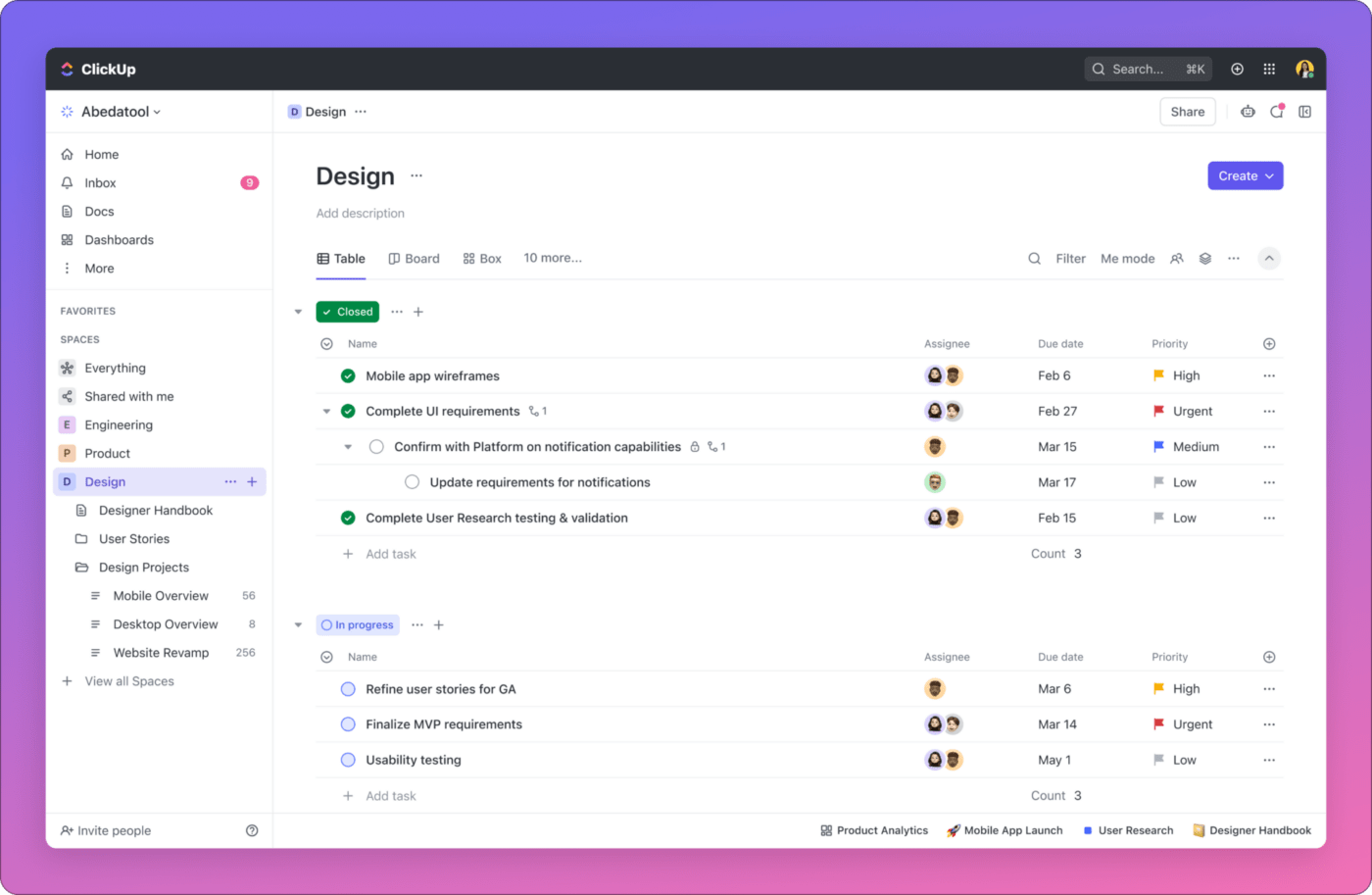
As we look at the new ClickUp 3.0 product experience, it will feel like an entirely new ClickUp, redesigned with epic improvements and new features.

From the start, we’ve been obsessed with crafting an unparalleled user experience, meticulously focusing on even the tiniest of details. ClickUp 3.0 brings the focus back to delivering the most exceptional, best-in-class user experience. It’s clean and intuitive. Modern and uncluttered.
With ClickUp 3.0, we’re introducing new capabilities to help you make the most of your time at work. With a stunning new design and an AI-powered assistant at your side, getting work done never felt (or looked) this good.
If you can think it, you can build it. Unleash your creativity to manage anything with the most powerful and customizable version of ClickUp ever with the help of:
Bring your teams, tools, and knowledge into one place, so that everyone can move faster together to get work done.
We can’t wait for you to get your hands on the brand-new ClickUp 3.0 experience. It will launch in two phases. Starting today, we are rolling out the ClickUp 3.0 product experience to Workspaces in beta and will increase the velocity of invites to those on the waitlist over the next several weeks. Separately, Workspaces will begin transitioning to the new ClickUp 3.0 infrastructure in March.
I’ll share more details during my keynote at our virtual productivity conference, LevelUp! And don’t forget to sign up for the ClickUp 3.0 Waitlist.
ClickUp 3.0 is a huge milestone, and what it unlocks as far as improving quality, finishing existing features, and the innovation to come is what I’m most excited for you to experience this next year and beyond.
Let’s make the world more productive, together.
💜 Zeb

© 2026 ClickUp

There’s an easier way. Try a free AI Agent in ClickUp that actually does the work for you—set up in minutes, save hours every week.