

Sorry, there were no results found for “”
Sorry, there were no results found for “”
Sorry, there were no results found for “”
You finally completed the report. The data’s solid, the numbers check out, but when you present it, people squint at the table and ask, ‘What am I supposed to take away from this?’
That’s the pain. You’re trying to make the data make sense while ensuring they grasp it quickly and visually, without an extended 5-minute explanation.
Pie charts used to be the go-to for that. Easy to read, easy to make. But in today’s world, where you’re juggling faster timelines, tighter decks, and attention spans shorter than ever, basic charts don’t cut it.
This is where AI pie chart generators are changing the game. These tools don’t just create a pie chart and color in some slices. They help you pick the right breakdown, suggest better diagrams when a pie chart doesn’t fit, fast-track data visualization, and even surface insights you didn’t know were in your spreadsheet.
Here are some that are actually worth using, especially if you want your charts to do more than just look smart.
Use the tools listed below to create and analyze pie charts with AI assistance:
| Tool | Key features | Best for | Pricing |
| ClickUp | – Real-time pie charts powered by live task data – Group data by assignee, status, or custom fields – Built-in AI (ClickUp Brain) for instant insights – Visual dashboards with donut chart toggle and filters | Teams of all sizes that need project-based real-time reporting—from small businesses to enterprises | Free plan available; customizations available for enterprises |
| Visme | – Natural language chart creation – Interactive charts with hover/click effects – Customizable design templates and branding – Real-time team collaboration on charts | Marketing teams, educators, and SMBs creating marketing reports and branded presentations | Free plan available; paid plans start at $29/month; customizations available for enterprises |
| Infogram | – AI-powered chart type and design suggestions – Integration with cloud services like Google Sheets – API access for automated visualizations – Brand kit and tooltip enhancements | Small to mid-sized data teams, analysts, and media professionals who need interactive dashboards and quick visualizations | Free plan available; paid plans start at $25/month; customizations available for enterprises |
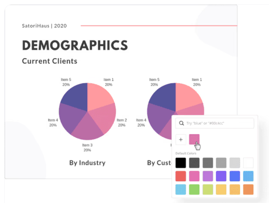
| Canva | – Easy manual or spreadsheet data input – Slice-level customization (values, labels) – Multi-device optimization – Simple sharing via link or embed | Freelancers, small businesses, and social media teams designing presentations and social media content | Free plan available; paid plans start at $15/month; customizations available for enterprises |
| ChatGPT | – Chart generation from natural language or raw data – Customizable chart elements (labels, colors, size) – Code generation in Python/JavaScript – Visual insights and interpretation on request | Teams of any size (especially early-stage or low-budget) for language-based tasks and intelligent assistance | Free plan available; paid plans start at $20/month; customizations available for enterprises |
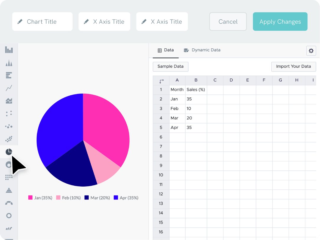
| Piktochart | – Import from Excel, CSV, Google Sheets – Interactive charts with hover/click actions – Real-time team collaboration – Brand color/logo integration | Interactive and branded pie chart creation for education, nonprofit, and internal comms teams | Free plan available; paid plans start at $29/month; customizations available for enterprises |
| EdrawMax | – AI interprets plain text or structured data – Detects trends, outliers, and metrics – 15,000+ templates & symbols – Drag-and-drop customization | Technical teams such as IT, Ops, and Engineering, that need AI-driven insights and detailed pie chart customization | Free trial available; paid team plans start at $5.53/month; customizations available for enterprises |
| Beautiful.ai | – Smart templates that auto-adjust design – Data import/link from Google Sheets, Dropbox, Box – Subtle animations – Interactive tooltips and legends – Brand typography and color consistency | Fast, presentation-ready pie charts with smart design for small to mid-sized sales, product, and exec teams | Free trial available; customizations available for enterprises |
When choosing an AI pie chart generator, look for features that go beyond basic visualization techniques and capabilities. The right tool should minimize manual setup, ensure data accuracy, and help you present insights clearly and professionally. Here’s what not to miss:
📚 Also Read: Pie Chart Alternatives for Better Data Visualization
Now that you’ve a fair idea of what makes an excellent pie chart tool, here are our recommendations—complete with their best features, limitations, and pricing insights.
With workflows moving faster today, teams don’t have time to sift through walls of text. They need a quick, visual way to check progress at a glance. But when it comes time to show the data, they’re digging through spreadsheets or chasing updates across scattered tools.
ClickUp found that the average professional spends 30+ minutes a day searching for work-related information—that’s over 120 hours a year lost to digging through emails, Slack threads, and scattered files.
ClickUp, the everything app for work, takes that pain away by letting you create AI-powered pie charts right inside your work dashboards.
Instead of having you upload spreadsheets or enter raw numbers manually, ClickUp pulls the relevant data from your workspace, including:
This gives you live, auto-updating pie charts directly tied to your projects, and grouped exactly how you want them.

Let’s say you want to see how work is distributed across your team. To do so, open ClickUp Dashboards, simply click on + Add card, choose the Pie Chart option under Custom cards, and select the data source.
From there, you can group your data by Assignee, with each slice of the pie representing a team member. You can also group by Status to track how much work is in progress, completed, or overdue.

Want to show this as a donut chart with total tasks in the center? Just toggle the display setting. You can even filter what shows up, drill down into specific segments, or display slices as percentages.
Watch this video explainer to set up your dashboards (including pie charts) 👇🏽
Here are some ideas for the key metrics you can monitor via pie charts in ClickUp:
It’s a no-code, drag-and-drop experience, tailored to your workspace setup.
But what sets ClickUp apart is ClickUp Brain, the built-in AI assistant. While it doesn’t generate pie charts directly yet, it enhances your reporting by:
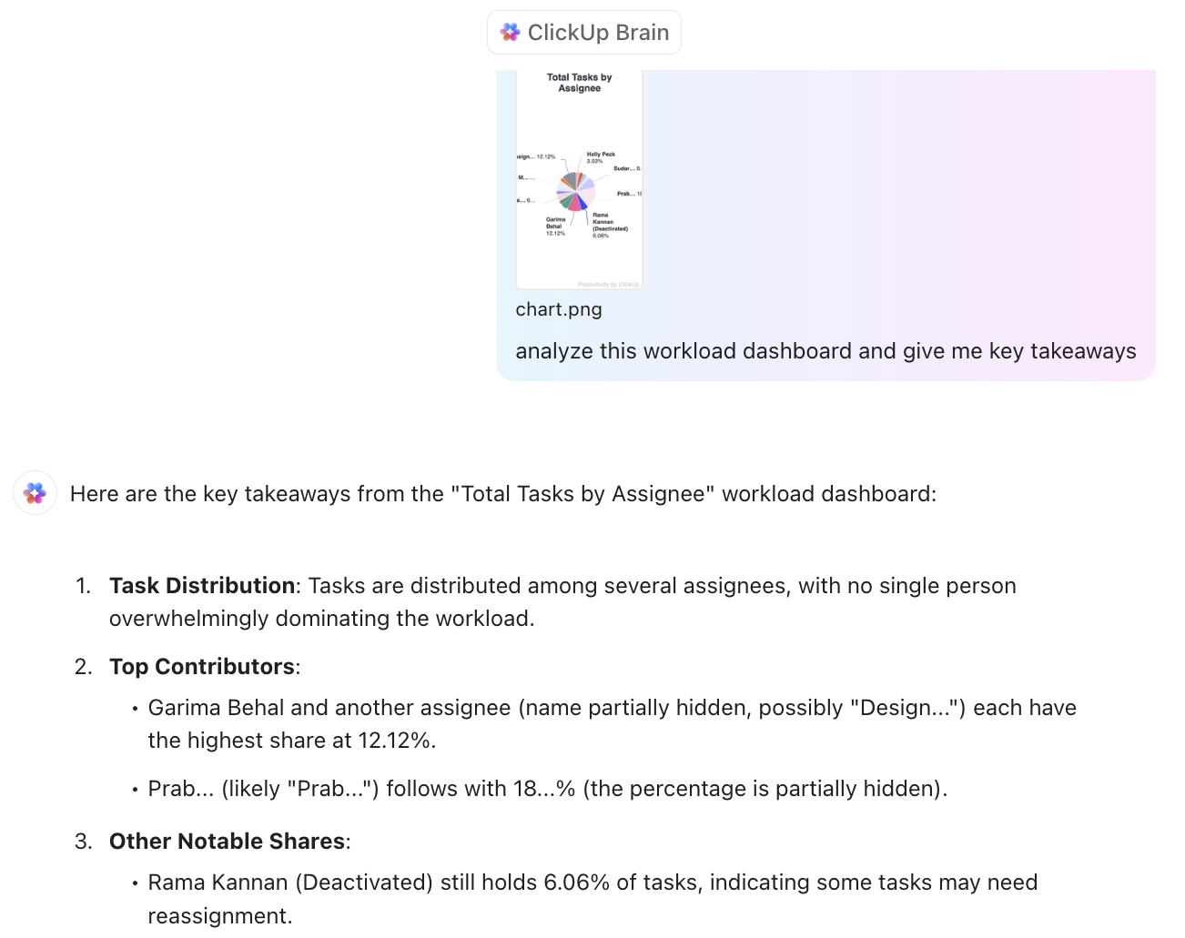
Here’s an example of the insights we get when we ask Brain, ‘What’s the workload of [team member]?’.
What makes this more powerful is how it’s all tied into your actual workflows. The chart pulls real-time data from ClickUp Tasks, so any update (say status change, a reassignment, or a completed milestone) instantly reflects in the chart.
📮ClickUp Insight: Only 12% of our survey respondents use AI features embedded within productivity suites. This low adoption suggests current implementations may lack the seamless, contextual integration that would compel users to transition from their preferred standalone conversational platforms.
For example, can the AI execute an automation workflow based on a plain text prompt from the user? ClickUp Brain can! The AI is deeply integrated into every aspect of ClickUp, including but not limited to summarizing chat threads, drafting or polishing text, pulling up information from the workspace, generating images, and more! Join the 40% of ClickUp customers who have replaced 3+ apps with our everything app for work!
🧠 Fun Fact: We found that 30% of workers believe automation could save them 1–2 hours per week, while 19% estimate it could unlock 3–5 hours for deep, focused work.
A G2 review says:
ClickUp has a diverse set of project management and collaboration tools. One key feature that is useful to my design team and I are the custom dashboards. I can set up custom filter instances and track projects for the whole team, or filter down by individual, and look at a pie chart of request, in progress, and in-review items all in one view.
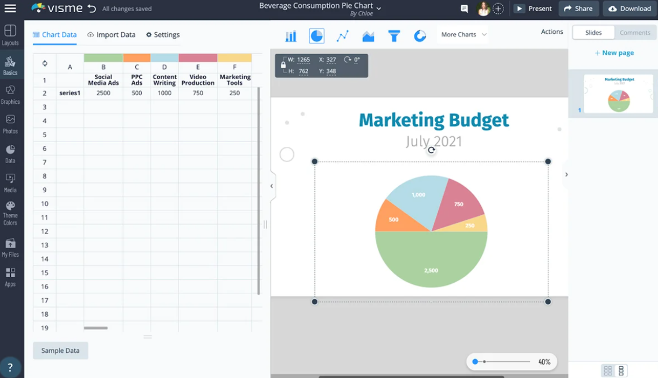
Visme’s free pie chart maker allows you to create charts simply by entering a natural language prompt, eliminating the need for manual design and data entry. Charts are fully interactive, which means you can add hover effects, clickable elements, or animated transitions to monitor your projects and make your digital reports more impactful.
The tool integrates easily with Google Sheets, enabling semi-dynamic data inputs.
A G2 review says:
The platform was easy to use right off – without training. It is intuitively easy making projects easier to complete. It also is loaded with templates and elements to use and it was easy to apply my own branding.
Infogram’s AI analyzes your data and recommends the most effective chart types, layouts, and color schemes suitable for your workflows. Subsequent information can be added through tooltips or captions in a content box to provide a more comprehensive understanding of the pie charts created.
Marketing professionals can ensure consistency by building a personalized brand kit with their logo, brand colors, and preferred fonts. And for complex reporting needs, Infogram’s pie chart creator offers API access to automate the data visualization processes.
A G2 review says:
Easy-to-use interface with great graph choices, and a huge range of images, video covers and icons
Canva’s Pie Chart Maker provides a user-friendly solution with a simple interface for communicating data insights effectively. Data input is straightforward—manually enter values or copy and paste them directly from spreadsheets. The platform also supports collaborative efforts, allowing teams to work simultaneously on chart designs, streamlining the feedback and editing process.
📮 ClickUp Insight: 1 in 4 employees uses four or more tools just to build context at work.
A key detail might be buried in an email, expanded in a Slack thread, and documented in a separate tool, forcing teams to waste time hunting for information instead of getting work done.
ClickUp converges your entire workflow into one unified platform. With features like ClickUp Email Project Management, ClickUp Chat, ClickUp Docs, and ClickUp Brain, everything stays connected, synced, and instantly accessible. Say goodbye to “work about work” and reclaim your productive time.
💫 Real Results: Teams are able to reclaim 5+ hours every week using ClickUp—that’s over 250 hours annually per person—by eliminating outdated knowledge management processes. Imagine what your team could create with an extra week of productivity every quarter!
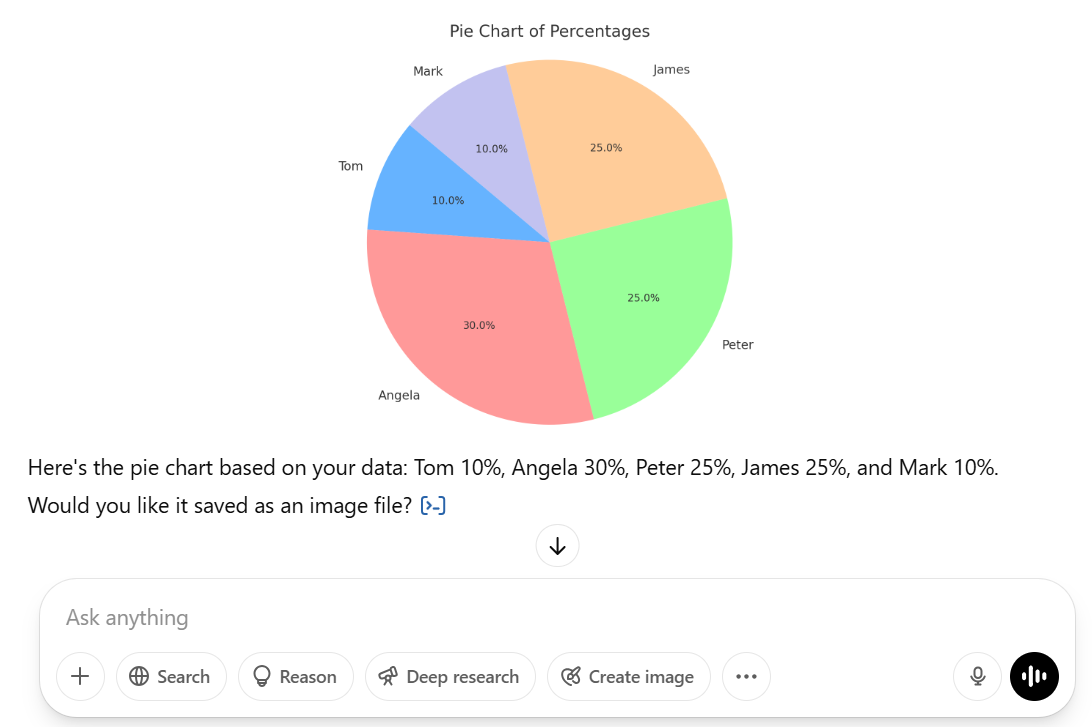
ChatGPT can generate different types of charts or reports based on the data you provide. If you provide categories and their corresponding values, it can quickly create a visual pie chart image. Additionally, the charts generated can be downloaded in various formats, including PNG or JPG for reports and SVG for websites.
📚 Also Read: Diagram Examples for Any Type of Project
With Piktochart’s pie chart generator, you can import data directly from Excel, CSV, or Google Sheets, and the tool will instantly generate your numbers into a polished pie chart. It also has customization capabilities, so you can adjust colors, add labels and percentages, and even animate chart elements for presentations.
This free tool offers interactive pie charts that enhance digital presentations by letting your viewers explore data through actions like hovering or clicking. Otherwise, if you’re creating materials for conventional needs, you can easily export your charts in high-quality formats such as JPG, PNG, or PDF for easy sharing and printing.
A G2 review says:
At the moment, Piktochart is where I do everything. The variety of templates makes it incredibly simple to alter various decks while saving me a ton of time.
EdrawMax’s AI-powered pie chart generator enables you to input data or describe your requirements in plain language, which the AI then interprets to create accurate pie charts.
Additionally, it analyzes your data to identify trends, outliers, and key metrics, transforming raw data into actionable visual representations. To further enhance your experience, EdrawMax offers access to a vast library of over 15,000 templates and symbols.
With pre-designed templates that automatically adjust to your content, Beautiful.ai helps you create pie charts with a polished and professional appearance.
Moreover, you can bring your data to life with subtle animations that catch the eye of your audience and pull their attention back to your presentation. For seamless and up-to-date data management, Beautiful.ai allows you to import data or integrate pie charts directly in Google Sheets, Dropbox, or Box.
A G2 review says:
I love using Beautiful.ai, still in the process of learning more everyday but it is very visual, I love how clean and different our decks look.
If you’re looking for more than a standalone pie chart tool, ClickUp offers an all-in-one solution for smarter, faster decision-making.
With AI-powered pie charts inside ClickUp Dashboards, you can instantly visualize and analyze task distribution, team performance, or project status in real time, without needing manual input.
Pair that with ClickUp Tasks to assign action items directly from insights, and use ClickUp Brain to generate summaries, spot patterns, or even suggest what to prioritize next based on your workload.
Sign up for ClickUp and try it all for free!

Praburam Srinivasan
Max 18min read

Manasi Nair
Max 24min read
Manasi Nair
Max 23min read

© 2026 ClickUp


