
ClickUp Dashboards turn project data into live reporting views for executives, project managers, sales teams, marketers, agencies, HR teams, developers, and individual contributors.
According to Microsoft’s Work Trend Index, 48% of employees say their work feels chaotic and fragmented. When project status lives across tasks, spreadsheets, chats, and updates, teams lose focus fast.
This guide shows 10 ClickUp Dashboard examples, the widgets behind them, and the design principles that make dashboards useful.
ClickUp Dashboard Examples at a Glance
ClickUp Dashboards work best when each dashboard answers one clear business question. The table below shows which dashboard fits each team, which widgets to use, and what decision it helps you make.
| Dashboard example | Best for | Key widgets | Decision it supports |
|---|---|---|---|
| Executive dashboard | Leadership teams | Portfolio, Pie Chart, Workload, AI Cards | Which initiatives need attention? |
| Project management dashboard | Project managers | Task List, Status Bar Chart, Timeline, Calculation | What is late, stuck, or at risk? |
| Sales dashboard | Sales managers | Pipeline Stage, Revenue Cards, Trend Charts | Which deals need follow-up? |
| Marketing dashboard | Marketing teams | Bar Chart, Task List, Embed Widget | Which campaigns are delayed or underperforming? |
| Time tracking dashboard | Agencies and services teams | Time Tracking, Billable Report, Calculation | Which clients or projects are over budget? |
| Team workload dashboard | Team leads | Workload, Task Count by Assignee | Who is overloaded or underused? |
| Client-facing dashboard | Agencies and client teams | Filtered Task List, Status Chart, Embed | What can clients see without internal noise? |
| HR dashboard | People Ops teams | Hiring Pipeline, Forms, Calculation | Where is hiring or onboarding blocked? |
| Product dashboard | Product and engineering teams | Sprint Burndown, Bug Severity, Velocity | Is the release still on track? |
| Personal productivity dashboard | Individual contributors | Dynamic Task List, Time Bar Chart, AI Priority Insight | What should I work on next? |
What Are ClickUp Dashboards?
ClickUp Dashboards are customizable, are customizable reporting pages that turn ClickUp tasks, goals, time entries, sprints, and Custom Fields into live visual widgets.
Unlike static spreadsheets or standalone reporting tools, ClickUp Dashboards stay connected to the work itself. Teams can track tasks, goals, time, workload, sprints, forms, and Custom Fields from the same workspace where execution happens.
Teams use ClickUp Dashboards to track project status, workload, sales pipeline health, campaign performance, time tracking, hiring progress, sprint velocity, and personal productivity.
Dashboards let you aggregate data from across your ClickUp Workspace into a single view using widgets—modular building blocks that display different types of information. Instead of digging through individual tasks and lists, you get a bird’s-eye view of what matters most.
ClickUp Dashboards support four core reporting needs:
- Customization: Teams can drag, resize, and arrange widgets
- Live updates: Widgets refresh as task data changes
- Sharing: Teams can share dashboards with guests, clients, or internal stakeholders
- Cross-space reporting: Dashboards can pull data from multiple Spaces, Folders, and Lists
Fun Fact: The word “dashboard” did not start in software or cars. It originally meant a wood or leather board on a horse-drawn carriage that stopped mud from being “dashed” up by the horses’ hooves.
Which ClickUp Dashboard Should You Build First?
Start with the dashboard tied to your most urgent decision. A team struggling with missed deadlines needs a project dashboard. A sales team with poor forecast visibility needs a pipeline dashboard. An agency losing margin needs a time tracking dashboard.
| If your team needs to… | Build this dashboard first | Why it helps |
|---|---|---|
| Spot late or blocked work | Project management dashboard | Shows overdue tasks, stalled statuses, and timeline risk |
| Reduce leadership status requests | Executive dashboard | Summarizes initiative progress, workload, and business health |
| Improve sales follow-up | Sales dashboard | Tracks deal stages, overdue outreach, and revenue movement |
| Protect agency margins | Time tracking dashboard | Compares billable hours, non-billable work, and estimates |
| Prevent burnout | Team workload dashboard | Shows overloaded teammates and unused capacity |
| Improve client visibility | Client-facing dashboard | Shares milestones and deliverables without exposing internal work |
| Speed up hiring | HR dashboard | Tracks candidate stages, time-to-hire, and onboarding tasks |
| Protect release timelines | Product dashboard | Shows sprint burndown, bug severity, and velocity trends |
Who Should Use ClickUp Dashboards?
ClickUp Dashboards are useful for teams that need live visibility across projects, people, timelines, and performance metrics.
Use a ClickUp Dashboard if you need to:
- Track project progress across multiple Lists, Folders, or Spaces
- Monitor workload and capacity by assignee
- Report sales pipeline, campaign, sprint, or hiring progress
- Share client-facing updates without exposing internal work
- Turn Custom Fields into charts, tables, and calculations
10 ClickUp Dashboard Examples for Every Team
The best ClickUp Dashboard depends on the decision your team needs to make. Executives need portfolio visibility. Project managers need risk and deadline tracking. Sales teams need pipeline health. Marketing teams need campaign execution and performance data. HR teams need hiring and onboarding visibility. Every example below can be built using native ClickUp widgets—and each one targets a specific function.
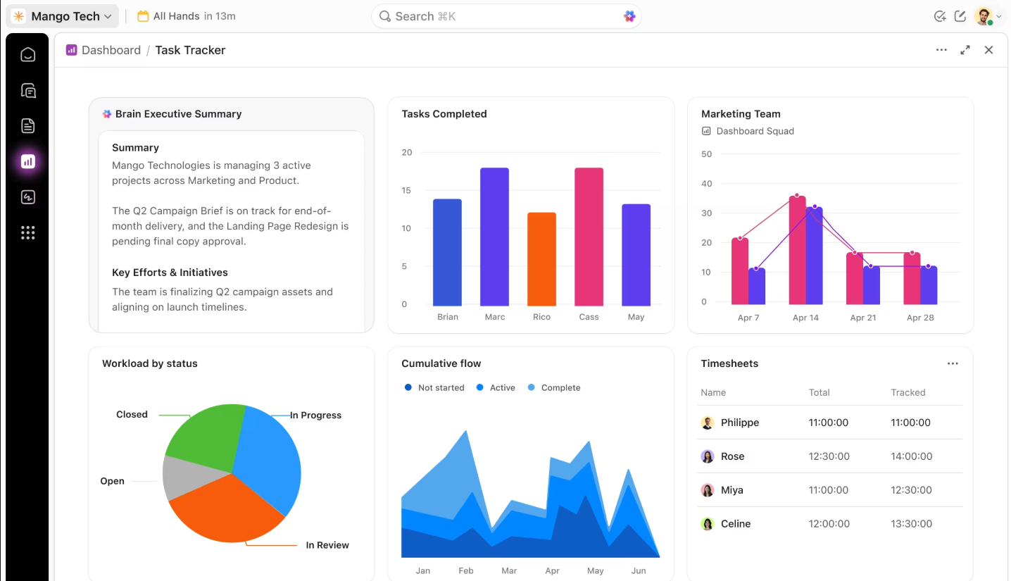
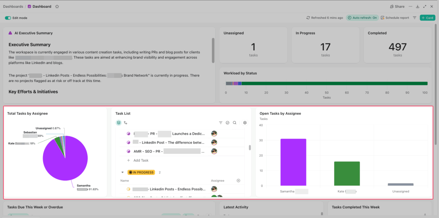
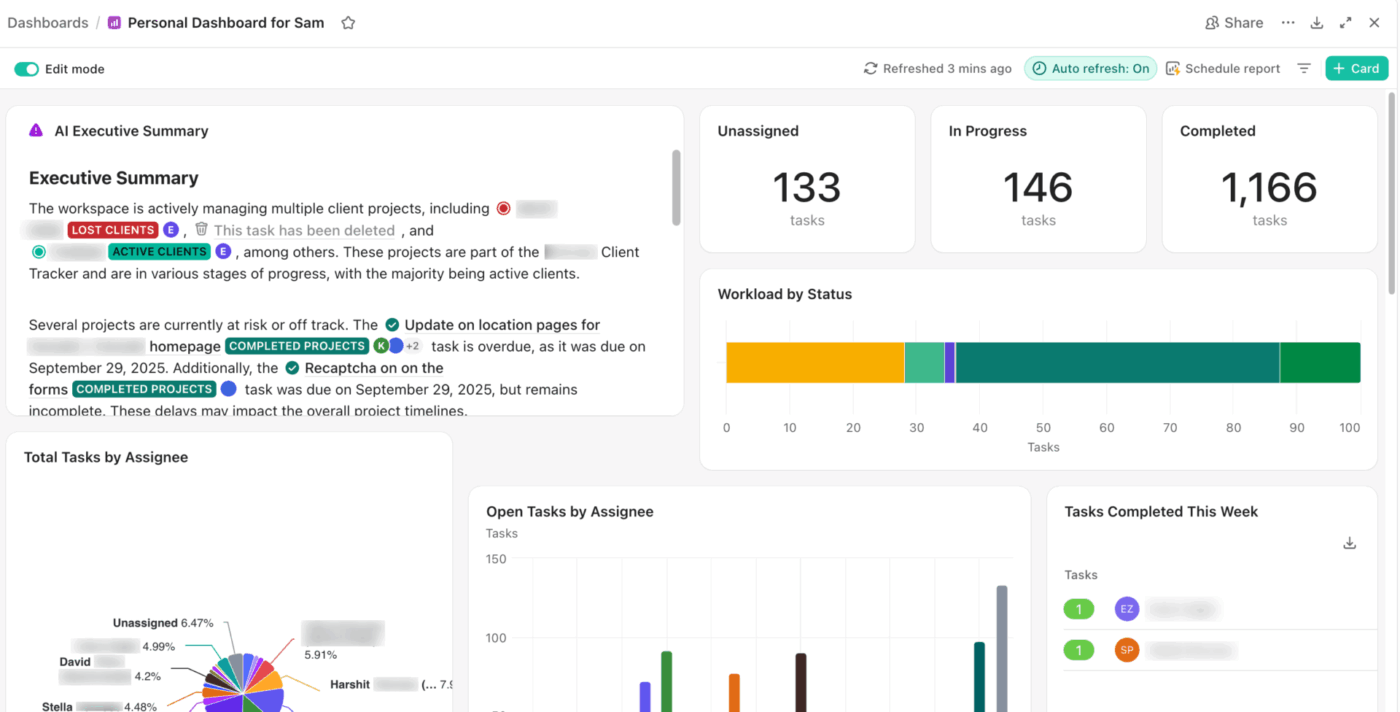
1. Executive dashboard
An executive dashboard gives leaders a live view of initiatives, risks, workload, and business health. This dashboard functions as a high-level “Mission Control,” aggregating data from every department into a single source of truth.
In ClickUp, that can mean using:
- Portfolio widgets to track progress across major initiatives
- Pie charts to show how work is distributed across the organization
- Workload widgets to flag where teams are stretched too thin
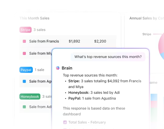
Pro Tip: Why spend time reading dashboards line by line when AI can surface the takeaway instantly? Add a ClickUp AI Card to turn live project activity into a crisp summary, right inside the dashboard. Leaders get the signal fast: key movement, emerging risks, and where attention should go next.
2. Project management dashboard
Project managers do not need more updates. What they need is a clear view of where the project stands right now.
In ClickUp, a project management dashboard can include:
- Task list: Filter it to overdue work so missed deadlines surface first
- Status bar chart: See where tasks are moving and where they are stalling
- Timeline widget: Track whether the project is still pacing against key dates
- Calculation widgets: Use ClickUp Custom Fields to turn project data into simple progress indicators
This setup works because each part answers a different question. What is late? What is stuck? Is the timeline holding? How far along are we, really?
For instance, if a product launch begins to slip, the project dashboard quickly highlights the issue. Overdue approvals are displayed prominently first. The status chart shows a buildup in review, and the timeline indicates where delays begin to impact subsequent tasks. This overview helps the project manager step in early, reassign work, and protect the deadline.
You can sharpen it further with ClickUp Automations that trigger alerts when due dates slip. And if you do not want to build from scratch, you can start with automation templates and customize from there.
Want to build your project management dashboard in under 15 minutes? This walkthrough shows how:
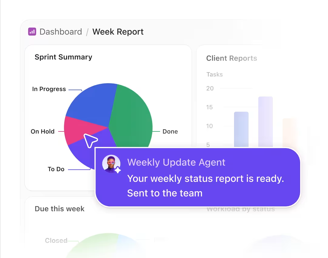
Pro Tip: Automate status reports with ClickUp Super Agents
Dashboards show what changed. ClickUp Super Agents can turn those changes into scheduled status reports for your team.
For example, a Weekly Update Agent can summarize sprint progress, overdue work, blockers, and completed tasks every Monday morning, then send the report to the right team channel automatically.
3. Sales dashboard
Sales managers typically monitor metrics such as win rate, average deal size, deal velocity, conversion by stage, pipeline coverage, and forecast accuracy. These numbers indicate whether the pipeline is healthy or merely appears busy on the surface.
ClickUp sales dashboards help teams track deal stages, overdue follow-ups, revenue targets, pipeline movement, and AI-prioritized risks.
- Pipeline stage view: See how many deals are sitting in each stage
- Overdue follow-up list: Catch stalled outreach before opportunities go cold
- Revenue and deal-count cards: Keep target attainment visible without digging
- Trend charts: Track pipeline movement, close pace, or stage conversion over time
- AI insights and automations: Use ClickUp Brain and Automations to surface risk, prioritize deals, and keep follow-ups moving
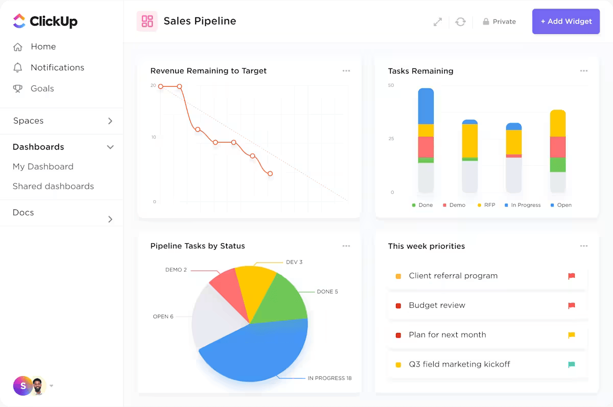
For example, you might open the dashboard and see strong deal volume, yet a large share of opportunities is still sitting in negotiation. Plus, follow-ups keep slipping, and forecasted revenue is starting to soften. At that point, the issue is easier to read. Your team does not need more pipeline at the top. You need to help reps move active deals through the final stages and close them.
Did You Know? Gartner predicts 40% of enterprise apps will feature task-specific AI agents by the end of this year. We’re already living that reality at ClickUp.
We use ClickUp Super Agents as our autonomous engines that prep demos and handle follow-ups, so we can focus on the win.
Watch our AI agents in action below:
4. Marketing dashboard
Marketing teams face Context Sprawl when campaign tasks, files, approvals, and performance data live across separate tools. A ClickUp marketing dashboard centralizes campaign execution and live performance data in one reporting view.
And in ClickUp, that dashboard means:
- Bar chart: Group tasks by campaign to see which initiatives are nearing the finish line and which are stalling
- Task list: Filter by “Content Type” (e. g. , Video, Blog, Ad Copy) to ensure the creative pipeline is balanced across all channels
- Embed widget: Pull in a live Google Analytics or Looker Studio view so performance data sits right next to the work generating it
This setup ensures that channel, funnel stage, and format—tracked via Custom Fields—power every visual breakdown.
Say a marketing director notices a traffic dip. They check the dashboard, see the “Social Media” status bar is lagging, and notice the embedded analytics show a drop in referral hits. They quickly recognize that the creative assets are still in “Legal Review,” enabling them to launch the campaign without a “status check” meeting.
Real-world impact: Finastra used ClickUp Dashboards to centralize global marketing visibility across regions. The team reduced manual reporting and gave leadership real-time access to campaign health.
The Solution: They transitioned to ClickUp Dashboards to act as a live “single source of truth. ” By centralizing campaign data, they removed the need for manual reporting and email chains.
The Result:
- Reduced “reporting tax”: The team stopped spending hours manually compiling regional data and started focusing on execution
- Instant access: Leadership can now monitor global campaign health in real time, eliminating the wait for weekly syncs
Our mentality is, ‘If it’s not in ClickUp, it doesn’t exist. ’ So nowadays, it’s essential that every single marketing activity is input into ClickUp where it’ll be visible to all stakeholders.
Our mentality is, ‘If it’s not in ClickUp, it doesn’t exist. ’ So nowadays, it’s essential that every single marketing activity is input into ClickUp where it’ll be visible to all stakeholders.
5. Time tracking dashboard
Agencies billing by the hour require precise data to protect their margins. ClickUp Time Tracking feeds dashboard widgets directly, reducing sync delays from third-party tools.
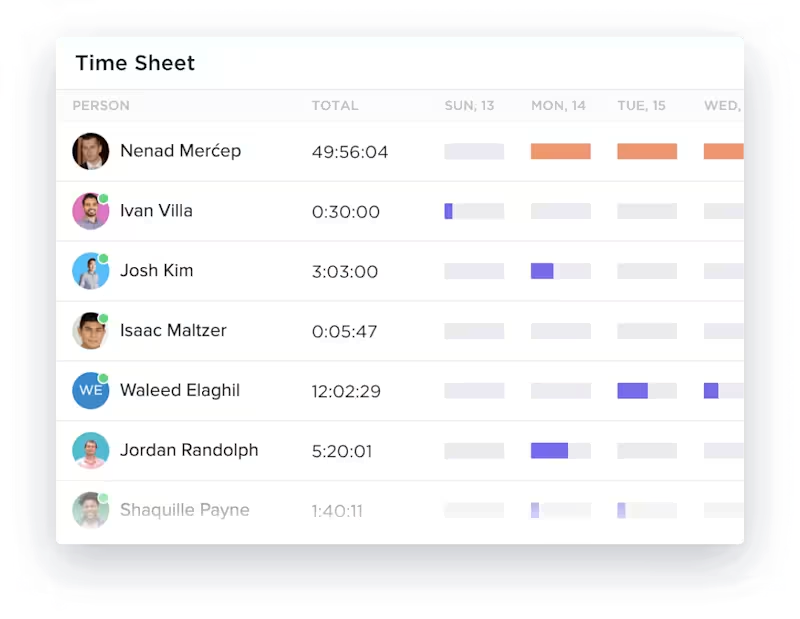
- Time Tracking by assignee: See who logged what in a bar chart
- Time Tracking by project: Compare hours across client accounts
- ClickUp billable report: Separate revenue-generating work from internal tasks
- Calculation widget: Compare estimated vs. actual hours to catch scope creep
For example, you open the dashboard and see that one client account has already burned through most of its estimated hours while billable time is rising faster than expected. That is your cue to review the scope, adjust the plan, or have a client conversation before the overrun gets worse.
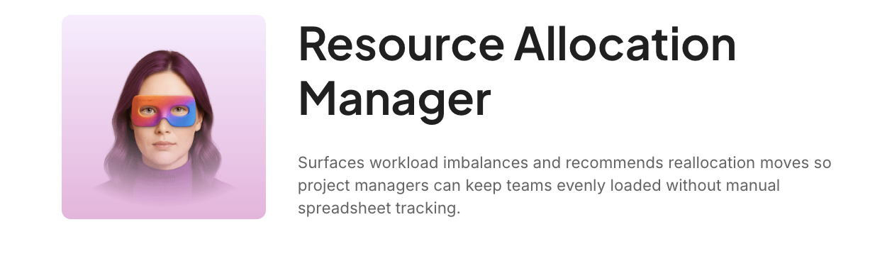
Bonus: ClickUp Super Agents can help rebalance client workload before capacity slips. For example, the Resource Allocation Manager AI Agent can monitor workload signals, flag overextension, and suggest task shifts across accounts.
Teams still control the agent’s permissions, knowledge, and memory.
6. Team workload dashboard
A team workload dashboard shows which employees are overloaded, underused, or carrying urgent work. Eliminate the guesswork with a Workload Widget that shows capacity by person. Set capacity limits per team member so the dashboard flags anyone who’s overloaded or has bandwidth.
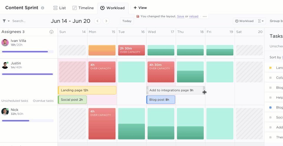
For example, you might open the dashboard and notice one designer is carrying most of the urgent work while another teammate has room. At that point, you can rebalance the load right from the data.
7. Client-facing dashboard
Transparency builds trust, but over-sharing leads to confusion. A ClickUp client-facing dashboard gives stakeholders read-only visibility into milestones, deliverables, project phases, and embedded assets.

In ClickUp, you can curate your dashboard like:
- Filtered task list: Only high-level “Milestones” and final deliverables appear. Internal subtasks and “In-Review” steps remain hidden to prevent noise
- Status bar chart: A macro-view visualization showing the completion of major project phases
- Embed widget: Live Figma prototypes or Loom walkthroughs. Clients interact with the latest work directly on the dashboard
For example, a software agency managing a complex build uses this dashboard to shield the client from 400+ technical tickets. The client sees a Status Pie Chart showing only three phases: “Development,” “QA,” and “Live. ” When the client notices the “QA” slice growing, they refer to the Text Widget where the Project Manager has already noted that a security patch is being finalized.
Want to build a client-facing dashboard? Watch this step-by-step walkthrough:
8. HR and people operations dashboard
People Ops teams lose candidates when hiring tasks sit across email, spreadsheets, forms, and interview notes. A ClickUp HR dashboard tracks candidate stages, application intake, time-to-hire, and onboarding progress in one view.
In ClickUp, you can customize your dashboard like:
- Bar chart (hiring pipeline): Visualizes candidate volume across Custom Fields like “Applied,” “Screened,” “Interviewed,” and “Offered”
- Form-to-task feed: Applications from ClickUp Forms are routed directly to a “New Applicants” widget
- Calculation widget: Monitors “Time-to-Hire” or “Open Roles vs. Filled Roles” to measure recruitment velocity

For instance, you might notice plenty of applicants at the top of the funnel, but very few are making it past screening. Or you might see that onboarding tasks are getting stuck in the first week. That gives you a clear signal to fix the process before it starts affecting hiring speed or the new hire experience.
9. Product and development dashboard
Shipping code on time requires spotting friction before it derails a release. A ClickUp product dashboard tracks sprint progress, bug severity, velocity, blocked work, and release risk.
You can curate your ClickUp Dashboard like:
- Sprint burndown chart: Track points against your “ideal” line to flag a potential “Friday crunch” before the sprint ends
- Bug severity breakdown: A pie chart using Custom Fields to ensure “Critical” bugs aren’t ignored in favor of easier UI fixes
- Sprint velocity chart: Maps historical output over recent sprints to provide stakeholders with data-backed roadmap estimates

Say the velocity trend still looks steady, but the burndown starts flattening halfway through the sprint. Then you notice a cluster of high-severity bugs and a growing blocked list. The dashboard helps you catch that shift early, while there is still time to protect the release.
10. Personal productivity dashboard
A personal productivity dashboard shows assigned tasks, due dates, time use, completed work, and AI-recommended priorities. This private “command center” strips away the organizational noise, presenting a tailored view of only what requires your immediate attention.
This is how you can customize your productivity dashboard:
- Dynamic task list: Displays only work assigned to you, sorted by due date to keep the “next up” priorities at the top
- Weekly time bar chart: A personal audit showing how your hours were distributed across projects, helping you spot your own time-sinks
- Completed tasks line chart: A tracker that visualizes your daily output, providing a clear look at your production trends
- AI priority insight: Uses ClickUp Brain to analyze deadlines and cleared dependencies, suggesting exactly which task to start next
For example, by midweek, your task list may look full but still tell you very little about where your effort is going. A personal dashboard fixes that. Identify deadlines that need action, see dependencies blocking work, and check whether your week is filled with progress or just activity. That kind of visibility helps you work with more intention, not just more urgency.
ClickUp Insight: Think those “mild distractions” from invisible work aren’t a big deal? They are.
For 28% of employees, the small interruptions and constant task juggling chip away at valuable deep work, reducing overall productivity and adding to their mental load.
With ClickUp’s Dashboards and personalized Home view, you can build a personal productivity dashboard that gives you a crystal-clear, panoramic overview of all your work, including those unseen tasks.
Identify where your time is truly going, and empower yourself to prioritize intelligently.
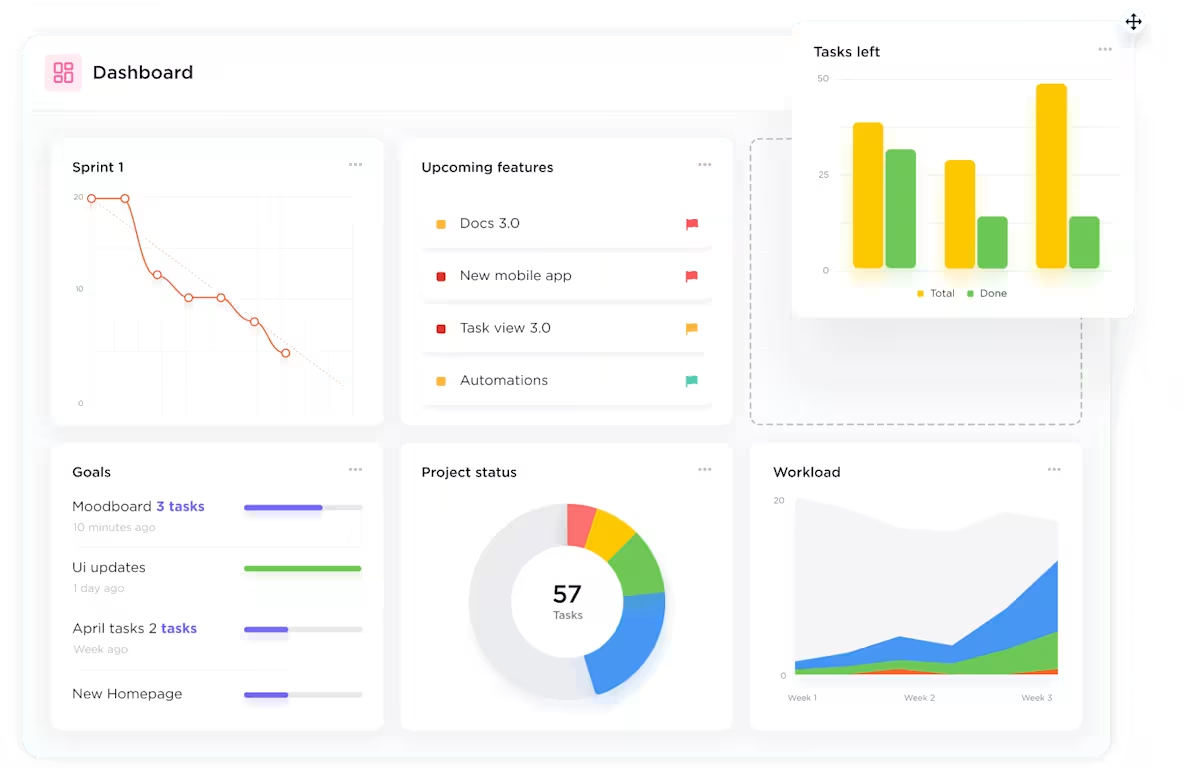
Popular Widgets for ClickUp Dashboards
ClickUp Dashboard widgets convert Workspace data into charts, lists, tables, embeds, and AI summaries. The best widget depends on the decision your dashboard needs to support.
Here are the most useful ones by category:
Time Tracking widgets
- Time Tracked by assignee: Bar chart showing hours per person
- Time Tracked by Project: Drill into where hours go
- Billable Report: Separate billable from non-billable entries
- ClickUp Time Reporting Table : Group by Space, Folder, List, or user
Status and progress widgets
- Status Pie Chart: Percentage of tasks in each status
- Status Bar Chart: Task counts by status across locations
- ClickUp Cumulative Flow Diagram: Visualize work moving through stages over time
Workload and assignee widgets
- Workload Widget: Capacity view showing who’s over or under their limit
- Task Count by Assignee: Bar or pie chart of assignment distribution
- ClickUp Overdue Tasks by Assignee: Spotlight where delays happen
Sprint widgets
- Sprint Burndown Chart: Tracks remaining work against ideal pace in one Sprint
- ClickUp Sprint Burnup Chart: Tracks scope changes and completed work in one Sprint
- Sprint Velocity Chart: Compares committed vs. completed work across three to 10 Sprints
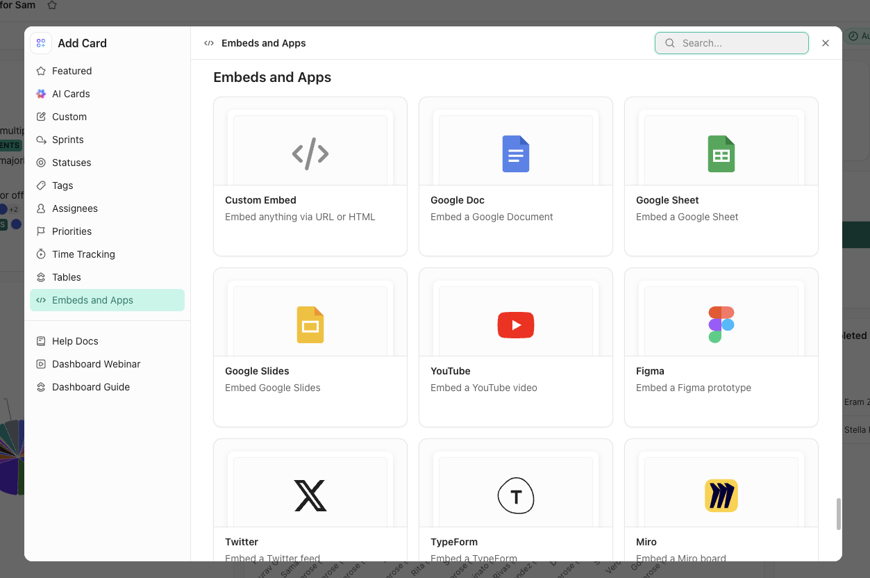
Custom and Embed widgets
- Embed Widget: Display Google Sheets, Figma, Loom, or any external URL
- Rich Text Widget: Add notes, instructions, or section labels for context
- ClickUp Custom Field Charts: Build bar, pie, or line charts from any Custom Field data
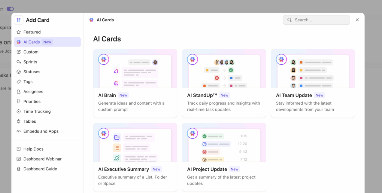
Use AI Cards to summarize dashboard activity
ClickUp AI Cards help teams turn dashboard data into plain-language summaries. Instead of scanning every chart manually, teams can use AI Cards to summarize project updates, team progress, blockers, and next steps from live Workspace data.
How to Create a Dashboard in ClickUp
Before you begin, ensure you have the necessary permissions within your Workspace to create and edit. And then, follow these steps:
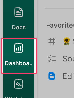
1. Click Dashboards in the left sidebar, or use the + button from any Space, Folder, or List
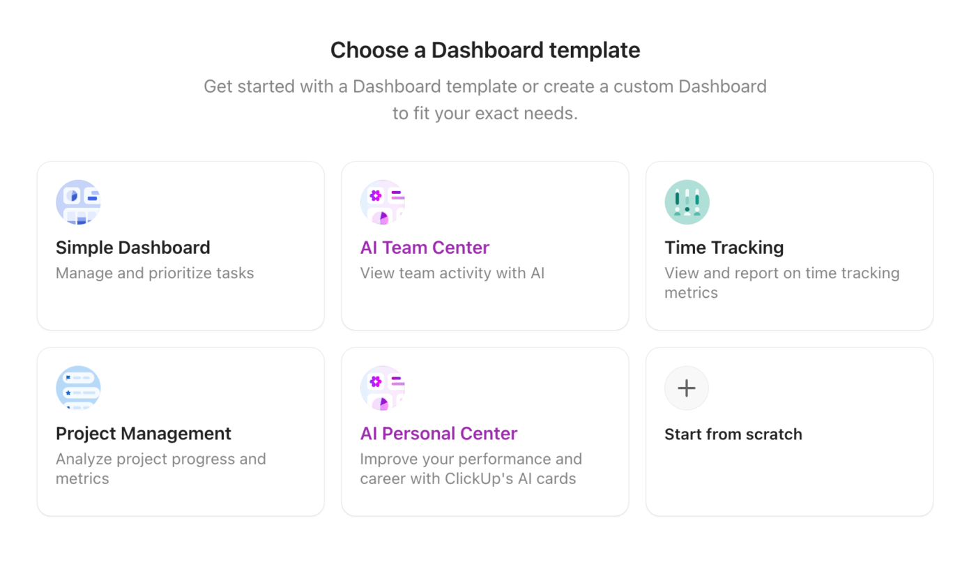
2. Choose Start from scratch or select a dashboard template
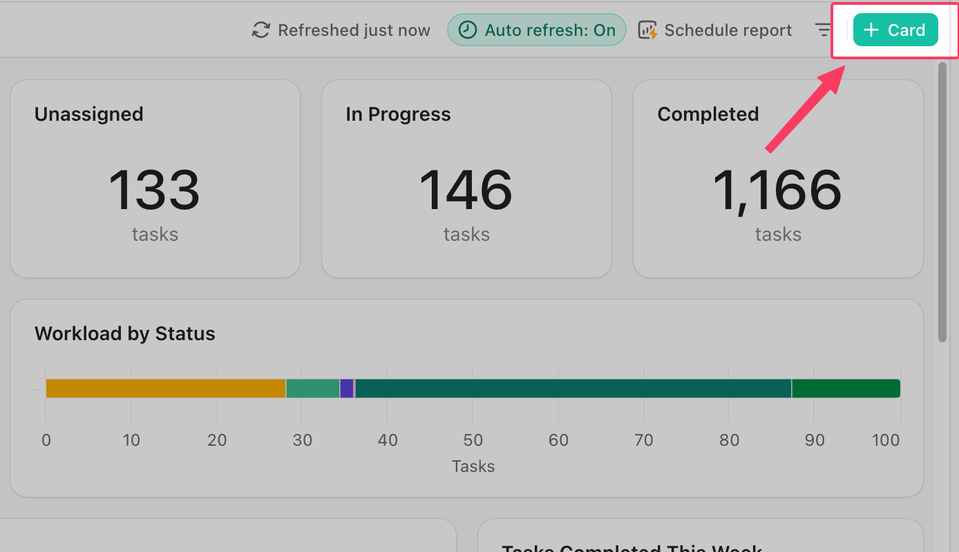
3. Click + Card to open the widget library
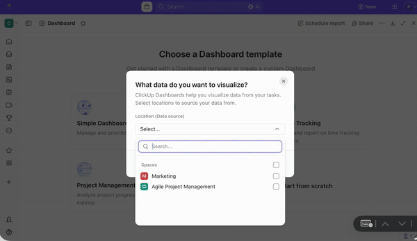
4. Select a widget category and configure the data source—choose the Spaces, Folders, or Lists you want to pull from
5. Drag and resize widgets on the canvas to arrange your layout
6. Use filters within each widget to narrow data by assignee, status, date range, tags, or Custom Fields
7. Name your dashboard and set sharing permissions (private, team-wide, or public link)
If a widget shows “No data,” check that the data source is correctly selected and that tasks have the relevant fields populated. Dashboards auto-refresh every 30 minutes by default, or you can refresh them manually at any time.
ClickUp Insight: 45% of workers have thought about using automation, but haven’t taken the leap.
Factors like limited time, uncertainty about the best tools, and overwhelming choices can hold people back from taking the first step toward automation. ⚒️
With its easy-to-build AI agents and natural language-based commands, ClickUp makes it easy to get started with automations. From auto-assigning tasks to AI-generated project summaries, you can unlock powerful automation and even build custom AI agents in minutes—minus the learning curve.
💫 Real Results: QubicaAMF cut reporting time by 40% using ClickUp’s dynamic dashboards and automated charts, transforming hours of manual work into real-time insights.
A thoughtfully designed ClickUp dashboard can transform how your team tracks progress, prioritizes work, and stays aligned. Here’s how to get it right 👇
Best Practices for ClickUp Dashboard Design
A thoughtfully designed ClickUp dashboard can transform how your team tracks progress, prioritizes work, and stays aligned. Here’s how to get it right 👇
Define your dashboard audience and data story
Before adding a single widget, answer two questions:
- Who will look at this dashboard? (executive, team lead, IC, client)
- What decision should it help them make ? (hire more people, reassign work, approve a budget)
Write a one-sentence purpose statement like “This dashboard helps the marketing lead see which campaigns are on track this quarter. ” If you can’t write one, you’re not ready to build yet.
Choose the right KPIs and widgets
Match widget type to data type:
| Proportions (% of tasks per status) | Pie chart |
| Comparisons (hours by team member) | Bar chart |
| Trends over time (completed tasks per week) | Line chart |
| Action items (overdue tasks, blocked work) | Task List |
| Single metrics (total hours, task count) | Calculation Widget |
If a metric does not drive a decision, leave it off.
Organize widgets for visual hierarchy
Place your most critical metric in the top-left corner to establish a clear visual hierarchy—that’s where eyes land first. Group related widgets together and use Text Widgets as section dividers.
Easily customize your layout by resizing widgets—make the main chart bigger and the supporting details smaller. ClickUp puts you in full control because size really does reflect importance.
Build Your First ClickUp Dashboard Today
Scattered project data slows decisions. A ClickUp Dashboard turns tasks, goals, time entries, workload, sprints, and Custom Fields into one live reporting view.
Teams can use ClickUp Dashboards to track executive priorities, project risks, sales pipelines, campaign performance, billable hours, hiring progress, sprint health, and personal productivity.
Get started for free with ClickUp and build your first dashboard in minutes.
Frequently Asked Questions
What is the difference between ClickUp Views and ClickUp Dashboards?
ClickUp Views (List, Board, Gantt, Calendar) organize and display tasks within a specific location—they’re where you do the work. ClickUp Dashboards aggregate data across multiple sources into visual widgets for reporting and monitoring—they’re where you see the big picture.
Can you share ClickUp Dashboards with clients who don’t have a ClickUp account?
Yes—you can generate a shareable public link for any dashboard, giving external viewers read-only access without needing a ClickUp account.
How many dashboards should a team create in ClickUp?
One per distinct audience or decision is a solid starting point. Most teams begin with two or three and expand from there.
Do ClickUp Dashboard widgets update automatically when task data changes?
Yes—widgets pull live data from your Workspace, and dashboards auto-refresh every 30 minutes. You can also trigger a manual refresh at any time.