
El café apenas ha empezado a hacer efecto, pero de alguna manera ya estás corriendo para reunir los números de tres hojas, filtrar los datos y dar sentido a las tareas pendientes.
Microsoft Excel es una herramienta muy potente, pero cuando se trata del seguimiento del rendimiento de un proyecto, puede saturarse fácilmente con largas líneas de datos.
Al dominar las fórmulas básicas de Excel y los trucos de diseño, transformará datos dispersos en información clara que mantendrá a su equipo alineado y sus proyectos por buen camino. Se acabó el tener que revisar interminables filas: ahora solo tendrá informes sencillos que destacan lo más importante.
En esta entrada del blog, exploraremos cómo crear un informe de resumen en Excel, lo que facilita la creación, lectura y aplicación de las actualizaciones de su proyecto.
¿Qué es un informe de resumen en Excel?
Un informe de resumen en Microsoft Excel es una herramienta poderosa para transmitir información esencial mediante la agregación y organización de datos sin procesar en un formato más fácil de digerir.
En lugar de revisar hojas de cálculo grandes y complejas, puede centrarse en métricas clave, como totales, promedios o recuentos, lo que facilita la identificación de tendencias y el seguimiento del rendimiento.
Este enfoque resulta beneficioso en situaciones en las que es fundamental tomar decisiones oportunas, como revisiones presupuestarias, análisis de ventas o gestión de proyectos.
🧠 Dato curioso: En la investigación genómica, Excel convirtió automáticamente nombres de genes como «MARCH1» en fechas («Mar-1»), lo que corrompió casi el 20 % de las listas de genes publicadas en algunos estudios. Esto provocó investigaciones erróneas a gran escala antes de que la gente se diera cuenta. ¡Resulta que las fechas de Excel son difíciles de manejar para todo el mundo!
⭐ Plantilla destacada
¿Quiere una forma práctica de resumir cualquier proyecto, reunión o tarea? Utilice la plantilla de informe resumido de ClickUp para gestionar su trabajo de forma personalizada y realizar un seguimiento eficaz del progreso.
Antes de empezar a organizar sus datos
Haga una pausa antes de pasar a las fórmulas, los gráficos o las tablas dinámicas para asegurarse de que sus datos estén ajustados correctamente.
A continuación le ofrecemos algunos consejos:
- Asigne a cada atributo su propia columna con un encabezado adecuado ✅.
- Asegúrese de que cada fila represente un único registro o transacción ✅.
- Evite dejar filas o columnas en blanco dentro de su conjunto de datos ✅
- Utilice formatos coherentes para las entradas de datos, como fechas, números y texto ✅.
- Elimine los registros duplicados del archivo Excel para evitar resúmenes inexactos ✅.
- Consolide y estandarice el diseño de los datos de múltiples fuentes de datos en una sola hoja ✅.
💡 Consejo profesional: Utilice intervalos con nombre para mayor claridad. Asigne nombres a sus bloques de datos clave, como «Total_Ventas_T2», en lugar de hacer referencia a C4:G9 en todas partes. Esto hace que sus fórmulas sean más fáciles de leer, especialmente cuando se colabora o se revisan después de varias semanas.
Cómo crear un informe de resumen en Excel
Si está terminando una revisión mensual de ventas o extrayendo información de un enorme volcado de datos, un informe de resumen bien elaborado en Excel puede ahorrarle horas de trabajo manual.
A continuación, le mostramos cómo pasar de datos sin procesar a un resumen limpio y fácil de compartir en solo unos pasos.
Paso n.º 1: Ponga en orden sus datos
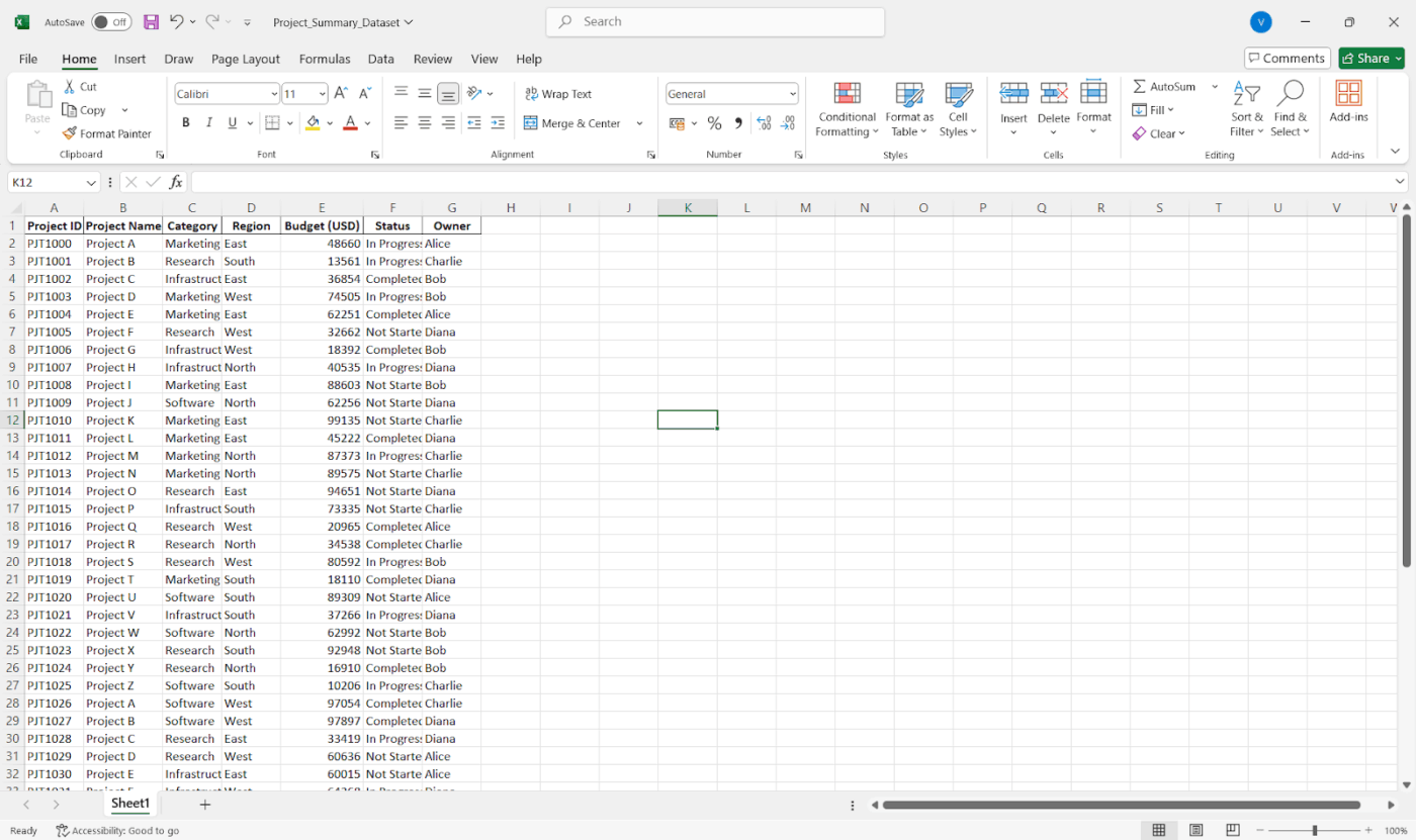
Empiece por asegurarse de que sus datos estén ordenados y organizados en tablas. Esto significa que cada columna debe tener un encabezado claro, cada fila debe representar un registro único y no debe haber una mezcla de texto y números.
💡 Consejo profesional: Utilice Formato como tabla para facilitar la clasificación, el filtrado y la referencia. No olvide eliminar los duplicados, limpiar los valores que faltan y estandarizar los formatos (especialmente las fechas y los números).
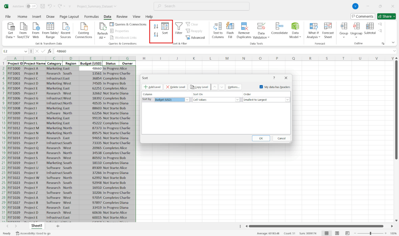
Paso n.º 2: Ordenar, filtrar y nombrar
Una vez que los datos estén limpios, ordénelos de forma significativa (por ejemplo, por fecha o categoría). Utilice el botón Filtro para ampliar lo que le interesa.
A continuación le mostramos cómo ordenar sus datos:
- Haga clic en cualquier celda de la columna que desee ordenar.
- Vaya a la pestaña Datos y haga clic en Ordenar de A a Z o Ordenar de Z a A (para números o texto).
- Para ordenar los datos de forma personalizada (por varias columnas), haga clic en Ordenar y configure los niveles, por ejemplo, «Ordenar por región y luego por ventas».
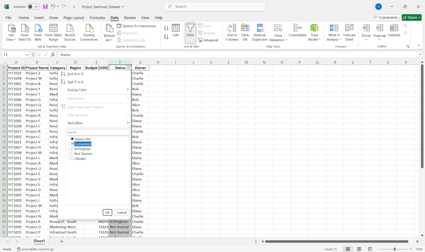
A continuación se explica cómo filtrar para centrarse:
- Seleccione su tabla
- Vaya a la pestaña Datos y haga clic en Filtro.
- Haga clic en la flecha desplegable de cualquier columna para filtrar por valores específicos, intervalos, texto, fechas o incluso colores.
Es pendiente hacerlo para mostrar solo los datos del segundo trimestre, ver las entradas de equipos o departamentos específicos y filtrar los valores atípicos o los valores que faltan.
💡 Consejo profesional: Utilice Fórmulas > Definir nombre para crear intervalos con nombre. Esto facilita la creación de fórmulas de resumen.
Paso n.º 3: Crear una tabla dinámica (recomendado)
Ahora que sus datos están limpios y organizados, es el momento de decidir cómo desea resumirlos. Su elección depende del tipo de informe que necesite, su nivel de flexibilidad y la estructura de los datos.
- Utilice una tabla dinámica para obtener resúmenes interactivos (son la mejor opción para obtener resúmenes flexibles que le permiten profundizar rápidamente).
- Utilice fórmulas como SUMIF, COUNTIF o AVERAGE para obtener informes más personalizados.
- ¿Quiere reunir datos de varias hojas? Pruebe la opción Consolidar en la pestaña Datos .
A continuación se explica cómo crear una tabla dinámica:
- Destaque sus datos
- Vaya a la pestaña Insertar y haga clic en Tabla dinámica.
- Elija dónde debe aparecer (lo mejor es una hoja nueva).
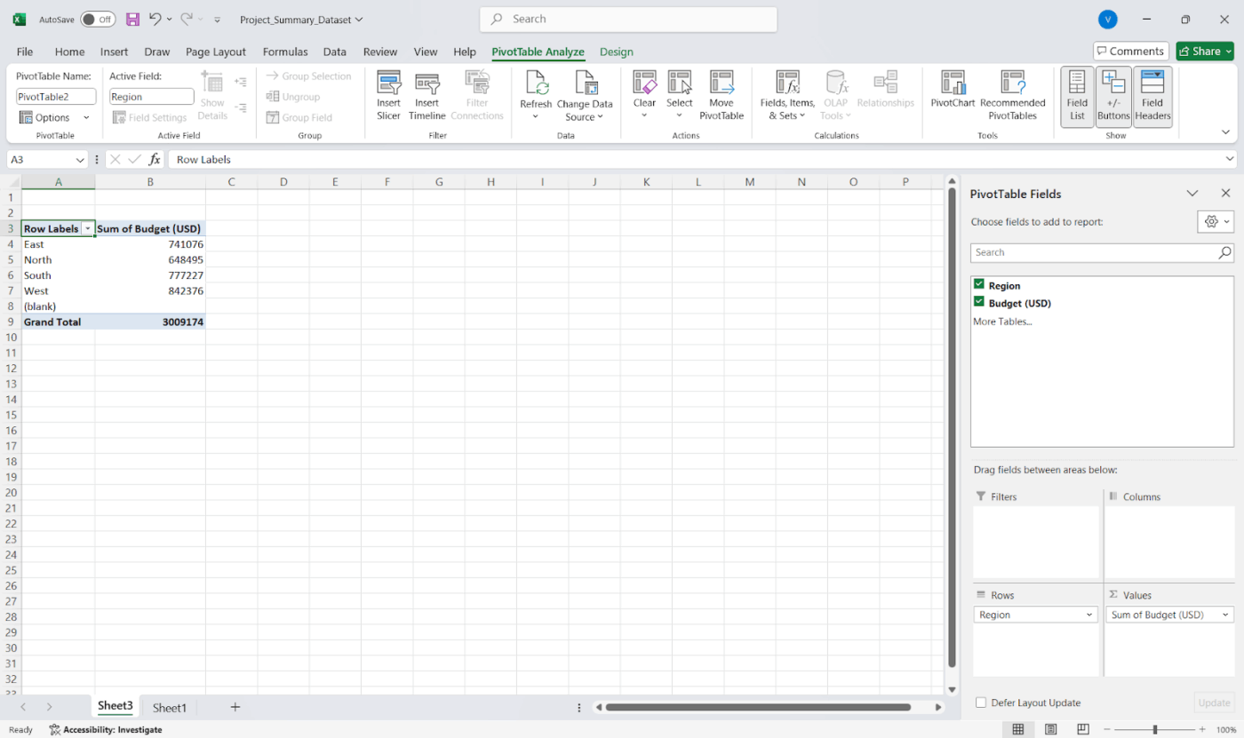
- Arrastre los campos a las áreas Fila y Valores.
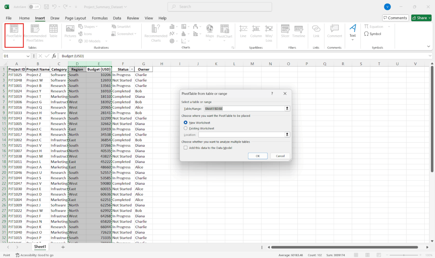
Por ejemplo, para ver las ventas por región, arrastre «Región» a Filas y «Ventas» a Valores.
Utilice las áreas Filtros y Columnas para obtener desgloses más detallados y haga doble clic en cualquier valor para ver los datos sin procesar que hay detrás.
💡 Consejo profesional: Cree menús desplegables dinámicos. ¿Quiere cambiar entre clientes, periodos de tiempo o categorías de productos sin duplicar hojas? Utilice la validación de datos + combinaciones INDIRECTO o FILTRO para que un resumen se adapte a múltiples entradas en tiempo real.
Paso n.º 4: Ajuste el diseño y los cálculos.
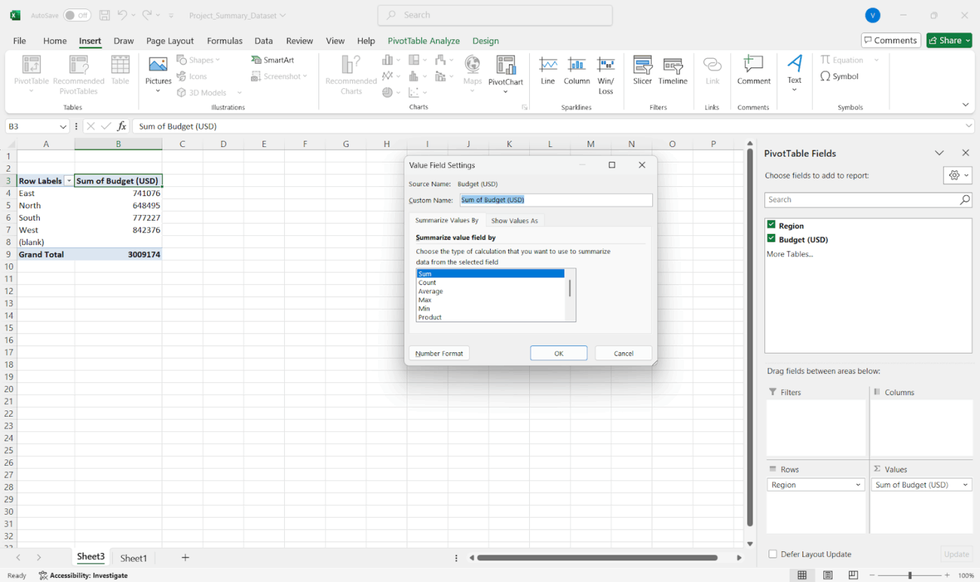
¿Necesita totales, promedios o recuentos? Haga clic con el botón derecho en un valor de la tabla dinámica y vaya a Ajustes del campo de valor para cambiar los datos. Añada campos calculados directamente en la tabla dinámica para obtener información adicional sin modificar los datos originales.
🎥 Ver: ¿Se siente abrumado por tantos pasos? Vea cómo Kulzer utiliza ClickUp para crear un panel de elaboración de informes:
Paso n.º 5: utilice el formato condicional para que destaque.
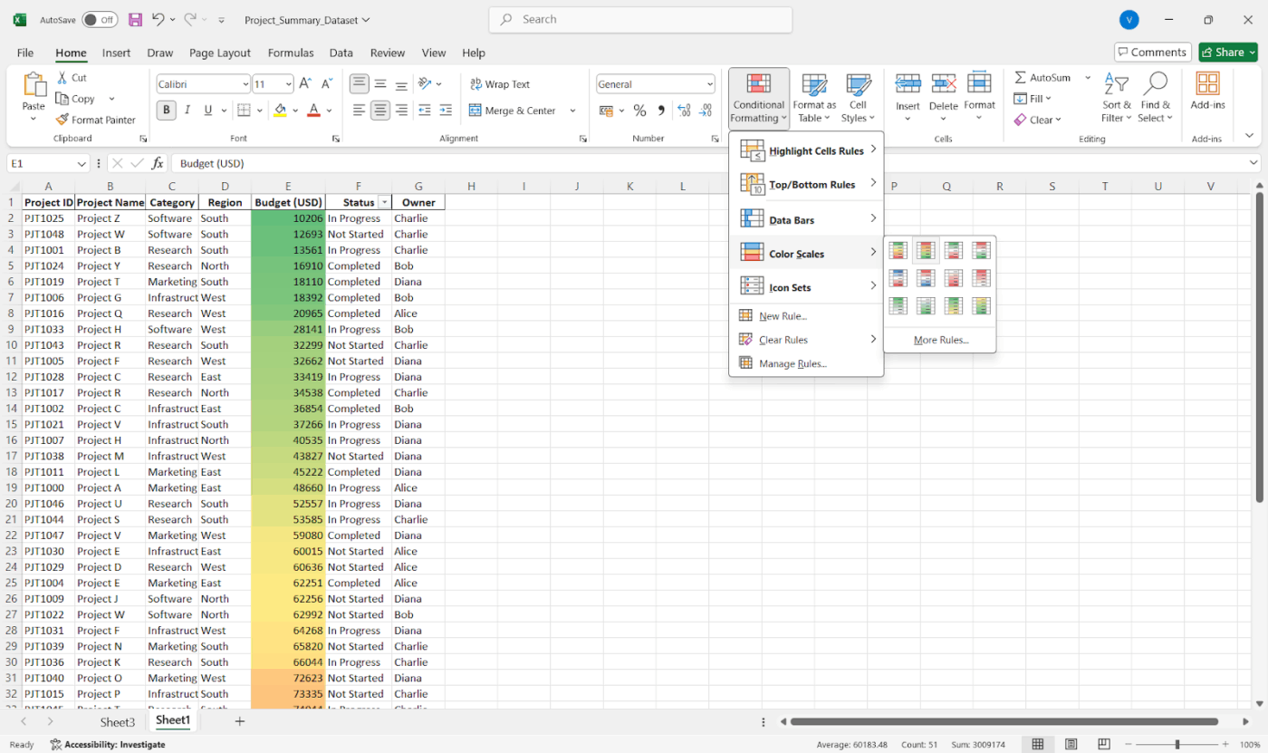
Utilice el formato condicional de la pestaña Inicio para resaltar valores atípicos, los mejores resultados o las tendencias. Añada minigráficos o barras de datos para obtener indicaciones visuales rápidas y mantenga la coherencia de los colores para facilitar la lectura.
📖 Lea también: Plantillas gratuitas para el seguimiento del progreso de proyectos para la gestión de proyectos
Paso n.º 6: Añadir elementos visuales (opcional)
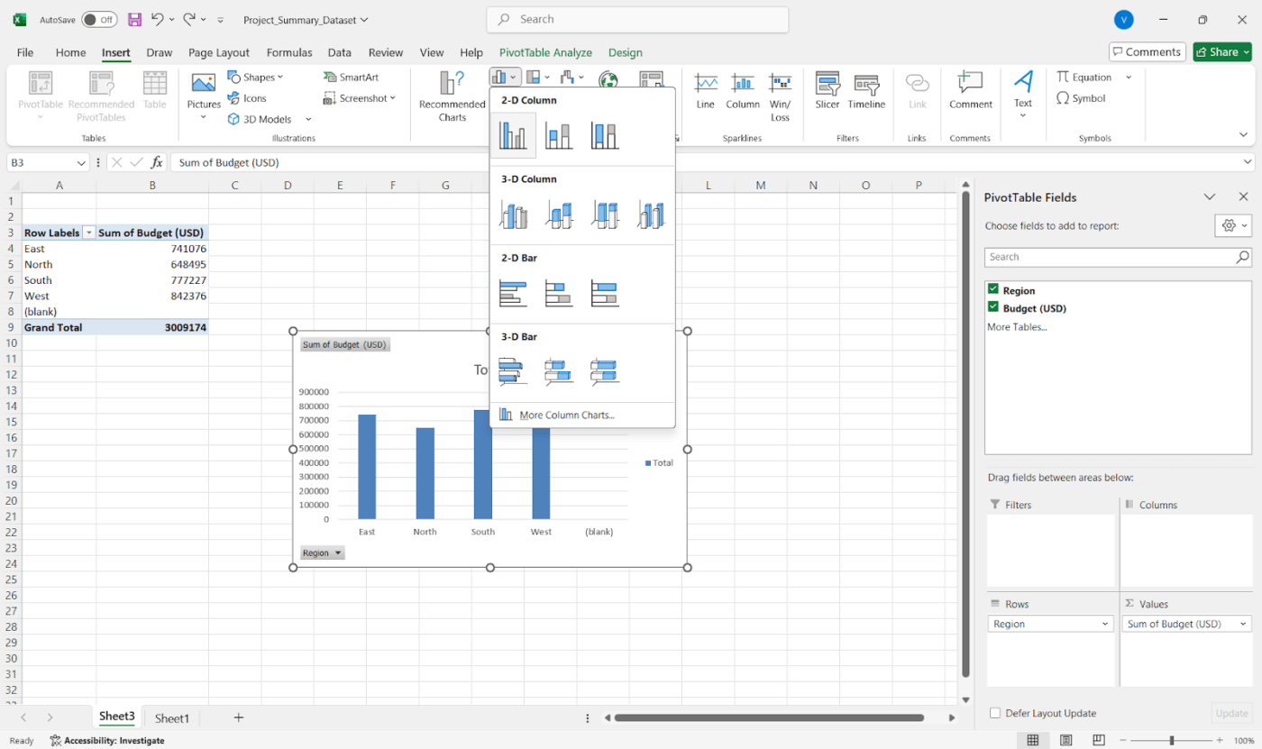
También puede convertir su resumen en un informe visual con gráficos de hitos. Solo tiene que seleccionar su tabla dinámica o tabla de resumen y ir a Insertar > Gráficos. Los gráficos dinámicos permanecen sincronizados con su tabla dinámica, por lo que puede filtrar los datos en tiempo real y el gráfico se actualiza automáticamente.
📖 Lea también: Cómo crear un informe en Excel (con pasos y plantillas)
Paso n.º 7: Rótulo, guardar y compartir
Añada rótulos de sección claros y notas breves para que los demás sepan lo que están viendo. A continuación, guárdelo, expórtelo a PDF o utilice el uso compartido a través de OneDrive para facilitar el acceso.
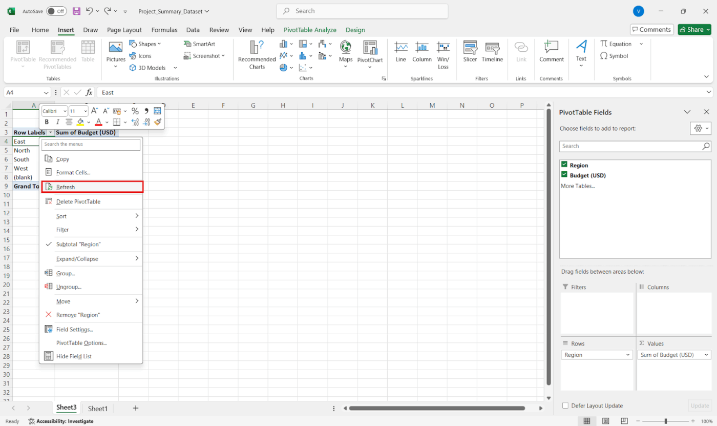
Paso n.º 8: Manténgalo actualizado
Si sus datos se actualizan, simplemente haga clic con el botón derecho del ratón en su tabla dinámica y seleccione Actualizar. Un consejo rápido es utilizar intervalos dinámicos con nombre o tablas de Excel para que su resumen crezca automáticamente con sus datos.
💡 Consejo profesional: A continuación se explica cómo combinar datos de varias hojas:
- Vaya a su hoja de resumen.
- Haga clic en Datos > Consolidar.
- Elija una función como SUM o AVERAGE.
- Añada los intervalos de datos de cada hoja.
- Utilice rótulos si los tiene. Terminado!
También puede utilizar fórmulas 3D como =SUM(Hoja1:Hoja4!B2) para sumar rápidamente la misma celda en varias hojas.
Limitaciones del uso de Excel para informes de resumen
Microsoft Excel funciona bien para procesar números y crear informes básicos. Sin embargo, es posible que se enfrente a límites comunes a medida que sus datos se vuelven más complejos.
Estos son algunos de los retos a los que puede enfrentarse al crear un resumen de proyecto:
- Límites de filas y columnas: Solo admite hasta 1 048 576 filas y 16 384 columnas en una hoja de cálculo, lo que supone un límite estricto para los datos sin procesar.
- Problemas de rendimiento: se vuelve lento y no responde cuando se intenta exportar o procesar datos en sus límites superiores.
- Actualización limitada de datos en tiempo real: Carece de la capacidad de actualizar automáticamente los informes de progreso en tiempo real, a menos que se utilicen conexiones o programación especializadas.
- Límites de visualización de filas y agrupaciones: la vista previa de filas tiene un límite de 20, y los elementos de grupo deben truncarse cuando se trabaja con informes conectados a Salesforce o integraciones similares.
- Muy sensible a los datos desordenados: se basa en datos limpios y con un formato coherente. Admite duplicados, filas en blanco o entradas irregulares, lo que puede romper fácilmente las fórmulas y las tablas dinámicas.
- Sin funciones avanzadas de elaboración de informes integradas: carece de capacidades como la automatización de la actualización, el modelado de datos relacionales o el análisis multisource sin fisuras que se encuentran en las herramientas de BI.
- Configuración manual = mayor riesgo de errores: Requiere que configure fórmulas, filtros y intervalos manualmente, lo que aumenta la posibilidad de cometer pequeños errores.
📖 Lea también: Plantillas de registro diario gratuitas para realizar el seguimiento eficiente de las actividades
Cómo ClickUp proporciona soporte para la elaboración de informes de resumen
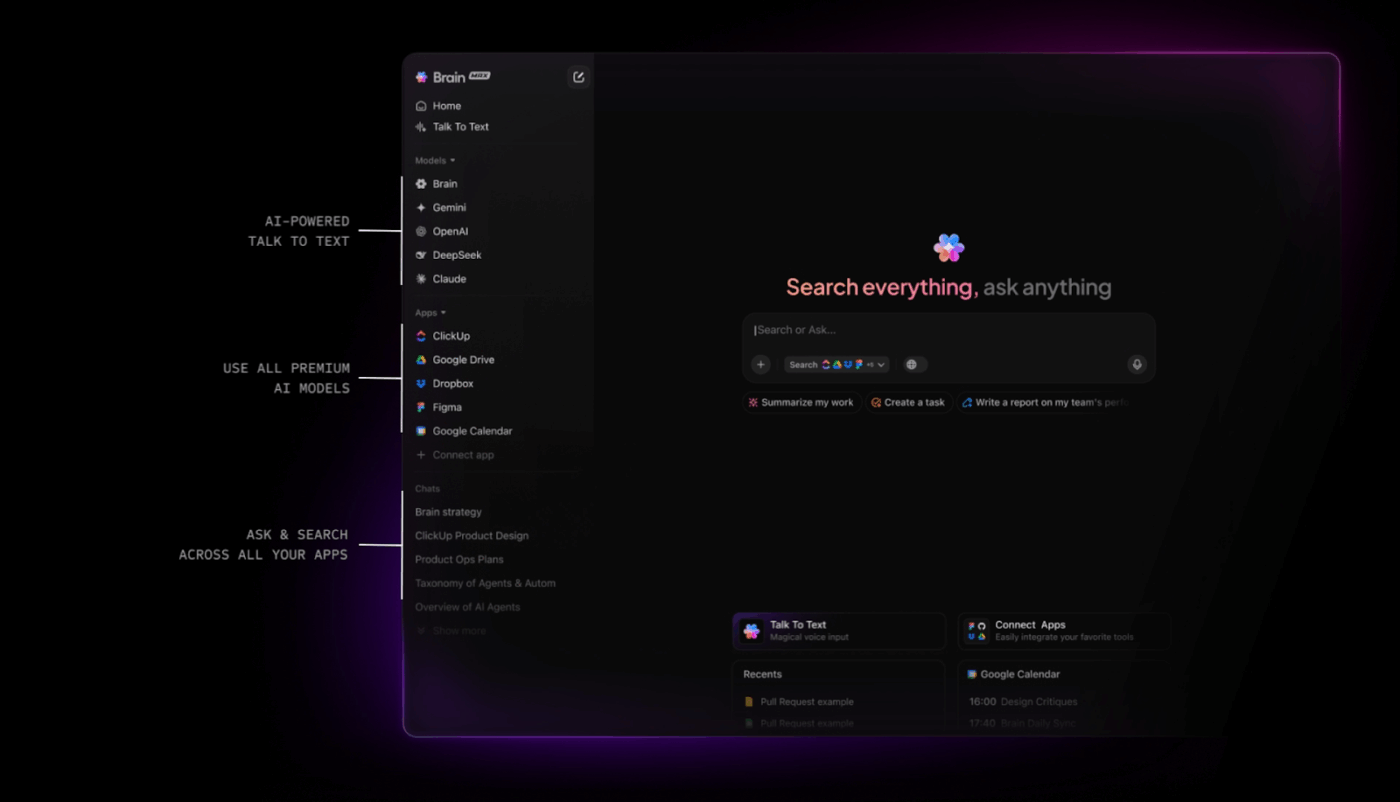
ClickUp es el primer entorno de trabajo con IA convergente del mundo que combina la gestión de proyectos, los documentos y la comunicación del equipo, todo en una sola plataforma, acelerada por la automatización y la búsqueda con IA de última generación.
Veamos cómo la plataforma le permite crear informes claros y personalizables utilizando herramientas integradas.
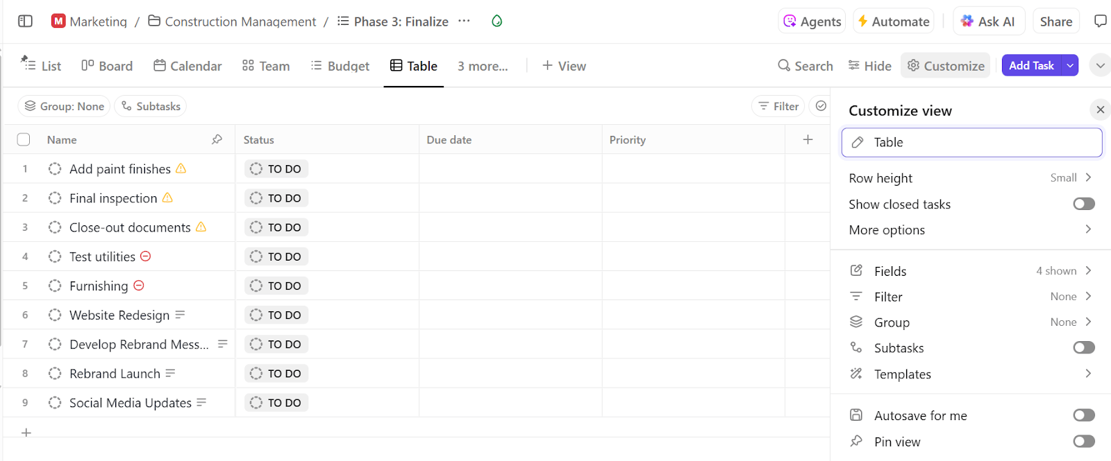
Paso n.º 1: visualice y organice los datos con la vista Tabla.
La vista Tabla de ClickUp es su centro de comandos para la elaboración de informes. Le ofrece un diseño similar a una hoja de cálculo con todas sus tareas, perfecto para organizar grandes conjuntos de datos de proyectos de un solo vistazo.
Acceda a él desde cualquier espacio, carpeta, lista o proyecto y personalice el diseño a su gusto. Puede añadir o eliminar columnas, ordenar tareas y filtrar por estado del proyecto, personas asignadas y fechas límite. También le permite realizar la edición masiva de varias entradas para limpiar datos rápidamente o actualizar campos en varias tareas con solo unos clics.
Paso n.º 2: Realice el seguimiento de la información adecuada
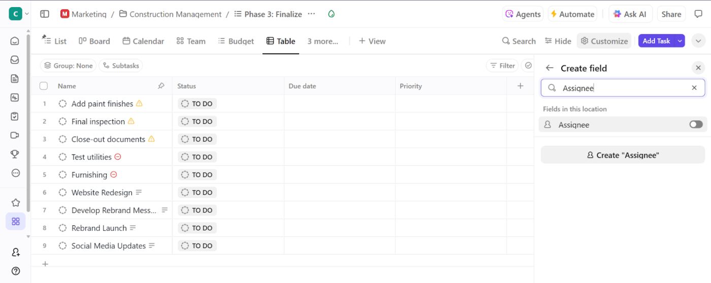
Cada equipo tiene necesidades de elaboración de informes diferentes, y los campos personalizados de ClickUp le ofrecen flexibilidad para el seguimiento de proyectos.
Esto es lo que debe hacer:
- Añada campos personalizados haciendo clic en el icono + de su vista.
- Elija entre más de 15 tipos, como menús desplegables, casillas de selección, fechas, números y mucho más.
- Añada campos como «Fase del proyecto» o «Salud del presupuesto».
- Reutilice estos campos en otros proyectos y listas para garantizar la coherencia en la elaboración de informes.
📮 ClickUp Insight: El 21 % de las personas afirma que más del 80 % de su jornada laboral la dedica a tareas repetitivas. Y otro 20 % afirma que las tareas repetitivas consumen al menos el 40 % de su día.
Eso supone casi la mitad de la semana laboral (41 %) dedicada a tareas que no requieren mucho pensamiento estratégico ni creatividad (como los correos electrónicos de seguimiento 👀).
Los agentes de IA de ClickUp ayudan a eliminar esta rutina. Piensa en la creación de tareas, recordatorios, actualizaciones, notas de reuniones, redacción de correos electrónicos e incluso la creación de flujos de trabajo de principio a fin. Todo eso (y más) se puede automatizar en un santiamén con ClickUp, tu aplicación para todo lo relacionado con el trabajo.
💫 Resultados reales: Lulu Press ahorra 1 hora al día por empleado gracias al uso de ClickUp Automations, lo que se traduce en un aumento del 12 % en la eficiencia del trabajo.
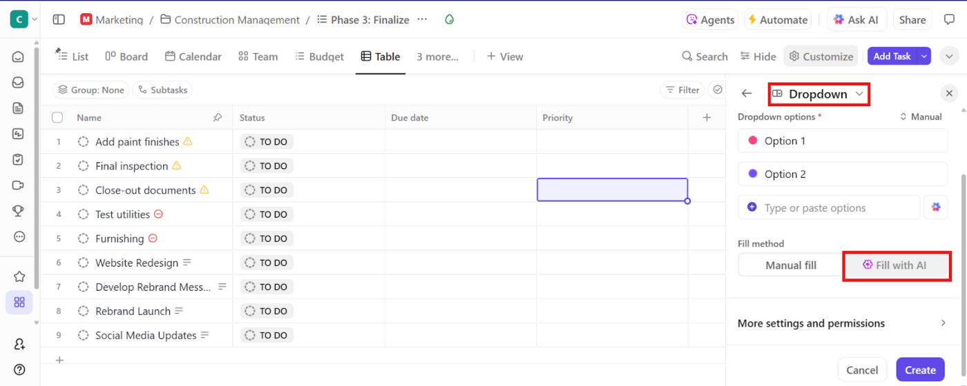
Paso n.º 3: Acelere el proceso con campos de IA.
Escribir actualizaciones para cada tarea manualmente puede llevar mucho tiempo. Los campos de IA de ClickUp utilizan ClickUp Brain para generar automáticamente resúmenes, actualizaciones e información basada en los datos de tus tareas.
Así es como funciona:
- Cree un texto breve, texto largo o campo personalizado desplegable.
- Habilite la opción Rellenar con IA .
- Elija lo que debe hacer la IA, como generar un resumen o identificar opiniones.
- Establezca el tono (lista con viñetas, resumen breve o descripción detallada) en función del nivel de profundidad que deba tener su informe.
- Genere actualizaciones de forma masiva; puede rellenar campos de IA para hasta 200 tareas a la vez desde la vista Tabla.
- Perfeccione y vuelva a solicitar a la IA si el resultado no es correcto.
Paso n.º 4: agrupe, filtre y exporte su resumen.
Una vez que sus datos estén estructurados y enriquecidos con campos, es el momento de convertirlos en un informe. Puede:
- Agrupe y filtre las tareas para centrarse en lo que es relevante.
- Exporte los datos a un archivo CSV para su posterior análisis.
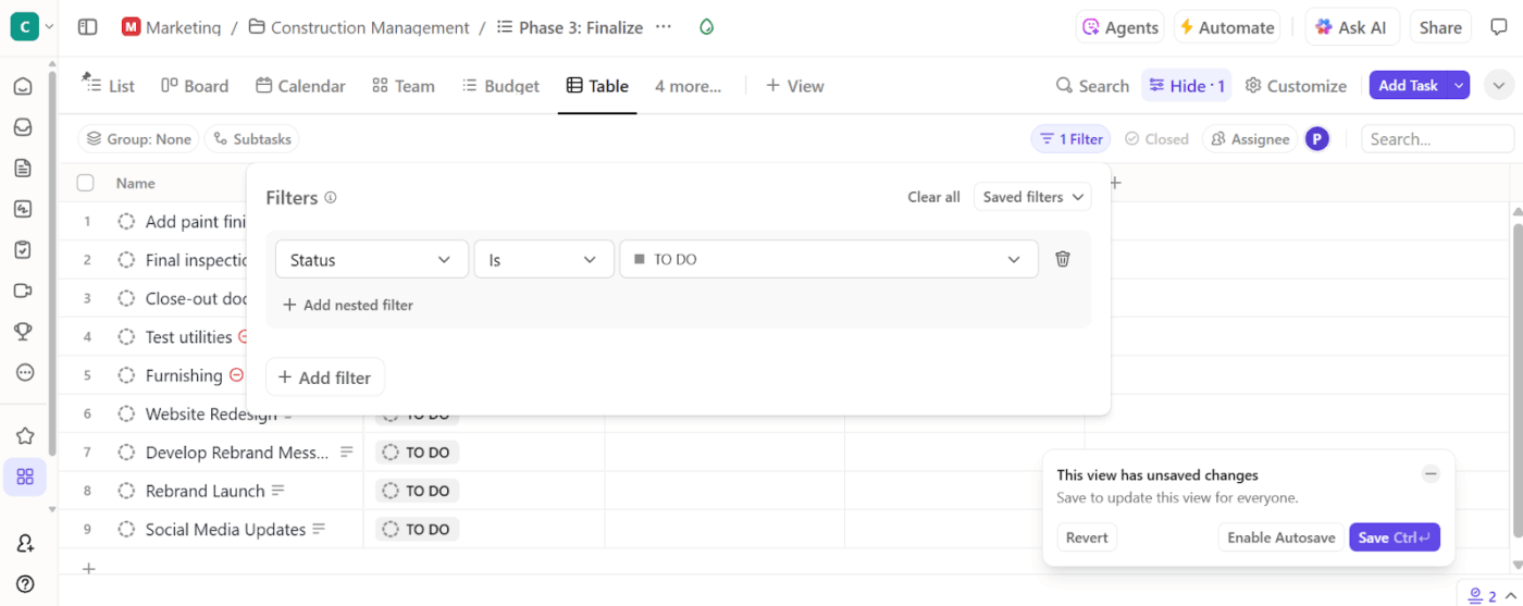
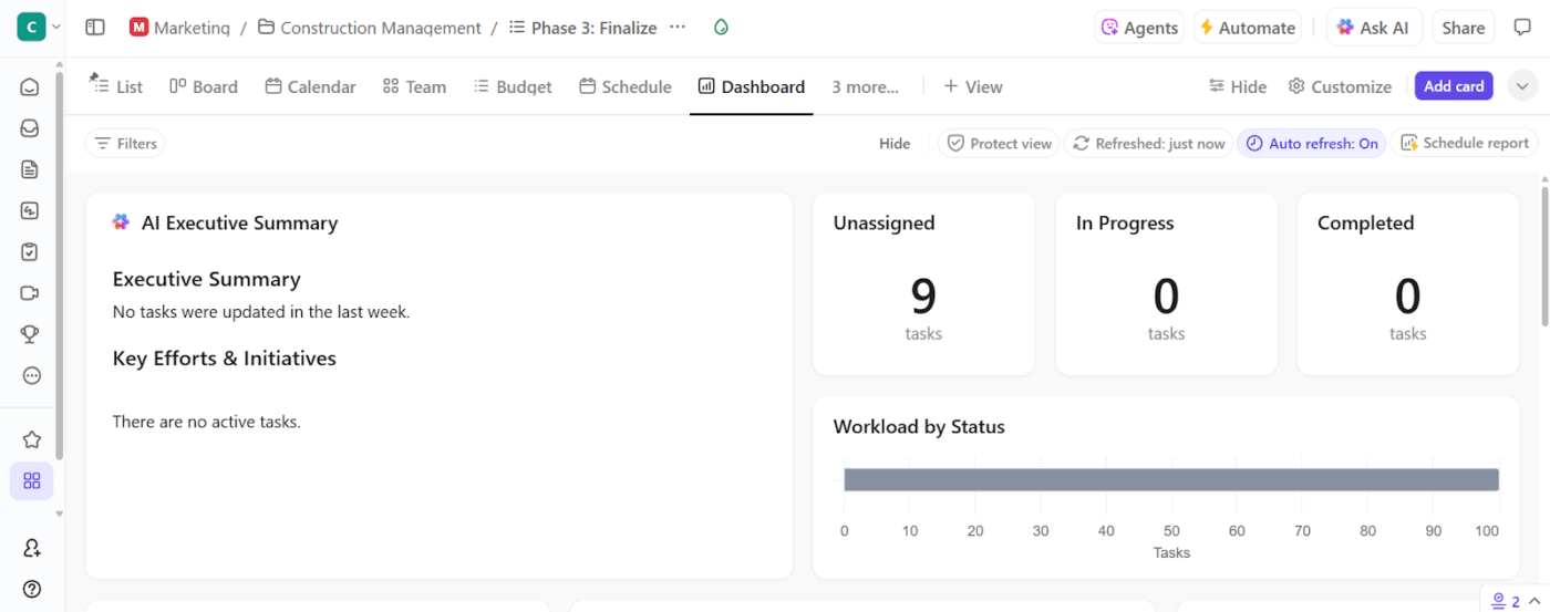
También puede utilizar los paneles de ClickUp si necesita una forma más visual de realizar el seguimiento de sus datos. Estos paneles de proyectos le ofrecen un informe visual en directo con gráficos, tarjetas y actualizaciones en tiempo real.
🎥 Ver: Cómo utilizar los paneles de ClickUp
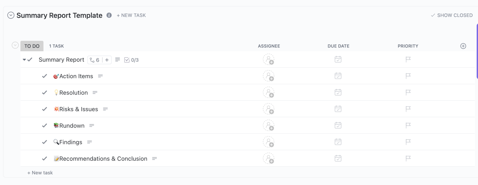
Paso n.º 5: Estandarice su proceso con plantillas predefinidas.
La plantilla de informe resumido de ClickUp convierte su resumen en un espacio de trabajo colaborativo y dinámico. Dispondrá de campos editables para una breve descripción, los miembros del equipo, el tamaño del contrato y el coste real. Además, proporciona seis subtareas predefinidas, como:
- Resumen: Un resumen rápido o recapitulación.
- Riesgos y problemas: Cualquier obstáculo o preocupación que haya surgido.
- Resolución: Conclusiones o descubrimientos clave.
- Elementos pendientes: Qué hay que hacer
La sección «Tareas pendientes» integra las subtareas directamente en su lista de tareas, convirtiendo su resumen en una plataforma de lanzamiento para el trabajo futuro.
🔍 ¿Sabías que... Casi todas las hojas de cálculo empresariales contienen errores. Los estudios estiman que el 94 % de ellas tienen errores en las fórmulas o en la lógica. Eso significa que prácticamente todos los informes importantes necesitan una comprobación de coherencia antes de poder confiar en ellos.
Automatice la creación de informes con IA + ClickUp.
El potente conjunto de funciones de automatización e IA de ClickUp le ayuda a eliminar el esfuerzo manual de generar resúmenes detallados.
ClickUp Brain conoce tu entorno de trabajo al dedillo. Si necesitas una actualización de tareas, un resumen de las notas de una reunión o ayuda para redactar tu informe, solo tienes que pedirlo en lenguaje natural.
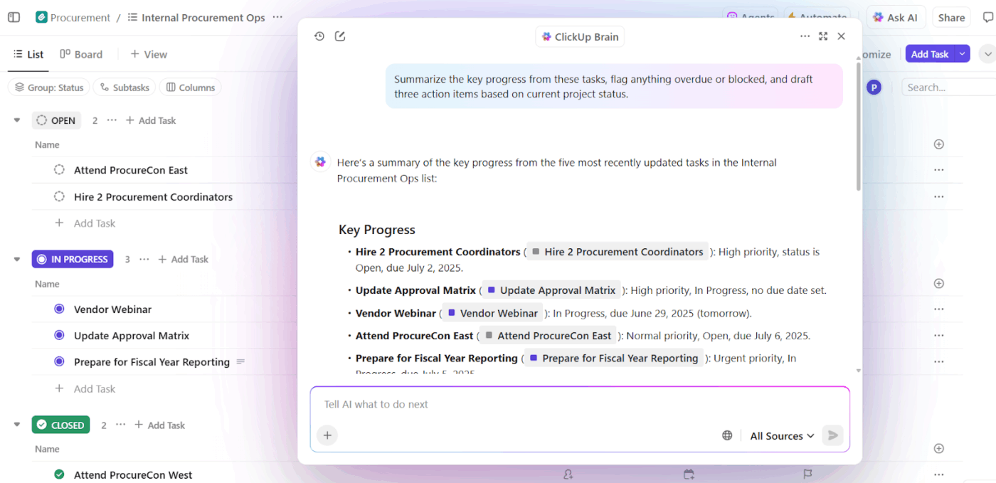
Así es como le ayuda con los informes de progreso:
- Genera resúmenes de tareas y proyectos con indicaciones en lenguaje natural como «resumir este hilo de tareas».
- Escribe secciones de informes con su IA Writer para generar secciones como «Conclusiones» y «Recomendaciones» basadas en comentarios de tareas o documentos adjuntos.
- Crea documentación a partir del trabajo existente para generar automáticamente informes dirigidos a los clientes.
Por ejemplo, en lugar de compilar manualmente los informes de estado del proyecto, pida a ClickUp Brain que cree un párrafo que resuma el progreso de todas las tareas de una lista o carpeta. Coloque ese resumen en su subtarea «Resumen del proyecto».
🚀 Ventaja de ClickUp: ClickUp Brain MAX es una importante mejora. Transforma ClickUp en un hub de IA unificado que comprende el contexto de su trabajo. Puede dictar las secciones de su informe resumido utilizando Talk to Text o ordenar a la IA que «Cree un resumen de este sprint y cree una lista de las tareas restantes con alta prioridad. »
Además, le permite elegir entre varios modelos de IA premium. Utilice ChatGPT para la elaboración de informes que requieran un razonamiento profundo, Claude para obtener rapidez y Gemini para obtener información estructurada, según lo que mejor se adapte a sus necesidades.
Automatizaciones inteligentes en ClickUp
Además, las automatizaciones de ClickUp garantizan que su proceso de elaboración de informes funcione como un reloj, incluso cuando usted no esté supervisándolo.
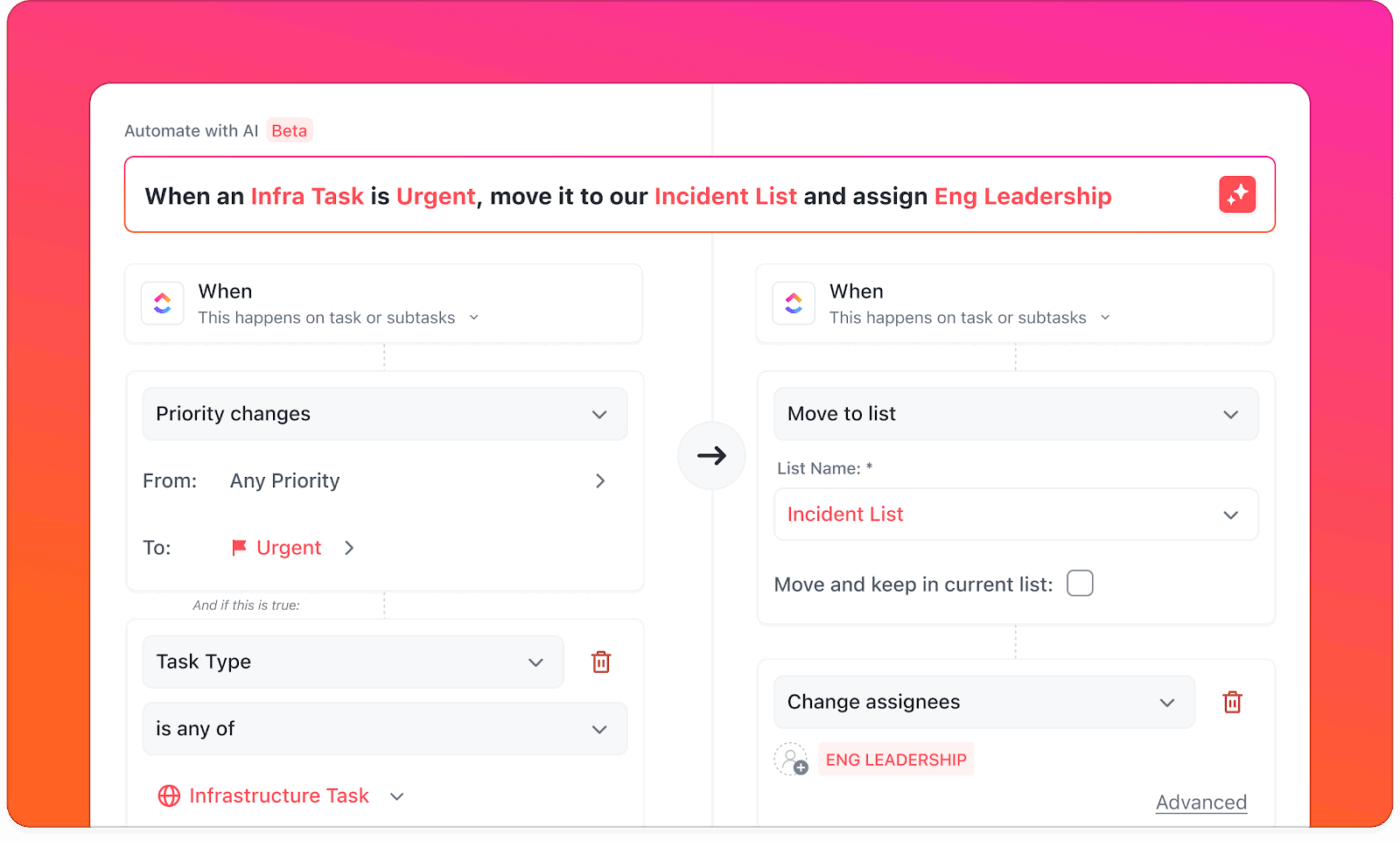
Así es como puede realizar la automatización de la elaboración de informes:
- Activa la creación de resúmenes cuando una tarea se marque como completada.
- Actualice el estado y asigne automáticamente con un resumen generado por IA.
- Programe informes periódicos y envíe recordatorios a las personas asignadas.
ClickUp: su atajo hacia la generación inteligente de informes
Puede crear un informe de resumen del proyecto o un flujo de trabajo de elaboración de informes en Excel si le gusta formatear celdas, ajustar fórmulas y buscar la última versión en los correos electrónicos.
Sin embargo, ClickUp ofrece un enfoque más automatizado y colaborativo para ello.
Con ClickUp, obtienes plantillas de elaboración de informes que se adaptan a tu flujo de trabajo, paneles inteligentes que extraen datos de proyectos en tiempo real y automatizaciones que mantienen todo sincronizado. Y con ClickUp Brain, tu asistente de IA, puedes resumir instantáneamente las actualizaciones, generar informes y responder preguntas sobre proyectos sobre la marcha.
¡Regístrese hoy mismo en ClickUp gratis! ✅