Sorry, there were no results found for “”
Sorry, there were no results found for “”
Sorry, there were no results found for “”
Most enterprise AI case studies look the same. The deck is gorgeous, the adoption chart goes up, up, up, and then someone asks a question that can stop the room cold: what changed on the P&L?
Consultancy firm, Roland Berger, put a number on that silence. Its study, The AI Value Gap, surveyed 203 senior executives across Europe, Japan, and the US. Nearly 90% said their AI returns were still trailing their spend. The more revealing part sat just under that headline: most had no coherent AI performance metrics tied to outcomes, just one-off reviews or sprawling KPI lists. They were flying blind on whether the technology had delivered at all.
And you don’t need 200+ executives to know how it feels. An AI support agent can run all day, send mediocre replies, and light up every dashboard while producing nothing the CFO can see. The chart looks healthy, so the team keeps scaling usage. That’s the whole trap.
The teams that get this right do the opposite. They measure what the AI enables, compare it against a baseline, and hand every result to a named owner.
This guide breaks AI performance metrics into four layers: output quality, system reliability, workforce adoption, and business impact. Each metric includes a formula, a direction, and a counter-metric. The goal is a scorecard lean enough to act on, paired with ownership that makes someone accountable when the numbers move.
An AI performance metric shows whether an AI system works reliably and produces a measurable business result. The most useful metrics cover four layers: output quality, system performance, workforce adoption, and business impact. Measure only quality, and you cannot prove value. Measure only usage or ROI, and you cannot diagnose why the results moved.
DX reached a similar conclusion in its AI Measurement Framework, developed using research and data from over 400 companies. It recommends evaluating utilization, impact, and cost together because no single category tells the full story.
You don’t need to track all 50+ metrics listed in this guide. Pick one or two from each layer based on the outcome the AI is meant to change. Pair every KPI with a counter-metric: speed with quality, containment with confirmed resolution, and adoption with useful use. Then assign an owner, baseline, target, and review cadence.
AI performance metrics show how well an AI system works and whether it creates business value. Some AI performance metrics measure technical quality, such as accuracy and latency. Others track the result, such as lower costs, faster work, or higher revenue.
The distinction that matters most is between a metric and a KPI. Prompts submitted, logins, tokens used, and words generated are metrics. But they turn into vanity metrics the moment you present them as success, because they measure motion, not results. A KPI is a smaller set of numbers that creates a business result when they move. So an AI performance metric to track would be cost per resolved ticket, not tickets touched.
A well-defined KPI has five parts: AI KPI = Metric + Baseline + Target + Time frame + Counter-metric
For example, an AI KPI for a support team would contribute to an objective like: Reduce first-response time from 24 hours to under four hours within one quarter, without lowering customer satisfaction. Customer satisfaction is the critical counterbalance here. It stops the team from hitting its speed target with quick but poor AI-generated replies.
| Category | Metric | KPI |
|---|---|---|
| What it is | Any quantifiable measure | A metric tied to a strategic or operational goal |
| Intent | Tracks activity | Tracks progress toward an outcome |
| AI example | Number of prompts submitted | Cost per resolved support ticket |
| The test | Interesting to know | If the number moves, someone does something different |
Every KPI is a metric, but not every metric is a KPI. For a deeper split, see KPIs vs. metrics.
A 2025 study of 5,172 customer-support agents shows what better measurement looks like. The researchers did not count prompts or AI suggestions. They tracked resolved issues per hour. And they found a 15% average jump once human agents had AI help. They also watched resolution rates and customer satisfaction, just to be sure the faster pace had not quietly hurt service quality.
Caveat: This was one company and one kind of work. So that 15% is not a universal AI benchmark.
A leading indicator gives you an early warning. A lagging indicator records the result after it happens. Both terms are regularly used when setting and measuring KPIs.
For example, a rising override rate may show that employees no longer trust the AI. Lower adoption and higher costs may follow later as employees turn to other tools. Override rate is the early signal; cost is the later outcome.
Still, these labels depend on context. Accuracy may lag a model update but lead to a later change in customer satisfaction. That is why the metrics below are grouped by what they measure.
Also Read: Lead vs. Lag Time in Project Management
The right metrics depend on what the AI is meant to do. A customer support bot, a fraud model, and a writing assistant shouldn’t share the same scorecard.
The metrics below fall into four layers: model and output quality, system performance, adoption and workforce impact, and business results. You don’t need all of them, though. Choose the few that match your goal, then pair each with a counter-metric.
These metrics answer the first question: Does the AI produce a correct, useful, and safe result?
For tasks with one known answer, like classification or data extraction, you can check the output against a reference set. Generative work is trickier to score because several answers can be valid simultaneously. There, you lean on human reviewers or model-based evaluators to rate factors like relevance, groundedness, completeness, and instruction-following.
These scores help you spot weak output and trace what went wrong. What they will not tell you is whether the AI saves money, smooths the workflow, or earns user trust. The later sections handle those results.
Accuracy is the share of predictions the AI gets right against a known answer. Say a ticket-routing model labels 1,000 tickets and gets 920 right. Its accuracy is 92%.
That sounds strong, but accuracy can hide the mistakes that matter most. If all 80 errors sent urgent tickets to the wrong queue, the overall score would still look healthy. It also loses value when one outcome appears far more often than another.
Precision shows how often the AI is right when it predicts a positive result. Put simply, it tells you how many alerts were worth acting on.
Suppose a fraud model flags 200 transactions, but only 150 are fraudulent. Its precision is 75%. The other 50 are false alarms, and each one creates more review work.
Recall shows how many of the real positive cases the AI actually caught. Precision asks whether a flag was right; recall asks whether anything real got missed. The two pull in opposite directions, so a model can look sharp on one while failing the other.
Say there are 180 fraudulent transactions, and the model catches 150 of them. Its recall is 83.3%, which means it missed 30 real cases. In fraud, medical screening, or security, those misses may cost far more than an extra review.
The F1 score combines precision and recall. It helps when false alarms and missed cases both matter, especially when one class appears far less often than another.
If a fraud model has 75% precision and 83.3% recall, its F1 score is about 79%. Since F1 uses a harmonic mean, a weak score on either side pulls the result down.
Groundedness shows whether the AI’s claims are supported by the sources it received. It matters most in retrieval-augmented systems, where a fluent answer can still wander beyond the evidence.
Suppose a policy assistant makes 10 factual claims and reviewers can trace nine back to the approved policy. Its claim-level groundedness is 90%. The last claim still needs attention, especially if it concerns pay, benefits, or compliance.
This is an operational formula, not a universal one. Decide what counts as a claim, what qualifies as support, and how you will score partial support before comparing results.
Relevance shows whether the output answers the question the user asked. An answer can be accurate and still be useless if it solves a nearby problem.
Say reviewers assess 100 chatbot replies and mark 85 as relevant. That gives you an 85% relevance pass rate. But the number means little until the team agrees on a scoring rubric and pass mark.
Instruction-following rate measures how often the AI obeys every required instruction. Format, length, exclusions, and required actions can all count.
For example, a workflow asks the model to return valid JSON with five required fields. If 94 of 100 outputs meet every rule, the rate is 94%. A reply that reads well but breaks the JSON schema still fails.
Define the rules before you run the test. If reviewers decide what “followed the instructions” means after seeing the output, the score will drift.
Completeness shows whether the AI covered every required part of the task. It catches answers that look polished but quietly leave something out.
Suppose a report must cover five sections and the AI completes four. Its completeness score is 80%. That does not mean the report is 80% good. The missing section may be the one the reader needed most.
For high-stakes work, weigh the elements by importance. A missing legal warning should count more than a missing optional example.
Hallucination rate tracks how often the AI introduces false or unsupported claims. Those problems overlap, but they are not always the same. A claim may be true in the wider world, but unsupported by the sources the system was told to use.
You can measure hallucinations by response or by claim. If 15 of 500 answers contain at least one unsupported claim, the response-level rate is 3%. A claim-level calculation may give you a different result.
Air Canada found this out the expensive way.
In 2024, A British Columbia court held Air Canada liable after its website chatbot gave a customer the wrong steps for claiming a bereavement fare. The man had asked about bereavement travel after his grandmother passed away. The bot told him he could buy the ticket first and apply for the lower fare later. But Air Canada’s own policy page said the opposite. Bereavement requests don’t apply once travel is done. The bot even linked to that policy. Its answer just went against it.
Air Canada’s defense was that the chatbot was its own legal entity, on the hook for its own actions. The tribunal didn’t buy it. And the reasoning was plain: the chatbot lived on Air Canada’s website, and the company owned the answers it gave.
The Lesson: An answer isn’t grounded just because it has a link. You have to check whether it matches the source it points to. For customer-facing AI, track hallucination rate right next to citation accuracy, policy-conflict rate, escalation rate, and repeat-contact rate.
Task completion rate shows how often the AI reaches the required end state. For an agent, that may mean issuing a refund, updating the customer record, and confirming the result. Producing a plausible reply does not count.
Suppose an agent attempts 1,000 eligible refund requests and completes 700 without human help. Its autonomous task completion rate is 70%. Report assisted completion separately, so a clean handoff does not get treated as either a complete success or failure.
Don’t borrow a public benchmark as your production target. Agent scores change quickly, and benchmark tasks rarely match your systems, policies, or customers. Build the test set from the work your agent will actually handle.
Tool-selection accuracy shows how often an agent chooses the right tool for its next step. This is separate from whether it uses that tool correctly.
An agent may search the web when it should query a customer record, or send an email when the user only asked for a draft. One wrong choice can push the rest of the task off course.
Once the agent picks a tool, it must pass the right values into it. Tool-call argument accuracy checks fields such as names, dates, IDs, and amounts.
Suppose an agent makes 300 booking calls and 264 contain every correct detail. Its strict argument accuracy is 88%. In a payment or booking flow, a wrong date or account number can cause a real transaction error.
A strict pass rate treats one wrong field as a failed call. Add field-level accuracy if you also need to find which arguments cause the problem.
Trajectory quality looks at the path an agent takes to finish a task. An agent may reach the right result after several needless searches, repeated calls, or policy breaches. A simple completion score would miss all of that.
Don’t judge every run against one ideal path. Complex tasks may have several valid routes. Score the run against required steps, allowed actions, and needless detours.
Score against a set of rules rather than a single perfect path, since complex tasks often have several valid routes. This is a real blind spot in agent testing. The 2025 TRAJECT-Bench was built to close it by checking tool choice, argument correctness, and whether calls occur in the right order, rather than only whether the agent reached the end.
Planning efficiency shows how much extra work an agent does before reaching the result. Each extra step adds time, tokens, and another chance to fail.
If a task should take four approved steps and the agent uses six, its step-based planning efficiency is 66.7%. The number only works when you can set a fair reference path or step budget.
Never reward a shorter path on its own. An agent that skips a required check may look efficient while creating more risk.
Consistency shows whether the AI gives equivalent results when you repeat the same task under the same conditions. One successful test could simply be a lucky run.
Suppose you run the same task 20 times and 18 results meet the same outcome criteria. The consistency rate is 90%. Compare the facts, decisions, or final actions rather than similar wording.
Robustness rate measures whether performance holds when the input changes in realistic ways. Tests may include typos, missing details, reordered information, longer prompts, or different wording.
If the model handles 170 of 200 altered test cases, its robustness rate is 85%. The test set should reflect the messy inputs your users submit.
Safety violation rate shows how often AI output breaks a defined safety policy. A violation might involve harmful advice, private data, banned content, or an action the agent had no right to take.
Suppose reviewers confirm 12 violations across 10,000 outputs. The rate is 0.12%. That small number may still be unacceptable if one failure can cause serious harm.
Report severity as well as frequency. Ten minor breaches should not carry the same weight as one disclosure of private data.
A fairness gap shows whether the AI performs differently across groups that should receive comparable treatment. One overall accuracy score can hide a large gap underneath it.
Suppose a screening model has an 82% true-positive rate for one group and 71% for another. The gap is 11 percentage points. Name the measure being compared. “Fairness gap” on its own is too vague.
A smaller gap does not prove the system is fair. Every group could be receiving equally poor results. Read each group’s score alongside the gap.
First-pass acceptance rate shows how often AI output is usable on the first review. It tells you far more than the volume of content, code, or analysis the system creates.
Say editors review 100 AI drafts and accept 65 without a rerun or major correction. The first-pass acceptance rate is 65%. Define “accepted” in advance, since a minor copyedit and a full rewrite should not count as the same outcome.
Rework rate shows how often AI output needs correction after it enters the workflow. It catches false efficiency, where the AI saves time at the start but moves more work to reviewers or downstream teams.
If 22 of 100 AI-written code samples return for correction, the rework rate is 22%. Separate defects caused by the AI from routine revisions or changes in scope.
This layer asks whether good output actually reaches users reliably, quickly, and at a cost the business can sustain. It is where adoption quietly dies, because a technically accurate model that responds slowly or costs too much never earns a place in the workflow.
Latency is the time between a request and a usable result, and what counts as usable depends entirely on the task. For a classifier, it may be the final answer. For an agent, it may be the moment the requested action completes. Watch out for averages, though, because they conceal the delays users genuinely feel. A support assistant might average 1.2 seconds but crawl to six during peak hours. Report percentiles like p50 and p95 so you see both the typical request and the slow one.
Time to first token (TTFT): For streaming systems, also track how long the reply takes to begin, not just to finish. Two assistants can both complete in five seconds, but the one that starts streaming at 300ms feels far faster than the one that leaves the screen blank for two. There is no universal TTFT benchmark: prompt length, model size, queues, and load all move it, so set a target for your own use case and test it at realistic traffic.
Throughput is how much work the system completes within a defined window. You might count requests per second, documents per hour, or successful tasks per day. Say a document pipeline handles 500 files an hour in testing, but drops to 200 under live traffic. That gap tells you whether it can survive a busy stretch without piling up a backlog.
Name the unit each time. Requests per second and tokens per second answer different questions.
Availability is the share of scheduled time the AI service can actually complete requests. A service can be online yet too slow or broken to finish the work, so define availability around a usable result. A 99% monthly rate still leaves room for about 7 hours and 12 minutes of downtime in a 30-day month. That may be fine for an optional writing assistant. It is a lot harder to accept for a support tool that people lean on around the clock.
System error rate covers technical failures such as timeouts, unavailable models, invalid responses, and broken integrations. Say 30 of 1,000 agent requests fail because an API goes down. That is a 3% error rate. Split those failures by cause, or the team will know something broke but not where to look.
Retry rate is how often the system must repeat a request or action. The underlying task may still succeed eventually, which is why retries slip past a simple completion score. Say 120 of 1,000 requests need one extra attempt. That is a 12% retry rate, and the system makes 1,120 attempts overall, roughly 12% additional work for that batch. More than one retry per request pushes the cost higher still.
Cost per successful task ties AI spending to completed work, which makes it considerably more honest than cost per request when failed attempts still consume tokens, tools, and infrastructure. Say each agent run costs 10 cents but only half succeed. Your direct cost per success is 20 cents. Add human review or rework and the real figure climbs higher still.
Containment rate is the share of eligible interactions that end without a human handoff. Support teams use it to estimate how much demand the AI carries on its own. It is also easy to inflate. Say a bot contains 800 of 1,000 chats, for an 80% rate. Some of those users received a real answer, while others simply gave up. Both appear contained unless you examine what happened next.
Only count queries the AI is meant to handle. Policy-based handoffs should not read as failures.
Escalation rate is how often an AI interaction moves to a human. A high rate can signal weak performance, but it can also mean the system knows when to step aside. Say 150 of 1,000 interactions escalate, for a 15% rate. On its own, that number says little. Split it into policy-required handoffs, user-requested ones, and the cases the AI simply could not resolve.
Containment and escalation tell you where an interaction ended. They don’t always tell you whether the service actually got better. One small business tracked both sides of that question.
What happened when a small retailer automated support?
A study followed an eight-person Slovak e-commerce company after it added an AI chatbot. Over three months, the bot’s share of inquiries rose from 61% to 85%. Average response time fell from 118 minutes to 64. And customer satisfaction went from 3.73 to 4.27 out of five.
Read those numbers with some care, though. Only the jump in satisfaction was statistically significant. The study covered one company over a short window. And the bot took the routine questions while people handled the hard ones, which may explain part of the speed gain on its own.
Even so, the case shows why you should read automation rate, response time, escalation, and satisfaction together. A higher containment rate means little if service quality slips beneath it.
A working AI system still has to earn a place in someone’s day. These metrics show whether people try it, use it for genuine work, and return once the novelty fades.
Usage alone will not prove value. Gallup found that 50% of employed Americans used AI at least a few times a year, yet only 13% used it daily. That gap is exactly why you track frequency, depth, and proficiency alongside plain adoption.
Eligible-user adoption rate shows how many of the people who could use the AI have completed at least one meaningful action with it. The denominator is what matters here. If 400 people activate a tool, that sounds great. But if 4,000 employees were given access, adoption is really just 10%. Leave out workers whose roles have no approved or useful AI use case.
Define “meaningful action” before launch. Opening the tool or submitting a test prompt should not count as adoption.
Active usage rate shows how many eligible users genuinely rely on AI within a defined period. Weekly active use often tells you far more than total sign-ups do. Say 1,000 employees are eligible and 600 have tried the tool, but only 180 actually touch it in a typical week. Your adoption figure might read 60%, while weekly active usage is just 18%. That second number sits considerably closer to the tool’s real place in the workflow.
Set a threshold that matches the work. Weekly use may suit writing and support tools, while a quarterly planning assistant needs a longer window.
Adoption breadth shows how widely AI use has spread across the teams, roles, or locations in the rollout. An overall adoption rate can hide a lopsided picture. One engineering team may lean on the tool daily. Meanwhile, sales, finance, and support barely touch it.
Don’t expect every group to reach the same level. Compare teams only when the AI is equally useful and available to them.
Adoption depth shows how many separate tasks active users handle with AI. It tells shallow use apart from the real thing. Someone who only rewrites email subject lines has picked up the tool, but not deeply. Someone who uses it for research, drafts, analysis, and meeting notes has woven it into much more of the day.
More use cases don’t always mean more value. A few high-impact workflows may beat a long list of trivial ones.
Workflow penetration shows what share of eligible work actually gets done with AI support. Adoption counts people. Workflow penetration counts the work itself. Say a support team handles 10,000 tickets that qualify for AI help, but AI touches only 2,500. Penetration is 25%, even if every agent has tried the tool at least once.
Keep the denominator limited to work the AI is approved and able to handle.
Retention shows how many people keep using the AI after their first meaningful use. It helps you tell lasting adoption from launch-week curiosity. Say 500 employees activate the tool in January and 300 still meet the usage threshold by April. Your three-month retention is 60%.
Measure retention by cohort. Comparing this month’s active users with last month’s total can hide new users replacing those who left.
Proficiency rate shows how many users can complete an approved task with AI while hitting the required quality and safety bar. Give people a realistic task, then check the result. Can a support agent use AI to draft an accurate reply, verify the source, and detect a fabricated policy?
Someone can use AI often and still use it poorly. That is why proficiency belongs beside adoption, not beneath it.
Override rate shows how often a person rejects, replaces, or reverses an AI suggestion. It can reveal weak output, low trust, or simply healthy human judgment. Say reviewers change 240 of 1,000 AI recommendations. That is a 24% override rate. You still need the reason, though. A necessary fix and a personal wording preference should not carry the same weight.
A low override rate can actually be worrying, if it means users accept weak output without checking it.
Human intervention rate measures how often an AI-started task needs unplanned help before it can finish. This is different from a planned approval or a policy handoff. Say an agent attempts 1,000 tasks and people have to rescue 180 of them. That is an 18% intervention rate. Those rescues carry labor costs that an autonomous completion rate can hide.
Keep planned review outside the numerator. A required approval is part of the workflow, not a system failure.
Time saved per completed task weighs the full AI-assisted workflow against a fair baseline. Count everything: prompting, waiting, checking, fixing, and rerunning. Skip that and you count only the fast first draft. You quietly ignore all the cleanup that comes after.
Self-reported time savings can help, but they need a reality check. St. Louis Fed research found that AI users reported saving about 2.2 hours in a 40-hour week. Yet a randomized trial by METR found that experienced developers took 19% longer with AI, even though they believed it had made them 20% faster. The studies covered different work, but together they make the point: ask users how much time they saved, then verify it with task data.
AI review time measures the human effort needed to check and approve an output. This is where promised time savings often quietly shrink. An AI draft may take 30 seconds to generate but 12 minutes to verify. Compare that total against the time the task would take without AI at all.
Don’t push review time toward zero in high-risk work. The aim is efficient checking, not blind approval.
Employee trust score tracks whether users believe the AI is reliable enough for its approved tasks, and whether they understand its limits. You can measure it with a short survey covering accuracy, transparency, safety, and confidence in spotting errors. Avoid one broad question like “Do you trust AI?” It gives you a vague score you cannot act on.
Also Read: Project Metrics
This is the layer executives fund against, and the one most AI dashboards skip. Output, cost, revenue, customer results, ROI: these are the numbers that decide whether a program gets renewed or shelved.
They are also the hardest to prove. Revenue can rise after a launch because demand shifted, not because the AI did anything. Costs can fall because the team reworked its process at the same time. A simple before-and-after tells you what changed, but not what caused it. For that you need a control group, a phased rollout, or a matched baseline, so you can see what would have happened anyway.
Incremental throughput measures how much more acceptable work the team completes after adding AI. Count only output that clears the same quality bar as the baseline. Say a team completed 500 approved cases a week before AI and now completes 575. That is 15% incremental throughput. But if rework climbed at the same time, the real gain may be smaller than it looks.
Cycle-time reduction shows how much faster work moves from start to finish. Include the waiting, review, corrections, and final approval. Measure only the AI generation step, and the result will appear better than it actually is. Say contract review took five days before AI and now takes three. Cycle time has dropped by 40%.
Cost per resolution shows what the business spends to solve one issue. It beats cost per contact, because a single customer problem can spin off several messages, calls, or escalations. Include model costs, human labor, tool calls, review, and repeat contacts. Otherwise a cheap first response hides an expensive path to the real answer.
Verified cost savings are the expenses you eliminated after implementing AI. Think lower overtime, fewer outsourced hours, or a smaller infrastructure bill. Time saved does not count as cash on its own. If employees stay on the same payroll and output holds flat, you have freed up capacity but not cut a real cost.
Keep cost avoidance separate. Savings remove an existing expense. Avoidance prevents a planned future one, such as hiring five more agents to handle rising ticket volume. Both can show value, but mixing them without labels makes the result look more certain than it is.
Incremental revenue is the extra revenue AI caused, beyond what would likely have happened anyway. The cleanest way to find it compares an AI group against a similar control group. No control group? Use a phased rollout or a matched baseline instead. And adjust for shifts in price, promos, demand, and season.
Revenue is not profit. Use the extra gross margin, not the full revenue figure, when you calculate ROI.
Conversion-rate lift shows whether AI helps more users complete a target action, like a purchase, a demo booking, or finishing onboarding. Say the control group converts at 5% and the AI-assisted group at 5.5%. The absolute lift is 0.5 percentage points, while the relative lift is 10%. Always specify which one you mean.
Customer satisfaction delta shows whether customer ratings shifted once AI entered the experience. Compare the same channel, issue type, customer group, and rating scale. Say AI-assisted support scores 4.3 out of five and the control group scores 4.1. The delta is 0.2 points.
Watch who answers the survey. Happy and angry customers may respond at different rates, which can move the score without a real change in service.
Repeat-contact rate shows how often a customer comes back about the same open issue. It catches the cases that only looked solved because the first chat happened to end. Say 120 of 1,000 supposedly resolved cases lead to another contact within a week. That is a 12% repeat-contact rate.
Set a clear time window and match contacts to the same issue. A customer returning with a new question should not count as a failed resolution.
Time to value measures how long an AI project takes to produce its first verified business result. Decide what counts as value before the rollout starts. A working prototype or a first user login does not count unless that was the agreed goal all along.
The shortest time to value does not always signal the strongest project. Research by MIT found that manufacturing firms often hit an early dip in productivity after adopting AI, then stronger growth later. Training, data work, and process changes delayed the gains. A short review window could have judged those projects too soon.
Return on AI investment weighs verified net benefits against what the program cost. Benefits can include extra gross profit, real cost savings, and clearly labeled cost avoidance. The cost side has to be honest too. Count the software, the models, and the servers. Then add setup, training, oversight, review, and upkeep.
Avoid double counting. If AI saves employee time and that time produces more output, count the value of the extra output or the labor saving. Counting both records the same benefit twice.
Pro Tip: Measuring AI-assisted marketing work? Start with campaign ROI. ClickUp’s Marketing ROI Calculator lets you stack campaign spend against revenue and see your ROI percentage and net profit in one place. Treat it as a quick first check. Then layer in the full AI costs later: software, model usage, setup, review time, training, and rework.
Payback period estimates how long an AI project takes to earn back its upfront investment through verified net benefits. Say a rollout costs $300,000 and returns a net benefit of $25,000 a month. The simple payback period works out to 12 months.
A simple payback calculation ignores the time value of money and any returns earned after the payback date. Finance teams may also use net present value for large or long-running AI programs.
People notice the time AI saves on a first draft. What they rarely account for is the time that follows: writing the prompt, checking the facts, fixing the errors, and redoing the weak parts. That missing math makes the gain feel considerably bigger than it is.
In the words of Farrah Lakhani, C-suite growth and strategy executive:
The most common mistake I see is treating time saved as the primary measure of AI success. Hours saved, tasks automated and cycle times reduced are the easiest data points to capture and present in a board update. They are also the least likely to reflect real business impact.
Further, METR surveyed 349 technical workers about how AI affected their work. The median respondent claimed a threefold speed increase and 1.4 to 2 times more value produced.
Those numbers sound impressive, but METR flagged them carefully. The figures came from workers’ own estimates, not from timed tasks or a control group. And researchers saw signs that the boldest claims overstated what actually showed up in the finished work.
None of this makes perception useless. If people feel AI helps them, they tend to use it more. Perception also surfaces trust, ease of use, and frustration. It turns dangerous only when a business treats that feeling as proof of productivity or ROI.
The better move is to measure the gap between what people report and what the workflow shows:
For example, say employees report a 30% speed gain, but the task records show only a 10% improvement. That is a 20-point perception gap. It may point to hidden review time, weak measurement, or work that simply feels easier without producing much more measurable value.
The safest rule is a simple one. Listen carefully to what your users say, then verify it against the actual work.
A single AI scorecard will not fit every team, since each team owns a different result. Customer service owns resolution. Engineering owns stable delivery. Marketing and sales own growth, while operations owns cost, speed, and control. Start from that result. Then add the metrics that show how AI moved it.
The real question is whether the customer’s issue stayed solved after the chat ended.
Measure the full path, from assigned work to a stable release in production. Code generated is only one step along that path.
Example: Nvidia offers a clean test of that trap. It says more than 30,000 of its engineers now use a customized version of the Cursor assistant, which produces roughly three times as much code as before, with no rise in bugs. But tripled output is a volume signal, not a delivery one. It does not show whether features ship faster or hold up in production. To close the gap, Nvidia would need to change lead time, production failure rate, and rework, besides the volume.
Marketing AI should reduce the cost or time needed to produce work that then passes review and performs with real customers.
Sales AI earns its keep when the right deals move faster through the pipeline and eventually close with healthy margins.
Example: Workato shows why faster is not the same as won. Its CIO said deals with agent-enriched data moved through pipeline stages up to 20% faster, with quote turnaround improving by 40%. Both numbers came from the company, and both measure speed, not outcome. Neither confirms more closed revenue. To prove the gain, Workato would need the win rate, margin, and closed revenue for similar deals with and without AI.
Here, AI should complete the work with fewer touches, errors, and exceptions. And every cost needs to enter the calculation.
Example: Omega Healthcare shows what a complete efficiency claim looks like. The company told Business Insider that AI saves it more than 15,000 staff hours a month on document work, with a 50% faster turnaround, 99.5% accuracy, and a 30% client ROI. That set ties time, quality, and cost into a single view.
Company results are only useful when you know what was measured. Was the number observed or forecast? Did the company count resolved work, or just work shifted away from humans? These four cases show why those details matter far more than the biggest figure in a press release.
By late 2025, Klarna said its AI support assistant handled two-thirds of all customer inquiries. It also cited 82% faster response times, 25% fewer repeat issues, $60 million in savings, and work equivalent to 853 full-time agents.
Klarna kept investing in the assistant. But it also started hiring human support staff again. Its CEO said that customers should always be able to reach a person. Reporting tied the shift to complaints about generic answers on the harder questions. The company, for its part, said its AI satisfaction remained at the same level as human support.
What this teaches: Track speed, repeat contacts, and cost, but split them by issue type. Then measure failed handoffs and satisfaction after complex cases. A strong average can hide the exact tickets that matter most.
IBM studied its own watsonx Code Assistant for a peer-reviewed CHI 2025 paper. Researchers surveyed 669 users and ran usability tests with 15 more. Many users felt the tool made them faster, but that benefit was not shared by everyone. There is an important limit to note. The study looked at developer experience and how productive people felt. It did not prove that software shipped faster or with fewer defects.
What this teaches: Pair user surveys with observed measures like review time, rework, change lead time, and change failure rate. Then split the results by task and experience level. A team average can hide developers who spend more time checking AI output than they save writing it.
Bank of America said Erica, their virtual financial assistant, handled 3 billion client interactions and now averages more than 58 million a month. Its employee version reached over 90% of staff and halved calls to the IT service desk. Erica also shows that AI efficiency does not need a generative model. The bank runs its customer assistant on a fixed library of more than 700 responses. That gives Erica less freedom than an open chatbot. But it makes the answers far easier to test and govern in a bank.
What this teaches: Match the model to the risk. For internal support, track service desk calls, successful self-service, repeat contacts, and time to resolution. A drop in call volume is promising, but it does not prove that every employee actually solved the problem.
Knowing the metrics is the easy part. The harder skill is choosing the handful that fit your goal, then deliberately ignoring the rest. Here is the approach to rely on.
Name the goal first, then pick the metric that measures it. If the goal is to cut support costs, track cost per resolution. If it is to grow revenue, track revenue per AI interaction. If it is to speed up decisions, track decision velocity. If a metric does not tie back to a goal like this, drop it.
And if you run OKRs beside KPIs, keep the roles clear: the objective sets the direction, the KPI measures progress under it. The common trap is tracking whatever your tool exports by default, instead of the number the goal needs. A metric that is easy to pull but answers no real question is still clutter.
Make each KPI Specific, Measurable, Attainable, Relevant, and Time-bound (SMART). Then cap the count deliberately. Generally, keep it to three to five per goal, and no more than seven to ten per team. Past that, review meetings stretch longer while the decisions get no sharper, because attention fragments too thin to act on any individual number. Here is a simple check: if you cannot identify the metric that would change a decision this week, your list has grown too long.
Pair every lagging outcome with a leading predictor. Cost per resolution pairs with adoption depth. Revenue lift pairs with proficiency. Defect rate pairs with code review turnaround.
The lagging metric confirms what happened; the leading one warns you early enough to act.
Every KPI needs a named owner and a review rhythm. Check operational metrics weekly, and the bigger ones monthly or quarterly. Give each metric to the person who can move the number, not the one who writes up the report. If the owner has no real lever to change it, nobody owns it. The number just drifts until the next review notices.
You don’t need a giant measurement stack on day one. You need the right tool for the metric you’re trying to prove.
Here are the resources worth knowing.
| If you need to measure… | Use this kind of resource | Good options |
|---|---|---|
| RAG and knowledge-assistant quality | RAG evaluation framework | Ragas, Microsoft Azure AI Foundry |
| Agent behavior and tool use | LLM observability and tracing | LangSmith, Arize Phoenix |
| Safety and adversarial failures | Red-teaming tool | Promptfoo |
| Drift and production quality | AI monitoring system | Evidently AI |
| Business and adoption KPIs | Work management or BI tracker | ClickUp, Looker Studio, Tableau, Power BI |
| Governance and risk | AI risk framework | NIST AI Risk Management Framework |
| Real-world failure modes | Incident database | AI Incident Database |
| Benchmark literacy | Public evaluation benchmark | Stanford HELM |
The table tells you which tool fits which job. What it can’t tell you is what each one buys you, or the failure it saves you from.
Once you have chosen your AI KPIs, they need a home that stays connected to the work so the scorecard updates itself.
Here is how our own teams keep AI metrics live in ClickUp:
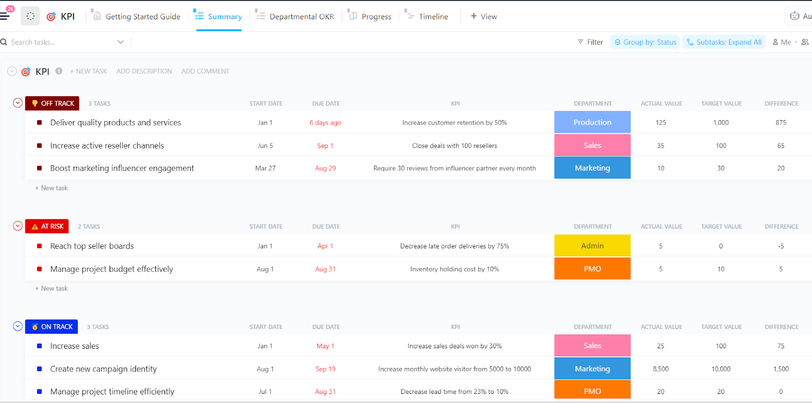
The ClickUp KPI Template gives you a solid starting structure. It ships with statuses like On Track, At Risk, and Off Track, plus Custom Fields for Target Value, Actual Value, Progress, Difference, and Variance.
Add the three to five AI KPIs that drive a decision, set a target for each, and assign an owner. That might mean first-pass acceptance, verified hours saved, cost per successful output, or escalation rate. The Progress and Summary views then give reviewers a quick read on which targets are holding and which need a closer look.
Keep in mind: The tracker records the score, but it does not gather evidence on its own. Connect each KPI to the tasks where the work happens, and use Custom Fields, Forms, Automations, integrations, or agent updates to feed in the real values.
Once those values live on active tasks, ClickUp Dashboards can roll them up across a List, team, workflow, or time period. Calculation cards add up verified time saved, average quality scores, or cost per resolution. Bar, line, and pie charts break the same numbers down by model, use case, team, or failure type.
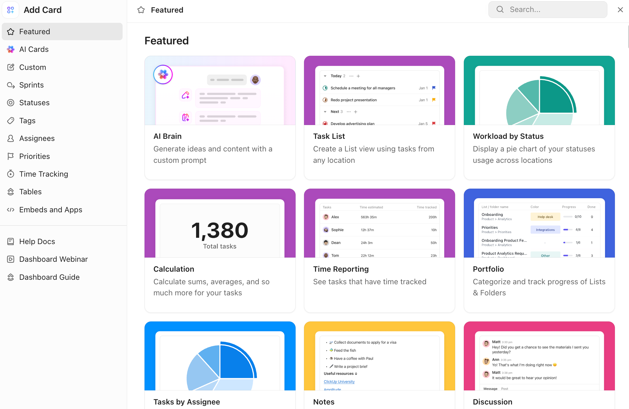
Reporting is where much of the manual effort hides. It is also the part worth automating only after your fields and definitions are reliable. Because ClickUp Brain can work with the tasks, Custom Fields, Docs, and conversations in your Workspace, you can ask it questions like:
The answer draws from your current work context in seconds. Continue in the same thread to narrow the analysis, compare periods, or ask Brain to turn the findings into interactive dashboards or slide decks.
Want to go deeper on ClickUp Brain? Here’s a quick walkthrough.
When Seismic moved AI past the pilot stage, it built 30 AI agents in 30 days across eight departments. But the team never treated the agent count as the win. What mattered was what those agents changed downstream.
Three power users reclaimed 20 hours of manual work in a single month. Reporting questions that once meant exports, pivot tables, and half a day of analysis started getting answered in seconds through ClickUp Brain. Those are the outcome signals: labor hours returned to higher-value work, and decision speed compressed from half a day to moments.
Adoption data confirmed the shift was sticking, not just spiking. Usage climbed 75% over three months, and one customer success team member went from logging activity 10 days per month to 23. Set against the hours saved and faster reporting, the frequency showed the tool had earned a daily place in the workflow rather than fading after launch week.
And as Mariah Wilcox, Chief of Staff to the CBO & CMO at Seismic, shares:
I was prepping for a meeting and asked ClickUp Brain who my power users were and which teams’ usage had jumped. In seconds, it told me our growth marketing team grew engagement 140% from February to May. That’s a stat we might never have surfaced otherwise.
Honest limitation: ClickUp ties team activity to goals well. But it is not a large-scale data warehouse like Snowflake, nor is it a specialized tool for model-level monitoring. It works best when your data and your work sit in one place, which is right where operational AI KPIs live. For deep model telemetry, pair it with a dedicated tool.
The hard part of AI was never getting it to do something. It’s knowing whether that “something” was worth doing. Most teams can tell you how much their tools are being used, how many drafts got generated, and almost none of those answer the only question that matters:
Did the work get better, cheaper, or faster in a way anyone downstream can feel?
When you decide what value looks like before you build, you end up measuring what the AI changes instead of what it merely does. Choose a handful of metrics that map to a real goal. Then, give each one a counter-metric so a win on speed can’t hide a loss on quality. Finally, hand every number a baseline, a target, a deadline, and an owner who can move it. Keep that scorecard beside the work it measures, and it tells you the truth on its own.
And if you want to track all of this as your AI use scales, you need a tool that grows with you. Sign up for ClickUp to build an AI KPI dashboard that keeps every metric beside the work it measures.
Start with one from each of the four layers: accuracy or first-pass acceptance (output quality), latency (system performance), active-user retention (adoption), and cost per resolution or ROI (business impact). The right combination depends on the AI’s job. A support bot needs containment, confirmed resolution, and repeat-contact rate. A code assistant needs change lead time, rework rate, and review time. Cap the total at three to five per goal and pair each with a counter-metric so a gain on one dimension cannot quietly hide a loss on another.
A benchmark scores a model on a fixed public dataset and task; a performance metric measures how your system behaves on your own work in production. A model can top a leaderboard and still fail on latency, cost, or safety once real users reach it. Treat benchmarks like Vectara’s hallucination leaderboard or MMLU as a shortlisting tool, then measure the metrics that match your goal.
There is no accepted industry-wide hallucination rate for an AI system. A useful target depends on the task, the cost of an error, and whether the system can admit uncertainty. For grounded business uses, a rate below 5% on a representative production test set is a reasonable starting point. But high-stakes systems should aim much closer to zero and route uncertain answers to a human. Treat that 5% as an operating target, not a published standard.
The bigger lesson is that hallucination rate can’t stand alone. A Nature study found that common accuracy benchmarks reward models for guessing rather than admitting they don’t know. Measure hallucinations alongside abstention rate, error severity, citation support, and how often unsupported claims reach users.
Review operational metrics like latency, error rate, and containment weekly; review business metrics like cost per resolution and ROI monthly or quarterly. Match the cadence to how fast the number can move and who acts on it. Give every metric a named owner who controls a real lever.
Most teams pair two layers. Work platforms like ClickUp track operational and business KPIs beside the tasks that generate them, using dashboards, custom fields, and agentic workflows to roll up values like first-pass acceptance or cost per successful task. Dedicated observability tools such as Arize, Langfuse, and WhyLabs handle model-level telemetry like drift and hallucination, while a warehouse like Snowflake stores the raw events for deeper analysis.
Yes, though less cleanly. A control group isolates what the AI caused from what would have happened anyway, so it’s the strongest option. Without one, use a phased rollout or a matched baseline, and adjust for shifts in price, promotions, demand, and season. A plain before-and-after tells you what changed but not what caused it, which is how seasonal demand or a parallel process fix gets miscredited to AI.
AI ROI is the value gained from an AI system compared to its total cost of building, running, and maintaining it. Establish a baseline for the process before deployment, then measure the change in a hard business metric, such as cost per resolution or revenue per interaction, against total cost of ownership.

Manasi Nair
Max 27min read

Sean Hardy
Max 26min read
Manasi Nair
Max 19min read
© 2026 ClickUp