Are you a software developer, engineer, product manager, or UX designer looking to learn more about user testing and assessing digital products? Heuristic evaluation is an incredibly powerful tool for improving your digital product’s design. This evaluation technique focuses on finding the underlying issues that are causing user friction, from navigation problems to confusing labels and unclear instructions.
Read on for an in-depth look at heuristic evaluations—what they are, how they can benefit you, and how to apply them for maximum success. You'll also see how technology solutions like the heuristic evaluation checklist template in ClickUp make it easy to add heuristic principles into your workflow.
What is a heuristic evaluation?
A heuristic evaluation is a
usability inspection method that can help you detect usability issues in a product or service. It involves having an expert or team of experts review the interface and assess its quality based on established guidelines. The process typically involves examining the interface for errors, inconsistencies, and usability problems that can affect a user’s experience.
This technique is based on the concept of “heuristics”, which are general rules or guidelines that experts use to identify potential issues. Heuristic evaluations typically involve evaluating each design element in terms of established criteria, such as recognized usability principles and industry standards. The idea is to identify any problems with the product so they can be resolved before they become major issues. This can help to increase user satisfaction and ultimately improve the product.
The benefits of running a heuristic evaluation.
Nobody wants to ship a product that people have trouble using. When you conduct a heuristic evaluation, you:
• Can uncover underlying issues before users recognize them and they become major problems
• Spend less time and fewer resources than you might with other usability testing methods
• Have more confidence in your results, since experts have detailed knowledge of best practices and industry standards
• Increase user satisfaction by correcting any usability issues
• Reduce development costs, since usability problems are identified and corrected earlier in the process
The next key thing to know about conducting a heuristic evaluation is knowing who should be a part of the evaluation system process.
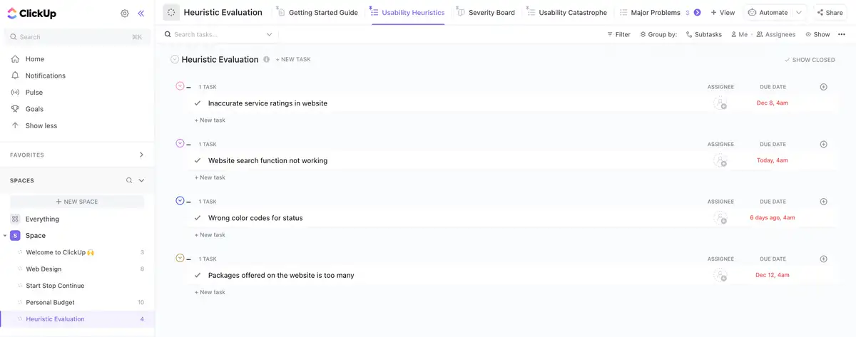
Pictured: Major problems encountered seen in List view in ClickUp.
Who should be involved in a heuristic evaluation.
Heuristic evaluations typically involve one or more experts assessing the user interface. These experts should have a detailed understanding of usability principles, industry standards and UX design best practices. It’s important to select people who can identify potential problems, as well as provide constructive feedback on how to fix them.
Depending on the size of the project, it may be beneficial to involve several experts, such as a product manager, UX designer and software developer. It’s also important to ensure that all participants are familiar with the product or service being evaluated. This will help them to better identify usability issues which should be addressed.
Heuristic evaluation vs. usability test.
The main difference between a heuristic evaluation and a usability test is who's involved. Heuristics operate by having one or more experts inspect the user interface to uncover problems, while usability tests involve actual users interacting with the product to detect these issues.
Usability tests typically involve actual users going through tasks and providing feedback on their experiences. But as mentioned above, heuristic evaluations are typically done by experts who have detailed knowledge of best practices and usability principles. Additionally, heuristic evaluations can often be conducted with fewer resources and in less time than usability tests.
Common heuristics used in evaluations.
The heuristics you'll use in your evaluation all depend on the kind of digital product you're building—so some may be more relevant than others. These are a few of the most common heuristics people consider in an evaluation:
- Accessibility:
Is the interface accessible to all users, including those with disabilities or impairments?
- Clarity:
Is the interface clear and understandable?
- Consistency:
Does the design adhere to standards within its context?
- Content:
Is the content clear and relevant to its context?
- Efficiency:
How quickly can users complete their tasks?
- Error Prevention:
Are there measures in place to prevent users from making mistakes?
- Feedback:
Does the interface provide feedback on user actions?
- Flexibility:
Can users easily switch between different functions?
- Learnability:
Is it easy for new users to understand the interface?
- Navigation:
Is the navigation system easy to use and understand?
- Security:
Are there measures in place to protect user data and information?
- Testing:
Has the product been tested for user acceptance prior to launch?
- Visual Design:
Does the design appeal to its intended audience?

Pictured: Usability heuristics seen in List view in ClickUp.
Key elements to include in a heuristic evaluation checklist.
So what exactly should go into your heuristic evaluation? Here are the most important features you'll need to include:
• Product or service being evaluated
• List of heuristics to be assessed
• Instructions for conducting the evaluation
• List of participants and their roles
• Evaluation criteria for each element being tested
• Results/ findings from the evaluation
• Action items for follow-up on identified issues.
How to conduct a heuristic evaluation.
Performing a heuristic evaluation can complex, so it helps to break down the process into smaller steps. To ensure success, follow this guidance when conducting your evaluation.
- Identify user goals and expectations.
Begin by understanding the task-flow, desired outcomes, and users’ expectations from the product.
Use a Doc in ClickUp to collaboratively brainstorm ideas about goals and expectations.
- Select experts.
Choose one or more experts with detailed knowledge of usability principles, industry standards and design process best practices.
Create a form in ClickUp to see who'd be interested in participating in an evaluation at your organization.
- Develop heuristics.
Create a set of evaluation criteria that best applies to the product being evaluated.
Create custom fields in ClickUp for each heuristic in your evaluation.
- Review the interface.
Have each expert review the user interface and assess its quality based on the established criteria.
Assign ClickUp tasks to your experts so they know what they should be focusing on.
- Identify problems.
Look for usability issues, errors, inconsistencies, and points of confusion in the interface.
Use custom fields to keep track of any problems your experts discover.
Pictured: Tracking problems by severity seen in Board view in ClickUp.
- Provide feedback.
Give constructive feedback on how to resolve problems and improve the user experience.
Leave comments in ClickUp tasks when giving feedback—and tag other users to make sure they see them.
- Compile results.
Document all findings in a report that summarizes the evaluation process, identified issues and suggested solutions.
Build out a Dashboard in ClickUp that summarizes your findings at a glance.
- Implement changes.
Make any necessary changes to the product or service based on the evaluation.
Create new tasks in ClickUp to implement any recommended changes.
- Test and refine.
Test the product again to ensure that all changes have been implemented correctly, and refine as needed.
Automate testing tasks in ClickUp to trigger whenever a new implementation or improvement has been completed.
- Review progress.
Track progress to make sure that all issues identified in the evaluation have been addressed.
Use Board view in ClickUp to see where things are running smoothly and identify any bottlenecks.
- Celebrate success.
Congratulate yourself on a job well done! You’ve just conducted a successful heuristic evaluation and improved your user experience!
How can technology help you conduct a heuristic evaluation?
Today, technology has made it much easier to conduct heuristic evaluations.
With the ClickUp heuristic evaluation template, you can quickly and easily add heuristics into your workflow. This template organizes all of the information related to your evaluation in one place. It includes instructions for conducting an evaluation; customizable fields for tracking progress, issues and solutions; personalized tasks for each participant; and automated testing tasks that trigger whenever a new implementation or improvement has been completed.
Done properly, heuristic evaluations can help to improve user experiences, increase customer satisfaction and save time and money. By taking the time to implement this powerful tool into your workflow, you'll be on your way to creating a product that meets the needs of users and achieves its goals.
Related Templates


